Walmart A/B Tests 4 vs 3 Column Listing Pages
Walmart just ran their very own 4 vs 3 column experiment on some of their listing pages. The a/b test seems to have had a similar hypothesis about product tile density to what Etsy ran just a few months ago. More interestingly, both companies seem to have landed on the 4 column tiles approach as Walmart's 3 column variation looks like it was rejected.
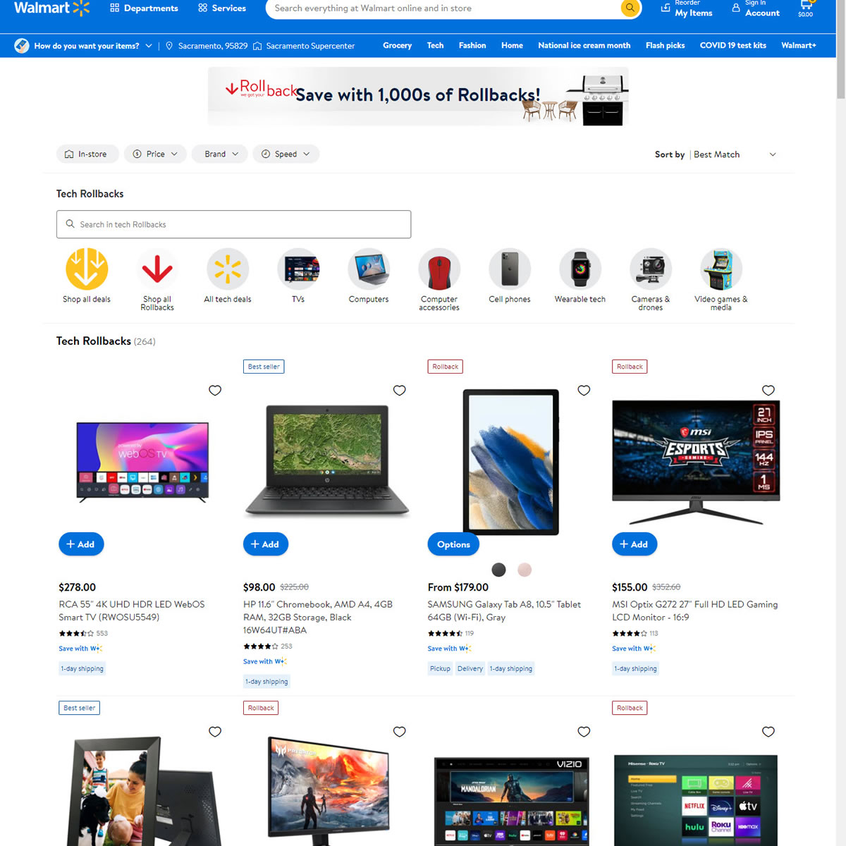
B - Jul 7, 2022 Screenshot
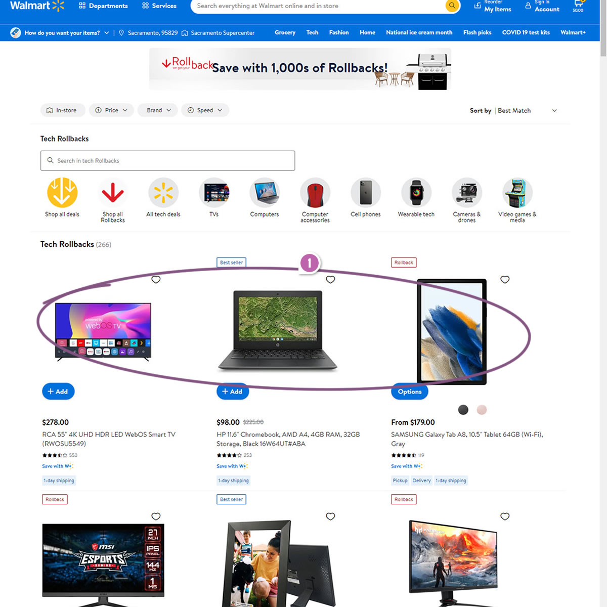
Highlighted UI Changes From This Leak
-
Expanded Vs Condensed Layout
In the (A) control we can see a 4 column layout with more tiles per screen (more condensed with higher density). In the (B) variation we can see a more expanded 3 column layout with fewer tiles per screen (lower density).
0.5 Repeatability has been assigned to Pattern #102: Expanded Or Condensed Layout as evidence that it's getting better
Repeatability is a net count of evidence for or against a pattern. It’s how we can predict which patterns are better than others. :)

Comments