Walmart Runs A Potentially Confounded Button Color A/B Test
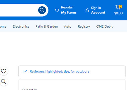
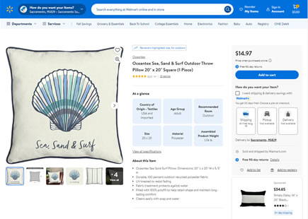
Walmart just ran another iteration of a button color a/b test as part of their navigation tests (seen here and here). This time, it looks their team attempted to isolate the button color change (a yellow vs blue background on the search button). However, upon looking at this more closely we can see that there is a possible confounding situation. The contrast of the icon in variation's hover state has has dropped heavily (barely legible).
For all we know, such changes may already have tiny effects that are barely detectable (and therefore make no relevant difference at all). Nevertheless it might be good to check for such confouders.
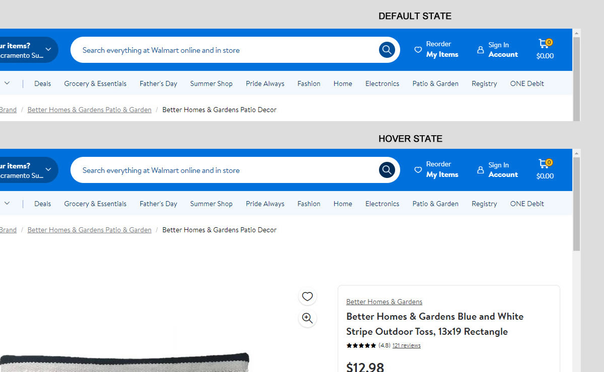
B - Jun 6, 2024 Screenshot
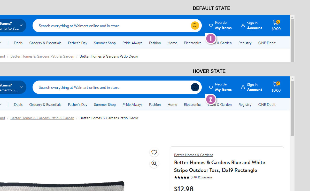
Highlighted UI Changes From This Leak
-
Changed Button Color
Instead of a dark blue background, the variation used a yellow one (possibly aiming for contrast from a somewhat complementary color choice).
-
Decreased Icon Contrast
The hover state however, has a strong decrease in contrast on the icon (dark on dark situation).


Comments