39 Tests By  Stanley Zuo
Tests
Test #583 on
Backstage.com
by
 Stanley Zuo
Mar 30, 2025
Desktop
Mobile
Stanley Zuo Tested Pattern #24: Visible Availability In Test #583 On Backstage.com
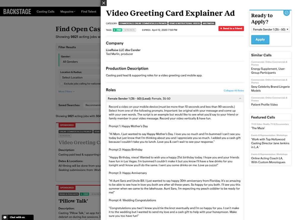
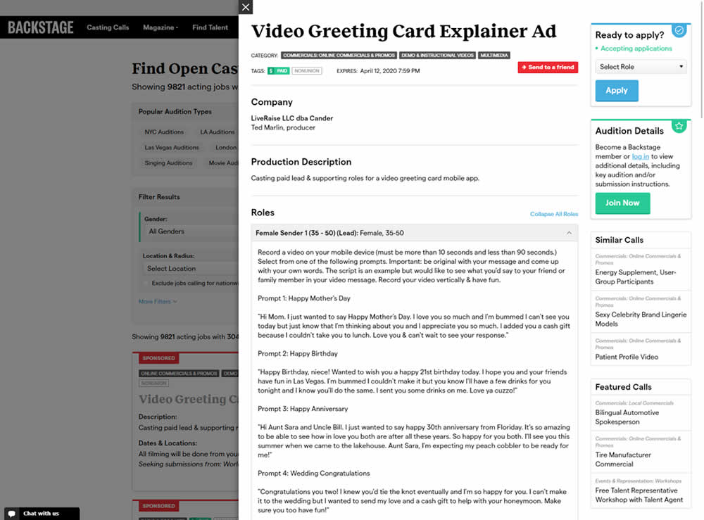
In this experiment, the active availability of a casting call (job offer) was was made more prominent using green text: "Accepting applications". The variation also made the "Join Now" button more prominent as an alternative path to signing up for a membership. The experiment reports on three metrics: clicks on apply, application starts and premium membership sales (measured a few steps further in the funnel).
Test #530 on
by
 Stanley Zuo
Apr 30, 2024
Desktop
Mobile
Stanley Zuo Tested Pattern #28: Easiest Fields First In Test #530 On


In this experiment, the order of two signup pages was tested: plan selection vs account creation. Here we have the account creation step first in the control and the the plan selection step first in the variation. (I flipped these around to match the pattern). Impact on signups was measured.
Test #514 on
Backstage.com
by
 Stanley Zuo
Jan 24, 2024
Desktop
Stanley Zuo Tested Pattern #97: Bigger Form Fields In Test #514 On Backstage.com


In this experiment, the click area of job listing tiles was expanded to the size of the full job tile. In the control, the click area was smaller - mostly only the job headline, along with additional "view more" links on the right hand column. Clicking the tile or headline would open up a new job details page in both control and variation. Impact on progression and membership sales was measured.
Test #487 on
Learnwithhomer.com
by
 Stanley Zuo
Aug 10, 2023
Mobile
Stanley Zuo Tested Pattern #78: Tags, Badges And Structured Information In Test #487 On Learnwithhomer.com
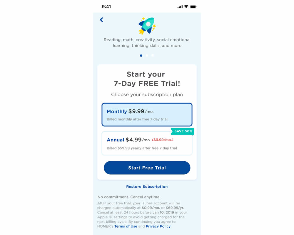
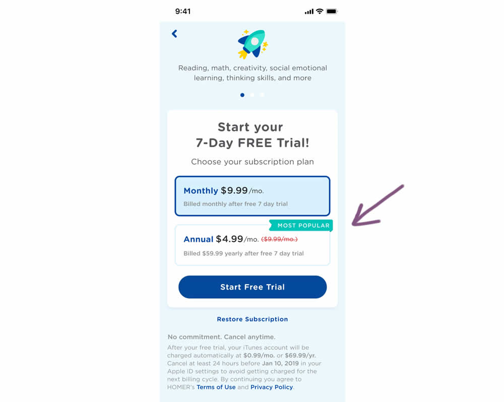
In this experiment, a "save 50%" badge was replaced with a "most popular" one with the intent of encouraging more users to select the higher priced plan. Impact on total and annual trial starts was measured.
Test #481 on
Backstage.com
by
 Stanley Zuo
Jul 14, 2023
Desktop
Mobile
Stanley Zuo Tested Pattern #15: Bulleted Reassurances In Test #481 On Backstage.com
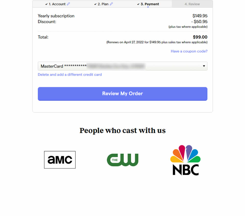
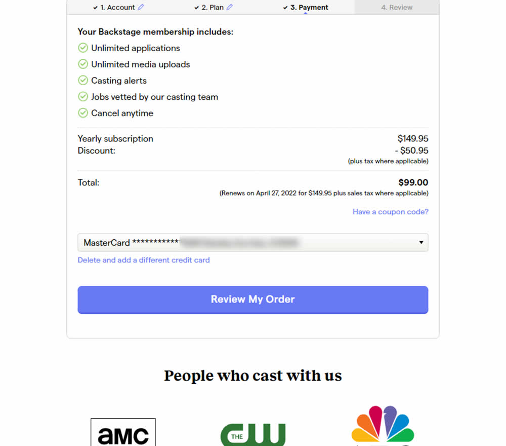
In this experiment, selling points and benefits of a subscription were placed as bullets at the top of a checkout page. The benefits highlighted things such as: unlimited applications, access to vetted jobs and the ability to cancel anytime. Impact on sales was measured.
Test #460 on
Backstage.com
by
 Stanley Zuo
Mar 21, 2023
Mobile
Stanley Zuo Tested Pattern #41: Sticky Call To Action In Test #460 On Backstage.com
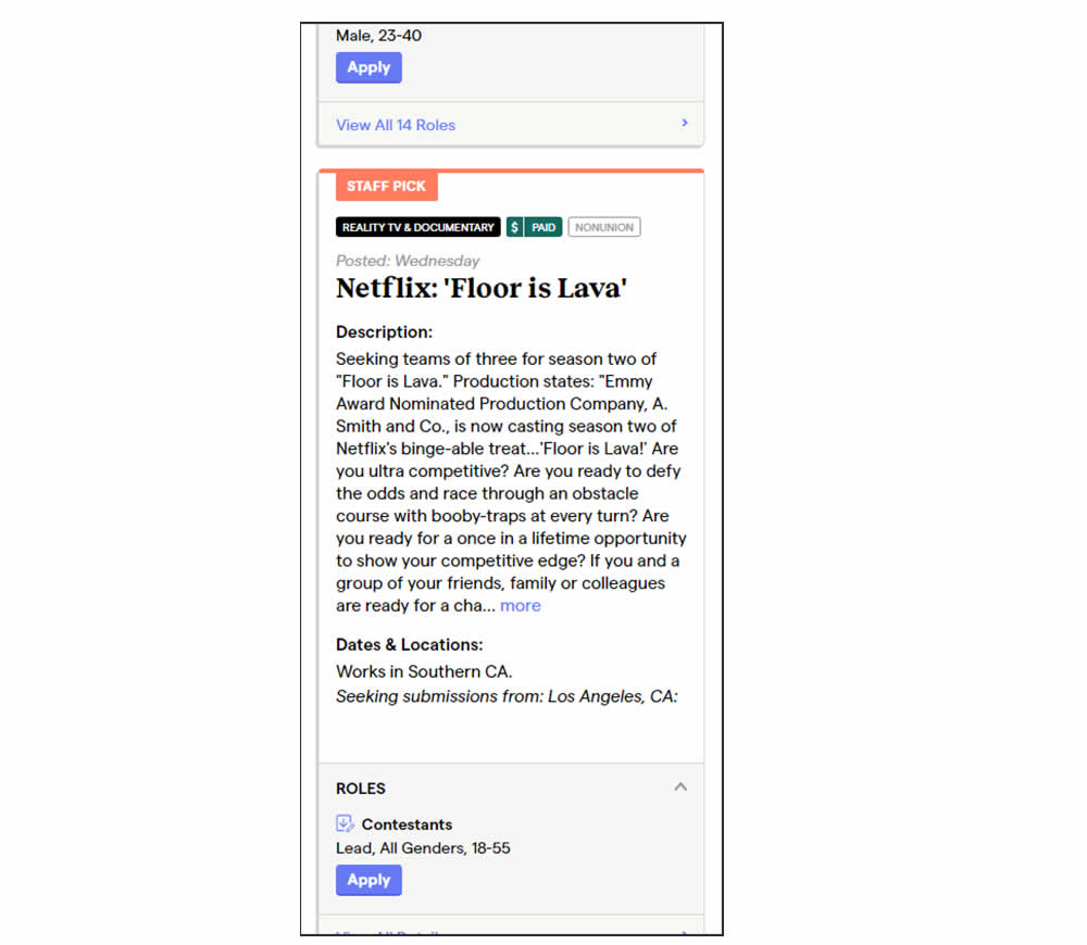
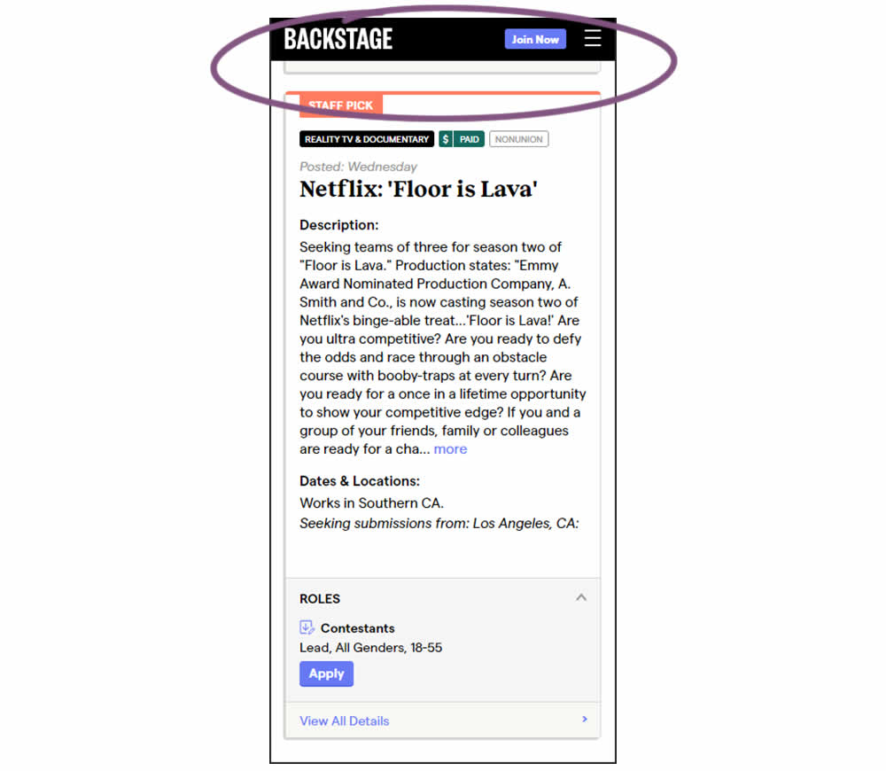
In this experiment, a floating top navigation was shown with a "Join" button. In the control, the navigation was only visible at the top of the page. Also keep in mind that signup starts were also triggered throughout multiple CTAs throughout the page and from particular job detail pages. The a/b test ran on a listing page of Backstage - a casting call job site. Impact on signups and checkouts was measured.
Test #434 on
Learnwithhomer.com
by
 Stanley Zuo
Sep 30, 2022
Mobile
Stanley Zuo Tested Pattern #66: Complementary Upsell In Test #434 On Learnwithhomer.com
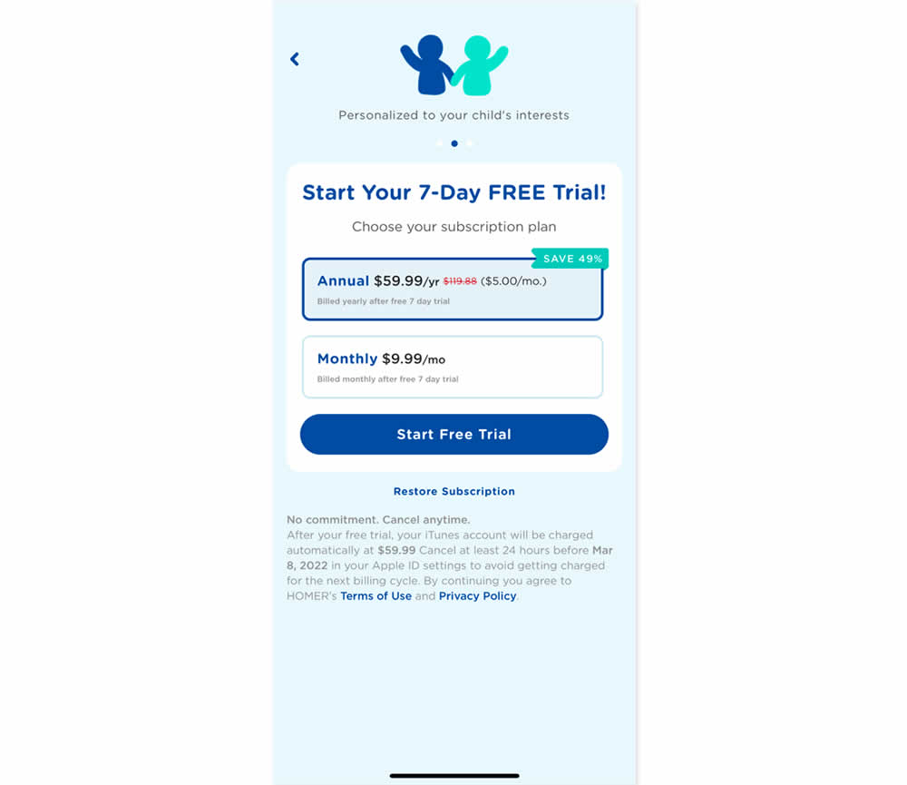
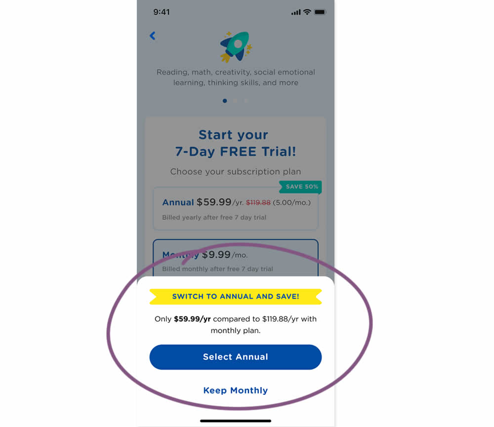
In this experiment, an upsell modal appeared during a signup funnel. In the variation, if users did not select a monthly plan, they were nudged to an annual one. Impact on overall and annual signups was measured.
Test #415 on
Learnwithhomer.com
by
 Stanley Zuo
Jun 09, 2022
Mobile
Stanley Zuo Tested Pattern #3: Fewer Form Fields In Test #415 On Learnwithhomer.com


Do fewer confirmation form fields matter? In this experiment, redundant password and email confirmation fields were removed during a signup / checkout funnel. Impact on signups was measured.
Test #405 on
Learnwithhomer.com
by
 Stanley Zuo
Apr 07, 2022
Mobile
Stanley Zuo Tested Pattern #119: Unselected Or Selected Defaults In Test #405 On Learnwithhomer.com

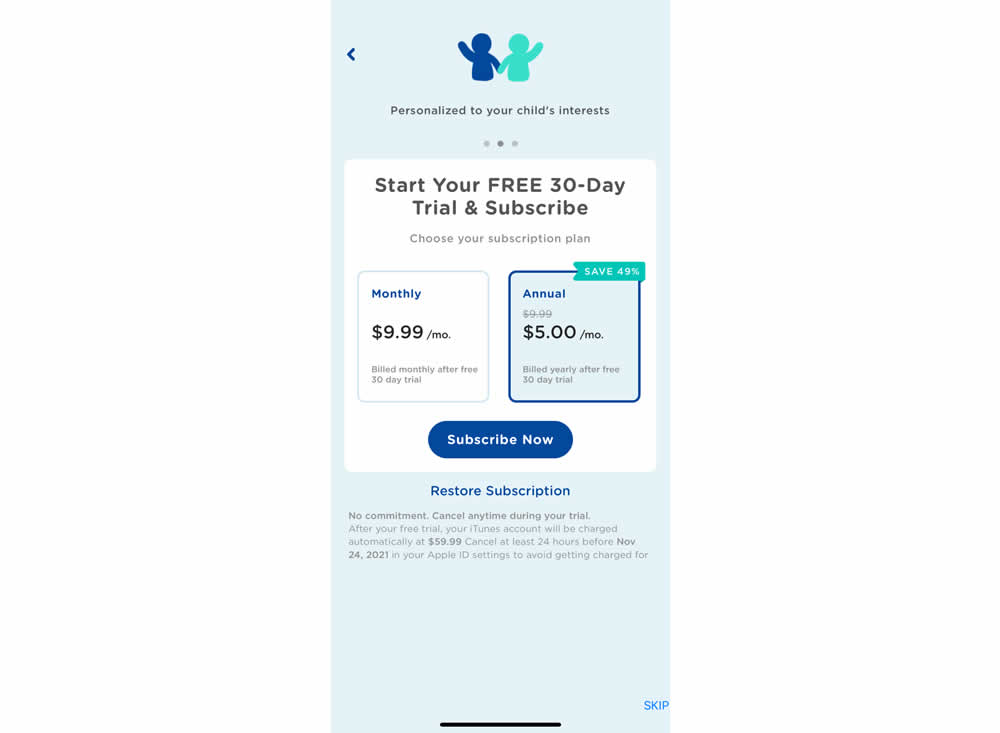
In this experiment, the annual plan was preselected instead of starting off unselected in the control. Impact on two metrics was measured: any plan and annual plan purchases.
Test #401 on
Learnwithhomer.com
by
 Stanley Zuo
Mar 11, 2022
Desktop
Stanley Zuo Tested Pattern #58: Full Height False Bottom In Test #401 On Learnwithhomer.com

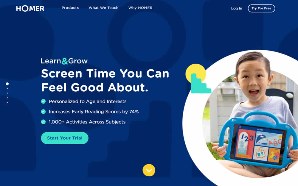
Here the experiment contained a layout change. Standard content components with varied heights were tested against sections with false bottoms. That is the conntent blocks in the variation took up 100% height of the viewport. This change was also applied throughout the rest of the content blocks. Impact on overall signup rates was measured.
Test #391 on
Backstage.com
by
 Stanley Zuo
Dec 30, 2021
Desktop
Mobile
Stanley Zuo Tested Pattern #82: Onboarding Callouts In Test #391 On Backstage.com

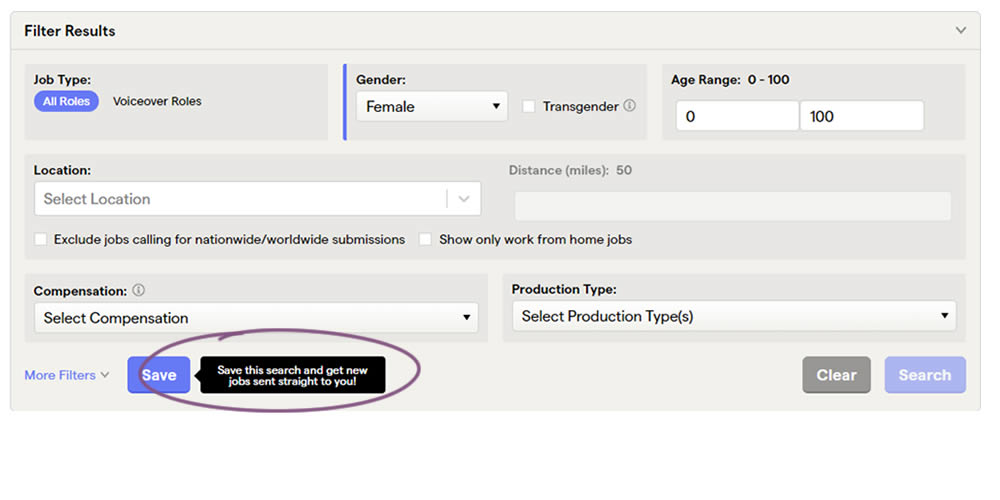
This experiment added a small nudge or callout to encourage more signups. Attention was directed towards the save function, which lead to the signup flow for anyone not signed it. Impact on signups was measured.
Test #386 on
Learnwithhomer.com
by
 Stanley Zuo
Nov 29, 2021
Desktop
Stanley Zuo Tested Pattern #112: Lower Price Frames In Test #386 On Learnwithhomer.com

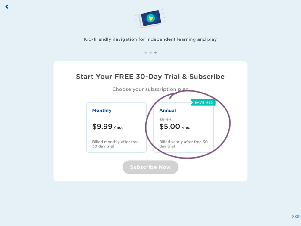
In this experiment, the annual plan was standardized and framed in a monthly price context (during the iOS signup flow). This made the annual plan more comparable to the monthly plan price. Impact on overall sales and annual plan sales was measured.
Test #379 on
Learnwithhomer.com
by
 Stanley Zuo
Oct 15, 2021
Mobile
Stanley Zuo Tested Pattern #112: Lower Price Frames In Test #379 On Learnwithhomer.com


In this experiment, the annual plan was standardized and framed in a monthly price context. This was more comparable with the monthly plan price above. Please also note that the annual billing price was also kept and clearly stated. Impact on overall sales and annual plan sales was measured.
Test #375 on
Backstage.com
by
 Stanley Zuo
Sep 17, 2021
Mobile
Stanley Zuo Tested Pattern #32: Condensed List In Test #375 On Backstage.com
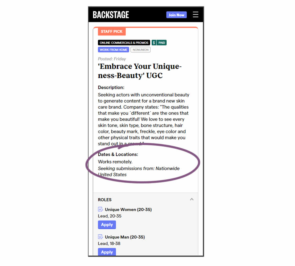

Similar to experiment 373, listing descriptions were shortened dynamically using exposable "more" links AND dates/location data was removed. This way, the variation showed shorter listings and therefore more listings per screens. Impact on listing clicks (progression) along with membership starts was measured.
Test #373 on
Backstage.com
by
 Stanley Zuo
Sep 06, 2021
Mobile
Stanley Zuo Tested Pattern #32: Condensed List In Test #373 On Backstage.com
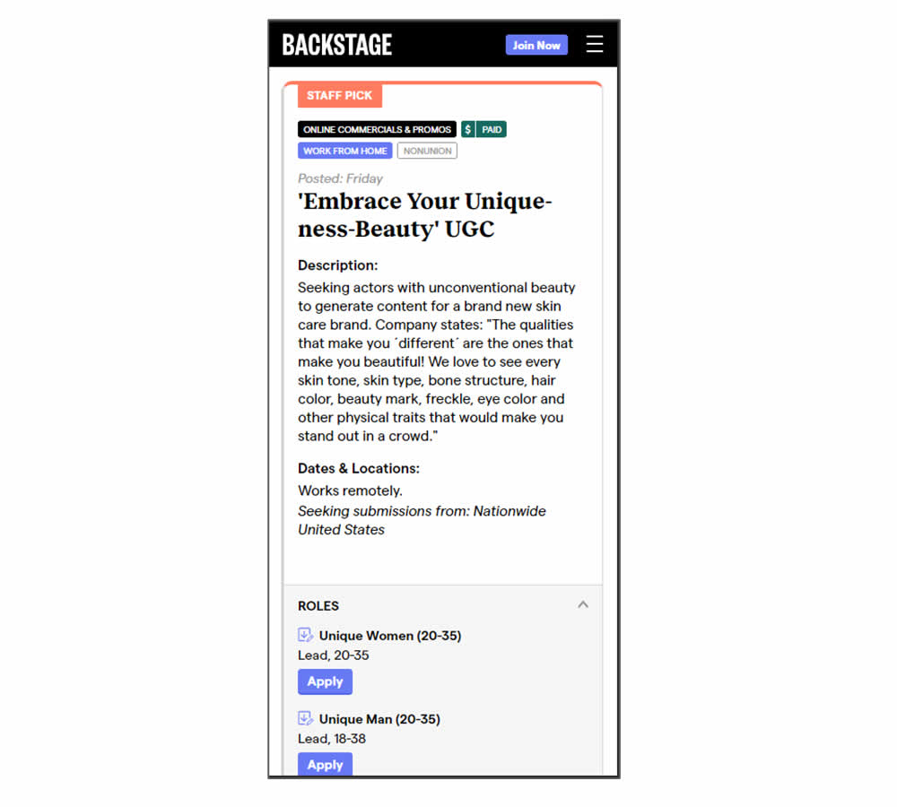

In this experiment, listing descriptions were shortened dynamically using exposable "more" links. This way, the variation showed shorter listings and therefore more listings per screens. Impact on listing clicks (progression) along with membership starts was measured.
Test #367 on
Backstage.com
by
 Stanley Zuo
Jul 22, 2021
Desktop
Mobile
Stanley Zuo Tested Pattern #124: Confirmed Selection In Test #367 On Backstage.com
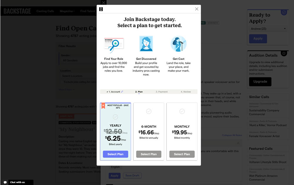

In this experiment, a confiming text was added at the top of a signup modal. The text reinforced the selection from a previous listing page, giving a good reason for continuing the signup process.
Test #353 on
Backstage.com
by
 Stanley Zuo
May 12, 2021
Desktop
Stanley Zuo Tested Pattern #13: Centered Forms & Buttons In Test #353 On Backstage.com
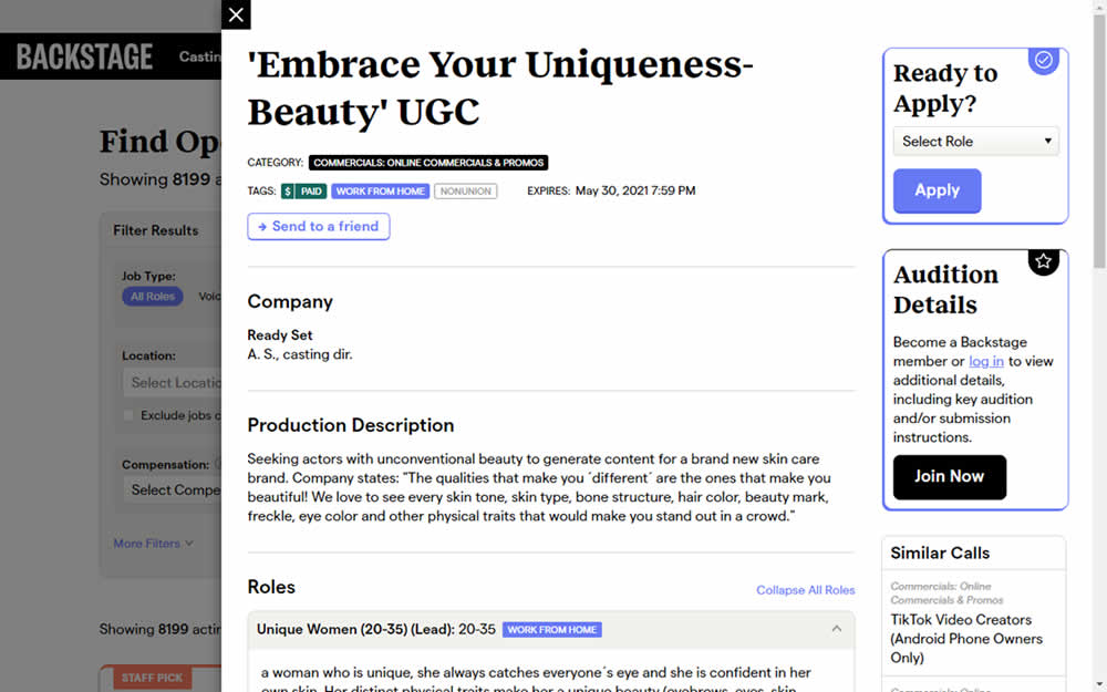

This experiment challanged a right aligned detail page. After clicking a result of a job role on a listing page, an overlay would appear on the right with the details. The variation used a full width screen instead - effectively centering the page.
Test #349 on
Backstage.com
by
 Stanley Zuo
Apr 27, 2021
Mobile
Stanley Zuo Tested Pattern #49: Above The Fold Call To Action In Test #349 On Backstage.com

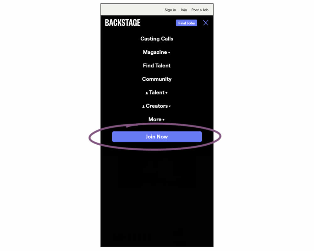
In this experiment, a simple "Join Now" button was added inside an expanded mobile navigation menu. Clicking the button would start a multiple step membership subscription process. Impact on subscription starts and final sales were tracked.
Test #346 on
by
 Stanley Zuo
Mar 30, 2021
Desktop
Mobile
Stanley Zuo Tested Pattern #117: Company Logos In Test #346
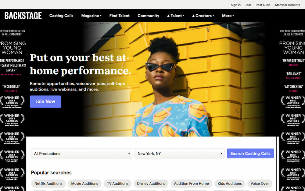
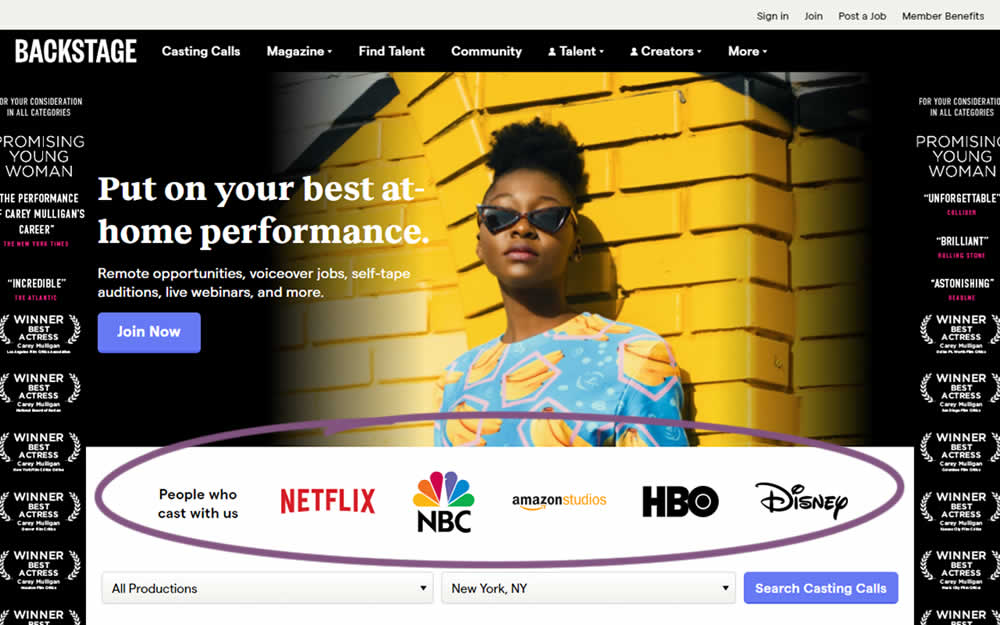
In this homepage experiment, company logos were added to the homepage. These were example clients or companies that Backstage works with and offers casting (job) listing from. Impact on the registration flow and membership checkouts was measured.
Test #342 on
Backstage.com
by
 Stanley Zuo
Feb 28, 2021
Desktop
Mobile
Stanley Zuo Tested Pattern #25: Nagging Results In Test #342 On Backstage.com

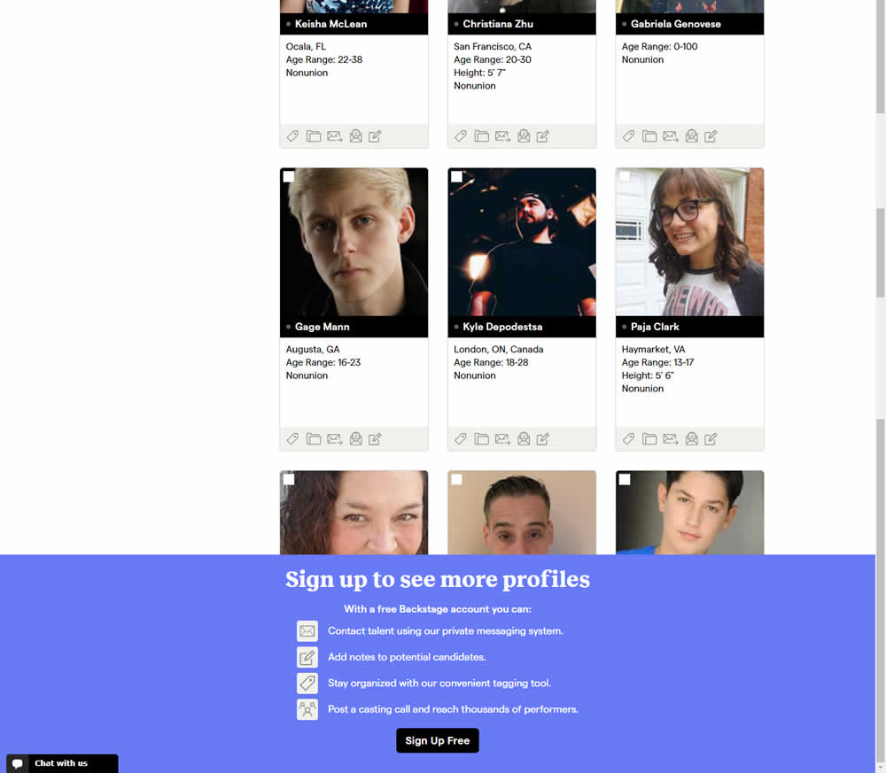
In this experiment, a registration wall was added on a listing page of casting call profiles. The registration wall appeared after the first 9 listings or so and encouraged users to sign up. Impact on registrations was measured, along with an engagement metric of "posting a job".