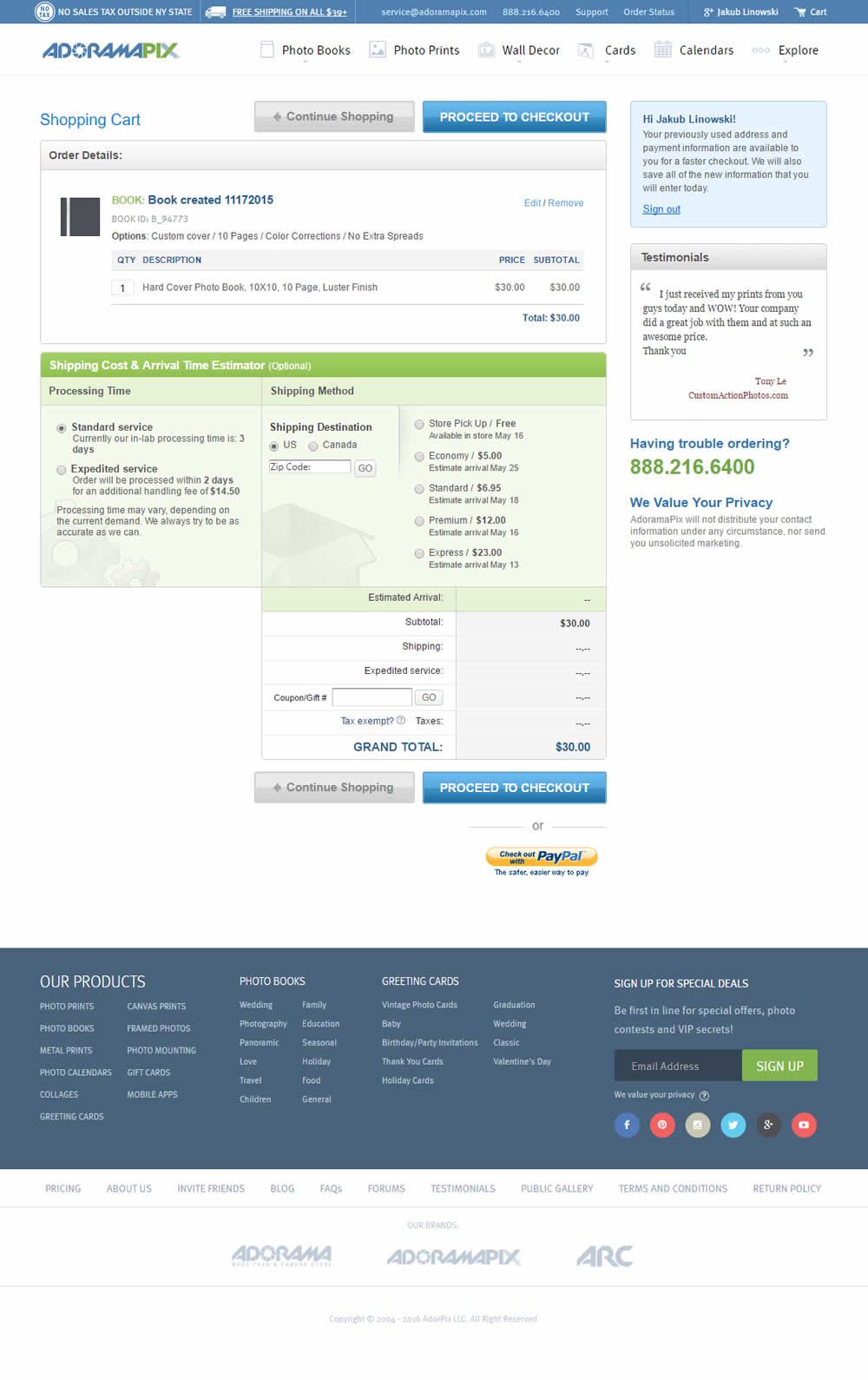
All Latest 556 A/B Tests
Become a member to unlock the abiltiy to see the highest impact a/b tests. Being able to see the actual test results and sort by impact allows growth and experimentation teams to take action on the biggest gains first
MOST RECENT TESTS
Test #573 on
Online.metro-cc.ru
by
 Andrey Andreev
Jan 28, 2025
Mobile
Shopping Cart
Andrey Andreev Tested Pattern #41: Sticky Call To Action In Test #573 On Online.metro-cc.ru
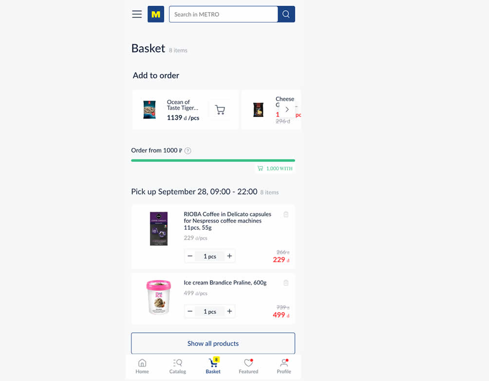
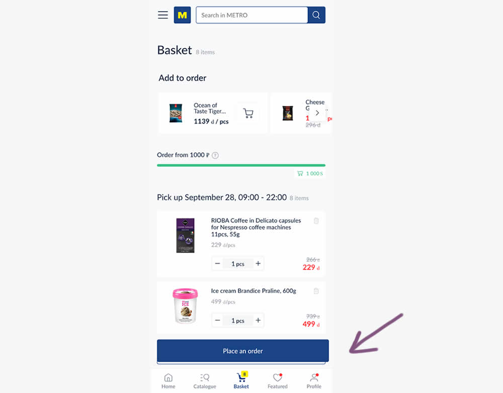
In this experiment, a floating "Place order" button was added to a mobile shopping cart screen. Impact on progression (to checkout) and sales was measured.
Test #457 on
by
 Jakub Linowski
Feb 26, 2023
Desktop
Mobile
Shopping Cart
Jakub Linowski Tested Pattern #64: Tunnel In Test #457
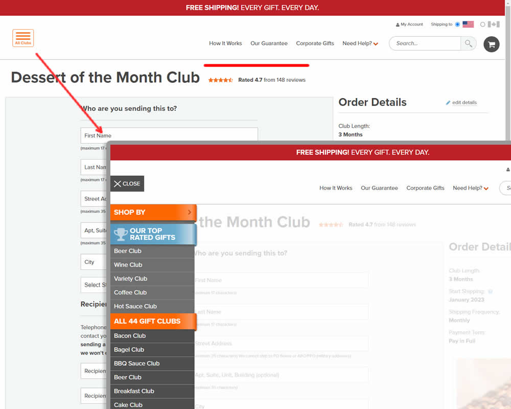

In this experiment, hamburger navigation with product links, was removed from the shopping / add to cart page. Tertiary links (How It Works, Guarantee details and support pages) were also removed, while a "Secure Checkout" message was brought into the header. This header version was already present on the next checkout page, and was copied over one step earlier. The idea was to keep customers within the checkout flow. Impact on sales was measured.
Test #454 on
Trenyrkarna.cz
by
 Ondřej Ilinčev
Jan 31, 2023
Desktop
Mobile
Shopping Cart
Ondřej Ilinčev Tested Pattern #64: Tunnel In Test #454 On Trenyrkarna.cz


In this shopping cart experiment, a tall footer was completely removed. The footer contained elements such as: app download links, a newsletter signup, secondary web site links, trust symbols, social media icons and company contant information. Impact on sales was measured.
Test #453 on
by
 Jakub Linowski
Jan 31, 2023
Desktop
Mobile
Shopping Cart
Jakub Linowski Tested Pattern #64: Tunnel In Test #453
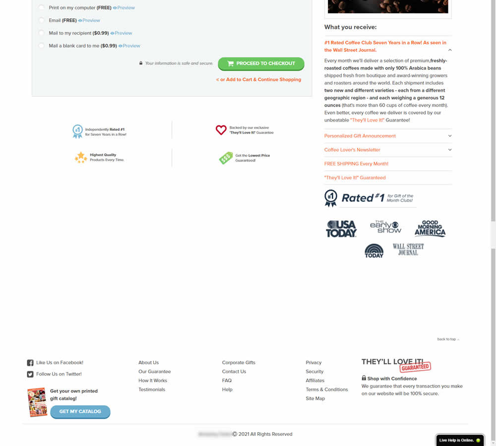

In this experiment, the footer was simplified with multiple elements being removed (catalog request, secondary links, and a guarantee). Additionally, a more prominent phone number was also displayed.
Test #450 on
Trenyrkarna.cz
by
 Ondřej Ilinčev
Jan 20, 2023
Desktop
Shopping Cart
Ondřej Ilinčev Tested Pattern #64: Tunnel In Test #450 On Trenyrkarna.cz
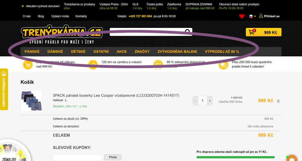
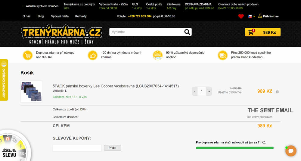
In this experiment, top category navigation (with fly out categories) was removed from the shopping cart of an online store. Impact on sale transactions was measured.
Test #424 on
by
 Sandis Viksna
Jul 28, 2022
Desktop
Shopping Cart
Sandis Viksna Tested Pattern #45: Benefit Bar In Test #424
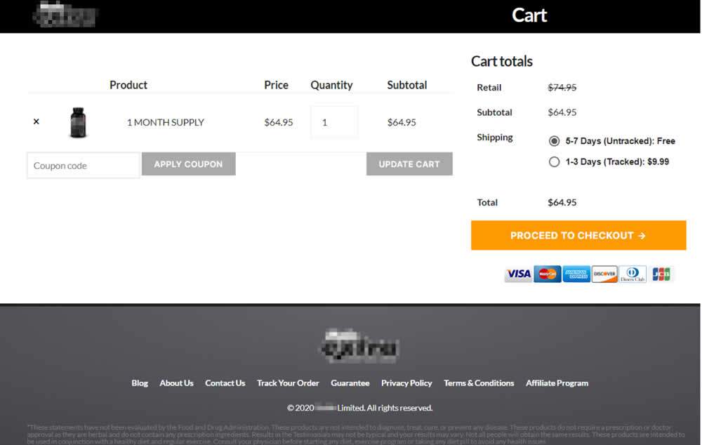

In this experiment, 3 reassurances were shown at the bottom of cart and checkout pages. The web site was selling health and nutrition products for males and one of the reassurances included "discreet shipping". Impact on sales was measured.
Test #422 on
Volders.de
by
 Daria Kurchinskaia
Jul 22, 2022
Desktop
Mobile
Shopping Cart
Daria Kurchinskaia Tested Pattern #3: Fewer Form Fields In Test #422 On Volders.de

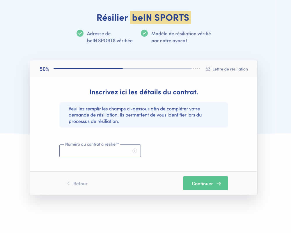
A birthdate field was removed during a signup process for a paid contract cancellation service. Impact on progression (next step) and sales (completed transactions) was measured.
Test #413 on
by
 Jakub Linowski
May 26, 2022
Desktop
Mobile
Shopping Cart
Jakub Linowski Tested Pattern #114: Less Or More Visible Prices In Test #413
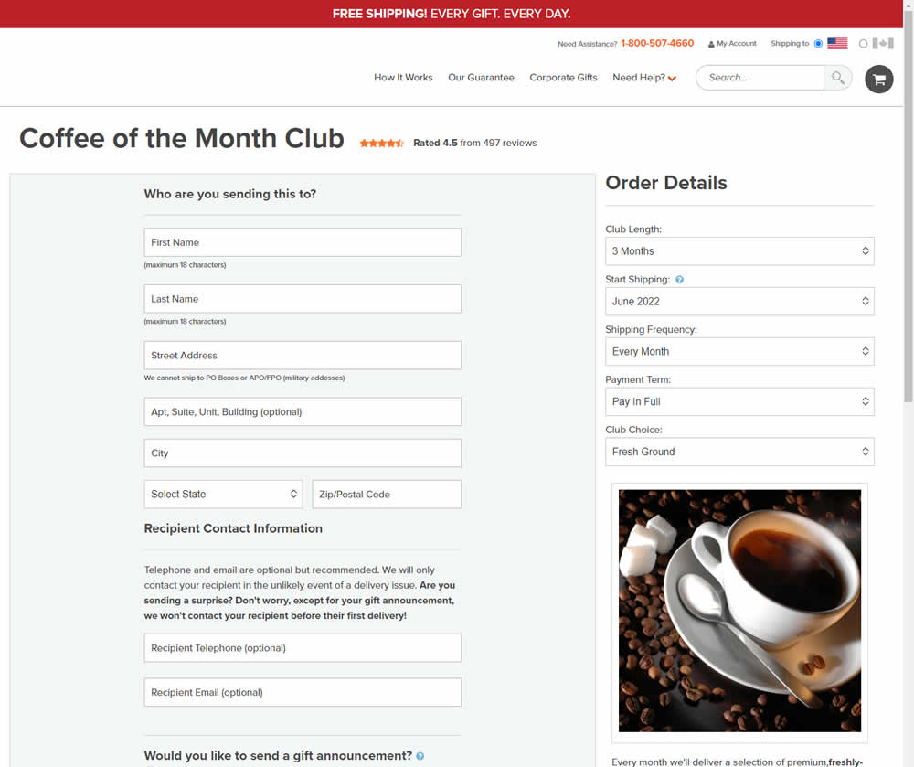
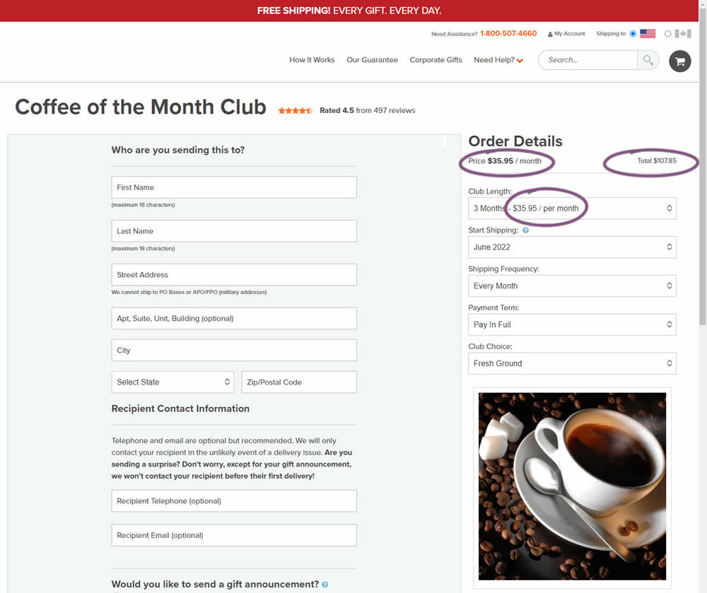
Should prices be displayed during an editing state on an add-to-cart screen (after adding-to-cart from a product detail page)? In this experiment, club pricing was added and shown in three areas after customers clicked on a small "edit details" links. The control did not have this pricing information (which was only shown on a product detail screen before).
Test #400 on
by
 Herman Klein
Mar 06, 2022
Desktop
Shopping Cart
Herman Klein Tested Pattern #65: Add More For Free Shipping In Test #400

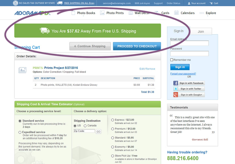
In this experiment, customers who were not yet eligible for free shipping (with cart amounts under $39) were presented with an encouraging message to add more and earn free shipping. Impact on progression to checkout and sales was measured.
Test #398 on
Adoramapix.com
by
 Herman Klein
Feb 25, 2022
Desktop
Shopping Cart
Herman Klein Tested Pattern #121: Free Shipping In Test #398 On Adoramapix.com
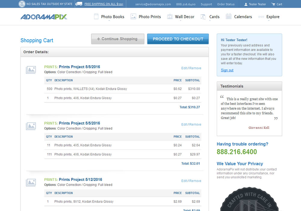
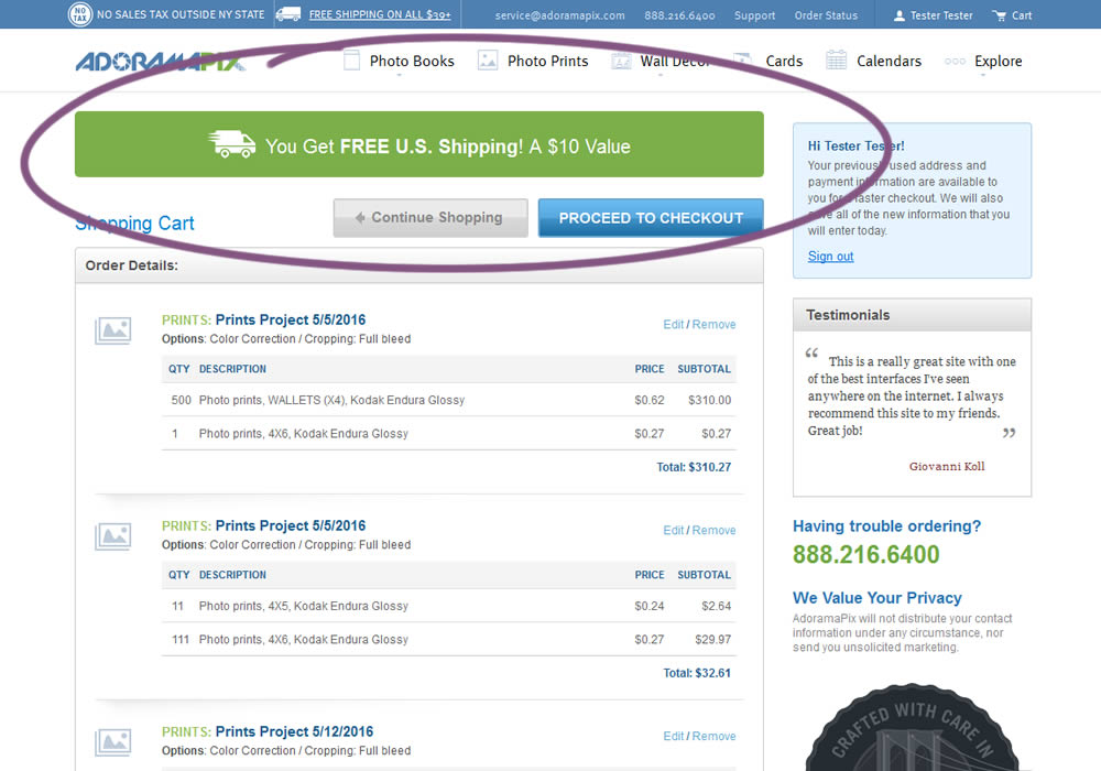
In this experiment, customers were eligible for free shipping (with cart amounts of $39 or more) were presented with an earned free shipping message. The variation also showed the value of the earned free shipping - (for example $10). Impact on progression to checkout and sales was measured.
Test #393 on
Snocks.com
by
 Melina Hess
Jan 19, 2022
Mobile
Shopping Cart
Melina Hess Tested Pattern #1: Remove Coupon Fields In Test #393 On Snocks.com


This experiment replaced a visible coupon field with a dynamic text link that would initially hide the form field. Only after clicking the text link would the coupon form field appear. The translation from German is "Do you have a coupon code? Click here to apply". Impact on completed transactions was measured.
Test #384 on
Mariemur.com
by
 Gleb Hodorovskiy
Nov 17, 2021
Mobile
Shopping Cart
Gleb Hodorovskiy Tested Pattern #103: Money Back Guarantee In Test #384 On Mariemur.com
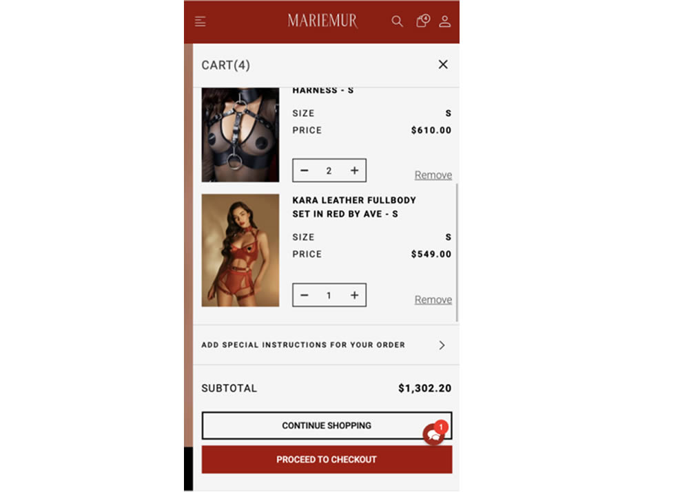

In this experiment from Conversionrate.store, a 14 day money back guarantee was added to a shopping cart of a lingerie online store. Secondary text further elaborated this with the following copy "Free returns if size doesn’t match". Impact on transactions was measured.
Test #377 on
Adoramapix.com
by
 Jakub Linowski
Sep 30, 2021
Desktop
Shopping Cart
Jakub Linowski Tested Pattern #121: Free Shipping In Test #377 On Adoramapix.com
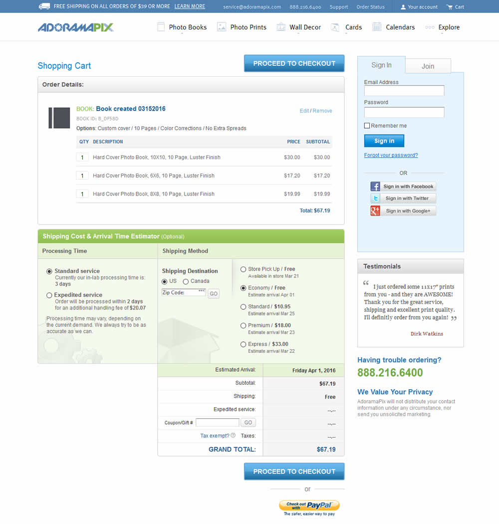
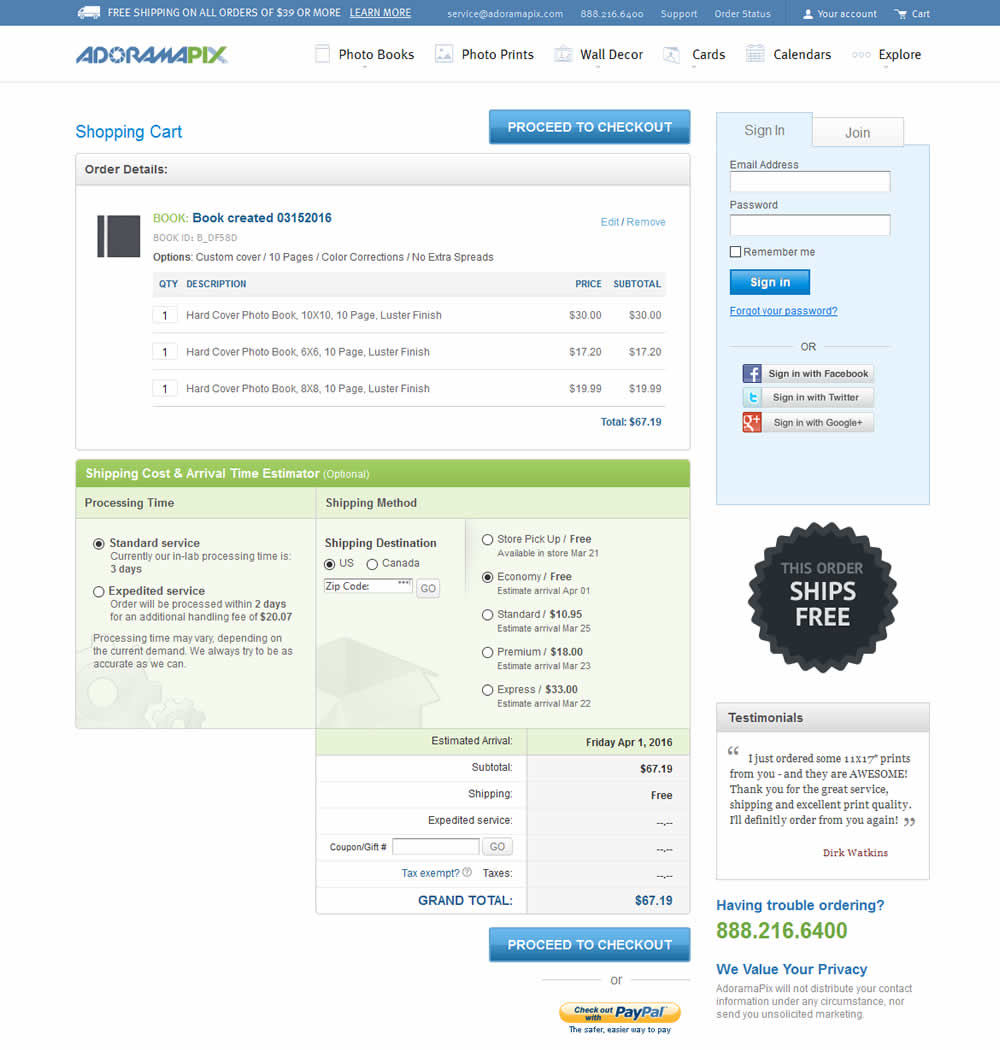
In this experiment, a big "free shipping" badge was added and defaulted to when available. Impact on progression to checkouts and completed sales was measured.
Test #278 on
by
 Someone
Jan 15, 2020
Mobile
Shopping Cart
Someone Tested Pattern #64: Tunnel In Test #278

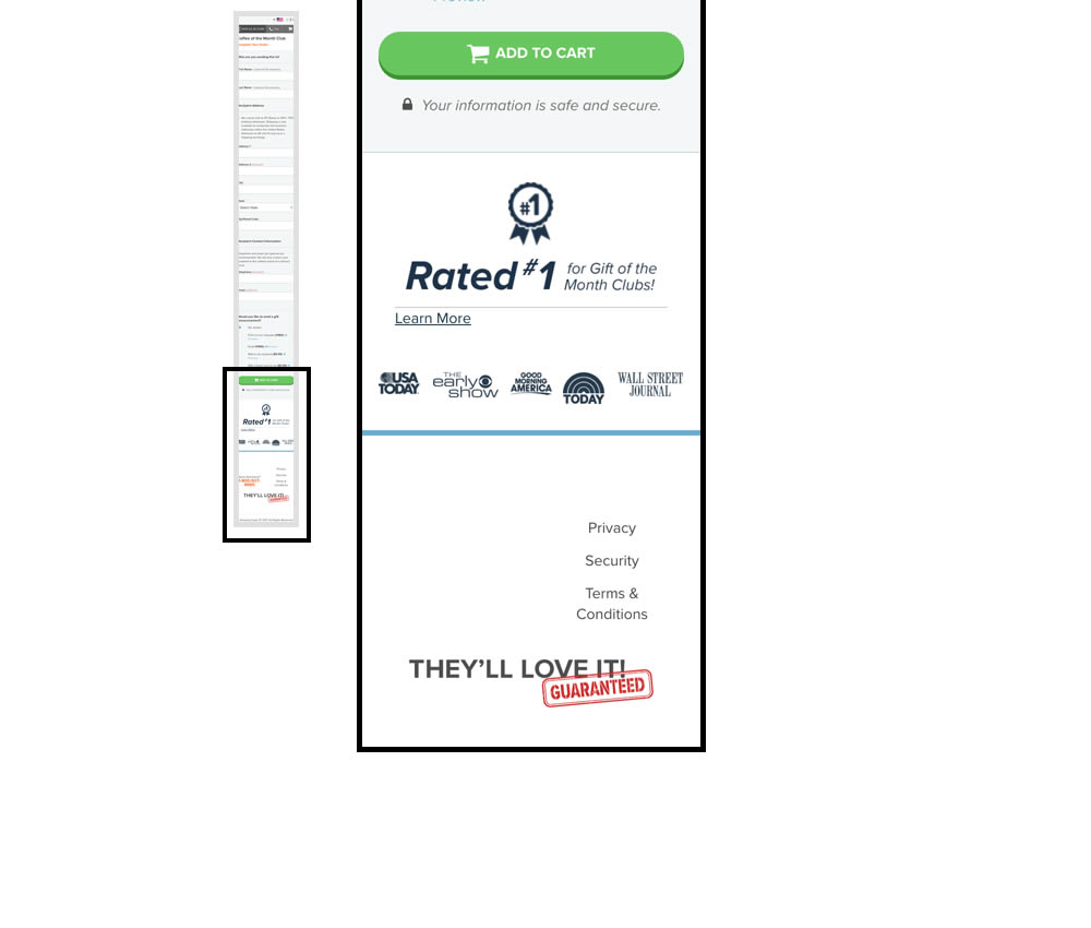
In this experiment, multiple elemenets were removed from the bottom of the cart page. This was done to see if they were potential distractions that hindered the purchase process. The elements included such things as: Order details (visible on other pages), large product photo, a "what you receive" section with selling points, more reassurances, and a newsletter subscribe box.
Test #177 on
by
 Devesh Khanal
May 17, 2018
Desktop
Shopping Cart
Devesh Khanal Tested Pattern #66: Complementary Upsell In Test #177


Test #117 on
Ssdnodes.com
by
 Matt Connor
Oct 02, 2017
Desktop
Shopping Cart
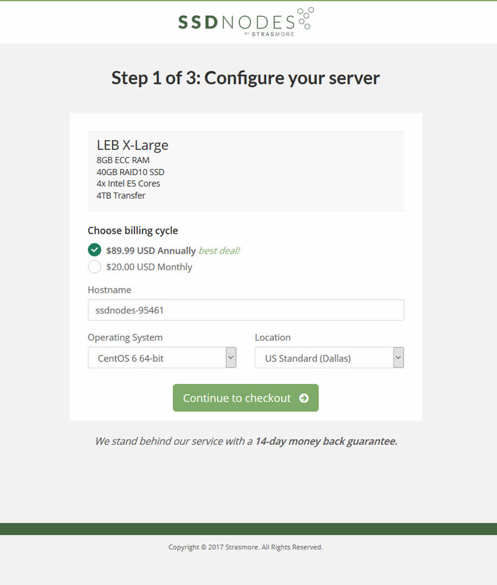
Matt Connor Tested Pattern #21: What It's Worth In Test #117 On Ssdnodes.com

Test #88 on
Ssdnodes.com
by
 Matt Connor
Mar 31, 2017
Desktop
Mobile
Shopping Cart
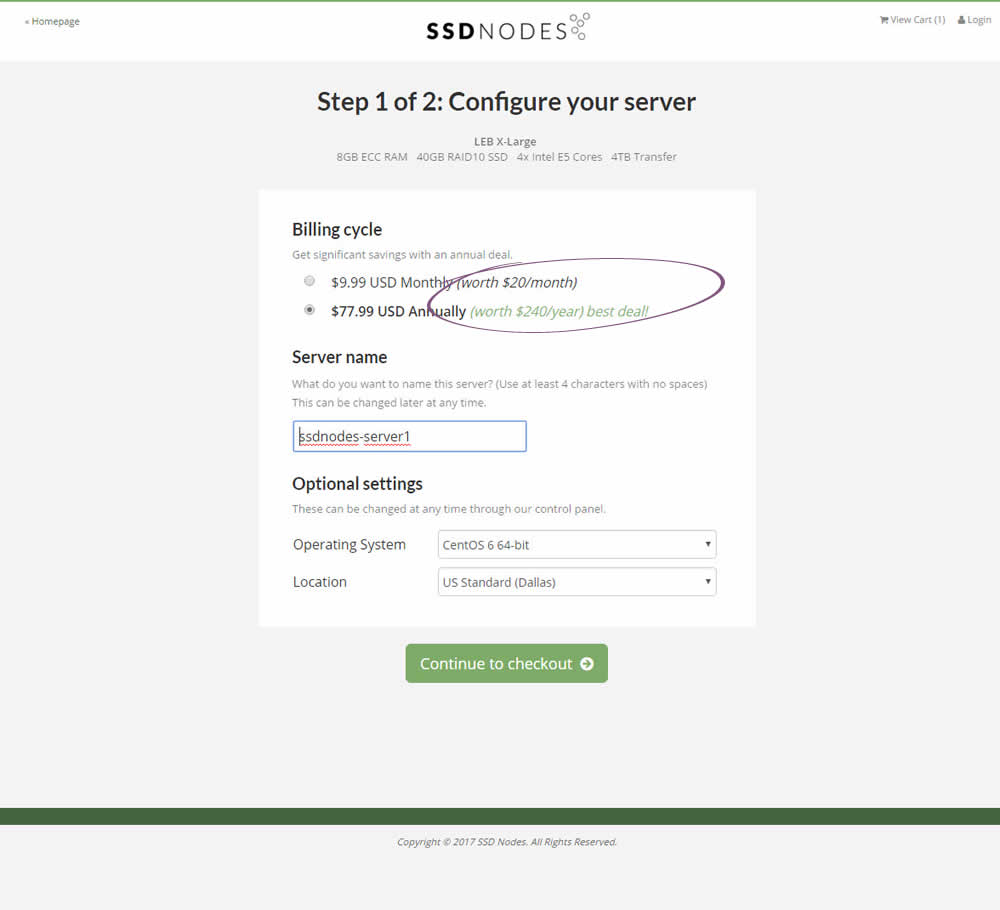
Matt Connor Tested Pattern #21: What It's Worth In Test #88 On Ssdnodes.com

Test #66 on
Telestream.net
by
 Chris Goward
Nov 01, 2016
Shopping Cart
Chris Goward Tested Pattern #9: Multiple Steps In Test #66 On Telestream.net
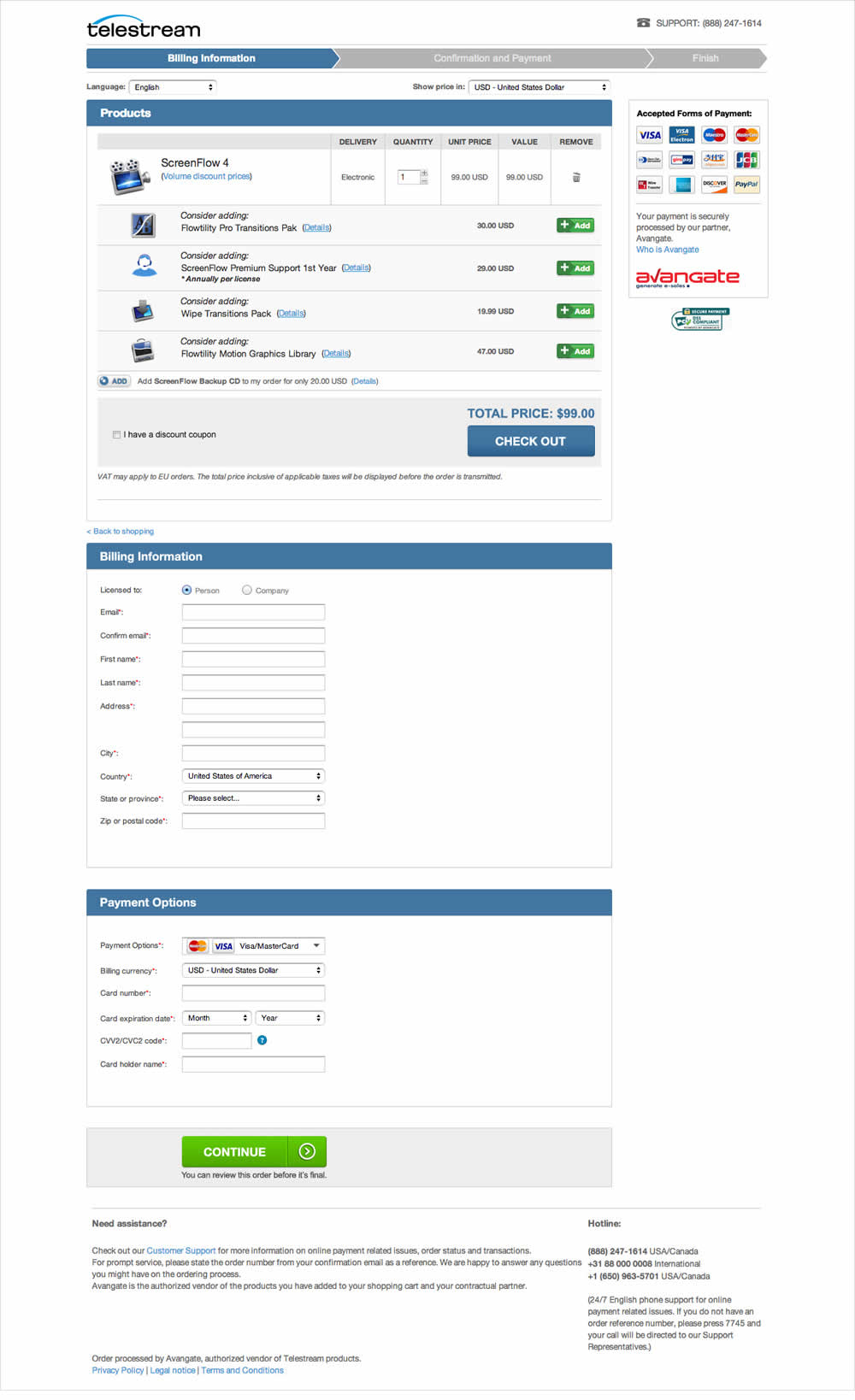
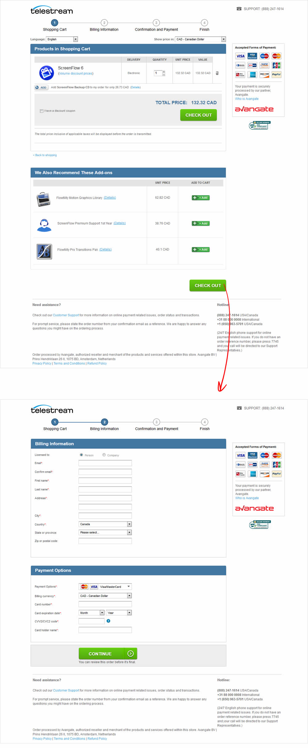
Telestream specializes in software that make it possible to get video content to any audience regardless of how it is created, distributed, or viewed. Telestream’s customer acquisition strategy is centered around driving traffic to their website to trial, or to purchase from their online store. Shoppers can buy software online, download it right away, and immediately start using it. The variation was designed with the same information as the control except spread across 4 steps (instead of 3). The rationale was that each step would be shorter and less overwhelming for the user.
Test #47 on
Adoramapix.com
by
 Herman Klein
Jun 09, 2016
Desktop
Shopping Cart
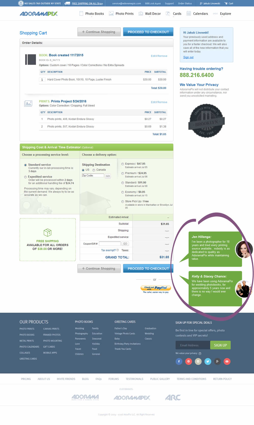
Herman Klein Tested Pattern #4: Testimonials In Test #47 On Adoramapix.com

Test #42 on
Adoramapix.com
by
 Herman Klein
May 11, 2016
Shopping Cart
Herman Klein Tested Pattern #1: Remove Coupon Fields In Test #42 On Adoramapix.com
