All Latest 556 A/B Tests
Become a member to unlock the abiltiy to see the highest impact a/b tests. Being able to see the actual test results and sort by impact allows growth and experimentation teams to take action on the biggest gains first
MOST RECENT TESTS
Test #253 on
Volders.de
by
 Alexander Krieger
Aug 08, 2019
Desktop
Mobile
Signup
Alexander Krieger Tested Pattern #17: Least Or Most Expensive First In Test #253 On Volders.de
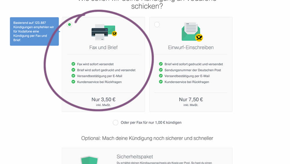
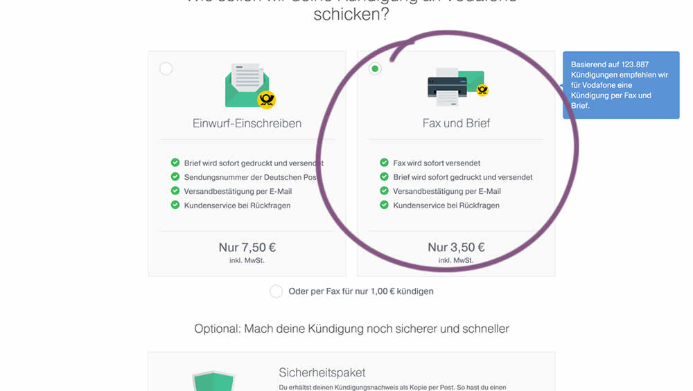
In this experiment, two pricing plans were inverted to show the most expensive plan first (in the variation).
Test #250 on
Volders.de
by
 Alexander Krieger
Jul 25, 2019
Desktop
Mobile
Signup
Alexander Krieger Tested Pattern #106: Back Buttons In Test #250 On Volders.de
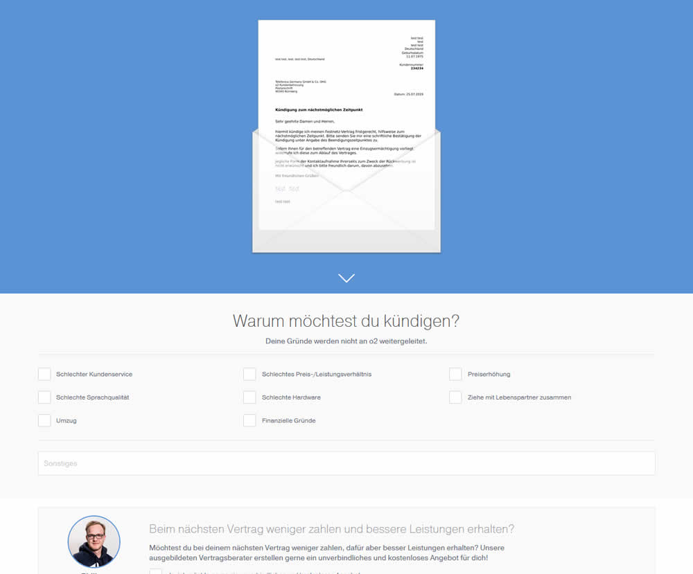
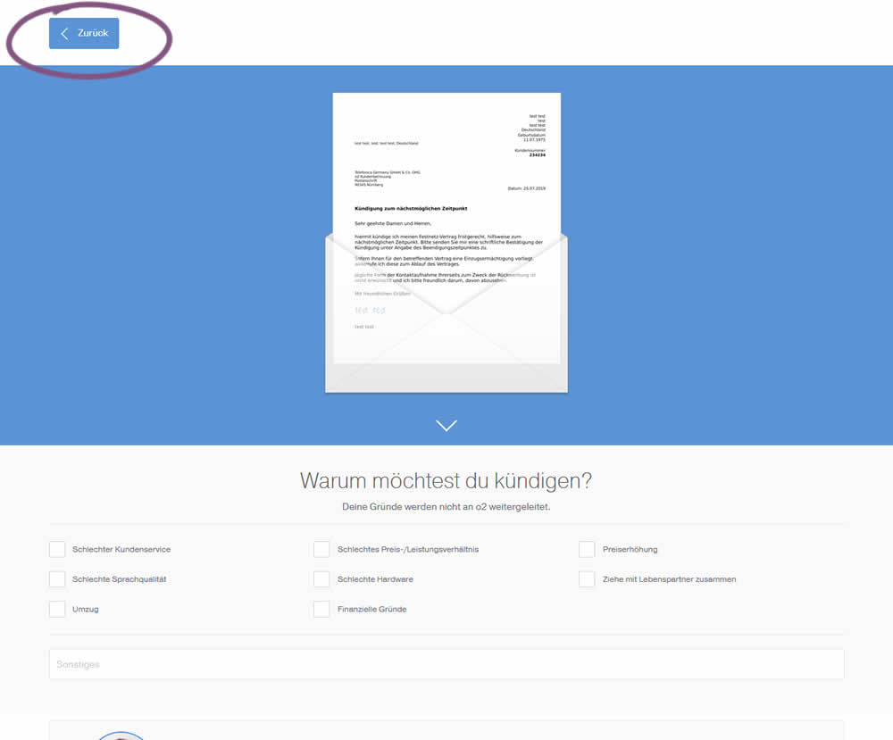
In this experiment, a version without a back button was tested against a one where it was positioned in the upper left corner. This test occured on a second step of a contract cancellation service.
Test #248 on
Volders.de
by
 Alexander Krieger
Jul 16, 2019
Desktop
Signup
Alexander Krieger Tested Pattern #20: Canned Response In Test #248 On Volders.de

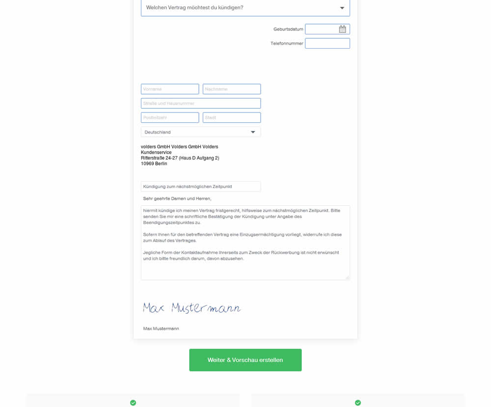
In this experiment, an editable contract cancellation letter was tested against a non-editable one. The editable letter first appeared in a text state, which required a click on a link in order for it to be transformed into an editable textarea field.
Test #39 on
Over-blog.com
by
 Tael Pinault
Jul 02, 2019
Desktop
Signup
Tael Pinault Tested Pattern #83: Progressive Fields In Test #39 On Over-blog.com
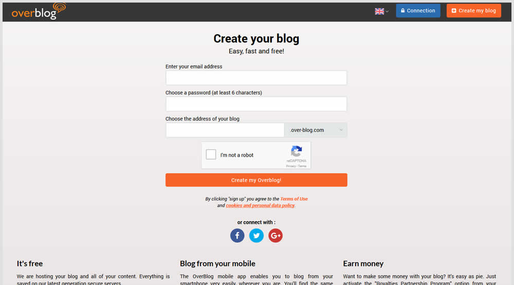
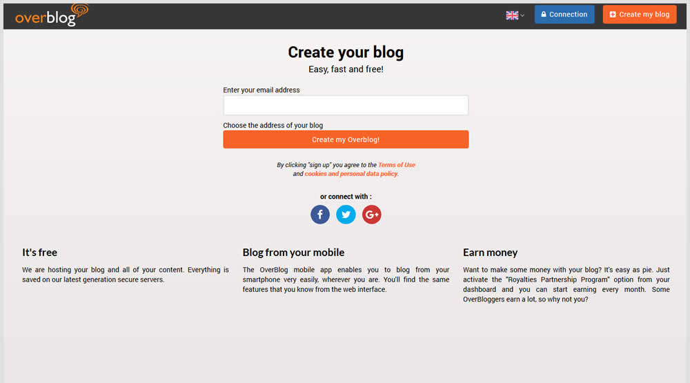
This test explored a progressive disclosure interaction in variation B. When a user started typing text into the first field, two more fields expanded into view.
Test #245 on
Kenhub.com
by
 Niels Hapke
Jun 11, 2019
Desktop
Signup
Niels Hapke Tested Pattern #19: Benefit Testimonials In Test #245 On Kenhub.com
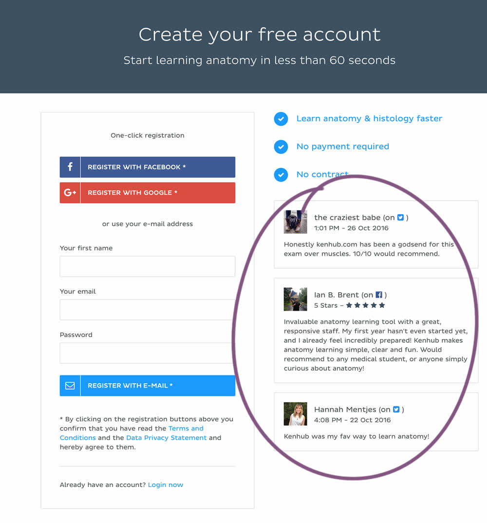
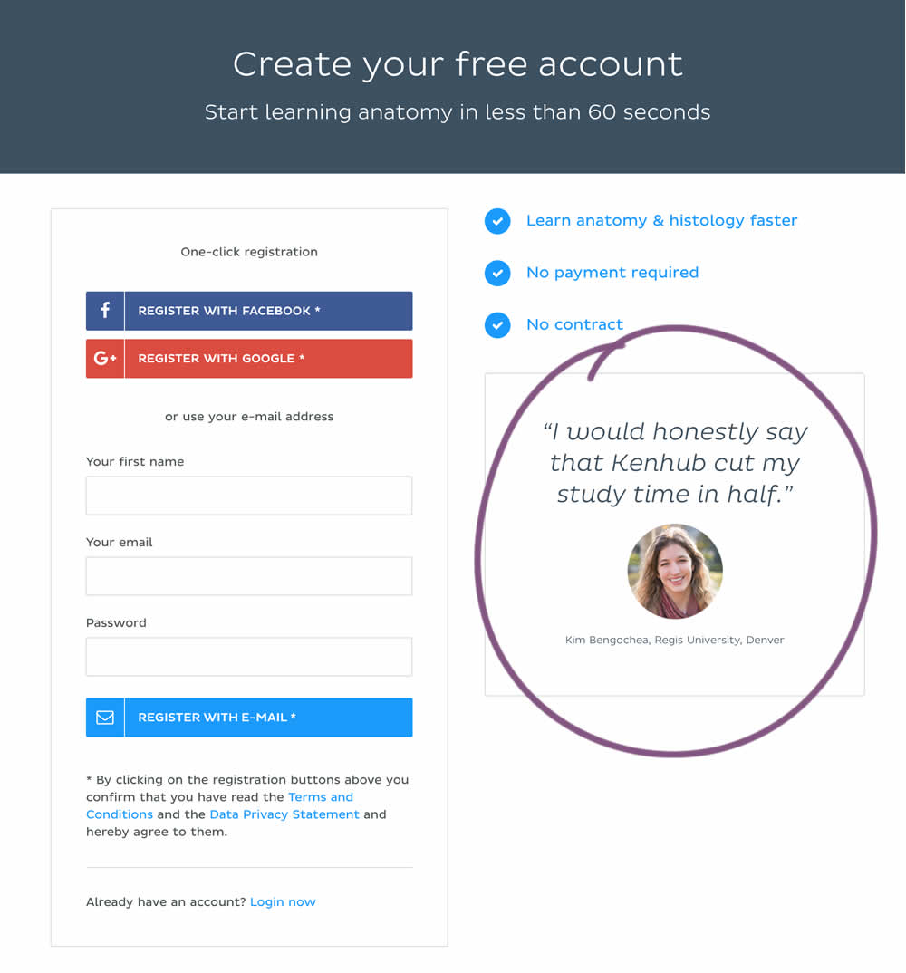
In this experiment a more elaborate and authentic testimonial was used instead of three more generic ones from social media sites.
Test #242 on
by
 Alex James
May 27, 2019
Desktop
Mobile
Signup
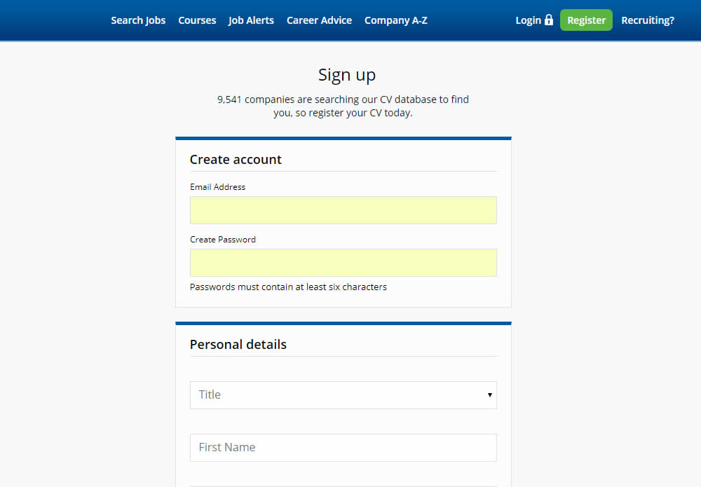
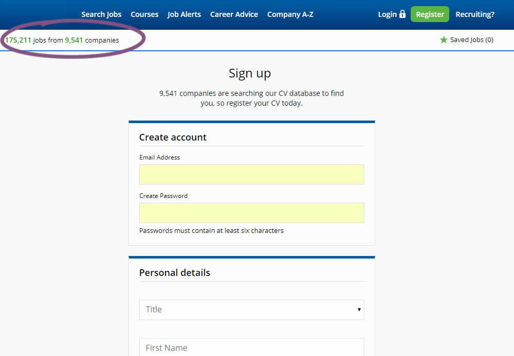
Alex James Tested Pattern #7: Social Counts In Test #242
Test #241 on
Kenhub.com
by
 Niels Hapke
May 24, 2019
Desktop
Mobile
Signup
Niels Hapke Tested Pattern #105: Lead Magnets In Test #241 On Kenhub.com
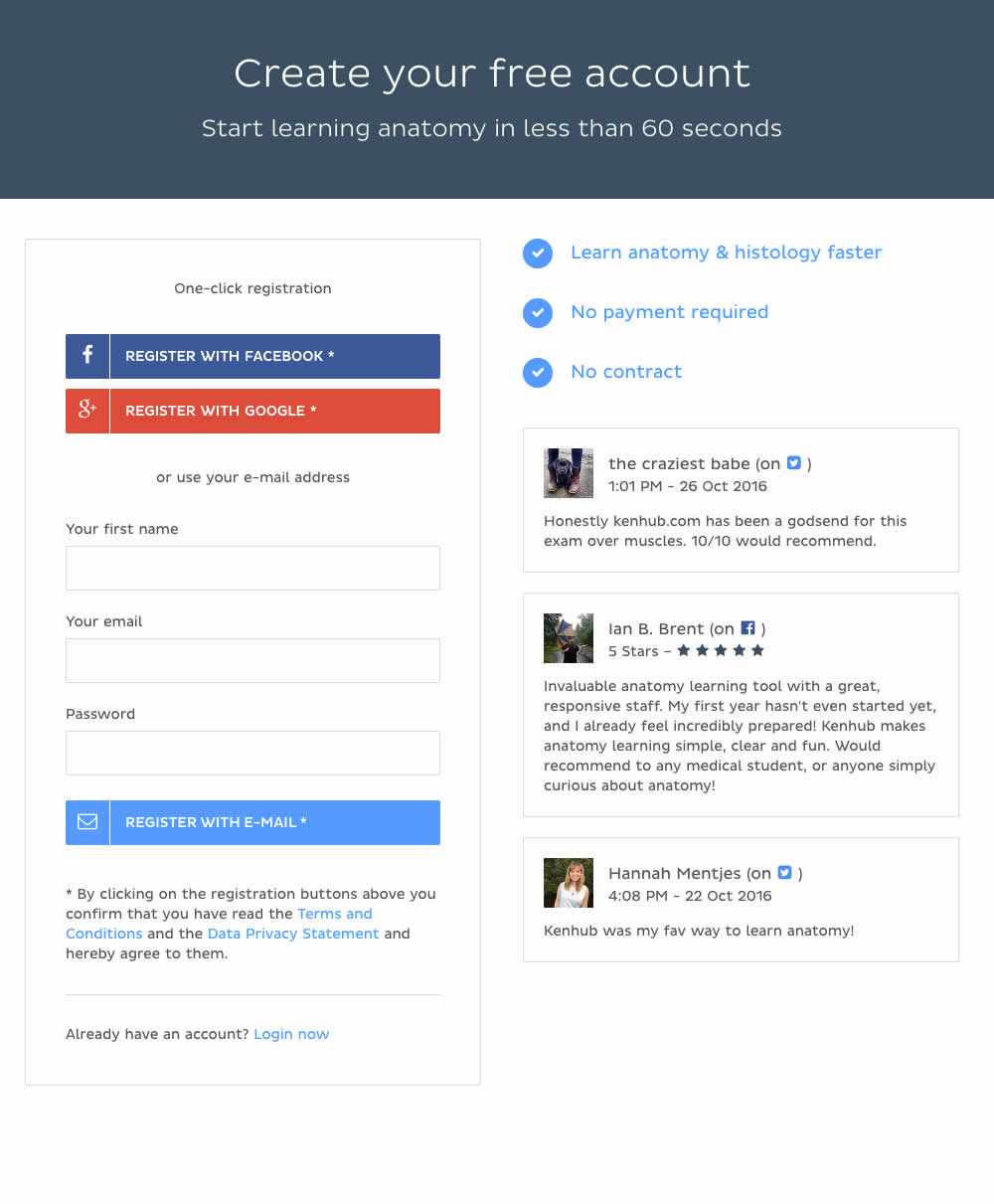
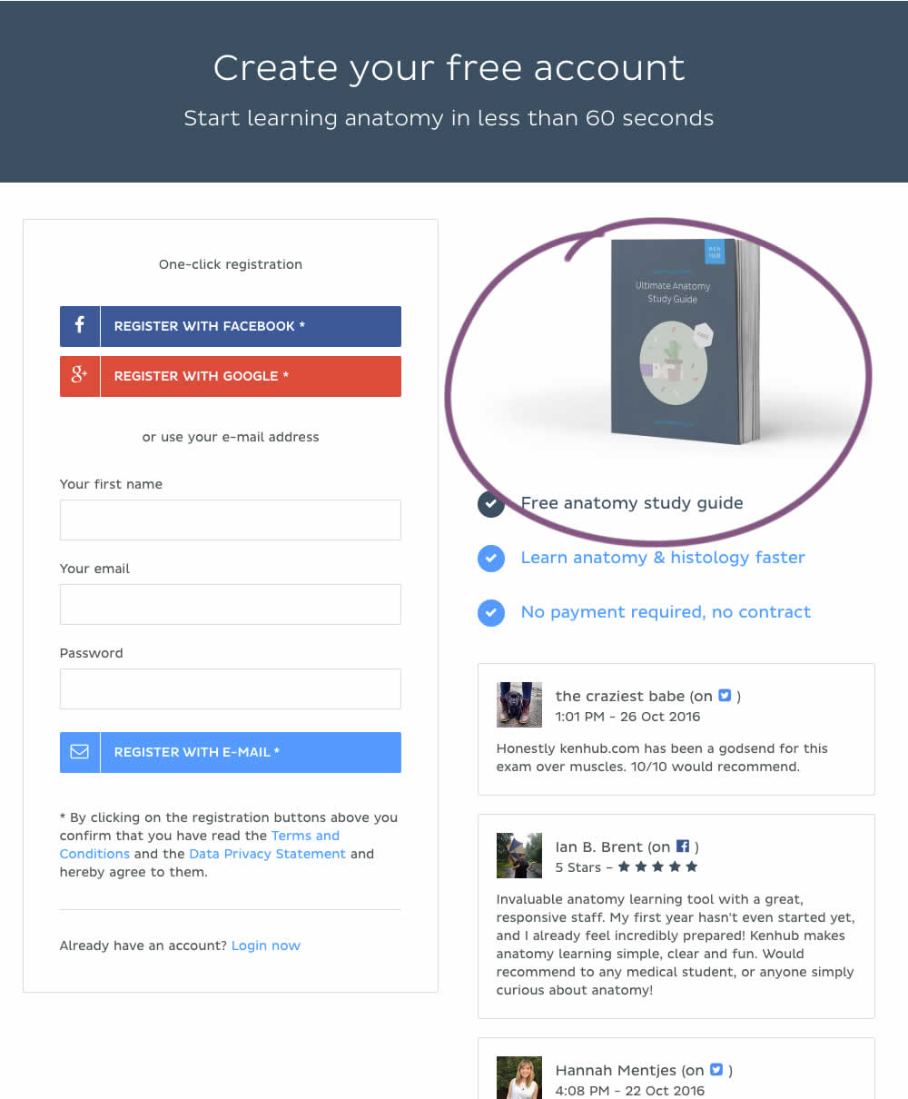
In this experiment, a free study guide ebook was promoted on a registration page.
Test #236 on
by
 Alex James
Apr 04, 2019
Desktop
Signup
Alex James Tested Pattern #9: Multiple Steps In Test #236
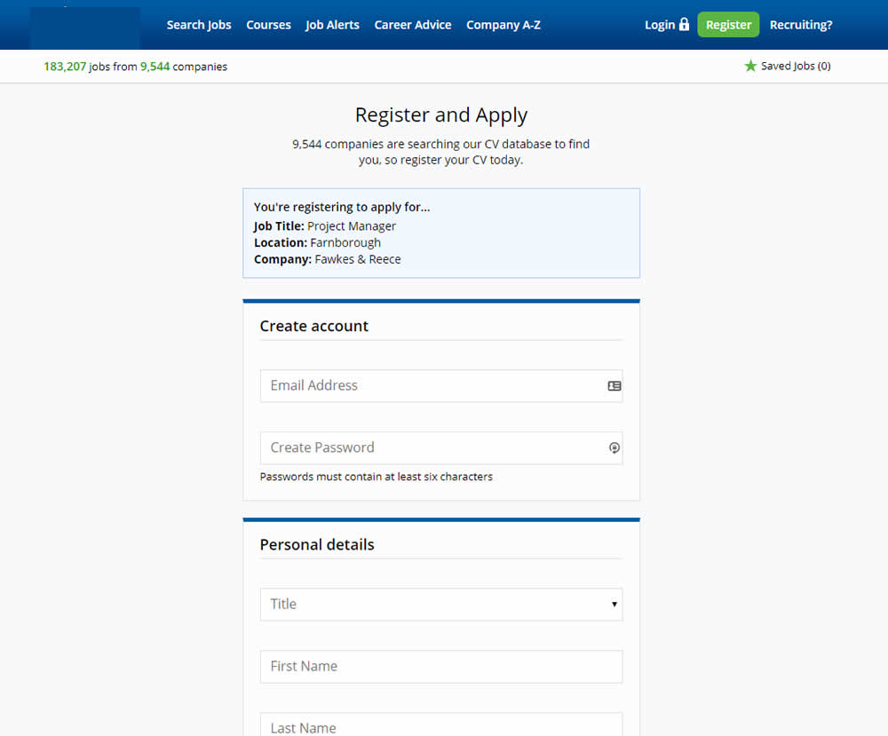
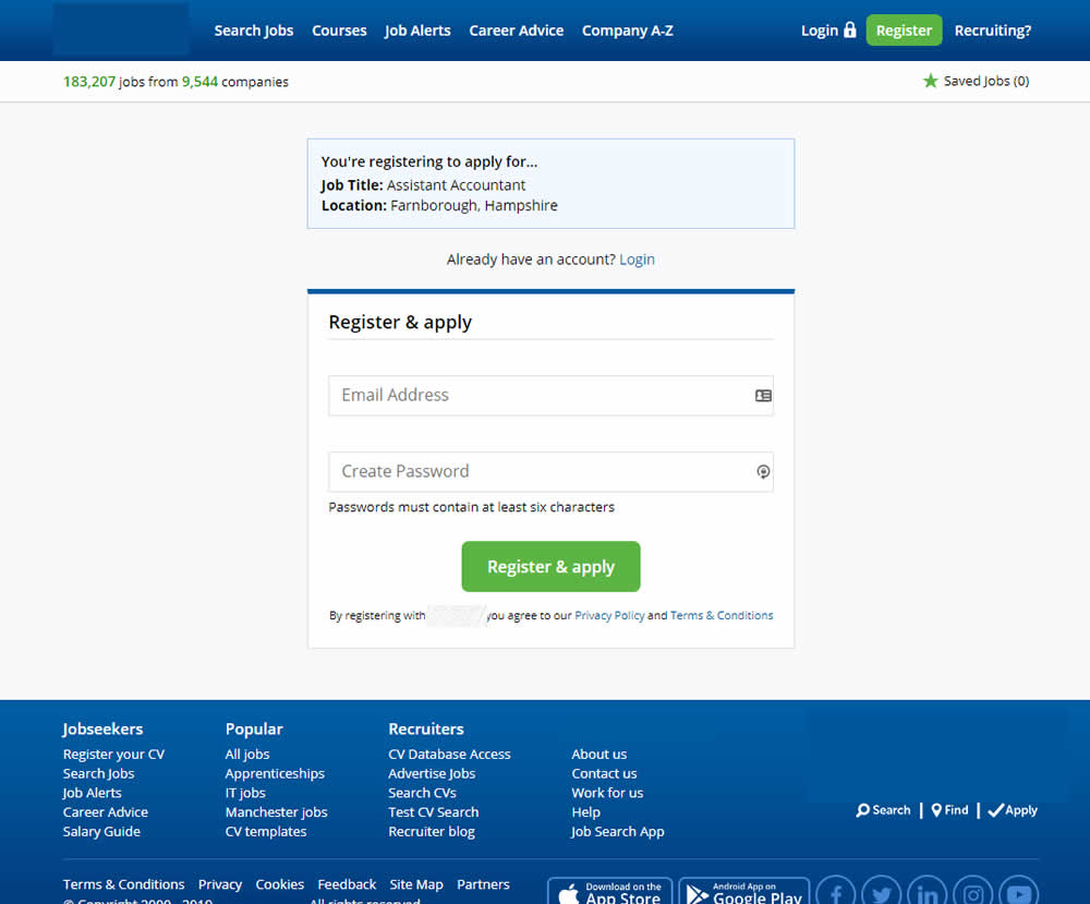
In this experiment a single screen signup process was broken into 2 separate steps: account creation & details.
Test #233 on
Annonce.cz
by
 Ondřej Ilinčev
Apr 01, 2019
Desktop
Signup
Ondřej Ilinčev Tested Pattern #100: Postponed Registration In Test #233 On Annonce.cz
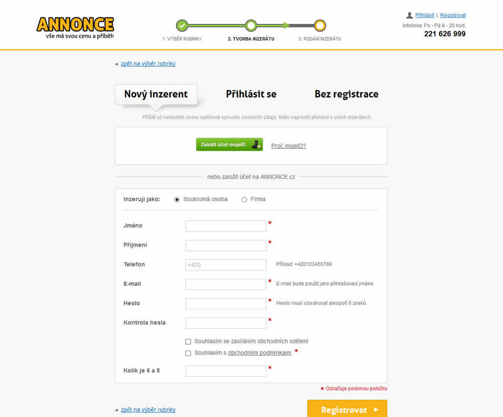
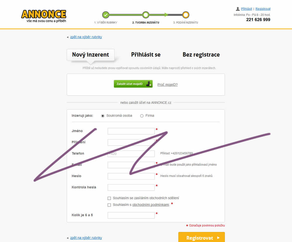
In this experiment, the old flow had a login / register / guest checkout as a second step. The variant B flow removed this step and treated everyone as a guest (and later offered to login / register). In the B version guests had a voluntary registration on the thank you page and in a confirmation email.
Test #231 on
Glass.net
by
 Mark Freedle
Mar 14, 2019
Desktop
Mobile
Signup
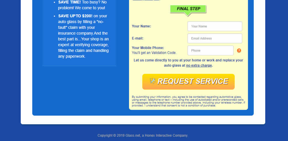
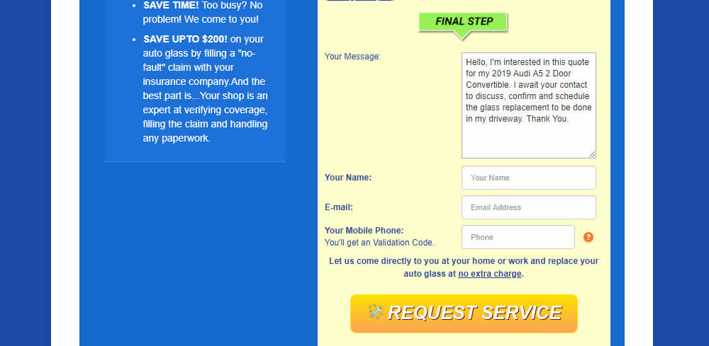
Mark Freedle Tested Pattern #20: Canned Response In Test #231 On Glass.net
Test #227 on
Volders.de
by
 Alexander Krieger
Mar 04, 2019
Desktop
Signup
Alexander Krieger Tested Pattern #99: Progress Bar In Test #227 On Volders.de
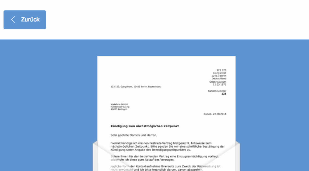
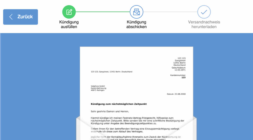
In this experiment, a simple progress bar was added to a 2nd step of contract cancellation funnel. The progress bar used separate styles to show which steps were completed, what the current step was, as well as the future step.
Translation of the 3 steps from German are as follows:
- Fill out the termination
- Send termination
- Proof of termination
Test #223 on
Volders.de
by
 Alexander Krieger
Feb 01, 2019
Desktop
Mobile
Signup
Alexander Krieger Tested Pattern #12: Payment First In Test #223 On Volders.de
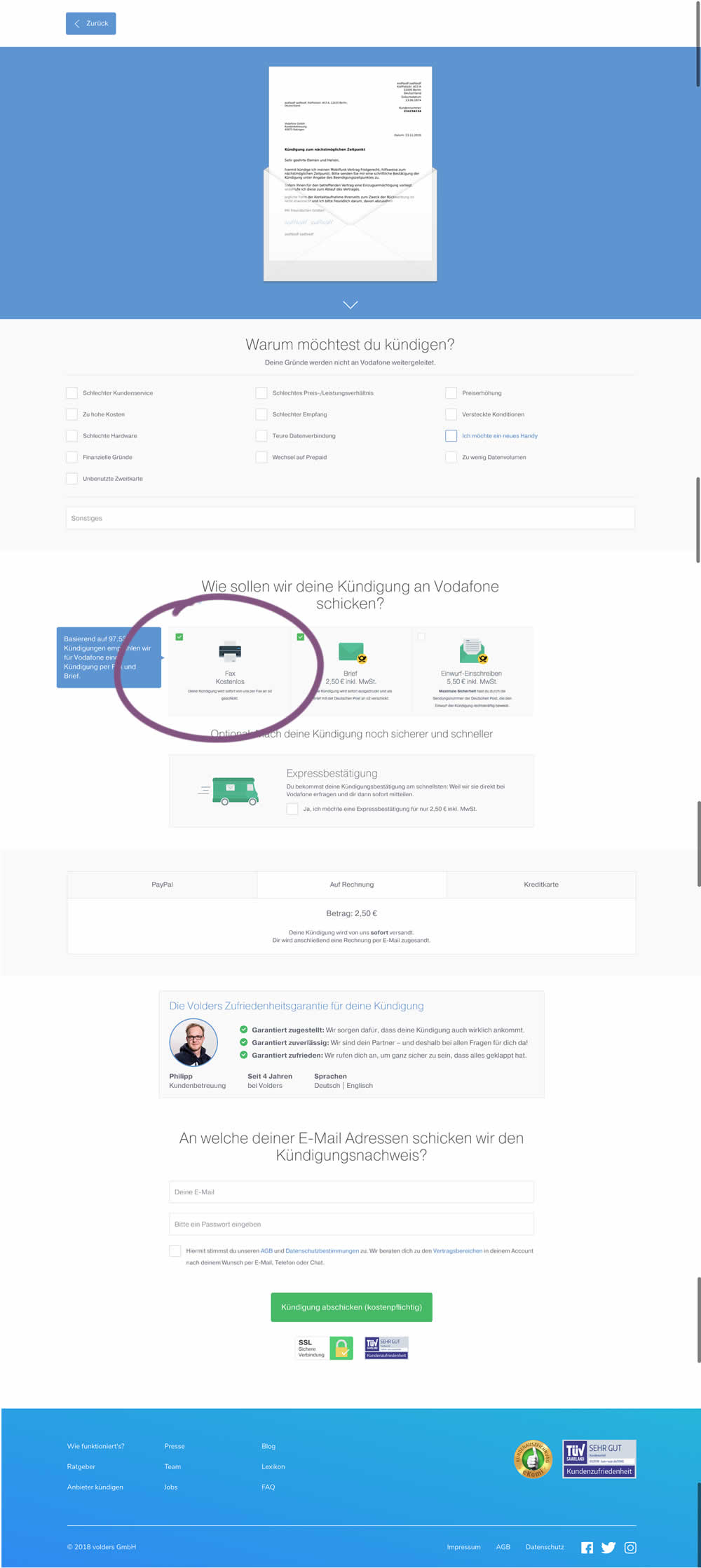
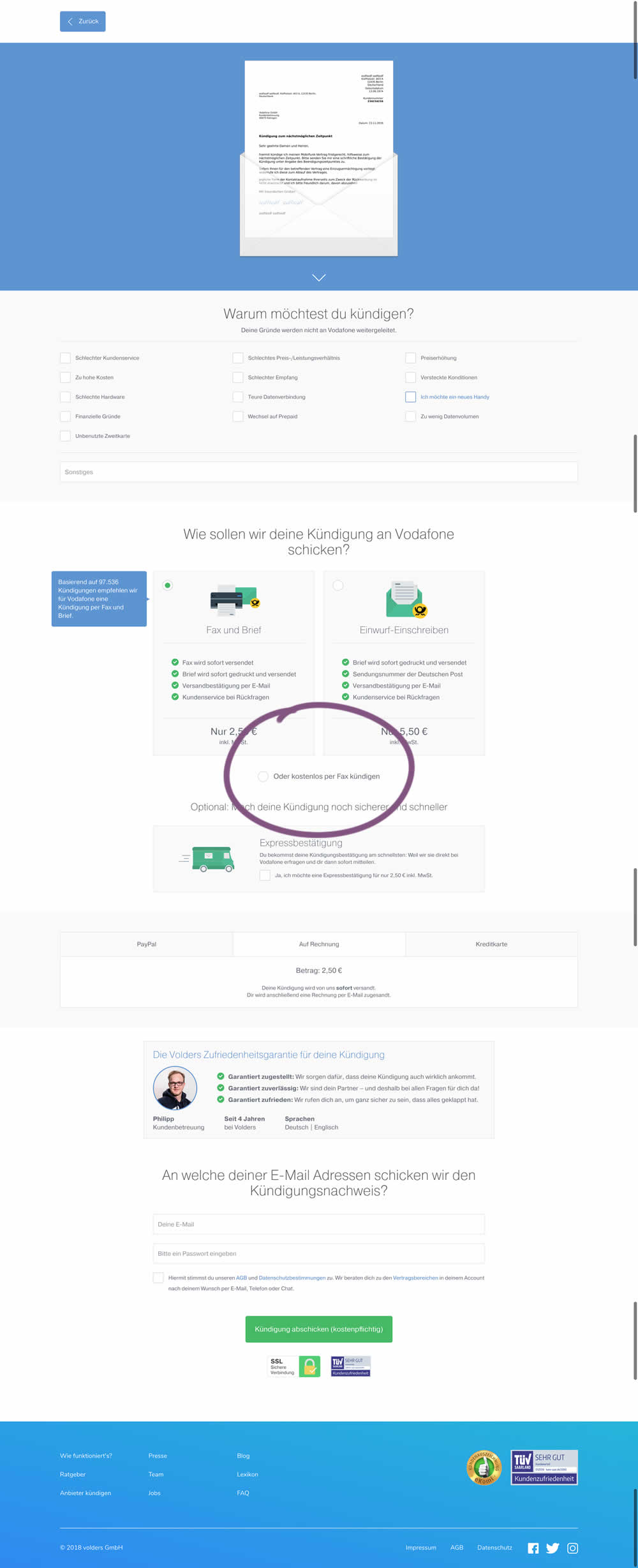
This test deprioritized the free option (kostenlos) of cancelling a contract. It did so by placing it under the paid options as small text link / radio option.
Test #214 on
Yummly.com
by
 Marcos Ciarrocchi
Dec 07, 2018
Mobile
Signup
Marcos Ciarrocchi Tested Pattern #91: Forced Action In Test #214 On Yummly.com
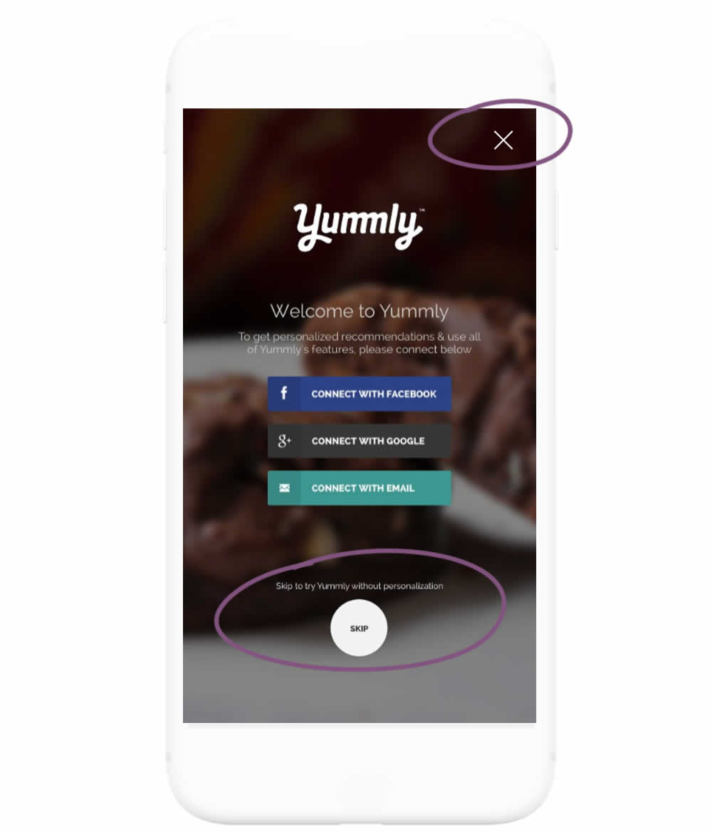
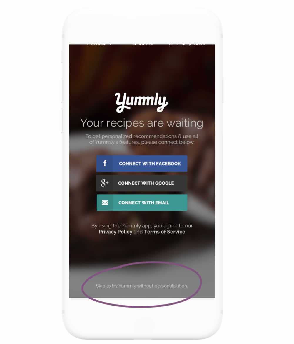
In this experiment, the highly prominent "skip" button was replaced with a less prominent text link. The copy of the skip text link also clarified the consequence of the action - losing out on personalization benefits. More so, the habitual top-right cancel icon was also removed.
Test #213 on
Mt.com
by
 Vito Mediavilla
Dec 04, 2018
Desktop
Mobile
Signup
Vito Mediavilla Tested Pattern #85: Benefit Button In Test #213 On Mt.com
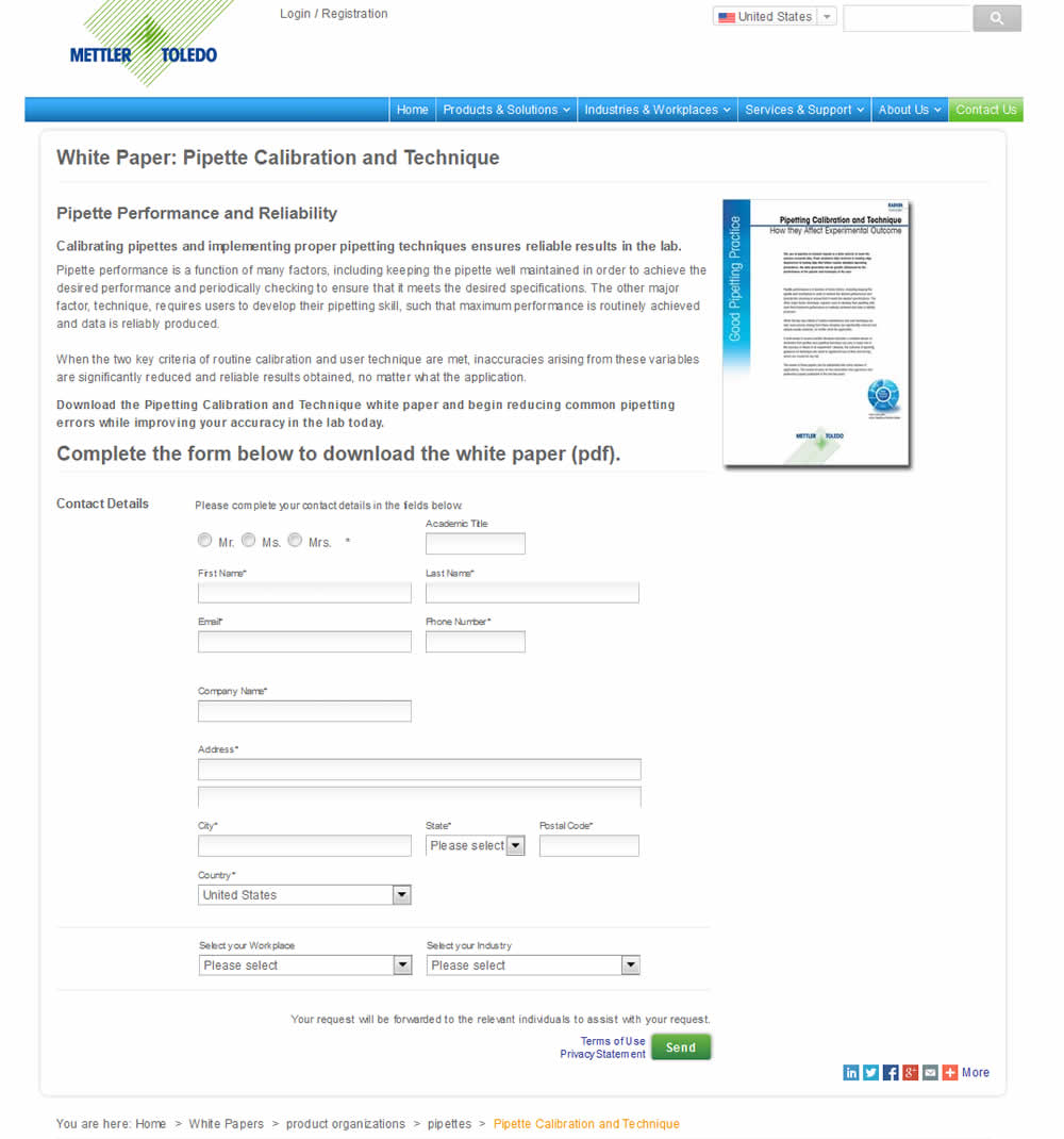
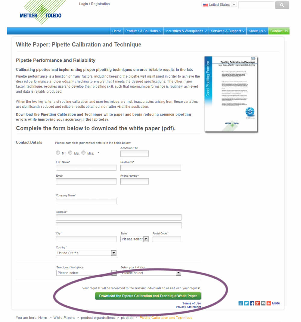
In this variation, a longer button label with a clearer benefit was tested against a shorter one.
Test #206 on
Yummly.com
by
 Kimberly Cheung
Oct 25, 2018
Desktop
Mobile
Signup
Kimberly Cheung Tested Pattern #40: Blurred Product Background In Test #206 On Yummly.com
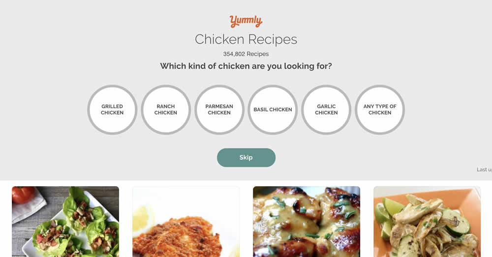
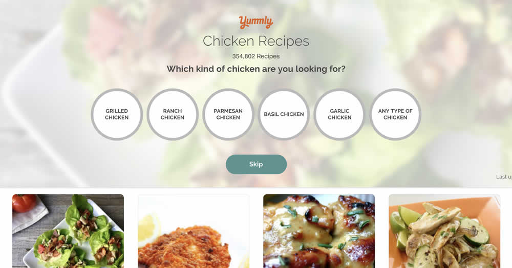
This test ran on the first step of a multiple signup funnel and only changed the background to a blurred image.
Test #198 on
Bomgar.com
by
 Lee Elkins
Sep 03, 2018
Desktop
Signup
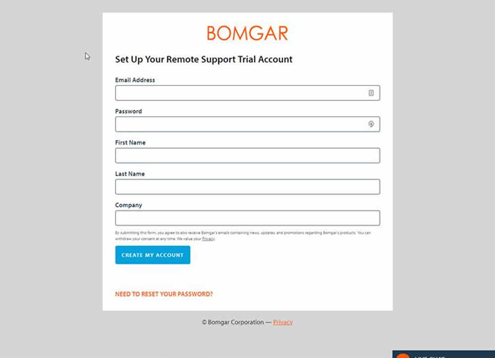
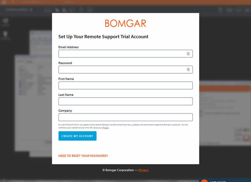
Lee Elkins Tested Pattern #40: Blurred Product Background In Test #198 On Bomgar.com
Test #193 on
Yummly.com
by
 Marcos Ciarrocchi
Aug 07, 2018
Desktop
Mobile
Signup
Marcos Ciarrocchi Tested Pattern #91: Forced Action In Test #193 On Yummly.com
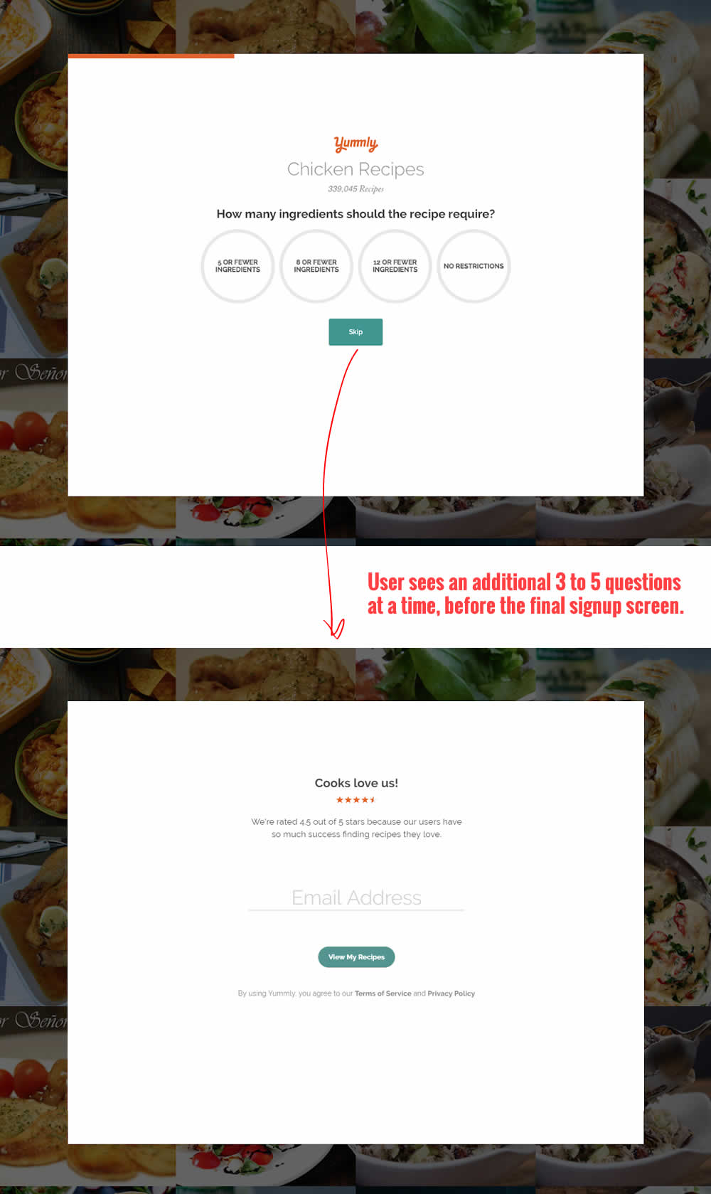
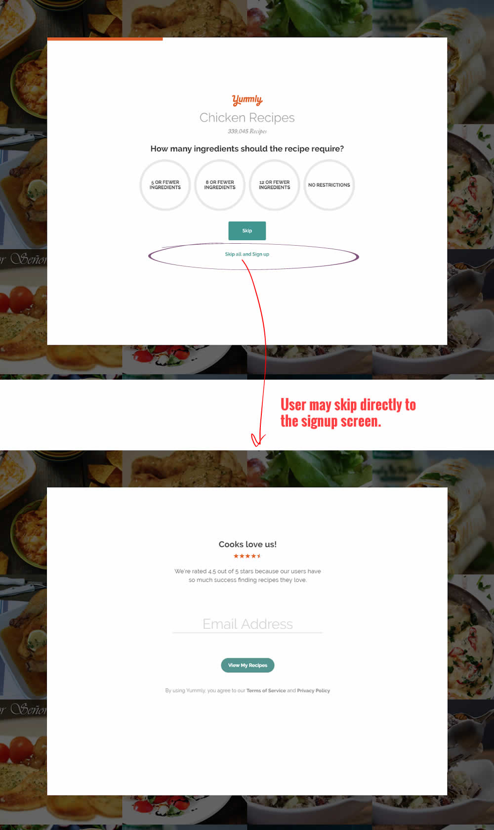
In this experiment, the presence of an additional "skip all" text link was tested on a multiple step signup flow. The skip all link allowed users to bypass personalization questions and go straight to their app dashboard. The control (A) shows its presence, and in variant B we can see it was removed.
Test #189 on
Yummly.com
by
 Kimberly Cheung
Jul 23, 2018
Desktop
Mobile
Signup
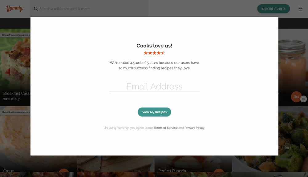
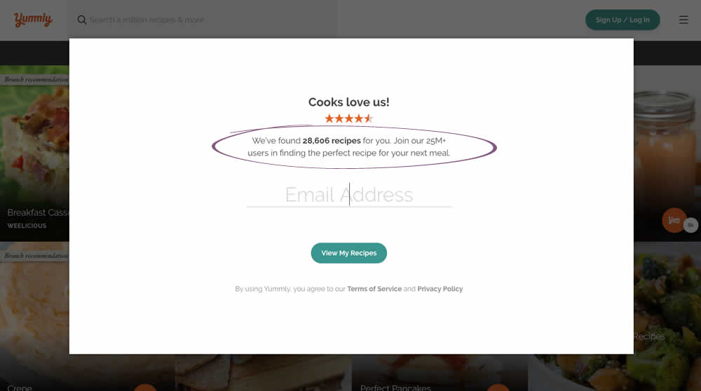
Kimberly Cheung Tested Pattern #7: Social Counts In Test #189 On Yummly.com
Test #181 on
Yummly.com
by
 Kimberly Cheung
Jun 04, 2018
Desktop
Mobile
Signup
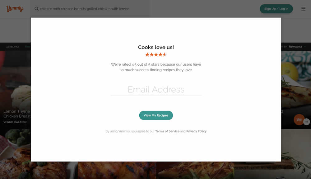
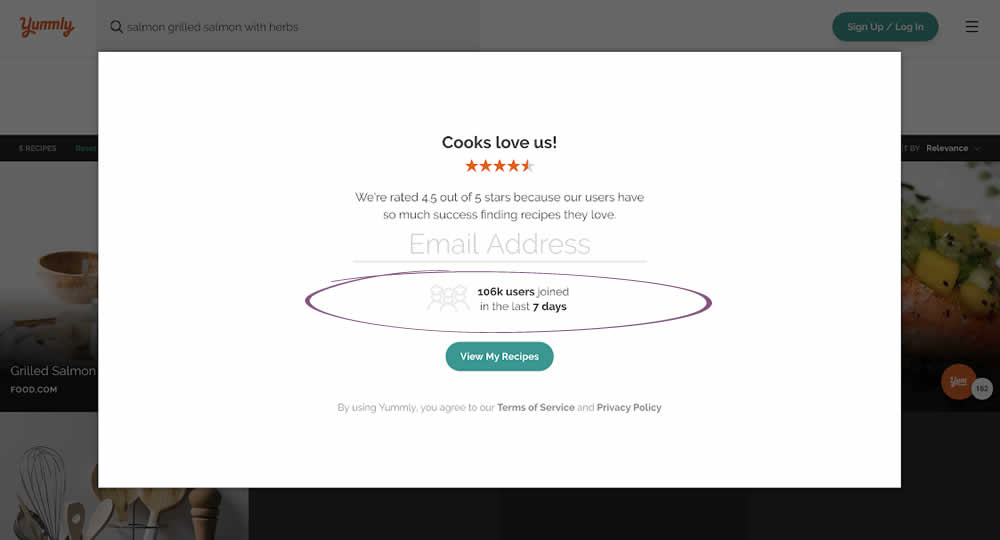
Kimberly Cheung Tested Pattern #7: Social Counts In Test #181 On Yummly.com
Test #171 on
Sjvc.edu
by
Phillip Barnes
Apr 27, 2018
Desktop
Mobile
Signup
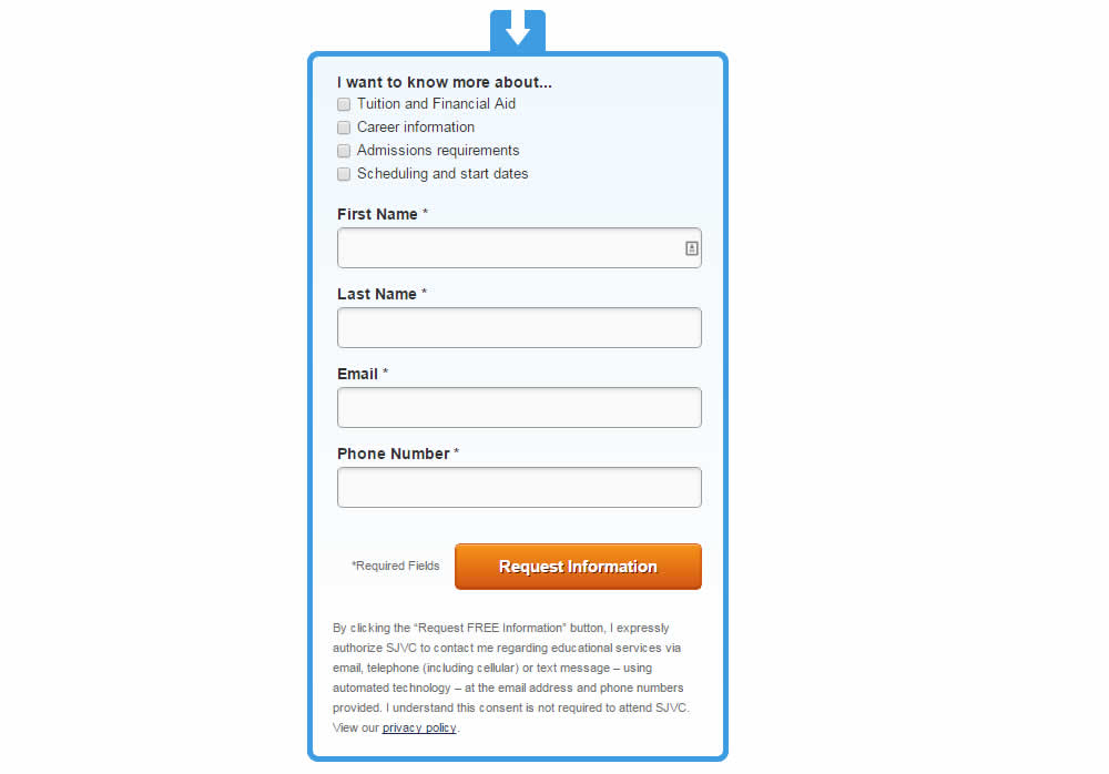
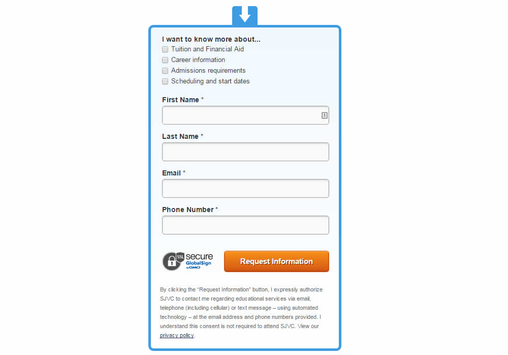
Phillip Barnes Tested Pattern #63: Trust Seals In Test #171 On Sjvc.edu
