All Latest 556 A/B Tests
Become a member to unlock the abiltiy to see the highest impact a/b tests. Being able to see the actual test results and sort by impact allows growth and experimentation teams to take action on the biggest gains first
MOST RECENT TESTS
Test #244 on
Mt.com
by
 Vito Mediavilla
Jun 06, 2019
Desktop
Product
Vito Mediavilla Tested Pattern #49: Above The Fold Call To Action In Test #244 On Mt.com

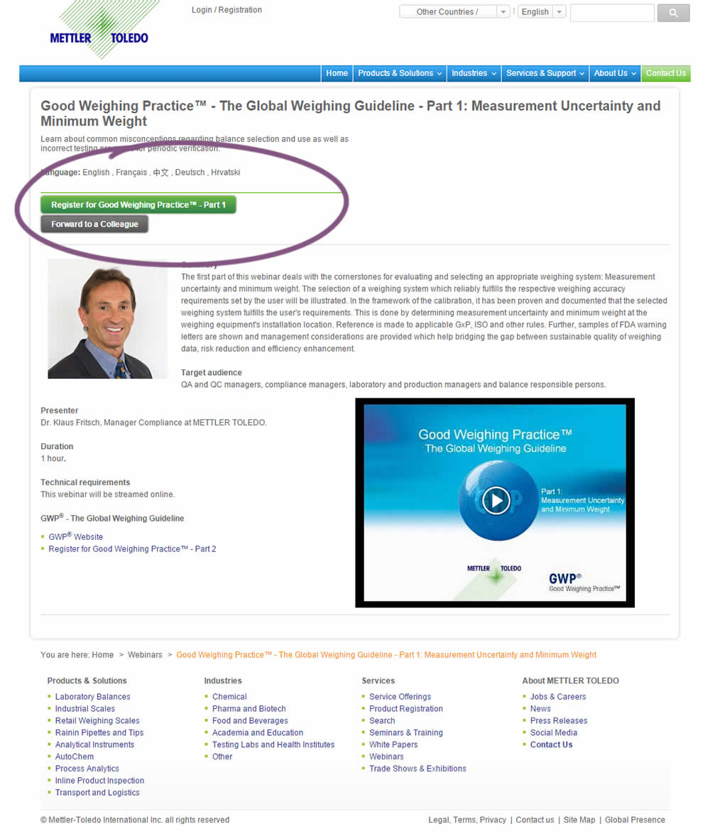
A product landing page with an image was tested against one without - raising the call to action above the fold.
Test #226 on
Microsoft.com
by
 Ronny Kohavi
Feb 18, 2019
Desktop
Product
Ronny Kohavi Tested Pattern #96: Single Focus Photos In Test #226 On Microsoft.com
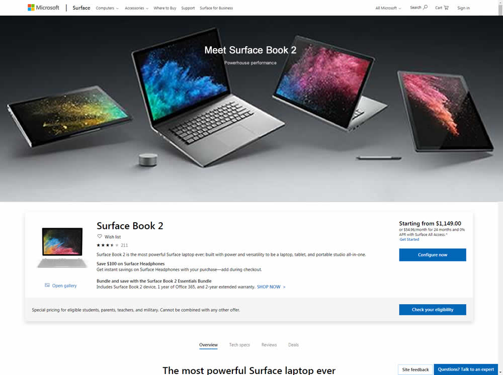
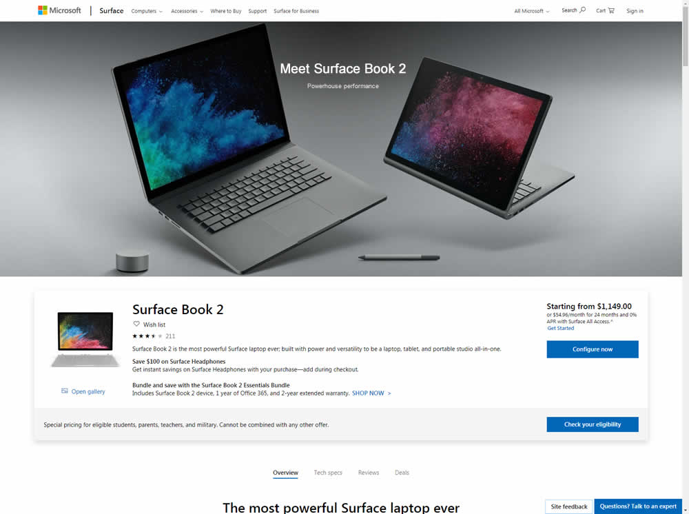
Microsoft Store ran an experiment on the Surface Book 2 product page. The treatment showed a hero image with fewer, yet larger product photos
Test #225 on
by
 Devesh Khanal
Feb 17, 2019
Desktop
Product
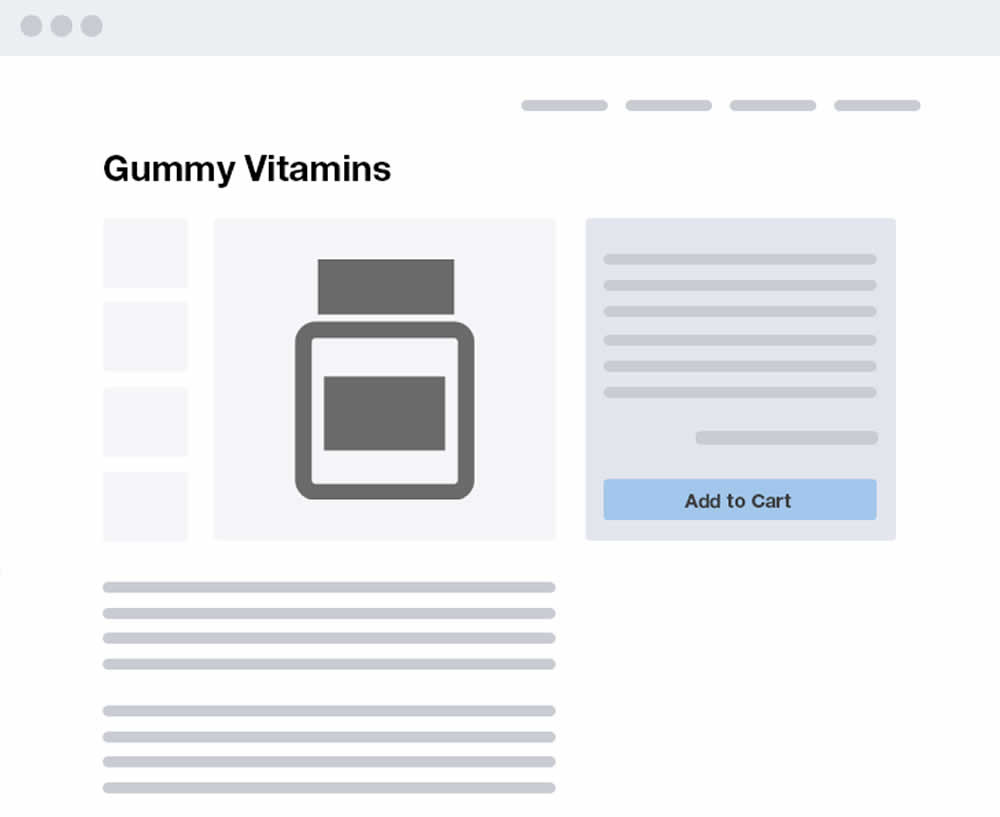
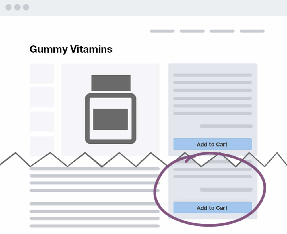
Devesh Khanal Tested Pattern #41: Sticky Call To Action In Test #225
Test #221 on
Microsoft.com
by
 Ronny Kohavi
Jan 27, 2019
Desktop
Product
Ronny Kohavi Tested Pattern #49: Above The Fold Call To Action In Test #221 On Microsoft.com
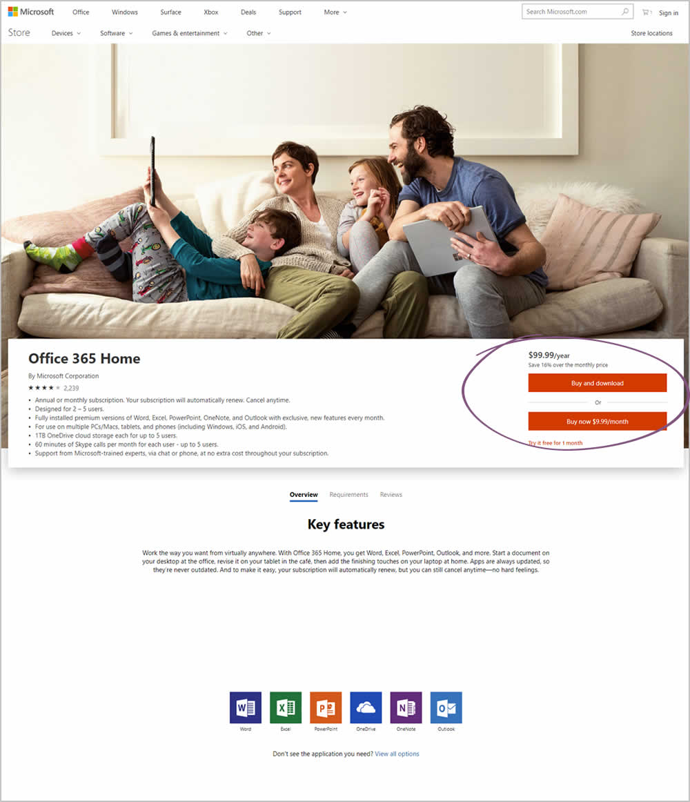
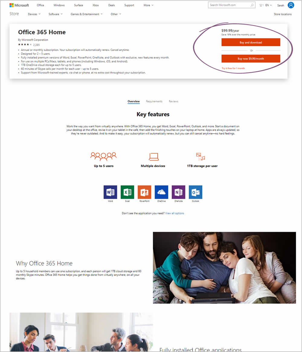
Microsoft Store ran an experiment on the Office 365 Home product page. The treatment raised the purchase calls to action higher by removing the hero image.
Test #212 on
Mt.com
by
 Vito Mediavilla
Dec 04, 2018
Desktop
Mobile
Product
Vito Mediavilla Tested Pattern #60: Repeated Bottom Call To Action In Test #212 On Mt.com
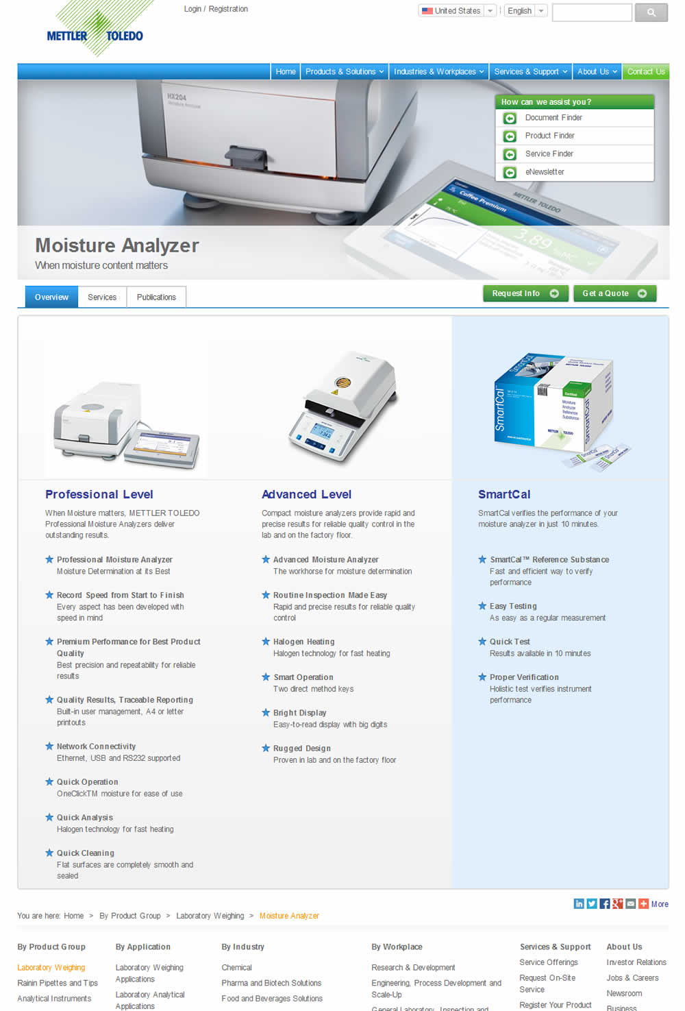
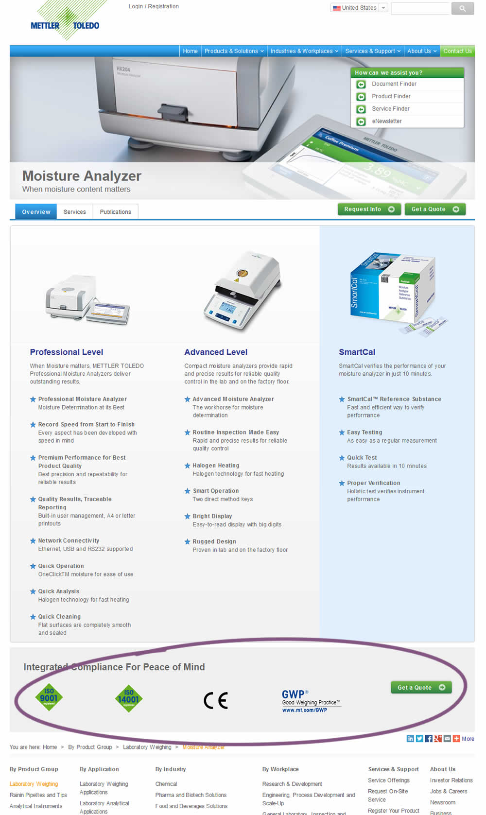
In this experiment, a call to action was repeated at the bottom of the product page. Additional certification icons were also added for additional reassurance.
Test #207 on
Suzuki.be
by
 Karl Gilis
Nov 01, 2018
Desktop
Product
Karl Gilis Tested Pattern #88: Action Button In Test #207 On Suzuki.be
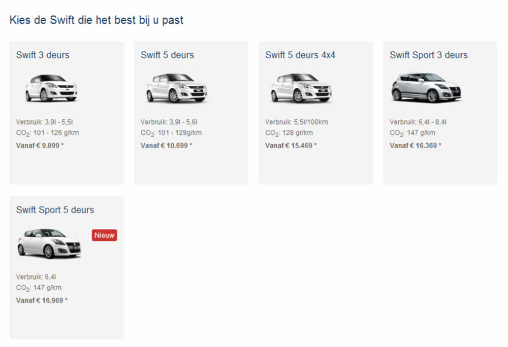
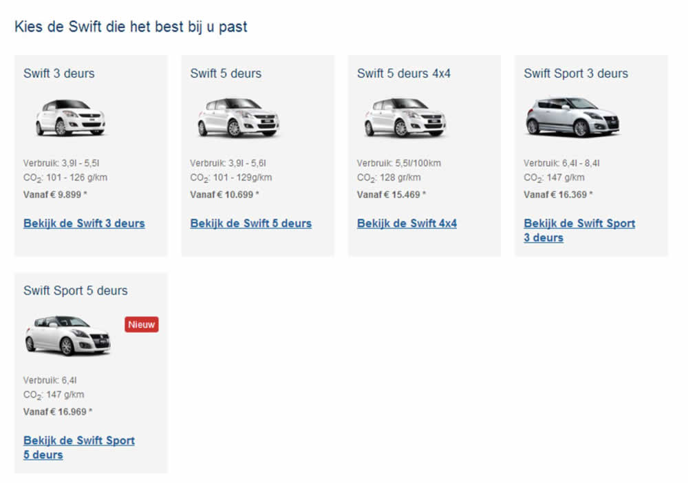
This test ran on the Suzuki Swift landing page. In the B variation, extra links with the following copy ‘Discover the <name of car model>’ were added for each sub product. (in Dutch: ‘Bekijk de…’).
Test #197 on
Reverb.com
by
 Nicholas Evans
Sep 04, 2018
Desktop
Product
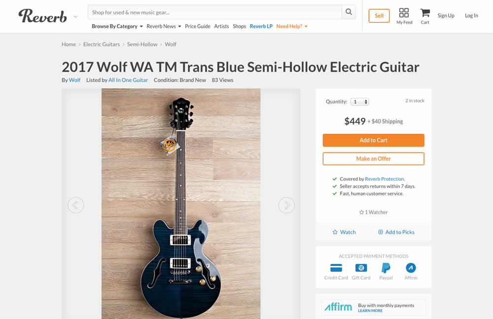
Nicholas Evans Tested Pattern #4: Testimonials In Test #197 On Reverb.com
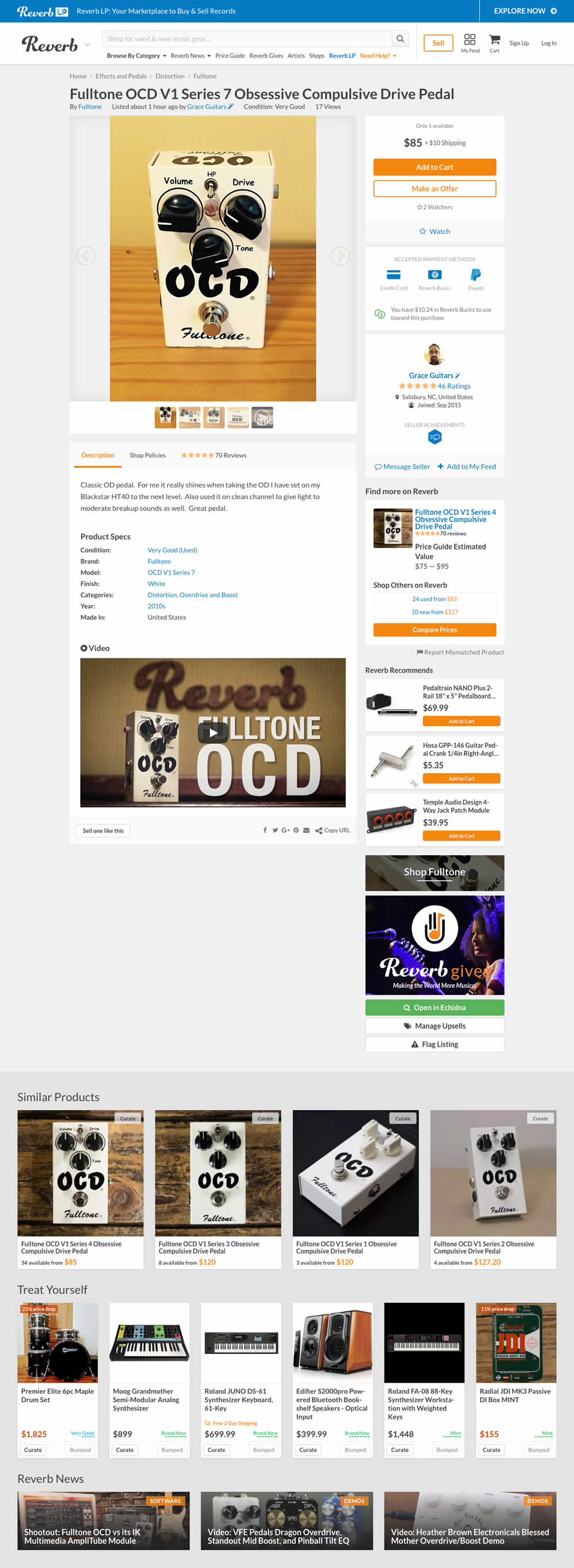

In the variation, customer reviews were exposed from a less visible tab view.
Test #192 on
Refactoring.guru
by
 Alexander Shvets
Aug 07, 2018
Desktop
Mobile
Product
Alexander Shvets Tested Pattern #4: Testimonials In Test #192 On Refactoring.guru


In this experiment, a number of customer reviews were added at the middle of a product page.
Test #187 on
Trydesignlab.com
by
 Will Anderson
Jul 09, 2018
Desktop
Mobile
Product
Will Anderson Tested Pattern #71: Personalized Next Step In Test #187 On Trydesignlab.com


In this experiment, a lead form (with a syllabus) would transform into the next application step of "enrolling" after being submitted. More so, this surfacing of the next enrollment step was personalized and shown for users that also returned to the web site in future visits.
Test #183 on
Trydesignlab.com
by
 Daniel Shapiro
Jun 19, 2018
Desktop
Mobile
Product
Daniel Shapiro Tested Pattern #46: Pay Later In Test #183 On Trydesignlab.com


Test #178 on
by
 Devesh Khanal
May 17, 2018
Desktop
Product
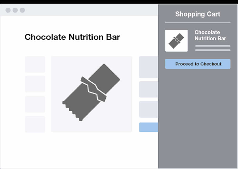
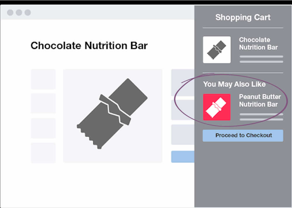
Devesh Khanal Tested Pattern #66: Complementary Upsell In Test #178
Test #172 on
Trydesignlab.com
by
 Daniel Shapiro
May 08, 2018
Desktop
Mobile
Product
Daniel Shapiro Tested Pattern #11: Gradual Reassurance In Test #172 On Trydesignlab.com

Test #167 on
Lovehoney.co.uk
by
 Matthew Curry
Apr 10, 2018
Desktop
Product
Matthew Curry Tested Pattern #69: Autodiscounting In Test #167 On Lovehoney.co.uk
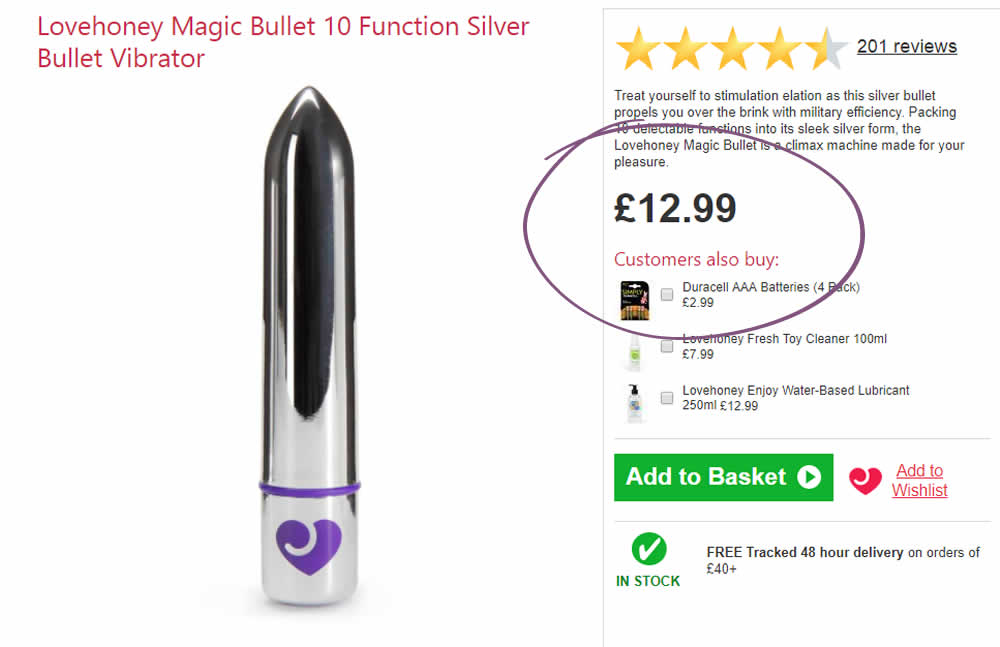
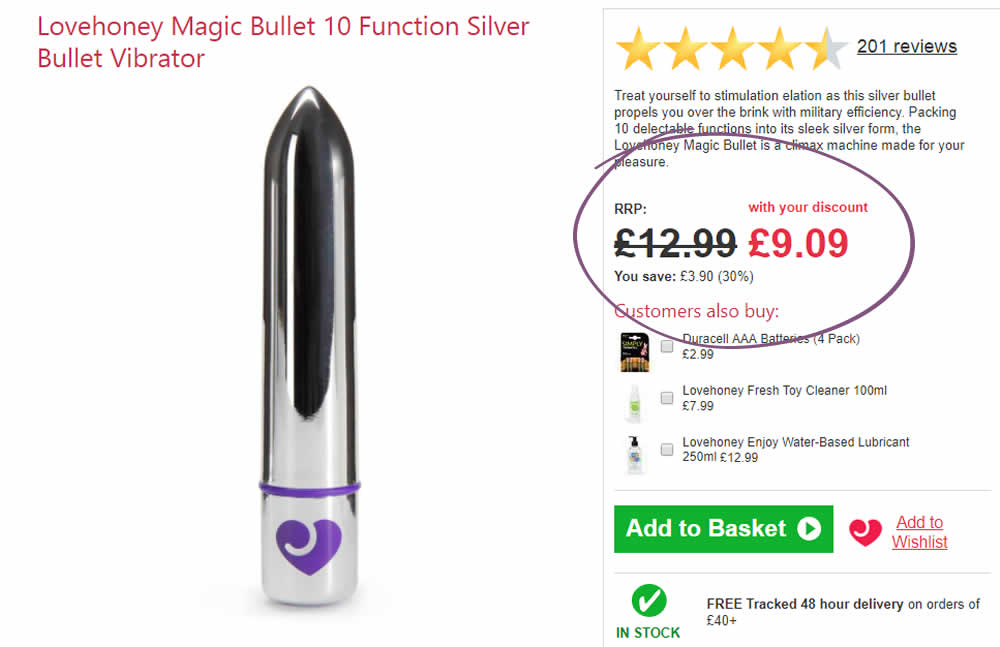
The idea is that, if the customer has an active discount code for that session (either by landing on a particular page, or entering a code somewhere), instead of just showing the discount in the basket, we show it further (earlier) up the funnel and automatically discount on the product page.
The effectiveness of this depends on the discount level, I've tested it at 30% and 50%.
With a 50% Discount:
Add to Cart rate +33%
Sales rate + 24%
With a 30% Discount:
Add to Cart rate +11.6%
Sales rate + 10.2%
Test #163 on
Lovehoney.co.uk
by
 Matthew Curry
Mar 27, 2018
Mobile
Desktop
Product
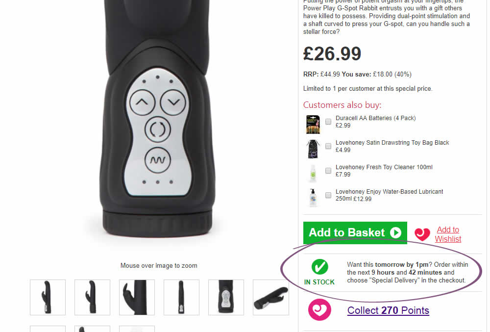
Matthew Curry Tested Pattern #62: Urgent Next Day Delivery In Test #163 On Lovehoney.co.uk

Test #160 on
Examine.com
by
 Martin Wong
Mar 15, 2018
Desktop
Mobile
Product
Martin Wong Tested Pattern #49: Above The Fold Call To Action In Test #160 On Examine.com


Test #157 on
Bobandlush.com
by
 Viljo Vabrit
Mar 06, 2018
Desktop
Product
Viljo Vabrit Tested Pattern #62: Urgent Next Day Delivery In Test #157 On Bobandlush.com
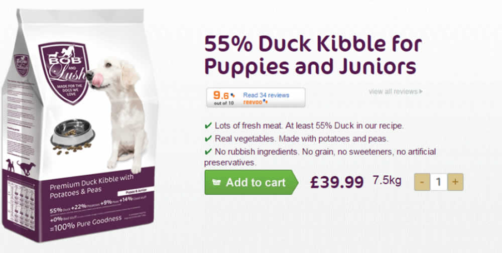
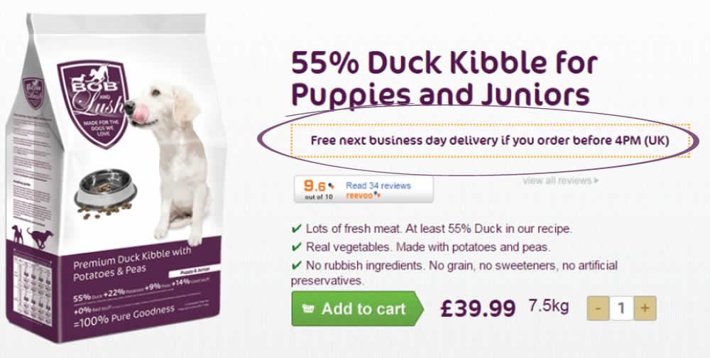
Hypothesis - Urgency leads to higher conversions as people have less time to think and will instead follow their impulse to complete the purchase now rather than later.
The Treatment - From Monday to Friday, before 4 PM, we added the urgency message “Free next business day delivery if you order before 4 PM (UK)”. We placed the urgency message just below the product name ensuring that it fell into the reading pattern of all visitors interested in the products. To ensure the treatment was only shown at the right time and for the right people we added a condition: MON, TUE, WED, THU, FRI before 4 PM; UK IP.
Test #155 on
Mt.com
by
 Vito Mediavilla
Feb 22, 2018
Mobile
Product
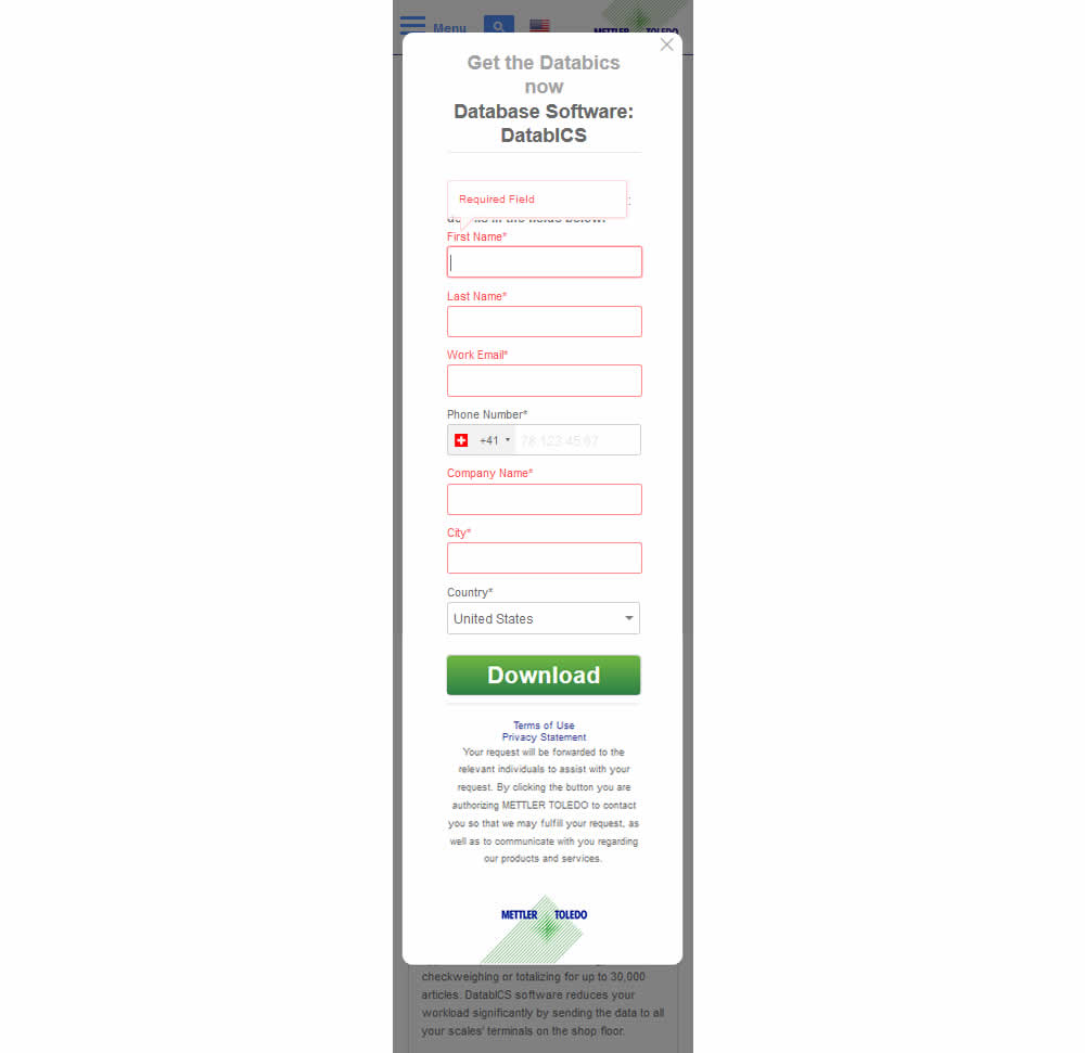
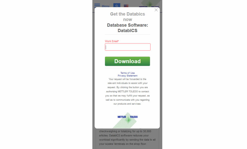
Vito Mediavilla Tested Pattern #3: Fewer Form Fields In Test #155 On Mt.com
Test #154 on
Reverb.com
by
 Nicholas Evans
Feb 20, 2018
Desktop
Mobile
Product
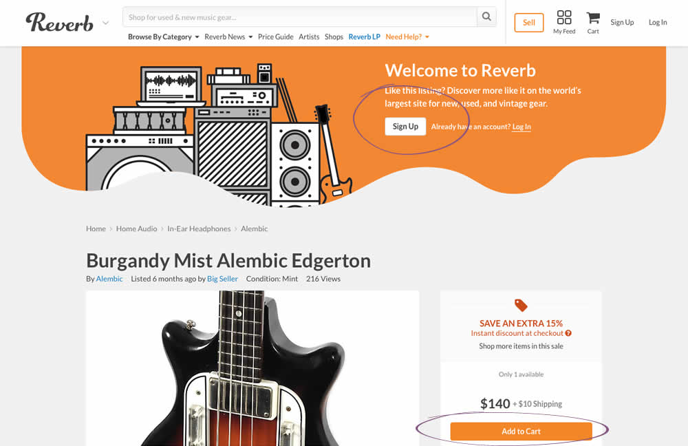
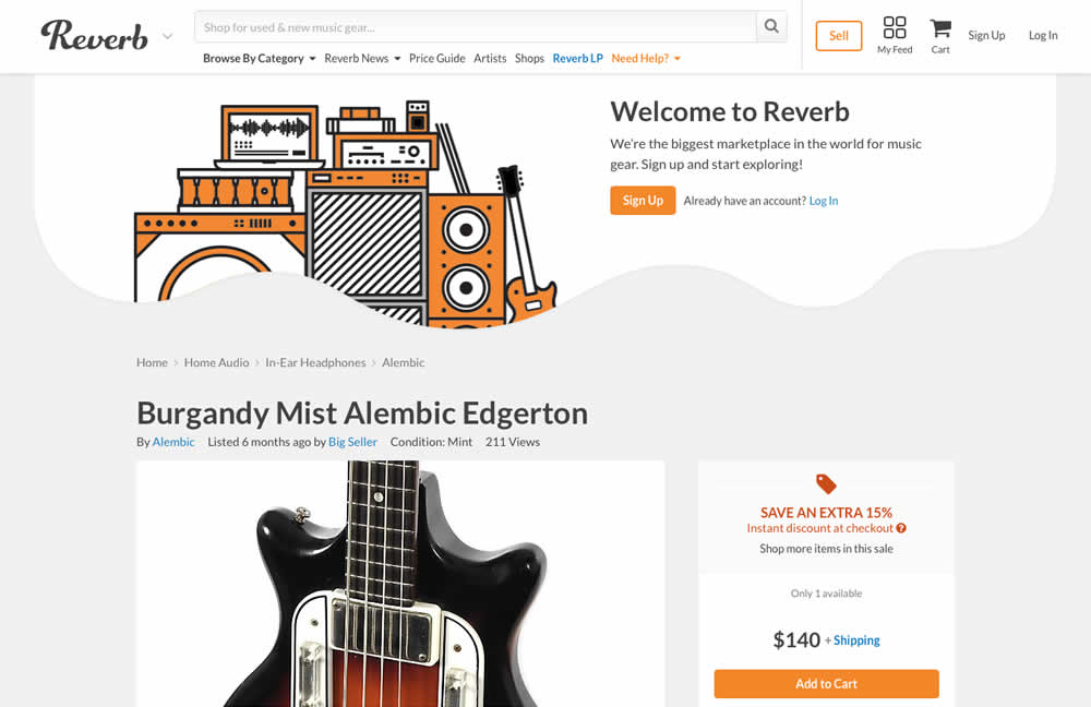
Nicholas Evans Tested Pattern #59: Inverted Or Consistent Button Styles In Test #154 On Reverb.com
Test #152 on
Reverb.com
by
 Nicholas Evans
Feb 13, 2018
Desktop
Mobile
Product
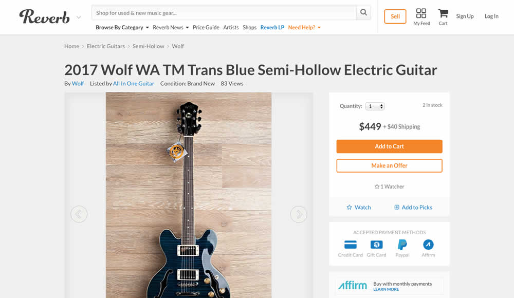
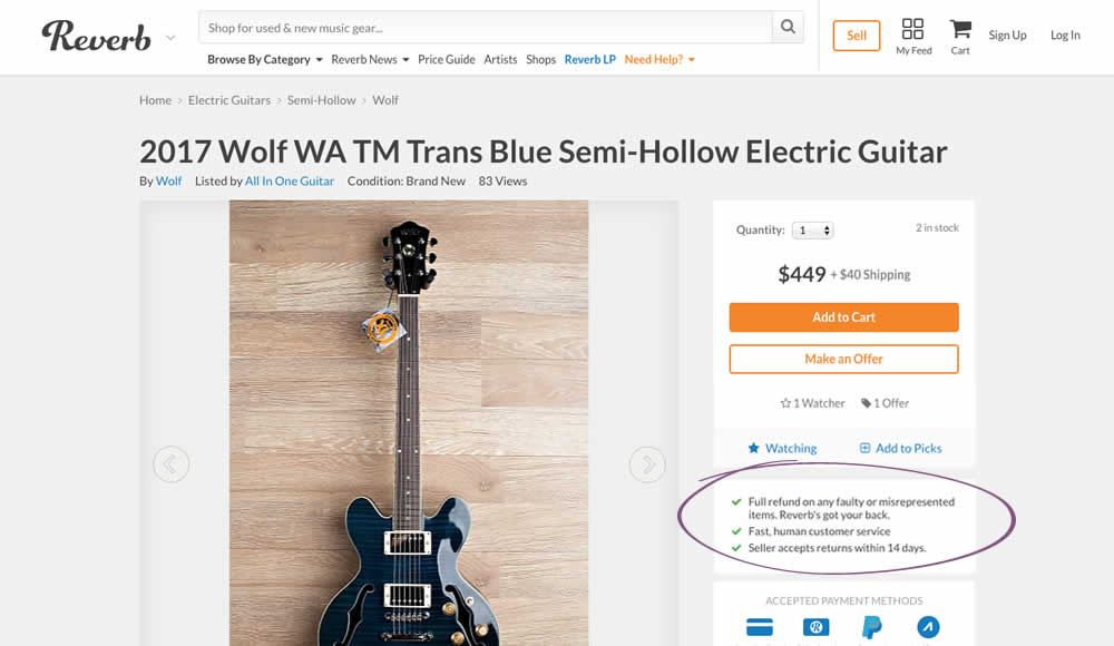
Nicholas Evans Tested Pattern #15: Bulleted Reassurances In Test #152 On Reverb.com
Test #149 on
Reverb.com
by
 Nicholas Evans
Feb 07, 2018
Desktop
Product
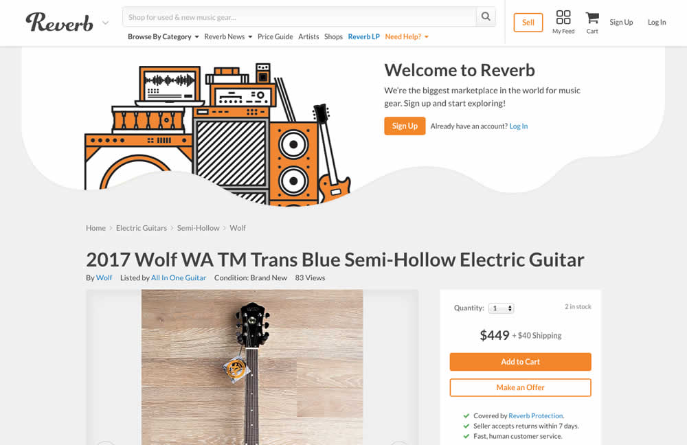
Nicholas Evans Tested Pattern #16: Welcome Mat - Partial In Test #149 On Reverb.com
