All Latest 556 A/B Tests
Become a member to unlock the abiltiy to see the highest impact a/b tests. Being able to see the actual test results and sort by impact allows growth and experimentation teams to take action on the biggest gains first
MOST RECENT TESTS
Test #477 on
Snocks.com
by
 Melina Hess
Jun 09, 2023
Mobile
Desktop
Product
Melina Hess Tested Pattern #95: Clickable Product Previews In Test #477 On Snocks.com

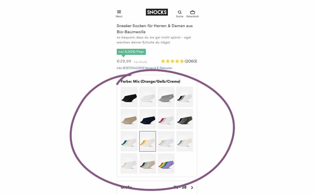
In this experiment, product color swatches were replaced with real product photos. Whereas the control showed the colors as more abstract circles. Impact on sales was measured.
Test #476 on
by
 Devesh Khanal
Jun 08, 2023
Mobile
Product
Devesh Khanal Tested Pattern #95: Clickable Product Previews In Test #476
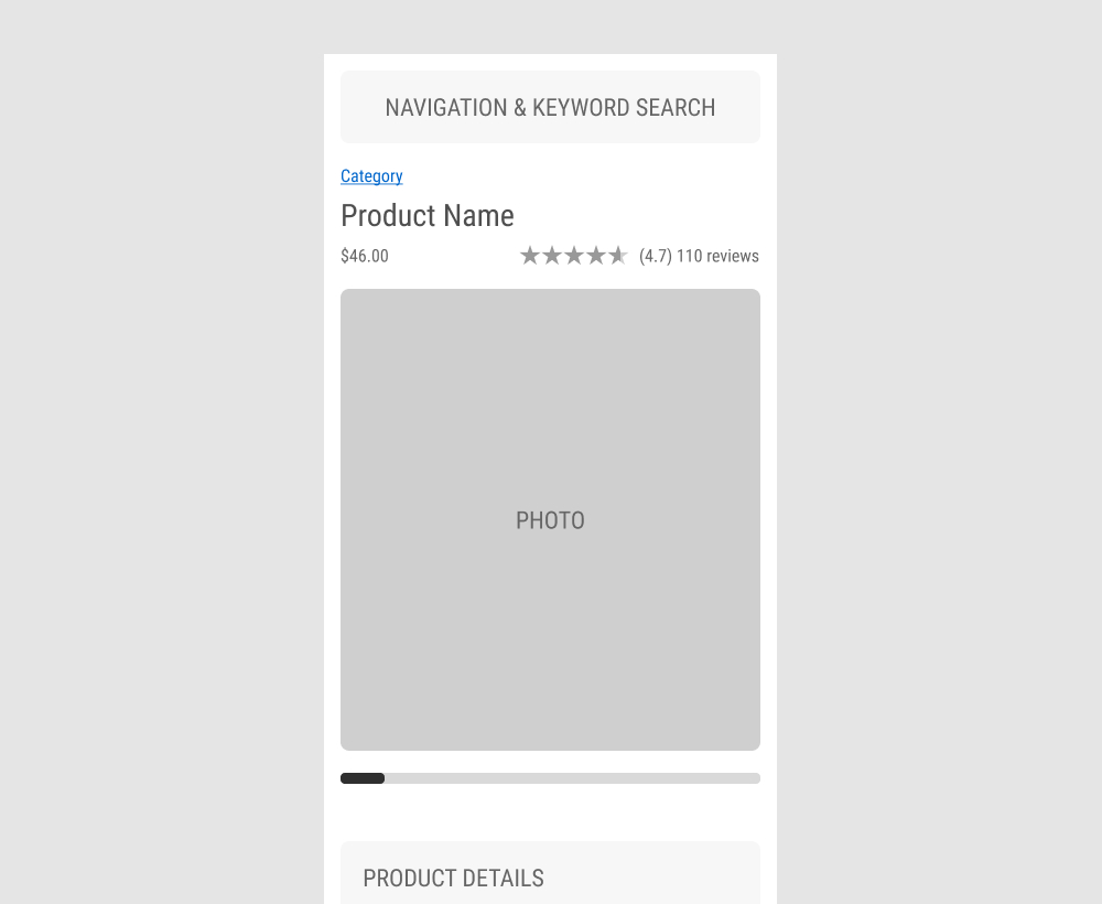
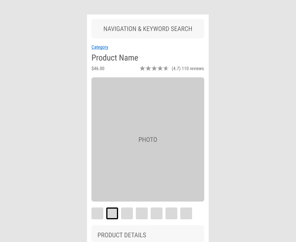
The GrowthRock team ran an experiment on one of their client's product detail pages. Instead of using a scrollbar (for mulitple images), clickable product photo thumbnails were used instead. Impact on sales was measured.
Test #467 on
by
 Jakub Linowski
Apr 27, 2023
Desktop
Mobile
Product
Jakub Linowski Tested Pattern #108: Frequently Asked Questions In Test #467
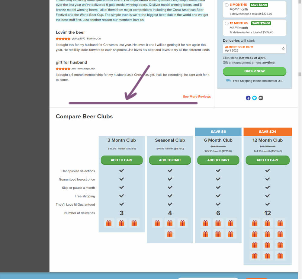
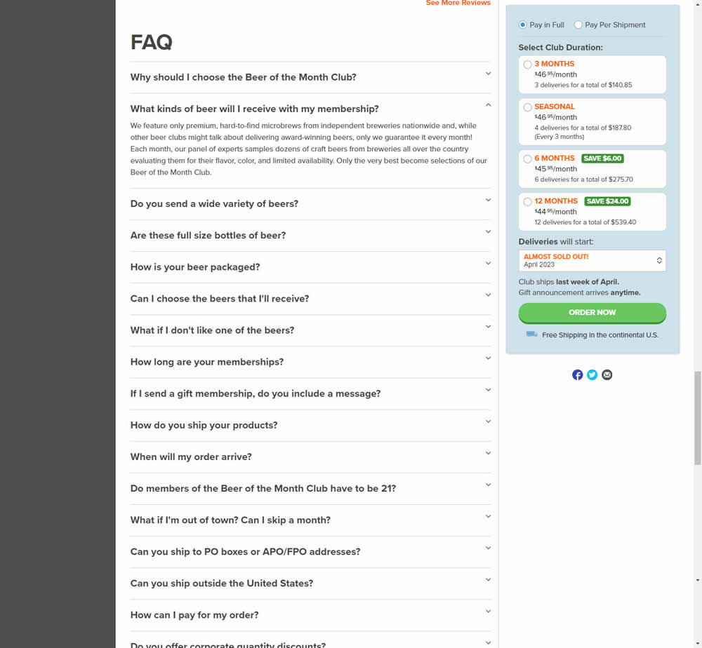
In this experiment, an FAQ section was added near the bottom of a long product page. The reviews were collapsed by default, but expandable upon clicking. Impact on adds-to-cart and sales was measured.
Test #465 on
by
 Melina Hess
Apr 22, 2023
Desktop
Mobile
Product
Melina Hess Tested Pattern #15: Bulleted Reassurances In Test #465
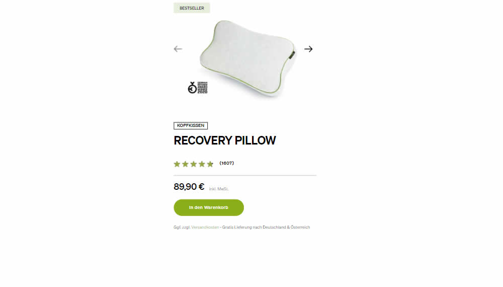
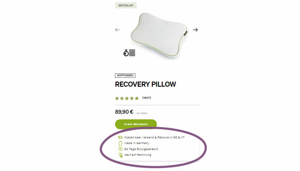
In this product detail page experiment, a number of reassurances were brought out visually in a lined or bulleted way. The 4 reassurances included: free shipping and returns; Made in Germany, 90 Day Returns; and Buy With Invoice (popular in Germany). Impact on revenue per user was measured. The control contained very feint copy (smaller and more subtle) about free shipping.
Test #462 on
by
 Jakub Linowski
Mar 24, 2023
Desktop
Mobile
Product
Jakub Linowski Tested Pattern #128: Standard Or Superscript Price Format In Test #462

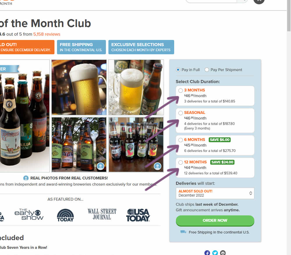
In this experiment, standard $ signs and cents were formatted into a smaller superscript. Impact on add-to-cart and sales was measured.
Test #461 on
Snocks.com
by
 Melina Hess
Mar 23, 2023
Mobile
Product
Melina Hess Tested Pattern #15: Bulleted Reassurances In Test #461 On Snocks.com

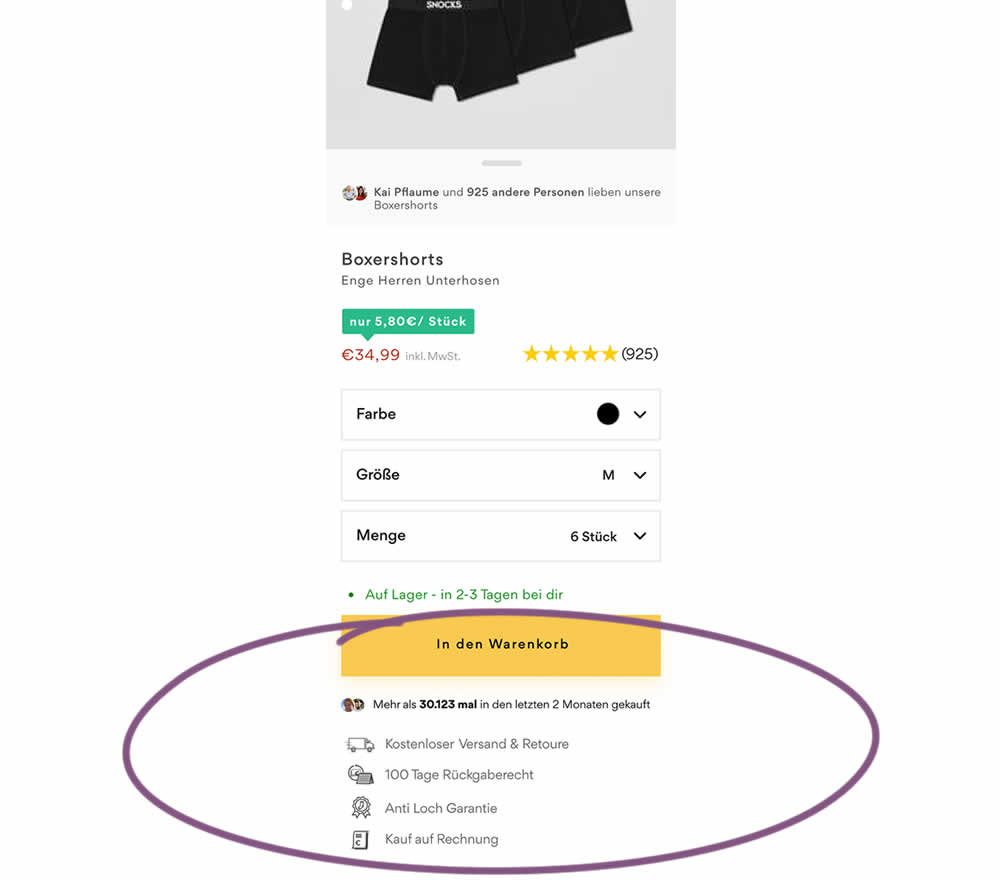
In this product detail page experiment, reassurances under the add-to-cart button were rearranged. The control contained copy about: free shipping and free returns formatted as two gray boxes, with a variety of payment methods and their corresponding logos underneath.
The variation used a more convention bulleted, line-by-line format. It also contained free shipping and returns, but also elaborated with "100 day returns", an "anti-hole guarantee", and "purchase with invoice" (perhaps more popular in Germany?). Impact on sales was measured.
Test #451 on
Fluke.com
by
 Marika Francisco
Jan 25, 2023
Desktop
Product
Marika Francisco Tested Pattern #115: Pricing Comparison Table In Test #451 On Fluke.com
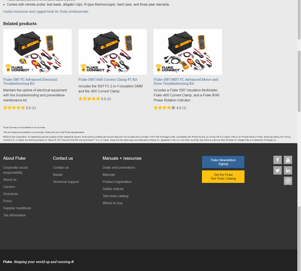
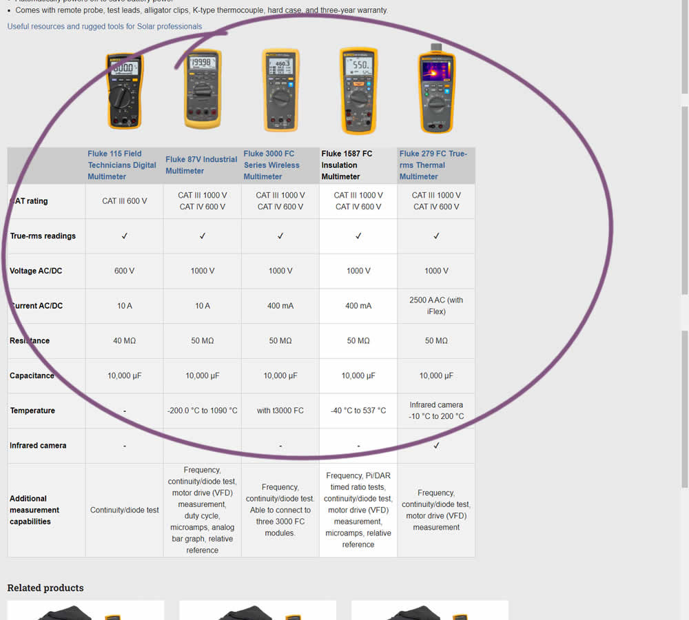
In this experiment, a product comparison table was added in the middle of a product detail page. The comparison table contained products from the same class or family of products. Clicking on the photo thumbnails also allowed customers to visit the specific detail page. Impact on adds to cart and transactions was measured.
Test #449 on
Snocks.com
by
 Melina Hess
Dec 31, 2022
Desktop
Mobile
Product
Melina Hess Tested Pattern #78: Tags, Badges And Structured Information In Test #449 On Snocks.com
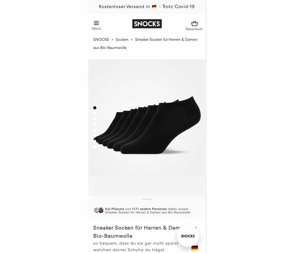
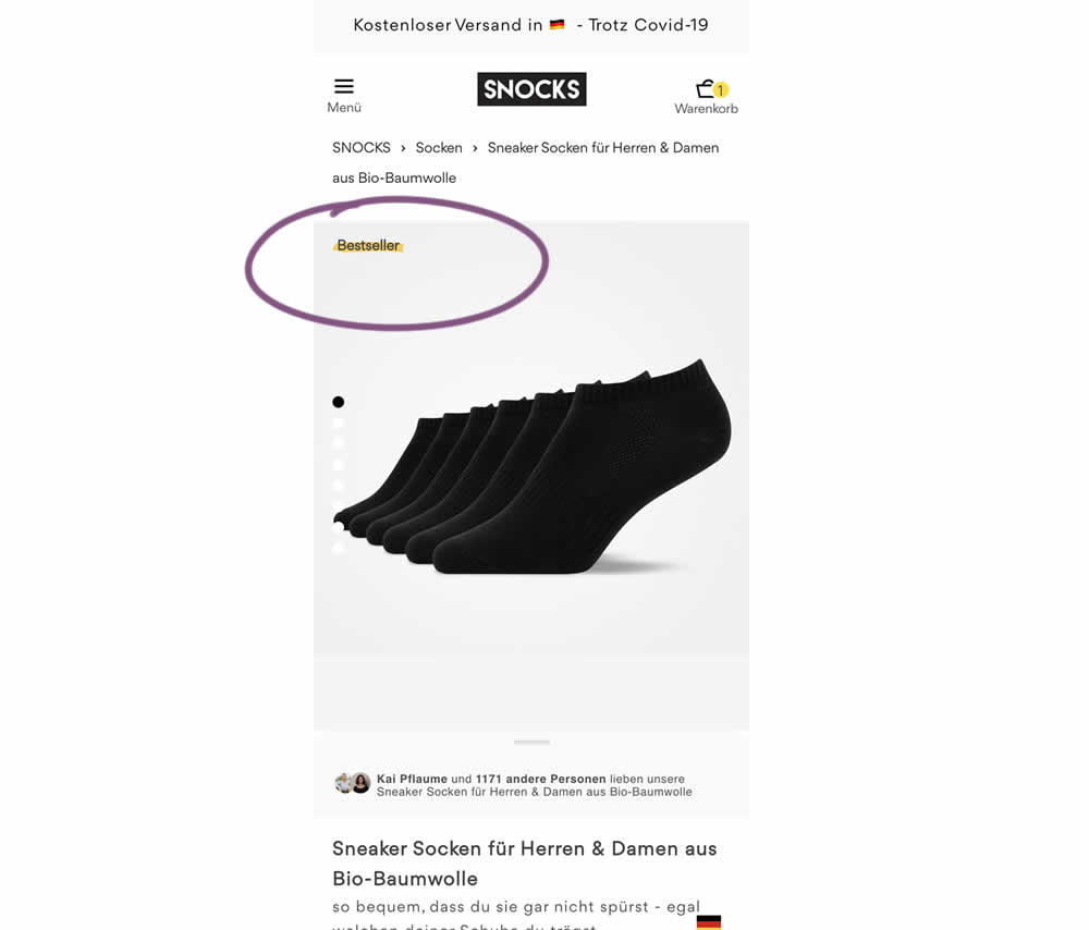
In this experiment, bestselling product colors were highlighted with a bestseller badge on product listing and product detail pages.
Test #448 on
Zapimoveis.com.br
by
 Vinicius Barros Peixoto
Dec 30, 2022
Desktop
Mobile
Product
Vinicius Barros Peixoto Tested Pattern #21: What It's Worth In Test #448 On Zapimoveis.com.br
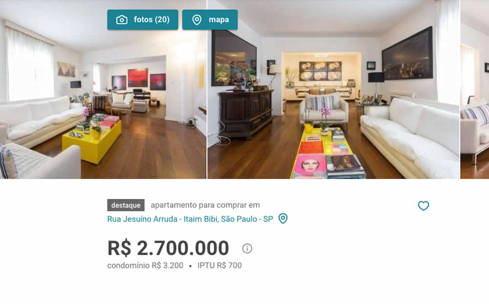
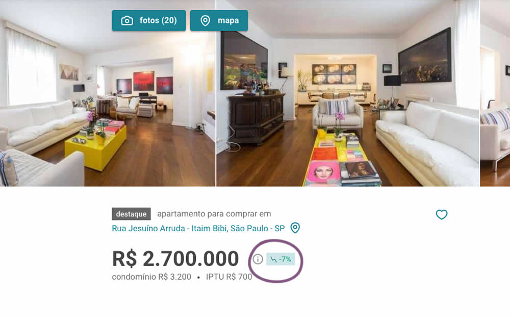
In this experiment, the B variation showed the relative discount in price from within the most recent 12 months as a percentage point. A tooltip was also shown which explained this message on hover.
Test #446 on
by
 Jakub Linowski
Dec 15, 2022
Desktop
Mobile
Product
Jakub Linowski Tested Pattern #18: Single Or Alternative Buttons In Test #446

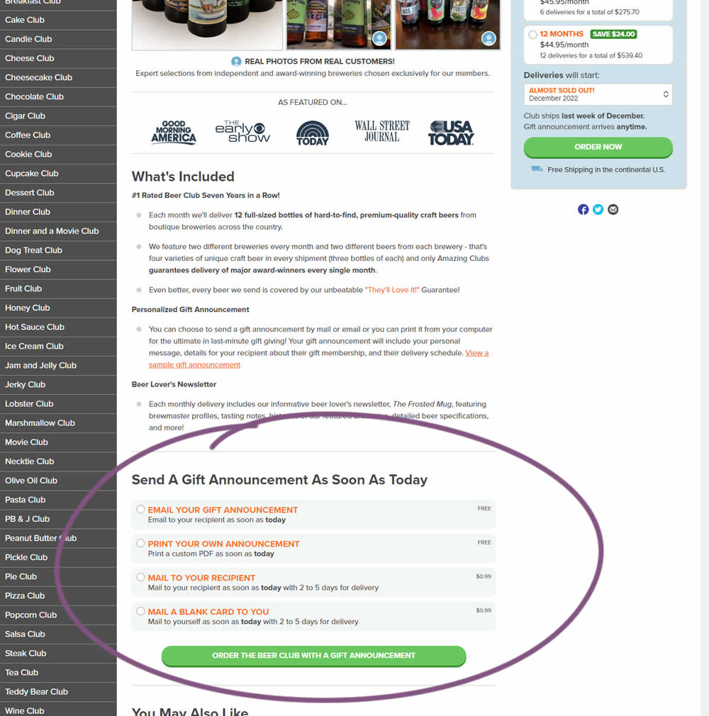
In this experiment, an additional purchase trigger was added - the ability to start by chosing a gift announcement option. In the control, this same question was asked further in the purchase funnel (after adding to cart). In the variation, this question was surfaced earlier as an alternative way of starting the purchase. Impact on total sales was measured.
Test #444 on
by
 Melina Hess
Nov 30, 2022
Mobile
Product
Melina Hess Tested Pattern #41: Sticky Call To Action In Test #444

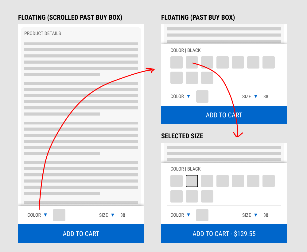
In this experiment, a floating add-to-cart with two product choices (color and size) were added on a product page. This appeared only after scrolling past the existing / embedded product selection buy box.
The floating add-to-cart widget had another layer of complexity in that it allowed customers to make a size and color selection with an expandable fly out. Making a selection would also append the total price to the add-to-cart button label.
Impact on total transactions was measured.
Test #441 on
by
 Melina Hess
Nov 23, 2022
Desktop
Mobile
Product
Melina Hess Tested Pattern #41: Sticky Call To Action In Test #441
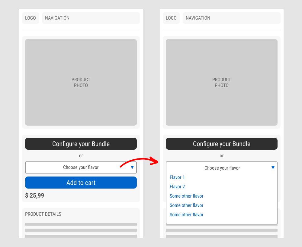
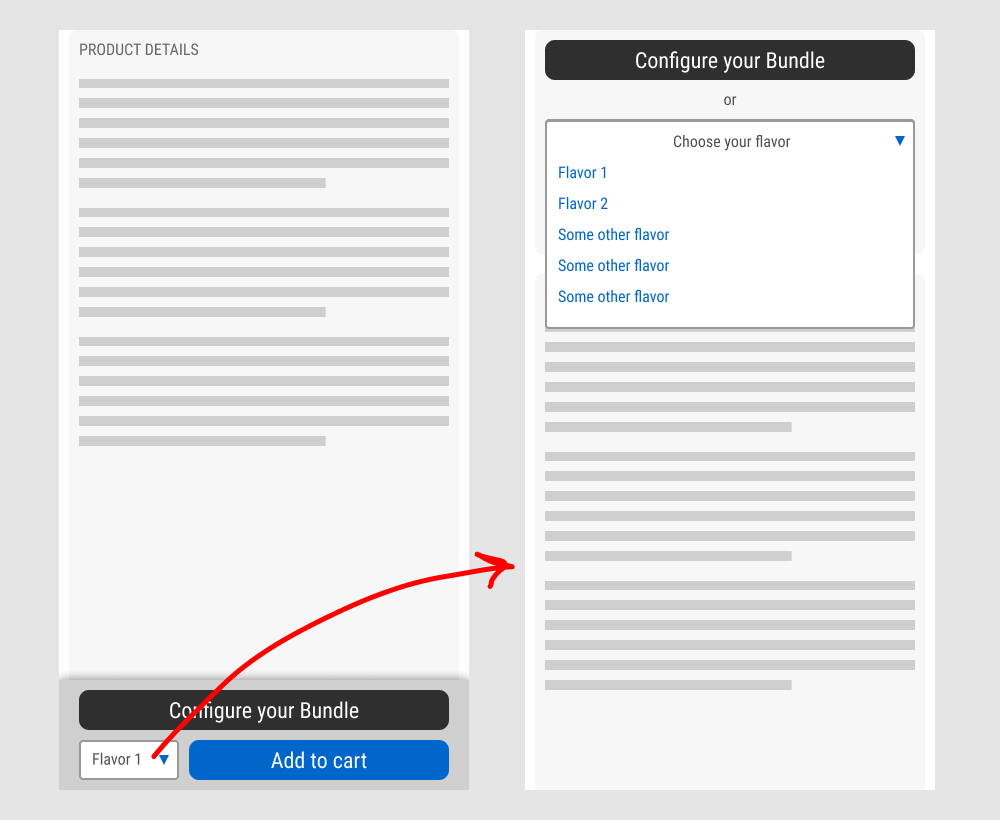
In this experiment, a floating sticky bar was added on product pages. The sticky elements only appeared after users scrolled beyond the fixed buy box area that is relatively high on the page (visible on the control screenshot). The sticky bar contained three elements: a button to configure up to three product choices, a flavor selection pulldown, and the add-to-cart button.
In the variation, when users clicked on the flavor pulldown three things happened. First, they were anchored back to the top of the buy box. Second, the floating sticky disappeared. And third, the flavors pulldown automatically expanded (overlapping the original primary add-to-cart button).
The control did not have any of the sticky behaviors.
Impact to total sales was measured.
Test #430 on
by
 Jakub Linowski
Sep 20, 2022
Desktop
Product
Jakub Linowski Tested Pattern #26: Cart Reminder And Recently Viewed In Test #430
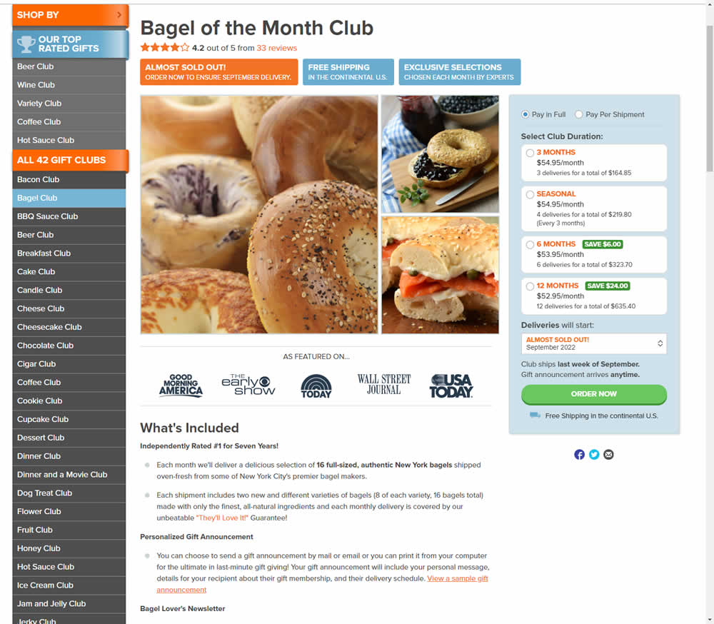
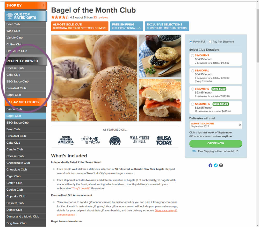
In this experiment, up to 5 recently viewed product pages would appear on the left hand navigation. The idea was to make it easier for users get back to what they were looking at in case they were browsing. These recently viewed products were not visibile in the control. Impact on adds-to-cart and completed transactions was measured.
Test #429 on
Snocks.com
by
 Melina Hess
Aug 16, 2022
Mobile
Desktop
Product
Melina Hess Tested Pattern #121: Free Shipping In Test #429 On Snocks.com

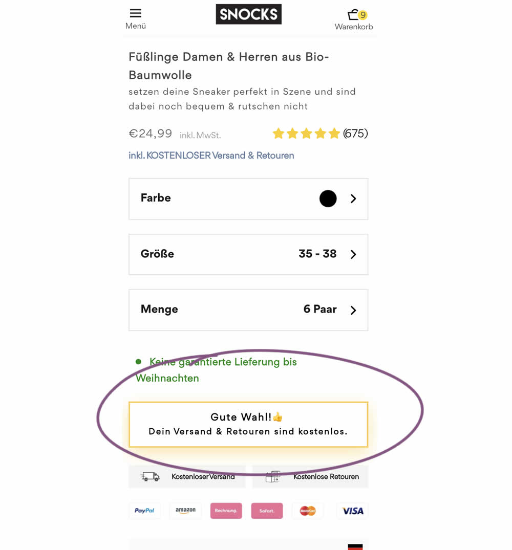
Upon clicking the Add-To-Cart button, the button label changed to a cheering message which congratulated the user on his choice and ensuring that shipping is free. Translation: "Good choice. Your shipping and returns are free."
Test #425 on
by
 Jakub Linowski
Aug 03, 2022
Desktop
Product
Jakub Linowski Tested Pattern #41: Sticky Call To Action In Test #425
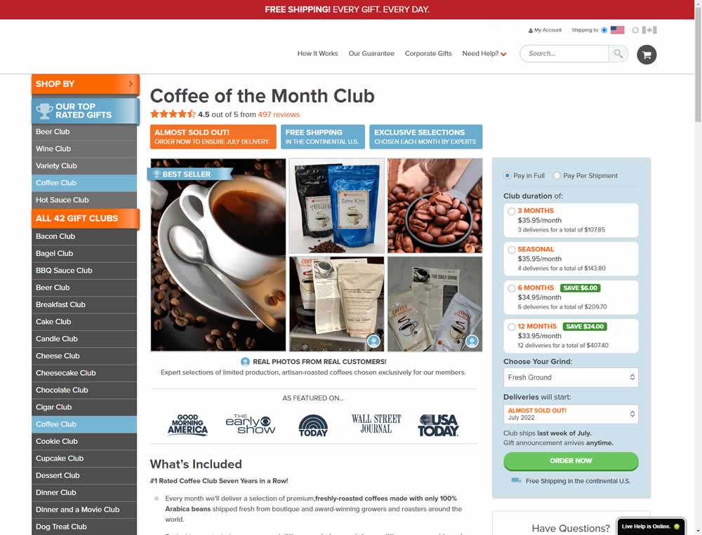

In this experiment, the complete buy box on a product detail page, floated along as users scrolled through the long screen. The variation made sure the product choice and order now button was always visible. Impact on adds-to-cart and sales was measured.
Test #421 on
Amazon.com
by
 Marika Francisco
Jul 15, 2022
Desktop
Mobile
Product
Marika Francisco Tested Pattern #43: Long Titles In Test #421 On Amazon.com
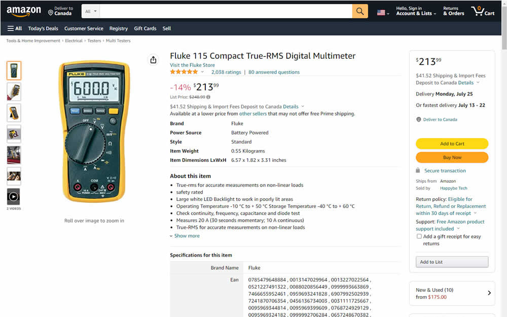
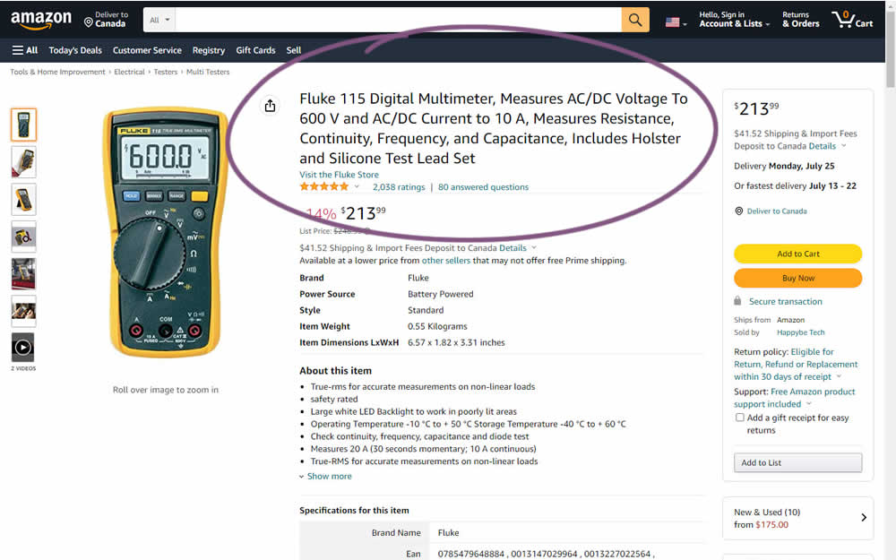
Fluke is an industrial manufacterer of measurement and calibration devices and they ran a test on their Amazon store for a series of their prodcts. Instead of using short product names, they tested longer and more descriptive ones. Impact was measured on sales.
Test #420 on
Designlab.com
by
 Daniel Shapiro
Jul 12, 2022
Desktop
Mobile
Product
Daniel Shapiro Tested Pattern #115: Pricing Comparison Table In Test #420 On Designlab.com
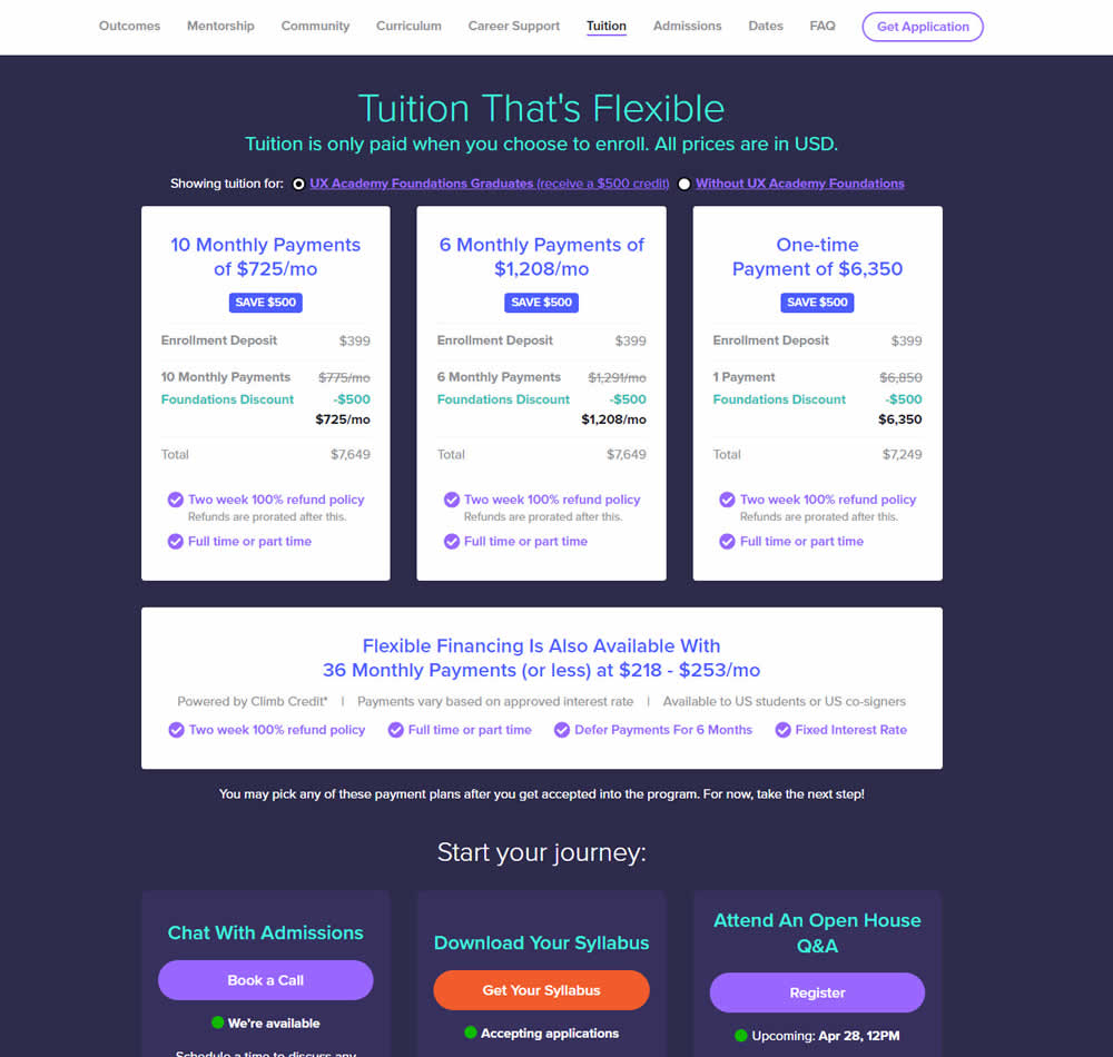
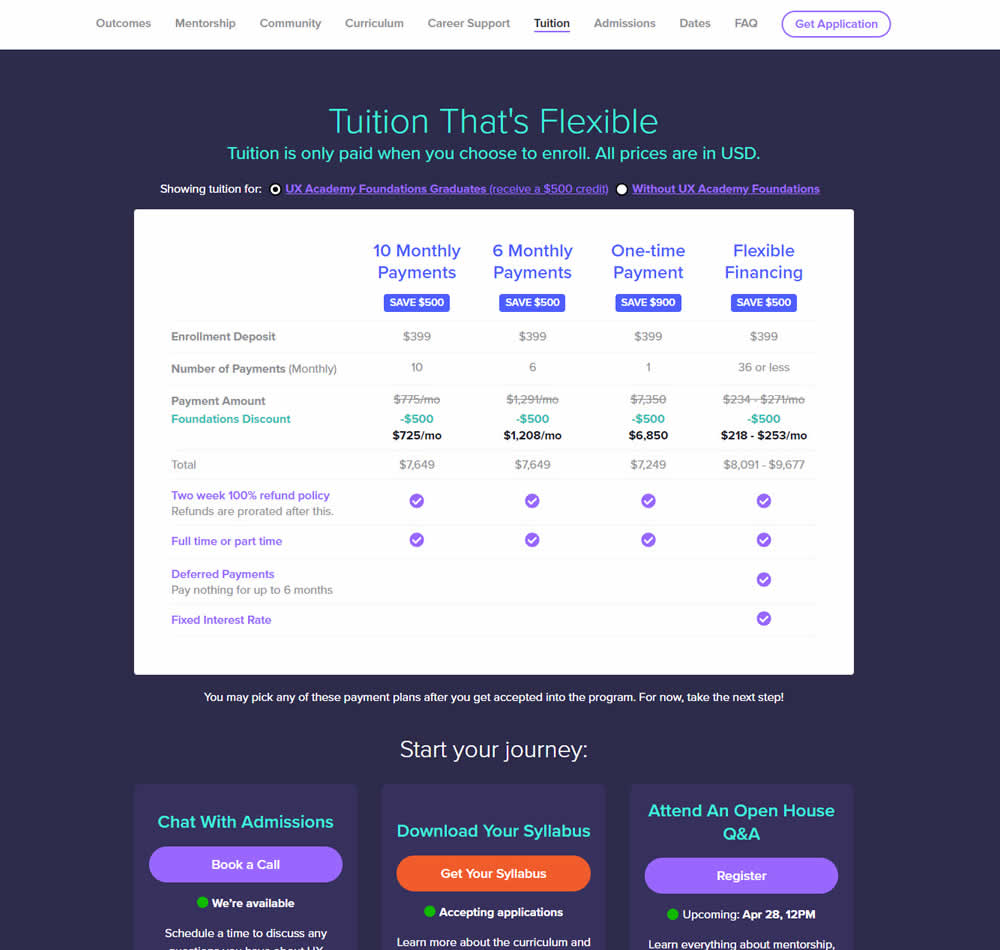
In this experiment, pricing plans were laid out horizontally for easier comparison. In the variation, most of the plan benefits, features and differences were also referenced using a single lable that was left-aligned. The idea was to make the variables aligned and therefore more comparable.
This pricing table appeared at the bottom of a long design program landing page. Impact on leads and applications was measured.
Test #416 on
Designlab.com
by
 Daniel Shapiro
Jun 20, 2022
Desktop
Mobile
Product
Daniel Shapiro Tested Pattern #105: Lead Magnets In Test #416 On Designlab.com

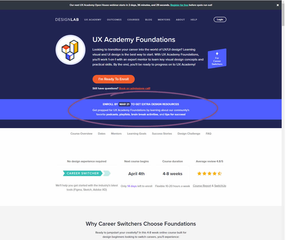
In this experiment, copy was added which communicated that students signing up for a course would receive extra design resources (the lead magnet). This was added in multiple states of the course page. Impact on lead generation and enrollment was measured.
Test #411 on
by
 Ayat Shukairy
May 09, 2022
Desktop
Mobile
Product
Ayat Shukairy Tested Pattern #126: Bottom Or Left Thumbnails In Test #411
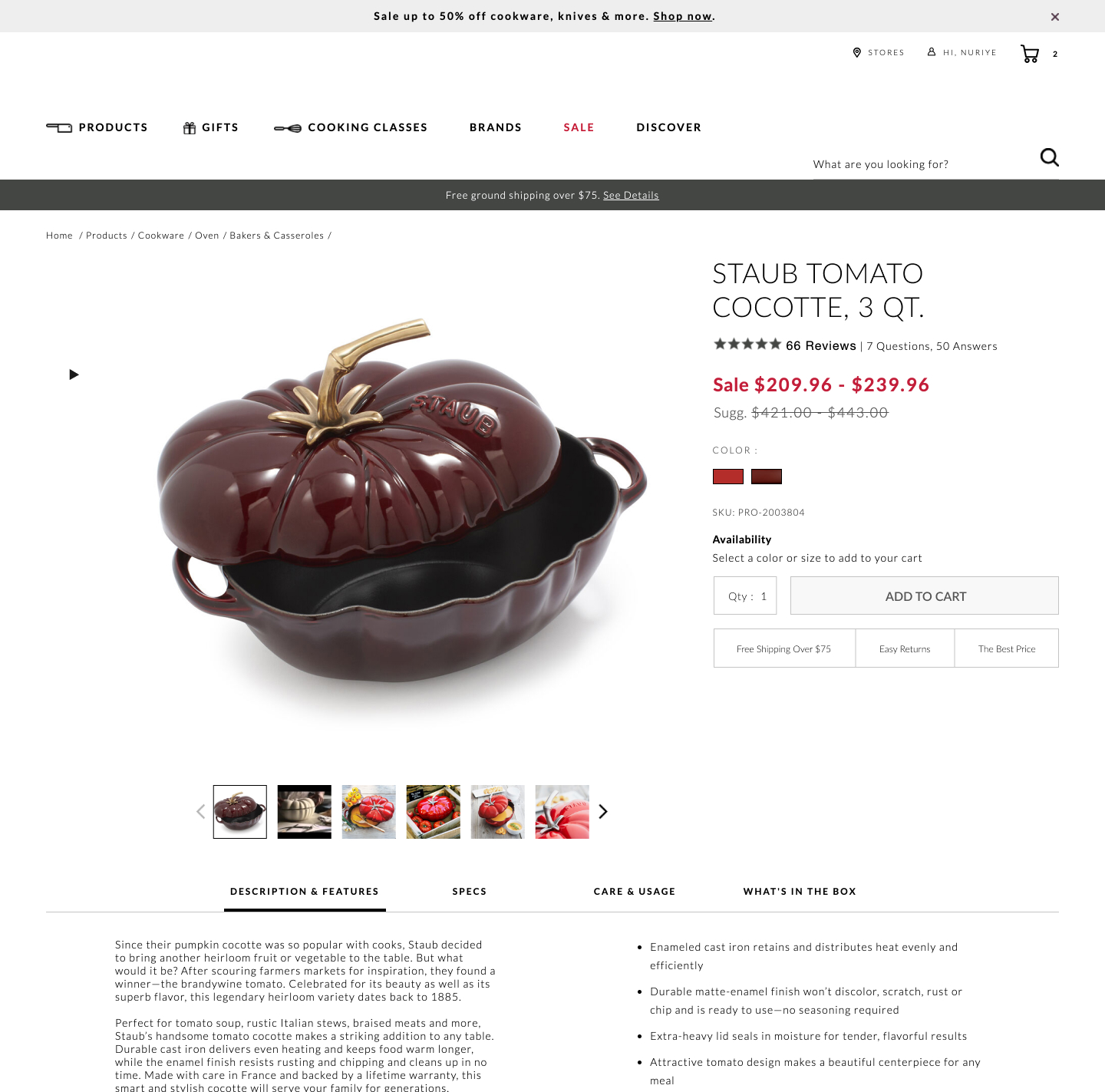
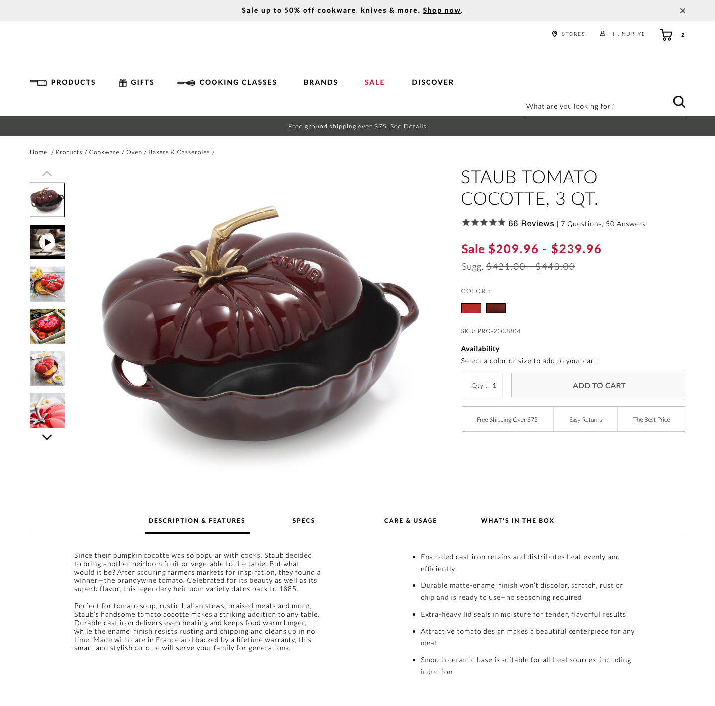
Bottom aligned thumbnails were shifted to the left side on a product image. Doing so, also shifted the product descriptions a little higher. Impact on adds-to-cart and total transactions was measured.
Test #408 on
by
 Jakub Linowski
Apr 29, 2022
Desktop
Mobile
Product
Jakub Linowski Tested Pattern #67: Currency & Taxes In Test #408
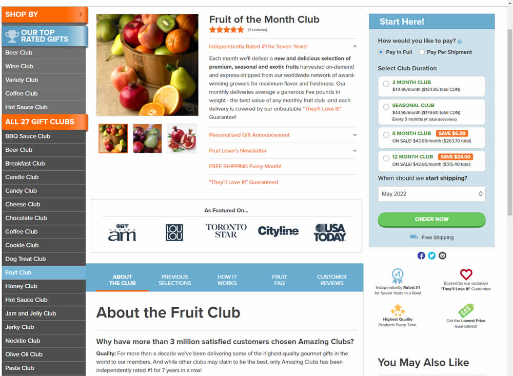
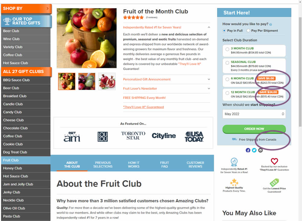
Here is a very simple experiment where CDN currency copy was appended to prices being shown on a Canadian ecommerce site. Additional copy ("from Canada") was appended to an existing shipping message.