All Latest 556 A/B Tests
Become a member to unlock the abiltiy to see the highest impact a/b tests. Being able to see the actual test results and sort by impact allows growth and experimentation teams to take action on the biggest gains first
MOST RECENT TESTS
Test #407 on
Snocks.com
by
 Melina Hess
Apr 22, 2022
Desktop
Mobile
Product
Melina Hess Tested Pattern #125: Unit Prices In Test #407 On Snocks.com
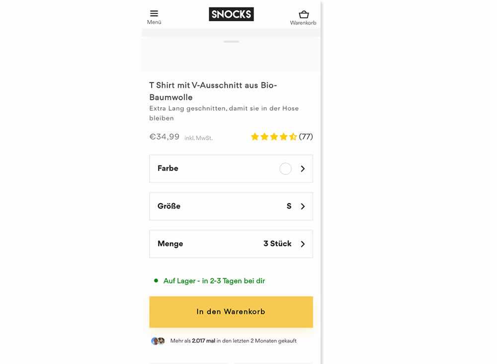

Here is an experiment with an added "price per pair" in the context of products with multiple items (packs).A high contrast badge-like copy was appended underneath the price which translates to "only $X per item". Impact on sales was measured.
Test #406 on
Chaos.com
by
 Velin Penev
Apr 12, 2022
Desktop
Mobile
Product
Velin Penev Tested Pattern #112: Lower Price Frames In Test #406 On Chaos.com

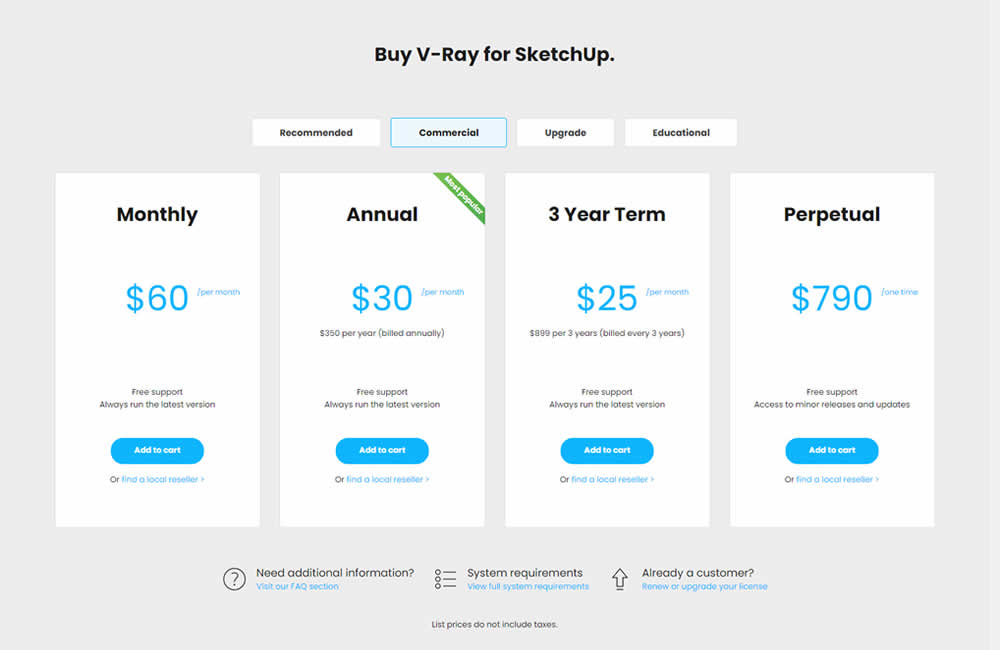
In this experiment, the pricing of three software plans was consistently framed into a more comparable monthly context. Whereas the control version only showed the total prices for each plan, the variation showed both the total and monthly prices. Impact on sales was measured.
Test #402 on
Snocks.com
by
 Melina Hess
Mar 25, 2022
Mobile
Product
Melina Hess Tested Pattern #103: Money Back Guarantee In Test #402 On Snocks.com
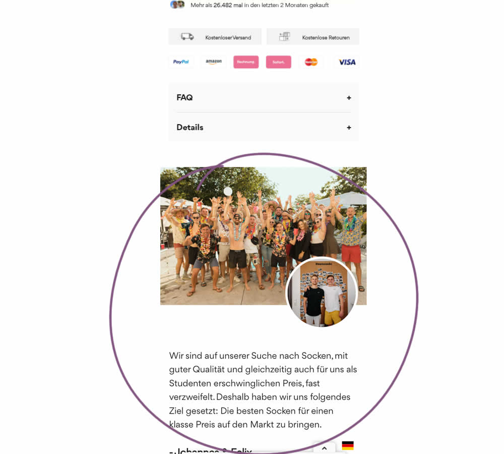
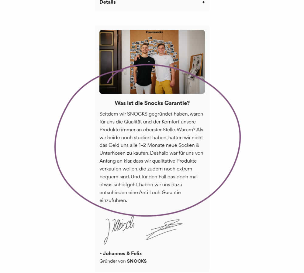
In this experiment on a product screen, a message about quality (from the founders) was reformatted to reinforce the "Anti Hole Guarantee" (in the context of socks). The founders were also made more prominent and their signature added as well. Interestingly, the actual guarantee copy (and its important detail about a 6 month product replacement) was present further down on both the control and variation.
The translation of the new copy (Google Translate) reads:
Since we founded SNOCKS, the quality and comfort of our products have always been our top priority. Why? When we both were still studying, we didn't have the money to buy new socks & underpants every 1-2 months. That's why it was clear to us from the start that we wanted to sell quality products that are also extremely comfortable. And just in case something goes wrong, we have decided to introduce an anti-hole guarantee.
Test #397 on
Snocks.com
by
 Melina Hess
Feb 24, 2022
Mobile
Product
Melina Hess Tested Pattern #121: Free Shipping In Test #397 On Snocks.com


In this experiment a "Free Shipping & Returns" message was added just below the price information.
Test #395 on
by
 Jakub Linowski
Jan 31, 2022
Desktop
Mobile
Product
Jakub Linowski Tested Pattern #52: How It Works In Test #395
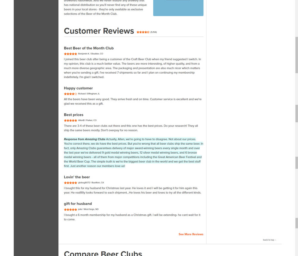
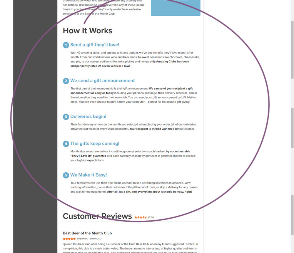
In this experiment, a How It Works section was appended on a product detail page just above product reviews.
Test #394 on
Chaos.com
by
 Velin Penev
Jan 29, 2022
Desktop
Product
Velin Penev Tested Pattern #113: More Or Fewer Plans In Test #394 On Chaos.com

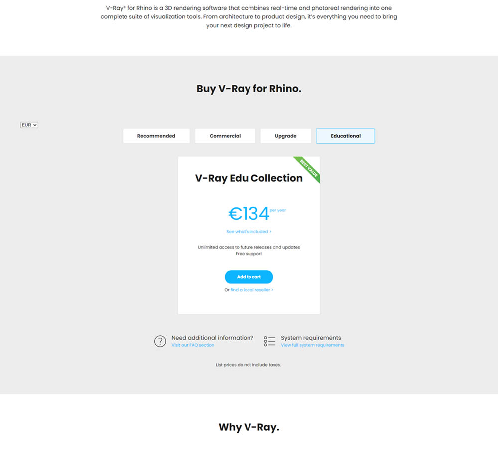
In this experiment, a two plan pricing plan (standalone product with a higher collection set) was tested against a single plan one (only a collection set). Impact on clicks and total sales was measured.
Test #5 on
Busyteacher.org
by
 Andrei Zakhareuski
Jan 23, 2022
Desktop
Mobile
Product
Andrei Zakhareuski Tested Pattern #21: What It's Worth In Test #5 On Busyteacher.org


The variation included a simple extention of the headline to include the full dollar worth of a discounted bundle deal.
Test #122 on
Designlab.com
by
 Daniel Shapiro
Jan 22, 2022
Desktop
Mobile
Product
Daniel Shapiro Tested Pattern #30: Authentic Photos In Test #122 On Designlab.com
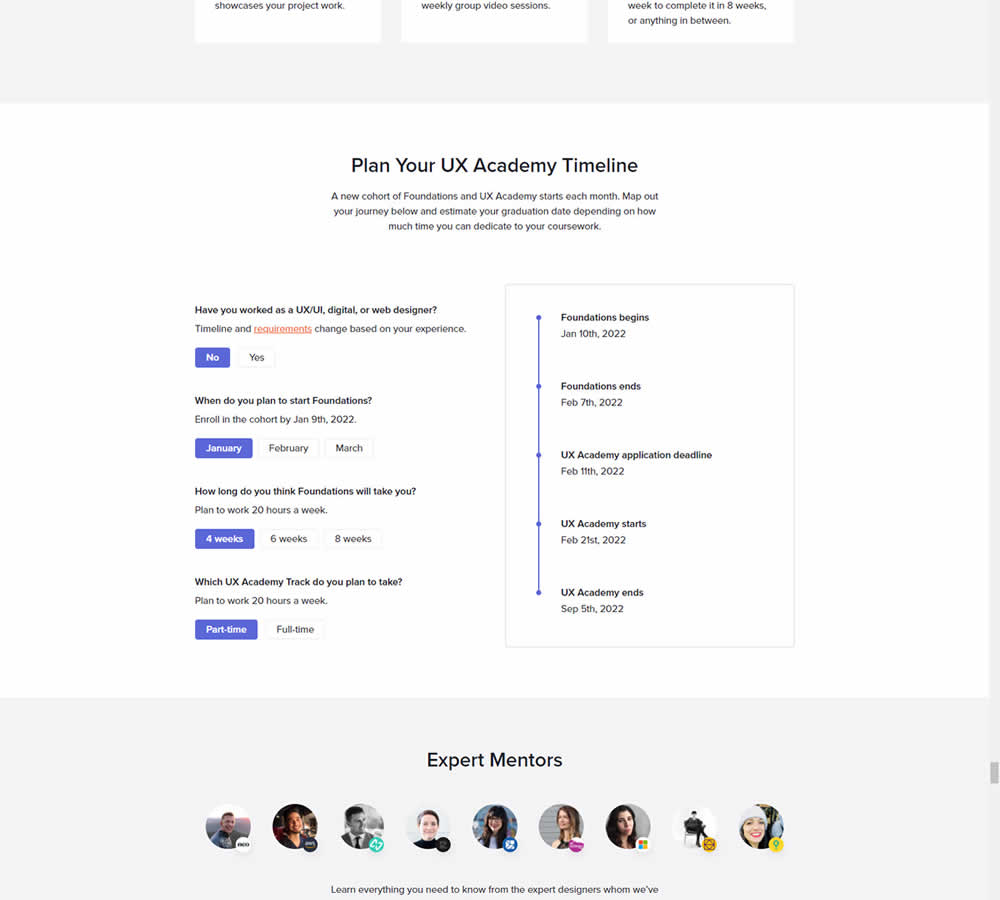
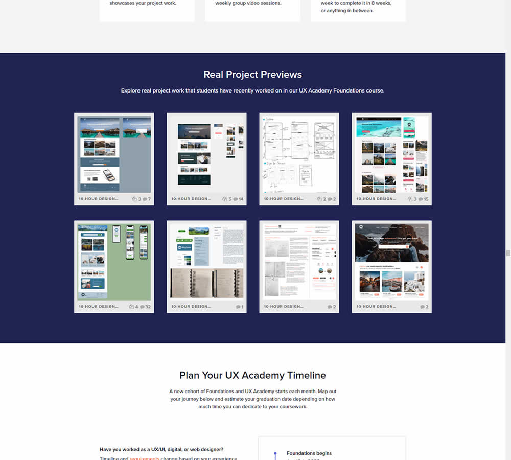
In this experiment for an online design course, the variation had an extra section with student work previews. The previews were not clickable but were added just below the fold. Impact on leads was measured by potential students requesting a syllabus through an online form throughout the long landing page.
Test #392 on
by
 Jakub Linowski
Dec 31, 2021
Desktop
Mobile
Product
Jakub Linowski Tested Pattern #122: Zigzag Layout In Test #392
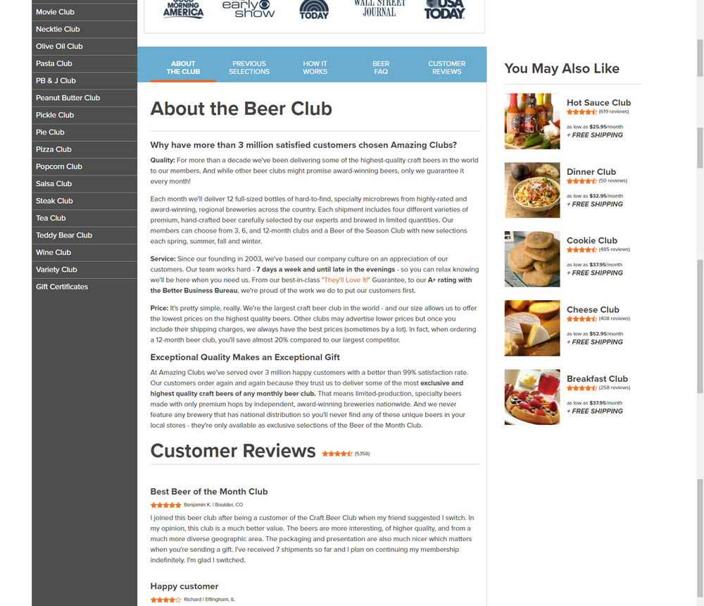

In this experiment, paragraph style copy was reorganized into a zig zag layout with key sections being reinforiced with copy-as-image statements. Impact on adds-to-cart and sales was measured.
Test #385 on
Snocks.com
by
 Samuel Hess
Nov 25, 2021
Mobile
Product
Samuel Hess Tested Pattern #63: Trust Seals In Test #385 On Snocks.com


In this experiment, a simple Amazon badge was added on a product page. The translated (Google) language read: "Since we founded snocks, our customers have always been our focus - we are constantly trying to develop further. That's why we're extremely proud that Amazon attracted attention and that they named us Sales Partner of the Year in 2019."
Test #382 on
Snocks.com
by
 Samuel Hess
Oct 31, 2021
Desktop
Product
Samuel Hess Tested Pattern #43: Long Titles In Test #382 On Snocks.com
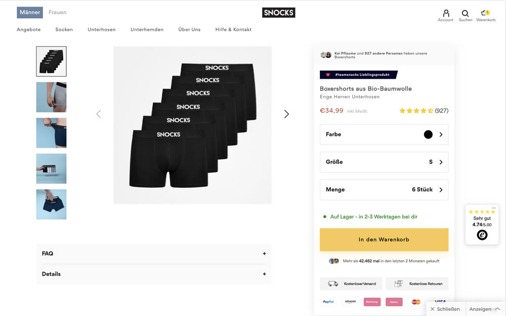

In this experiment, the variation contained a simple text change that described the quality of the product. According to Google Translate the text changed from "tight men's underpants" (control) to "are so comfortable that you don't feel them when you wear them" (variation).
Test #378 on
by
 Jakub Linowski
Oct 07, 2021
Desktop
Mobile
Product
Jakub Linowski Tested Pattern #119: Unselected Or Selected Defaults In Test #378

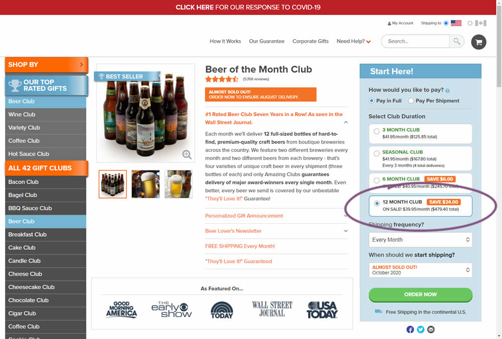
Here we have an experiment with a variation that preselected an option for a club duration. The control required customers to first express the choice for how many months they would like to order a product for. Whereas the variation defaulted to 12 months from the beginning.
Impact on adds-to-cart and sales was measured. The experiment unfortunately had to be stopped early due to another embedded variation that was performing poorly. And so it does not have many transactions.
Test #376 on
Snocks.com
by
 Samuel Hess
Sep 29, 2021
Mobile
Desktop
Product
Samuel Hess Tested Pattern #15: Bulleted Reassurances In Test #376 On Snocks.com
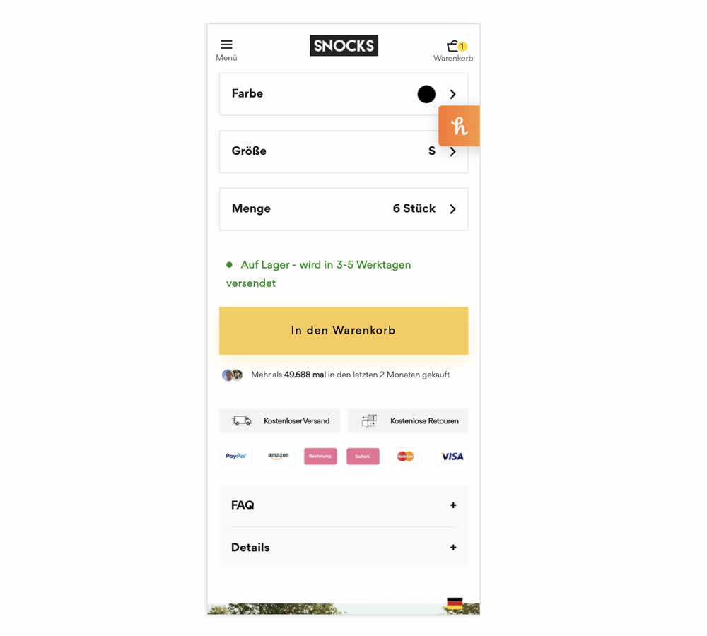
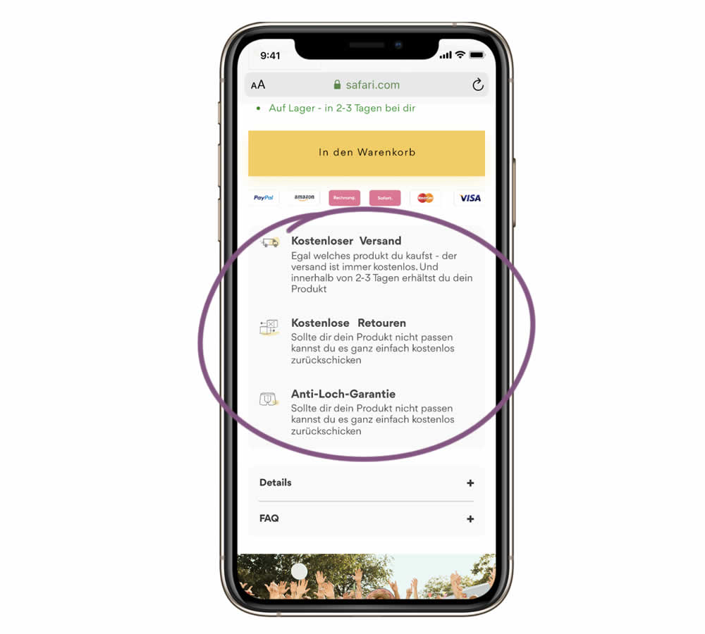
In this experiment, a series of reassurances were added just below the add to cart button. These included: "free shipping", "free returns" and an "anti-hole guarantee". The test ran on the product page of an socks ecommerce company. Impact on sales was measured.
Test #372 on
Fluke.com
by
 Marika Francisco
Aug 30, 2021
Desktop
Product
Marika Francisco Tested Pattern #122: Zigzag Layout In Test #372 On Fluke.com
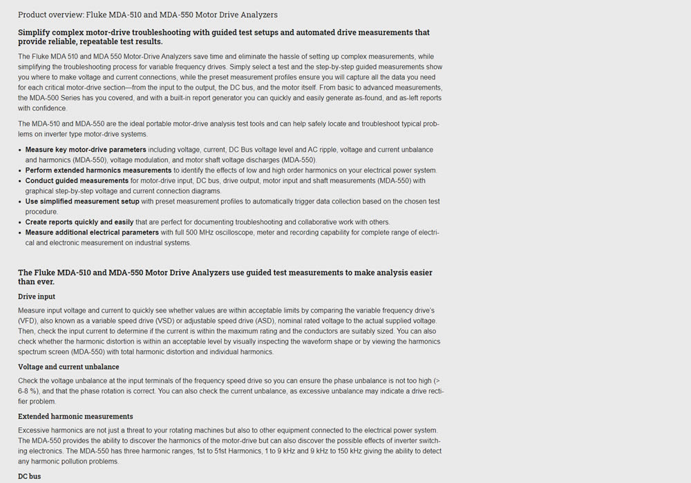
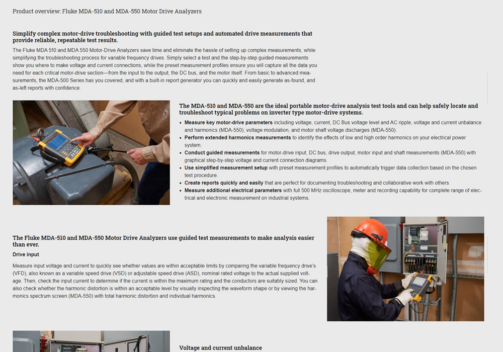
In this experiment, product descriptions were changed to an alternating zig zag layout with images. Impact on adds-to-cart and sales was measured.
Test #366 on
Mvideo.ru
by
 Andrey Andreev
Jul 14, 2021
Desktop
Mobile
Product
Andrey Andreev Tested Pattern #93: Auto Next In Test #366 On Mvideo.ru
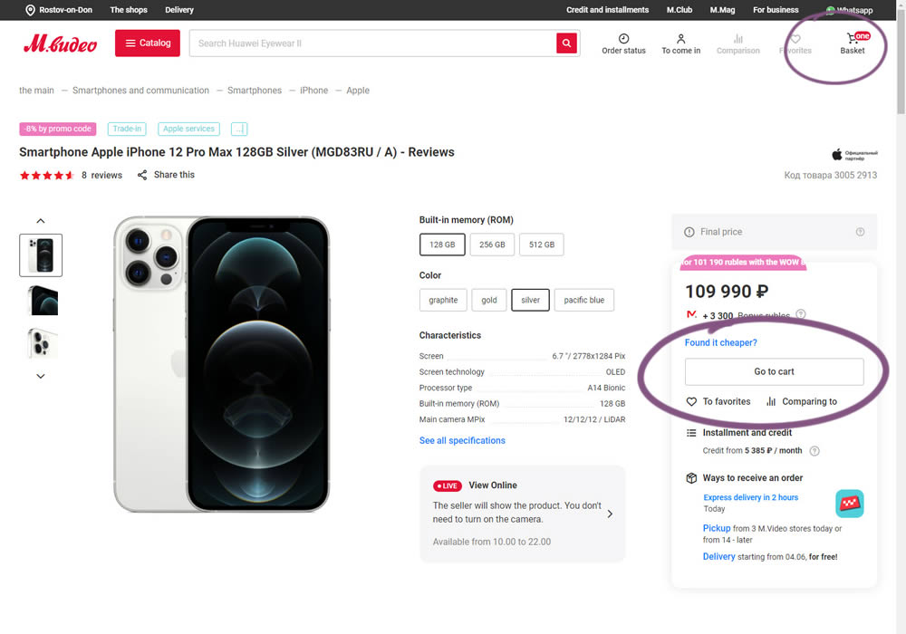
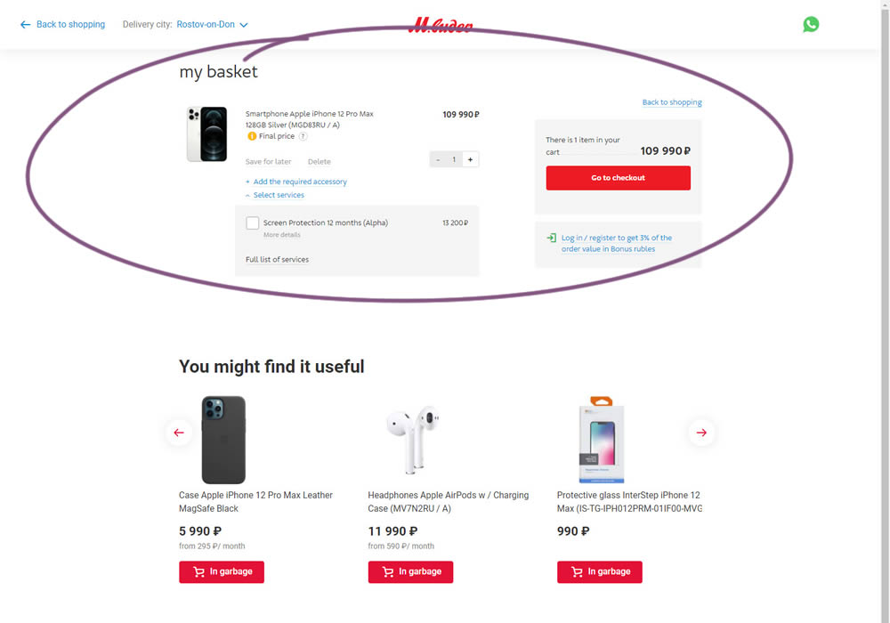
In this experiment, the interaction on a product page was changed. In the control (A), after clicking "add to cart", the customer would remain on the product page with an updated basket and the button changing to "Go To Cart". The variation (B) however took customers forward automatically to the cart.
Test #365 on
Mvideo.ru
by
 Andrey Andreev
Jul 13, 2021
Mobile
Product
Andrey Andreev Tested Pattern #4: Testimonials In Test #365 On Mvideo.ru


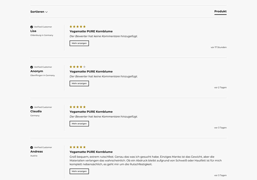
In this experiment, reviews on product pages were exposed completely. Instead of hiding them under a clickable tab, they were shown by default in the variation. Impact on sales was measured.
Test #364 on
Lotuscrafts.eu
by
 Samuel Hess
Jul 06, 2021
Desktop
Product
Samuel Hess Tested Pattern #122: Zigzag Layout In Test #364 On Lotuscrafts.eu
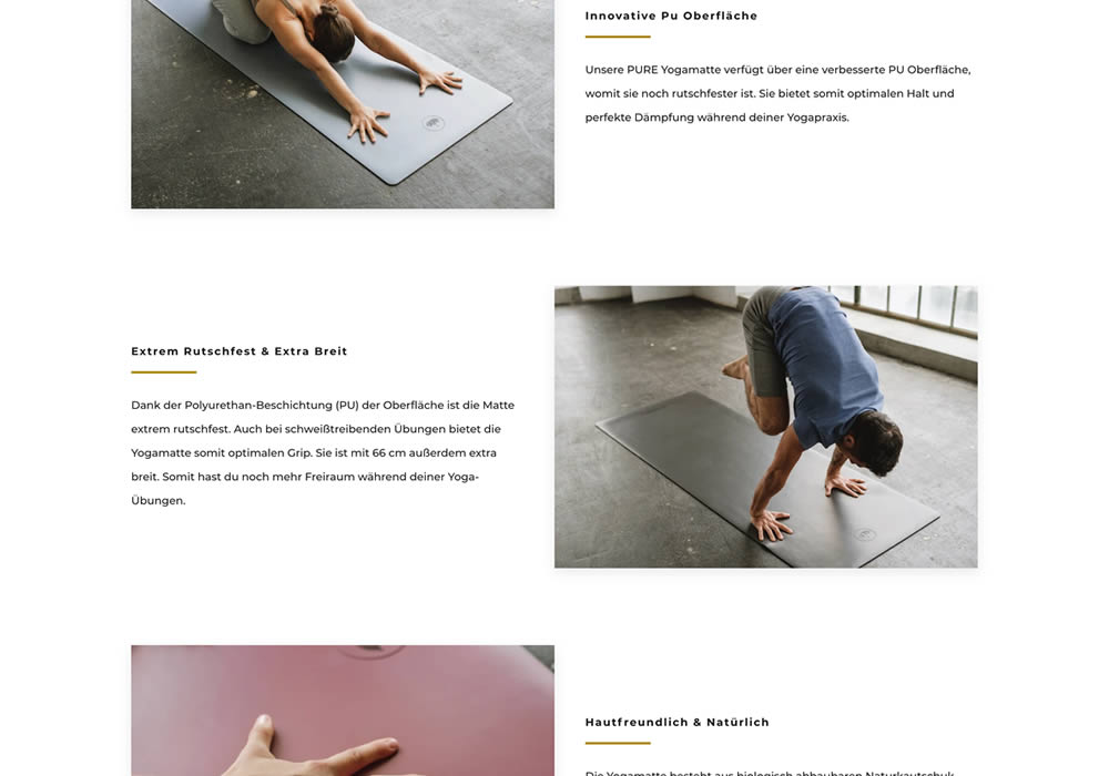
In this experiment, product descriptions or qualities were added using a zigzag layout pattern composed of photos and extra copy. This sections was appended between existing copy and testimonials. Some of the copy highlights included wording such as "innovative surface", "non-slip and wide", and "skin-friendly". Impact on adds-to-cart and sales was measured.
Test #363 on
by
 Jakub Linowski
Jul 05, 2021
Desktop
Mobile
Product
Jakub Linowski Tested Pattern #30: Authentic Photos In Test #363
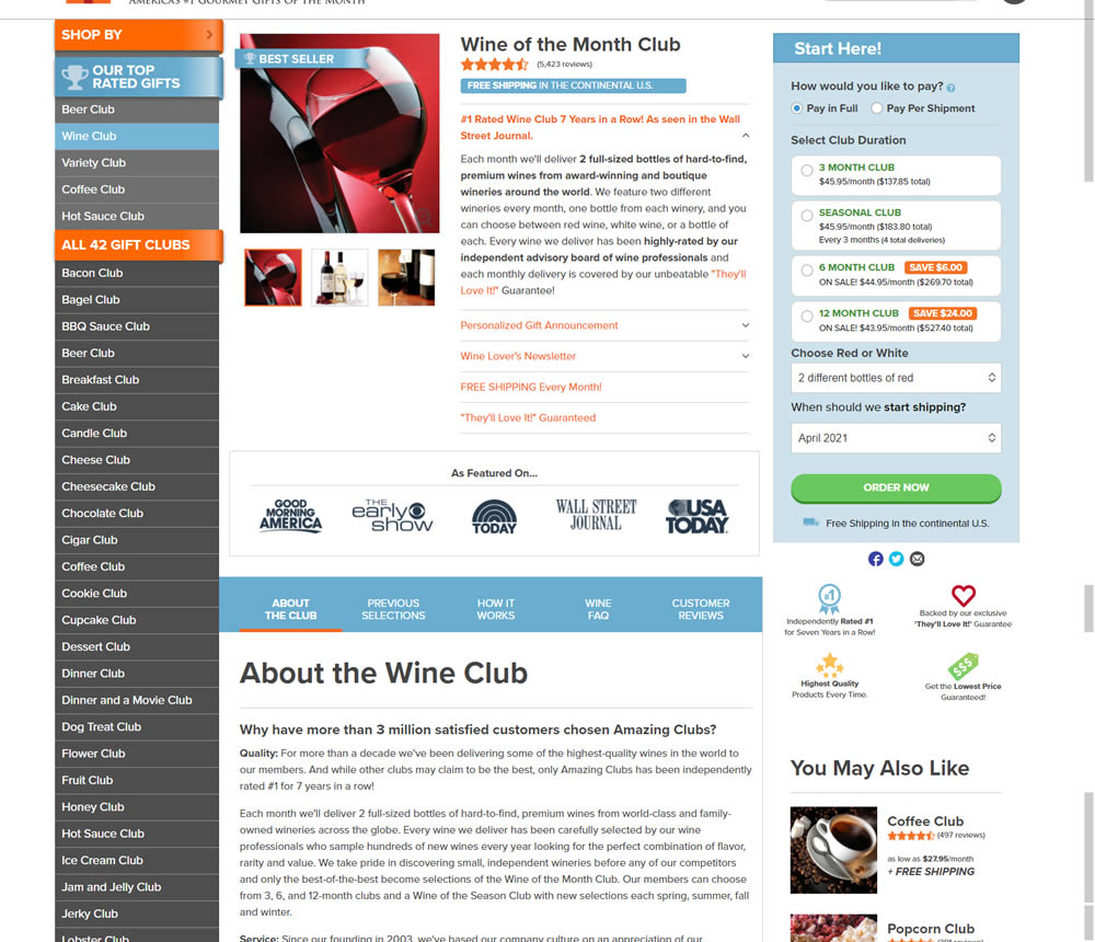

In this experiment, six product photos from were added which showed the actual products (including unboxing images).
Test #362 on
Vivareal.com.br
by
 Vinicius Barros Peixoto
Jun 23, 2021
Desktop
Mobile
Product
Vinicius Barros Peixoto Tested Pattern #7: Social Counts In Test #362 On Vivareal.com.br
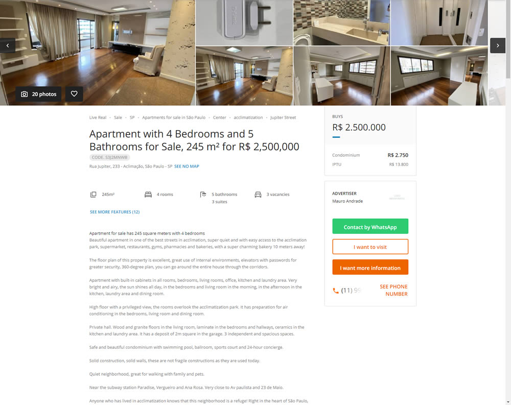
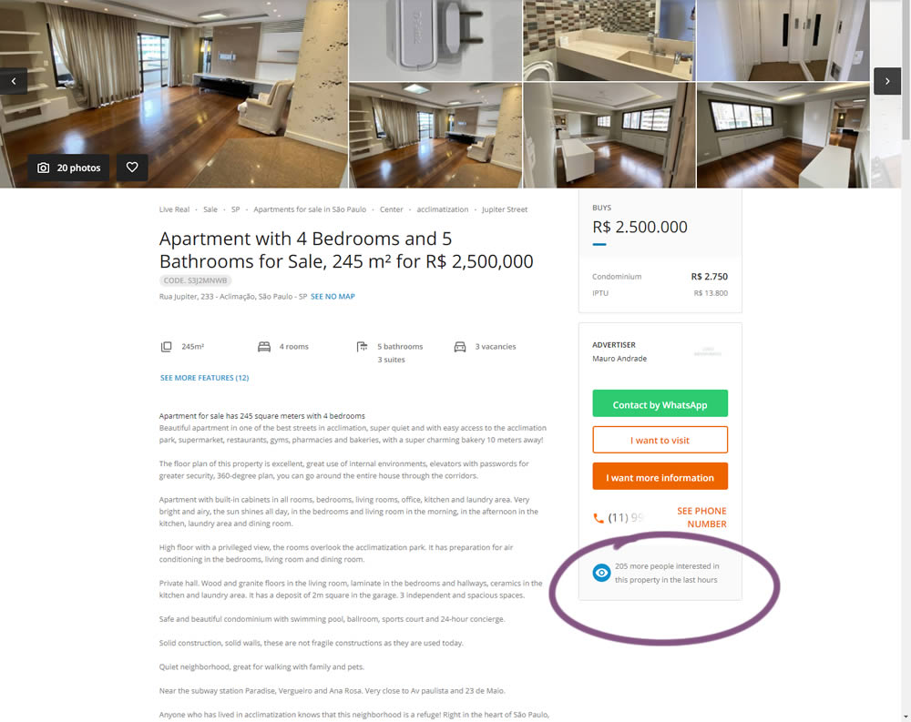
In this experiment, the number of recent property views was displayed under the call to action. Impact on overall lead generation was measured. (Translated using Google from Brazilian Portuguese.)
Test #361 on
Chaosgroup.com
by
 Velin Penev
Jun 22, 2021
Desktop
Product
Velin Penev Tested Pattern #49: Above The Fold Call To Action In Test #361 On Chaosgroup.com


In this experiment, a pricing plan selector was shifted from the very bottom of a long product page towards (almost) the top. Impact on any transactions or sales was measured.