All Latest 556 A/B Tests
Become a member to unlock the abiltiy to see the highest impact a/b tests. Being able to see the actual test results and sort by impact allows growth and experimentation teams to take action on the biggest gains first
MOST RECENT TESTS
Test #330 on
Backstage.com
by
 Stanley Zuo
Dec 29, 2020
Desktop
Content
Stanley Zuo Tested Pattern #116: Links Or Buttons In Test #330 On Backstage.com
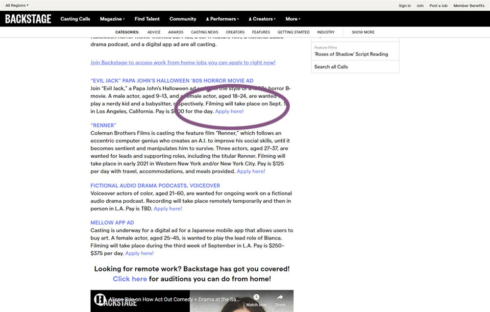
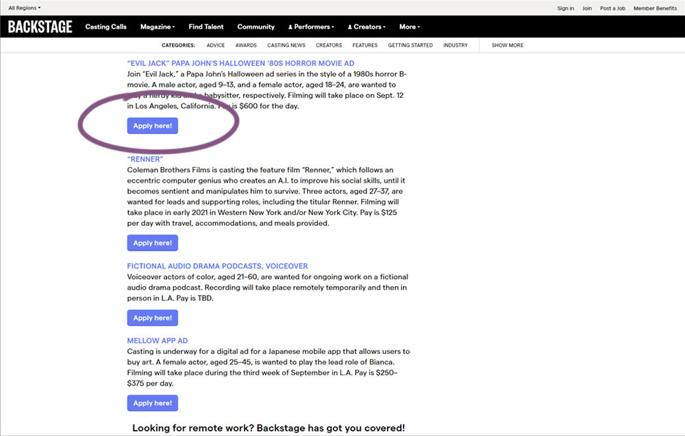
In this simple experiment on a content page, links were turned into more prominent buttons. The experiment measured clicks and signups.
Test #329 on
Snocks.com
by
 Samuel Hess
Dec 23, 2020
Mobile
Home & Landing
Samuel Hess Tested Pattern #14: Exposed Menu Options In Test #329 On Snocks.com
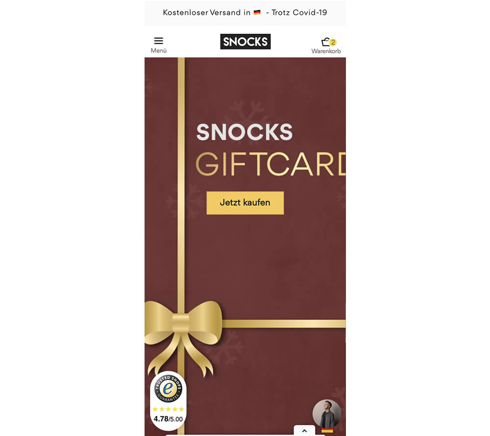
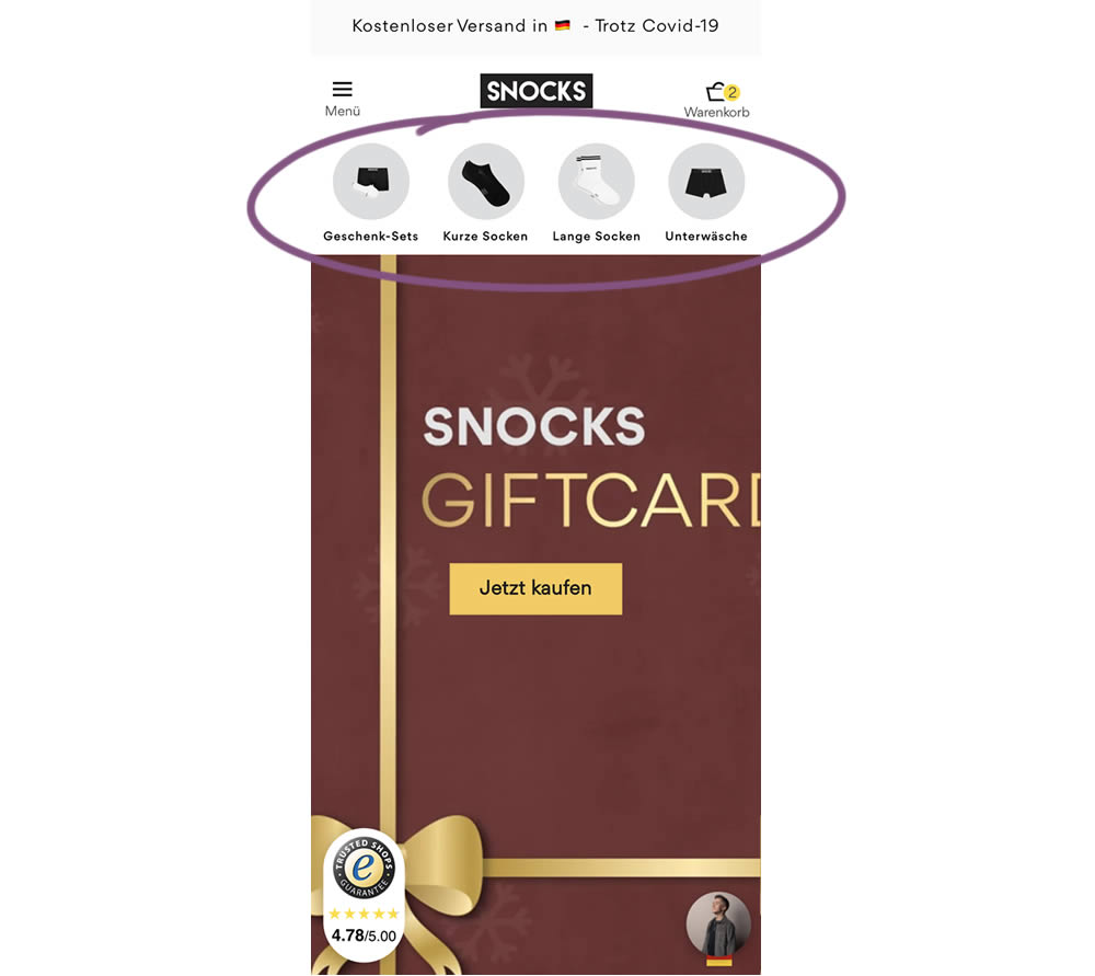
In this homepage experiment, a series of product categories were shown more visible near the top of the screen (instead of only being shown inside the hamburger menu). They linked up to corresponding listing pages with such items as: gifts, short socks, long socks, and underwear. Impact on adds-to-cart and total sales was measured.
Test #328 on
Umbraco.com
by
 Lars Skjold Iversen
Dec 21, 2020
Desktop
Mobile
Home & Landing
Lars Skjold Iversen Tested Pattern #60: Repeated Bottom Call To Action In Test #328 On Umbraco.com
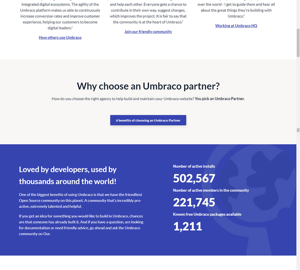
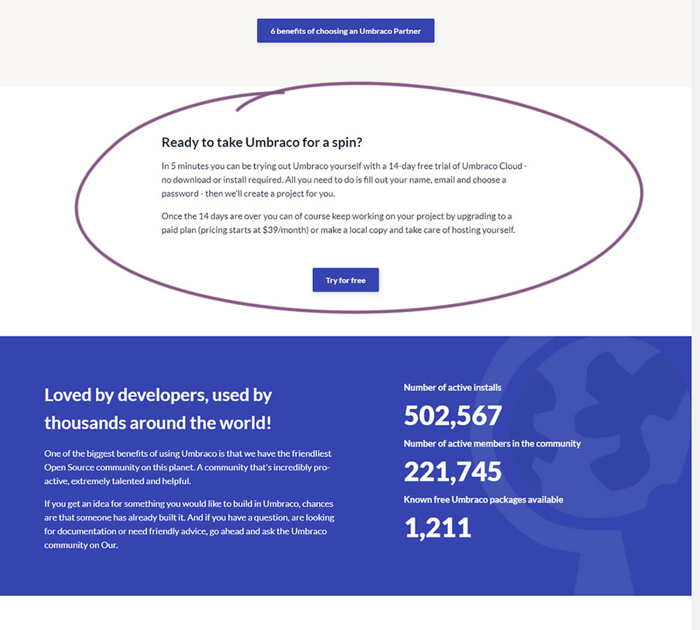
In this experiment, a trial signup section was added at the bottom of Umbraco's long homepage (CMS business). The experiment measured the impact on trial signups.
Test #10 on
Tradegecko.com
by
 Syed AtiF Husain
Nov 30, 2020
Desktop
Home & Landing
Syed AtiF Husain Tested Pattern #10: Postponed Modal Forms In Test #10 On Tradegecko.com


In this experiment, 3 form fields were removed (postponed to a next step) from the homepage leaving only a "Start Trail" button. When users clicked on the "Start A Free 14 Day Trial" button, in both the control and variation they've seen the same next registration page with all of the fields. The registration page repeated the same fields with their corresponding values, as well as asked for a password as an extra field. The experiment measured successful leads.
Test #98 on
3dhubs.com
by
 Rob Draaijer
Nov 30, 2020
Desktop
Mobile
Listing
Rob Draaijer Tested Pattern #24: Visible Availability In Test #98 On 3dhubs.com
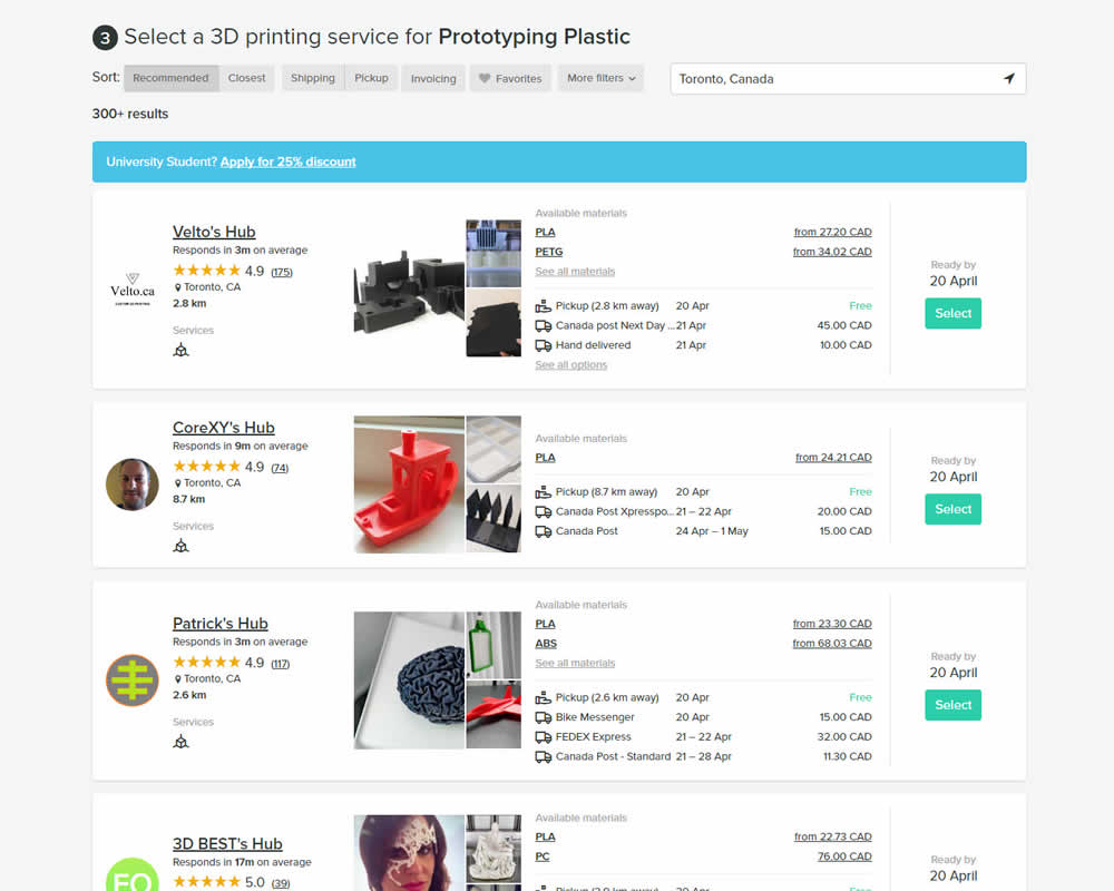
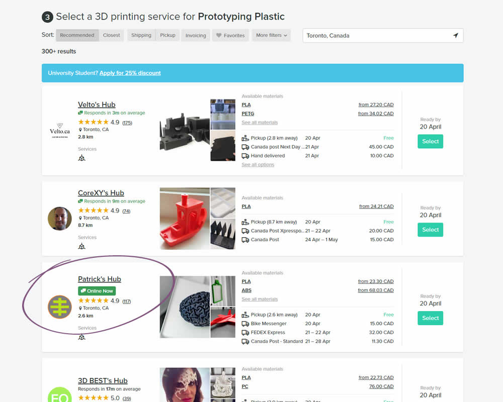
In this experiment, the variation showed a listing's owner online status as a badge, instead of showing their average "response time". More specifically, an "Online Now" badge was shown beside individual listings of a 3D printing marketplace site. The experiment measured completed quote / lead requests (a few steps further).
Test #327 on
Backstage.com
by
 Stanley Zuo
Nov 26, 2020
Desktop
Signup
Stanley Zuo Tested Pattern #120: Supporting Theme Images In Test #327 On Backstage.com


In this experiment, an aspirational photo was shown on the right side panel - reinforcing the theme of casting calls. The experiment measured progression to the next step and completed signups.
Test #326 on
Thomasnet.com
by
 Kyle Phillips
Nov 25, 2020
Desktop
Mobile
Content
Kyle Phillips Tested Pattern #41: Sticky Call To Action In Test #326 On Thomasnet.com


In this simple experiment on an article page, the variation slid out a sticky call to action linking to the next article. The sliding interaction triggered after some scrolling threshold (around 1000px or so). Afterwards, the sticky call to action maintained its floating position. The experiment measured clicks on this "next article" button.
Test #325 on
Snocks.com
by
 Samuel Hess
Nov 24, 2020
Desktop
Global
Samuel Hess Tested Pattern #45: Benefit Bar In Test #325 On Snocks.com
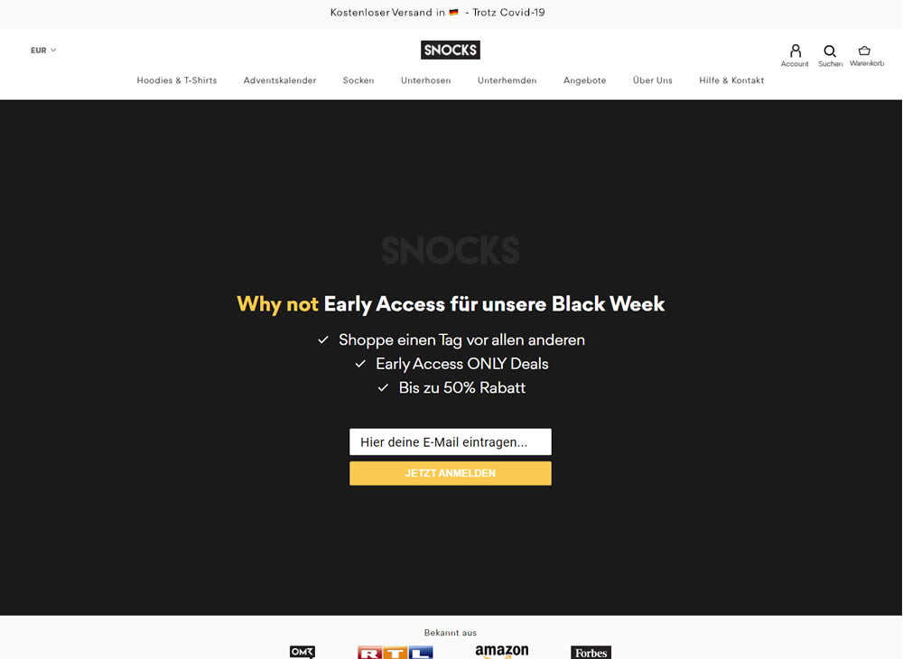
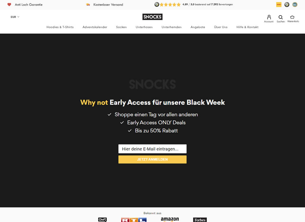
In this experiment, a set of reassurances and reviews were added in the header of this ecommerce website. Translating from German, these read: "Anti Hole Guarantee", "Free Shipping" and "X Ratings out of Y Reviews".
Test #324 on
by
 Jakub Linowski
Oct 30, 2020
Desktop
Mobile
Product
Jakub Linowski Tested Pattern #17: Least Or Most Expensive First In Test #324
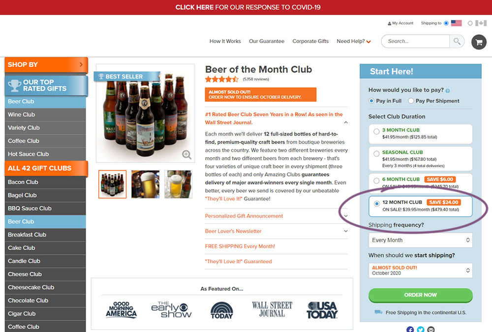
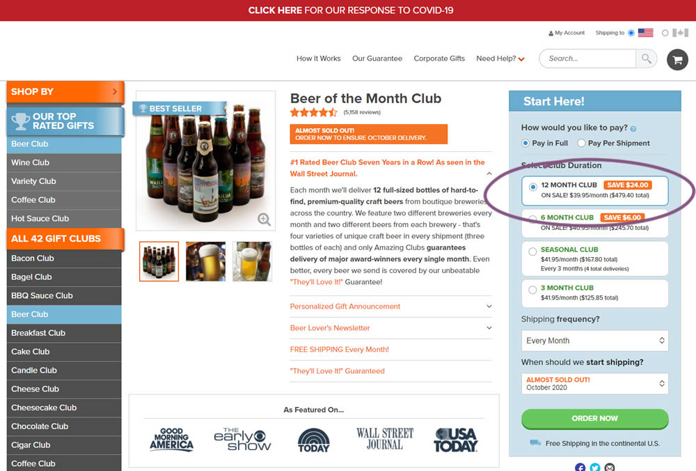
This experiment tested the order of purchase plans. The control version sorted the purchase options by the least expensive while the variation sorted them by the most expensive first. Impact on sales and revenue was measured.
Test #323 on
Backstage.com
by
 Stanley Zuo
Oct 29, 2020
Mobile
Signup
Stanley Zuo Tested Pattern #117: Company Logos In Test #323 On Backstage.com
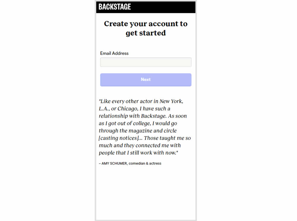
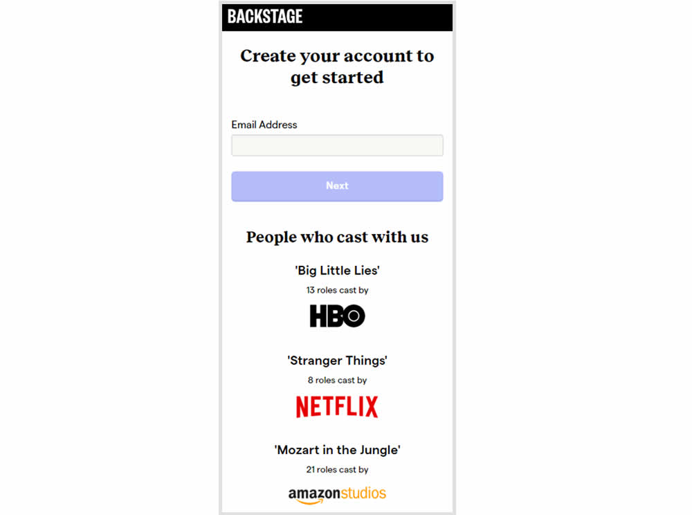
In this experiment, the variation replaced a text testimonial with high-profile production companies that have cast with Backstage. The logos were shown during the signup and checkout flow.
Test #322 on
Thomasnet.com
by
 Kyle Phillips
Oct 27, 2020
Desktop
Mobile
Product
Kyle Phillips Tested Pattern #82: Onboarding Callouts In Test #322 On Thomasnet.com
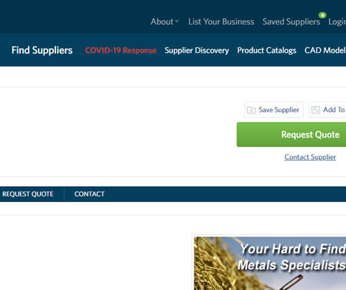
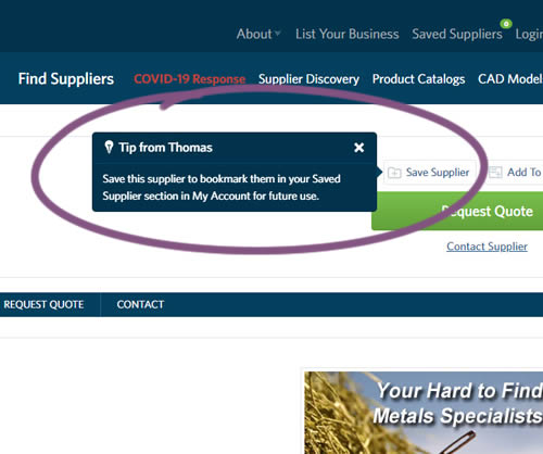
This experiment variation prompted users to save (bookmark) a company profile on a company detail page. Clicking on the save feature while logged out, would prompt a registration modal. Hence the save feature acted as an extra reason to signup. The number of people engaging or interacting with the feature was measured, as well as registrations.
Test #321 on
Elevate App App
by
 Jesse Germinario
Oct 23, 2020
Mobile
Jesse Germinario Tested Pattern #11: Gradual Reassurance In Test #321
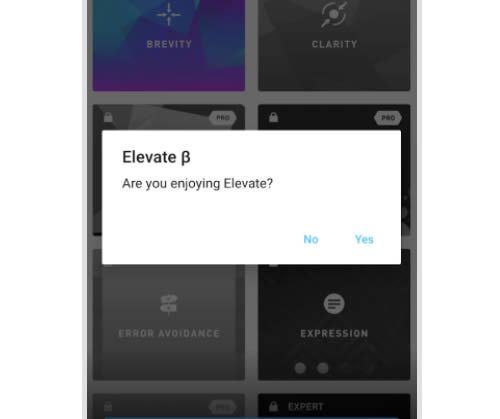
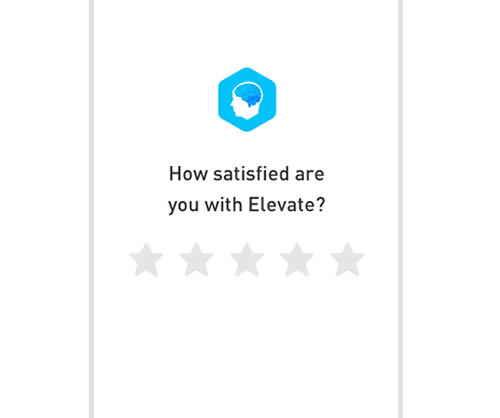
This experiment aimed to increase the number of application ratings from within the Elevate app. Success was measured by the number of users going towards Google Play to create the rating. The control version prompted users if they wanted to rate the app with a simple yes and no answer. The variation however presented the rating choice right away in the form of 5 stars - enabling users to express their choice sooner.
Test #320 on
by
 Jakub Linowski
Oct 20, 2020
Desktop
Checkout
Jakub Linowski Tested Pattern #49: Above The Fold Call To Action In Test #320
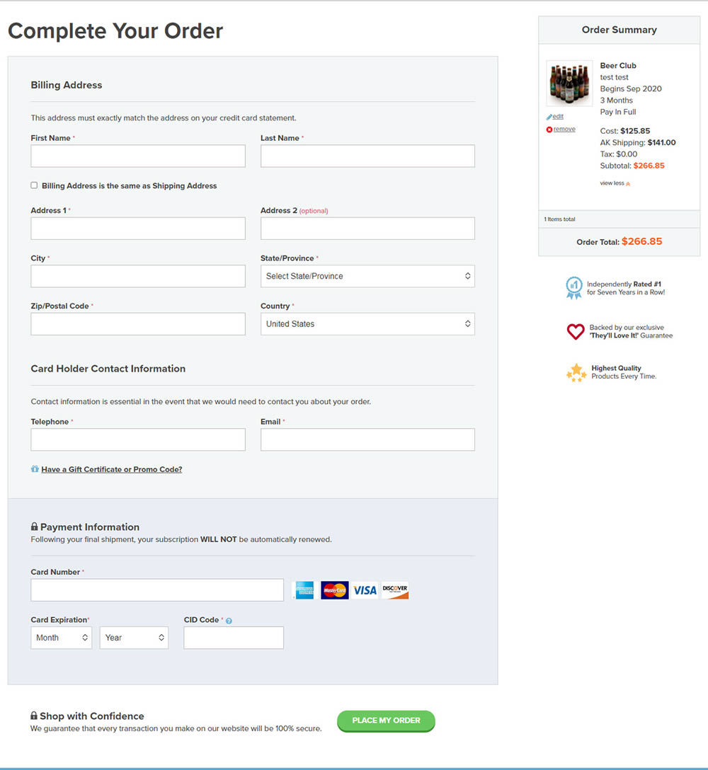
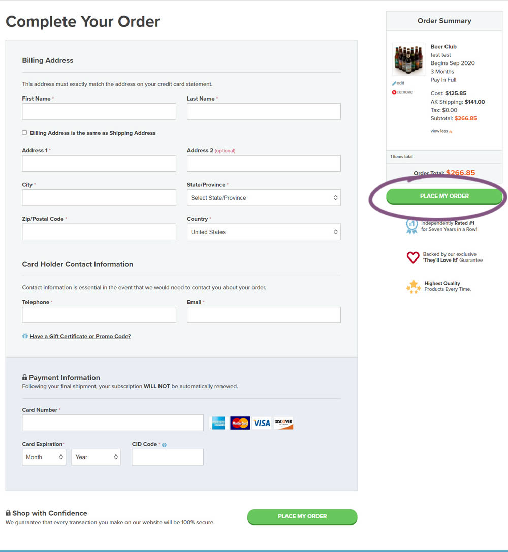
An extra "Place Order" button was duplicated above the fold on this checkout page. The control had a similar button further down at the bottom of the screen. The impact on total sales was measured from this change.
Test #319 on
Backstage.com
by
 Stanley Zuo
Sep 30, 2020
Desktop
Pricing
Stanley Zuo Tested Pattern #113: More Or Fewer Plans In Test #319 On Backstage.com
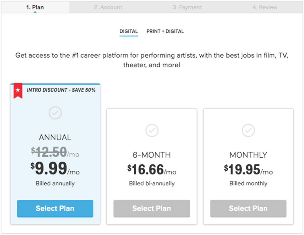
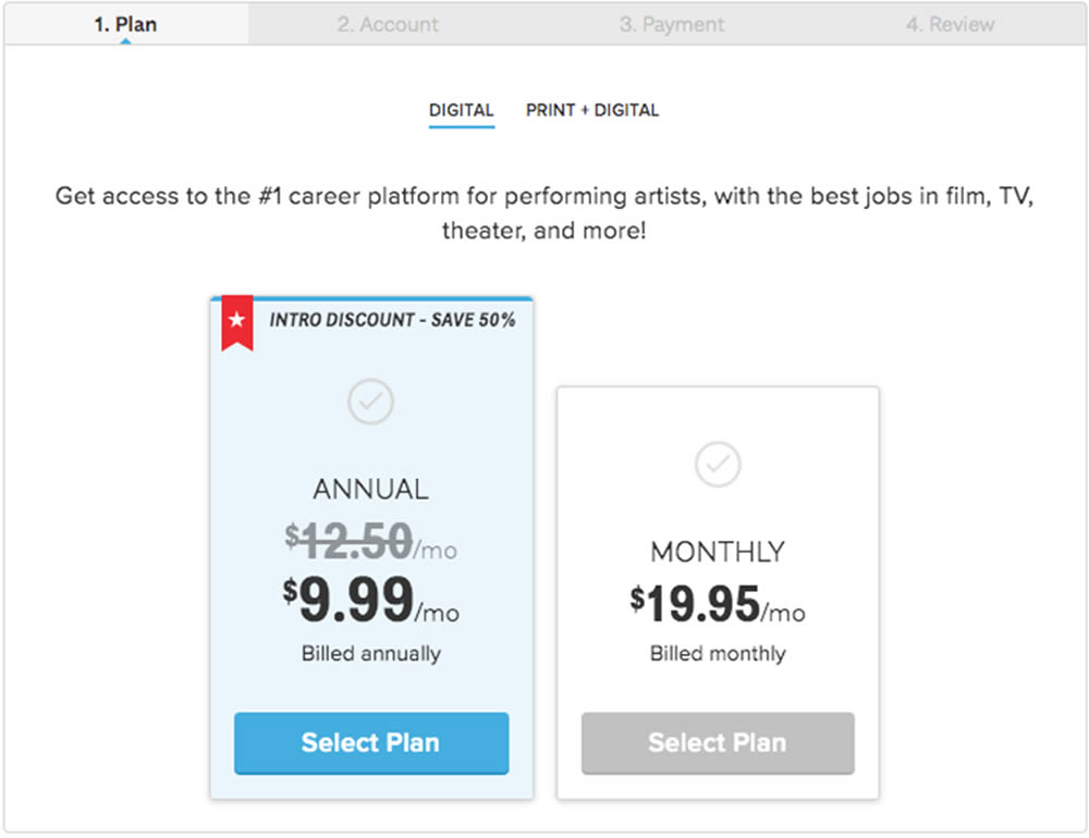
In this experiment, a 3 plan vs 2 plan pricing page was shown to potential customers. Impact on sales and revenue were measured.
Test #318 on
Thomasnet.com
by
 Kyle Phillips
Sep 29, 2020
Desktop
Mobile
Content
Kyle Phillips Tested Pattern #60: Repeated Bottom Call To Action In Test #318 On Thomasnet.com

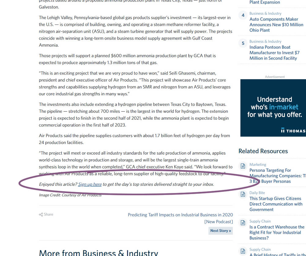
In this experiment, a simple link to a newsletter signup landing page was added at the bottom of an article. The newsletter landing page then encouraged users to provide their email address for future article updates.
Test #317 on
Volders.com
by
Michal Fiech
Sep 28, 2020
Mobile
Signup
Michal Fiech Tested Pattern #119: Unselected Or Selected Defaults In Test #317 On Volders.com
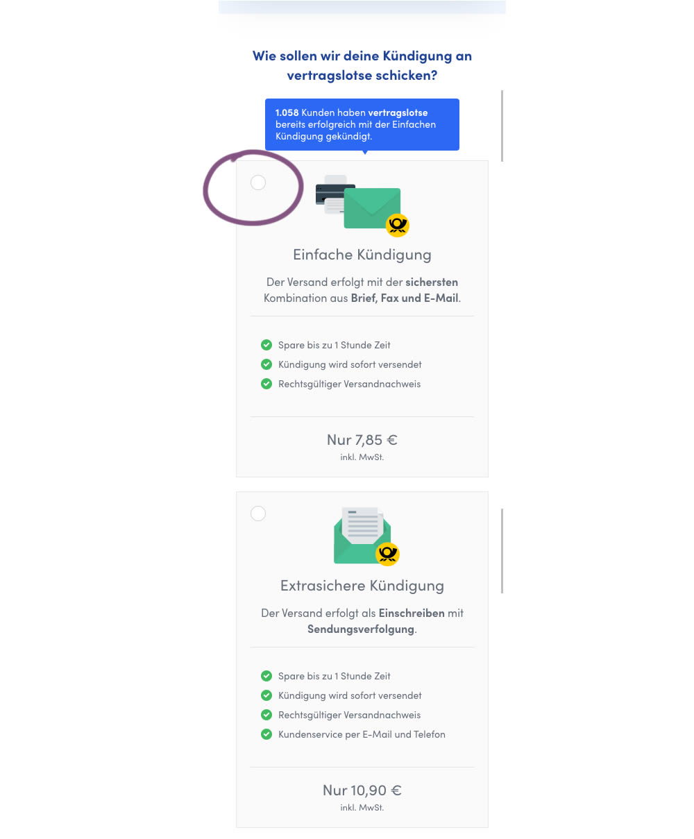
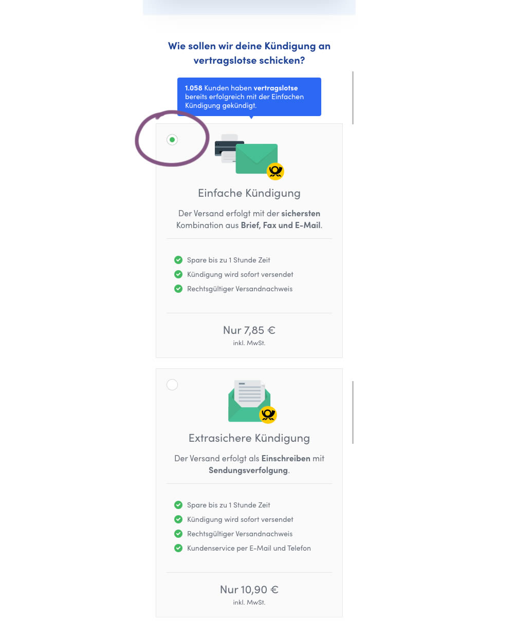
In this mobile experiment, an unselected vs selected payment plan was tested for its impact on sales. The experiment ran on a mid page of a signup funnel where customers were being asked to select one of two payment plans.
Test #316 on
Trydesignlab.com
by
 Daniel Shapiro
Sep 24, 2020
Desktop
Mobile
Home & Landing
Daniel Shapiro Tested Pattern #22: Empowering Headline In Test #316 On Trydesignlab.com


In this experiment, the headline was changed to focus more on the end-goal of the UX Academy program - that of landing your first UI/UX role.
Test #99 on
Vivareal.com.br
by
 Rodrigo Maués
Sep 23, 2020
Desktop
Mobile
Product
Rodrigo Maués Tested Pattern #24: Visible Availability In Test #99 On Vivareal.com.br
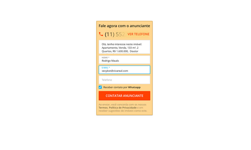
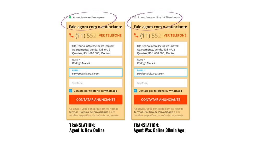
In this experiment, a lead form on a listing page showed whether an agent was recently online or not. The diplayed had two statuses: either indicating that someone is online now, or the most recent time they were online in minutes.
Test #315 on
Backstage.com
by
 Stanley Zuo
Aug 22, 2020
Mobile
Signup
Stanley Zuo Tested Pattern #7: Social Counts In Test #315 On Backstage.com
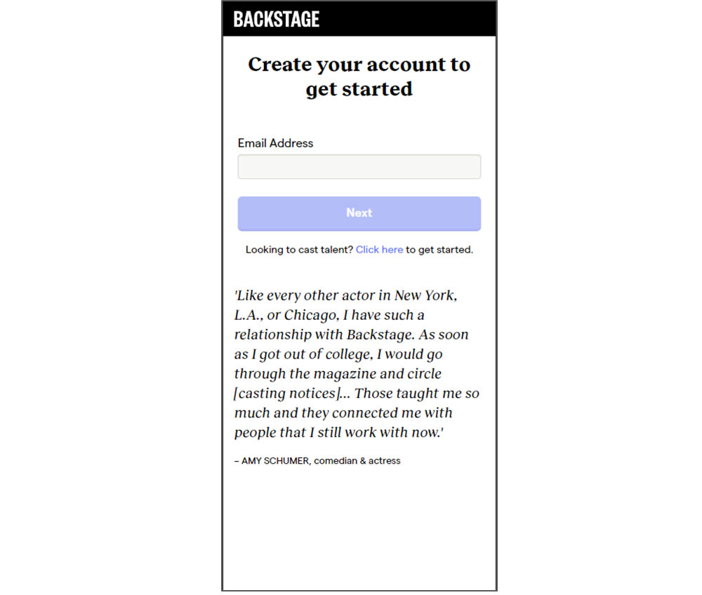
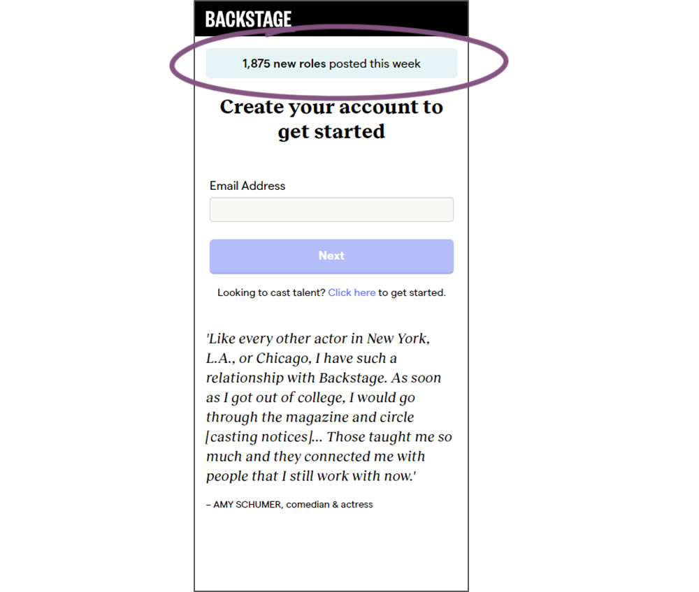
In this experiment, a dynamic number of job postings was displayed during the signup process - reinforcing the value of signing up for membership access.
Test #314 on
Zapimoveis.com.br
by
 Vinicius Barros Peixoto
Aug 21, 2020
Desktop
Mobile
Product
Vinicius Barros Peixoto Tested Pattern #43: Long Titles In Test #314 On Zapimoveis.com.br
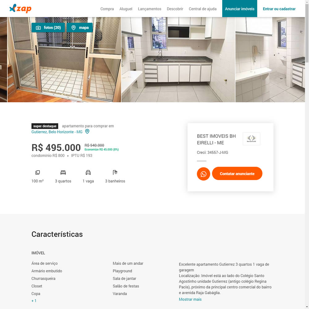
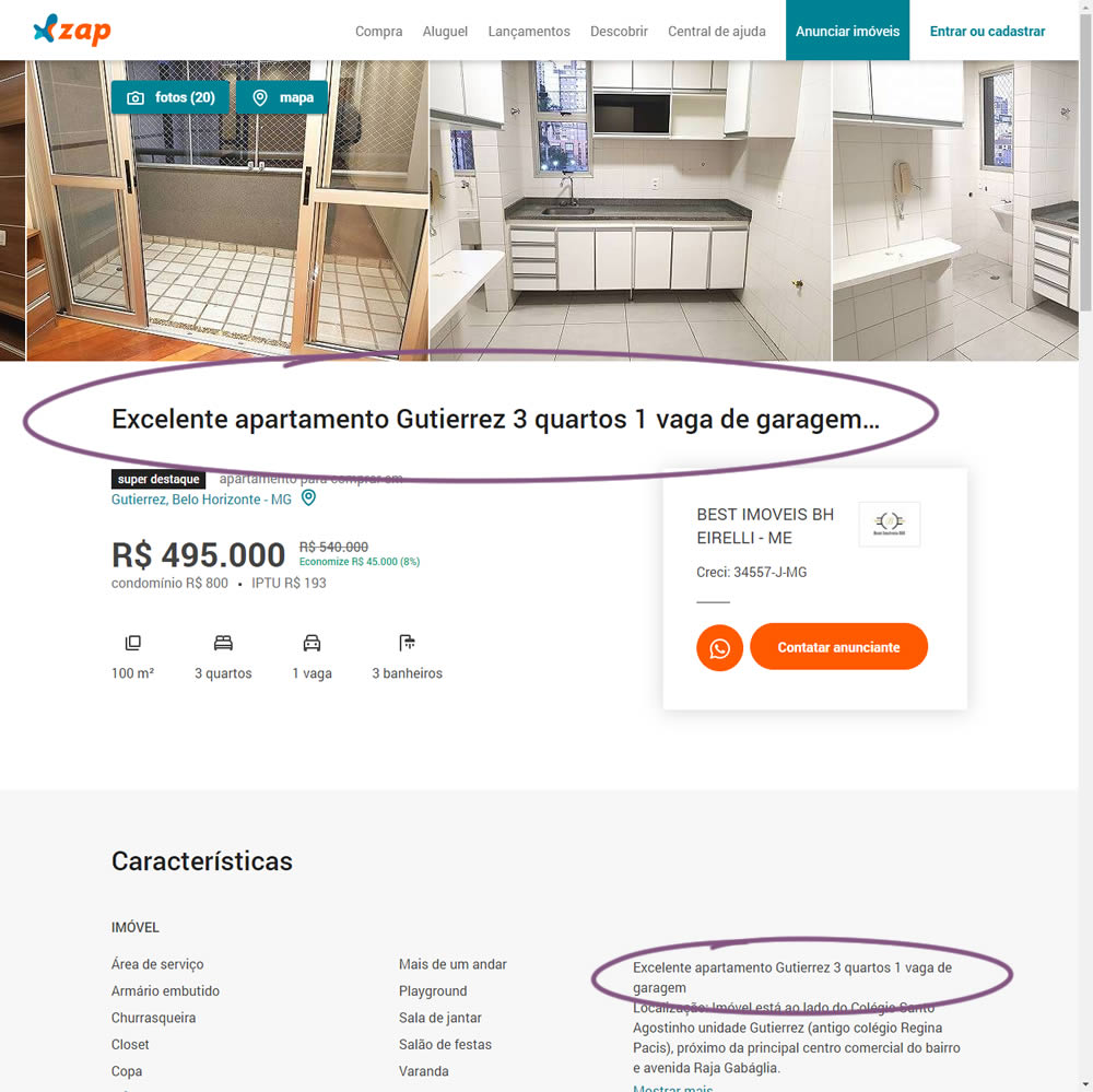
In this experiment, a dynamic page title was generated and added at the top of the screen. The first few words from a property description were used to dynamically generate these titles. The effect on leads was measured.