All Latest 556 A/B Tests
Become a member to unlock the abiltiy to see the highest impact a/b tests. Being able to see the actual test results and sort by impact allows growth and experimentation teams to take action on the biggest gains first
MOST RECENT TESTS
Test #348 on
Flukenetworks.com
by
 Marika Francisco
Apr 22, 2021
Desktop
Home & Landing
Marika Francisco Tested Pattern #97: Bigger Form Fields In Test #348 On Flukenetworks.com


In this simple experiment, the size of the "Get Quote" button in the top navigation was increased.
Test #347 on
by
 Jakub Linowski
Apr 07, 2021
Desktop
Mobile
Home & Landing
Jakub Linowski Tested Pattern #26: Cart Reminder And Recently Viewed In Test #347


In this experiment, when customers viewed a product and returned to the homepage, they would then see the most recently viewed one - a delicate nudge. The experiment ran with full traffic and impact on sales was measured.
Test #104 on
3dhubs.com
by
 Rob Draaijer
Mar 31, 2021
Desktop
Listing
Rob Draaijer Tested Pattern #15: Bulleted Reassurances In Test #104 On 3dhubs.com
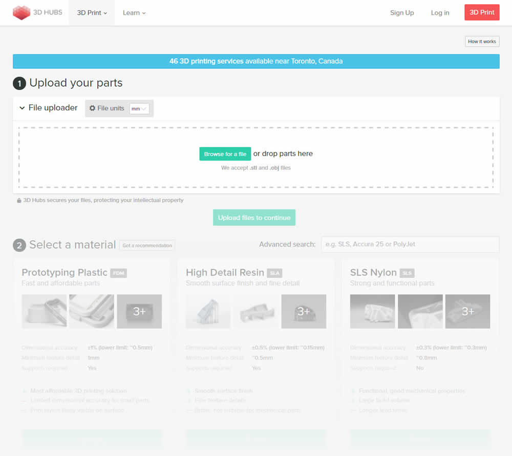
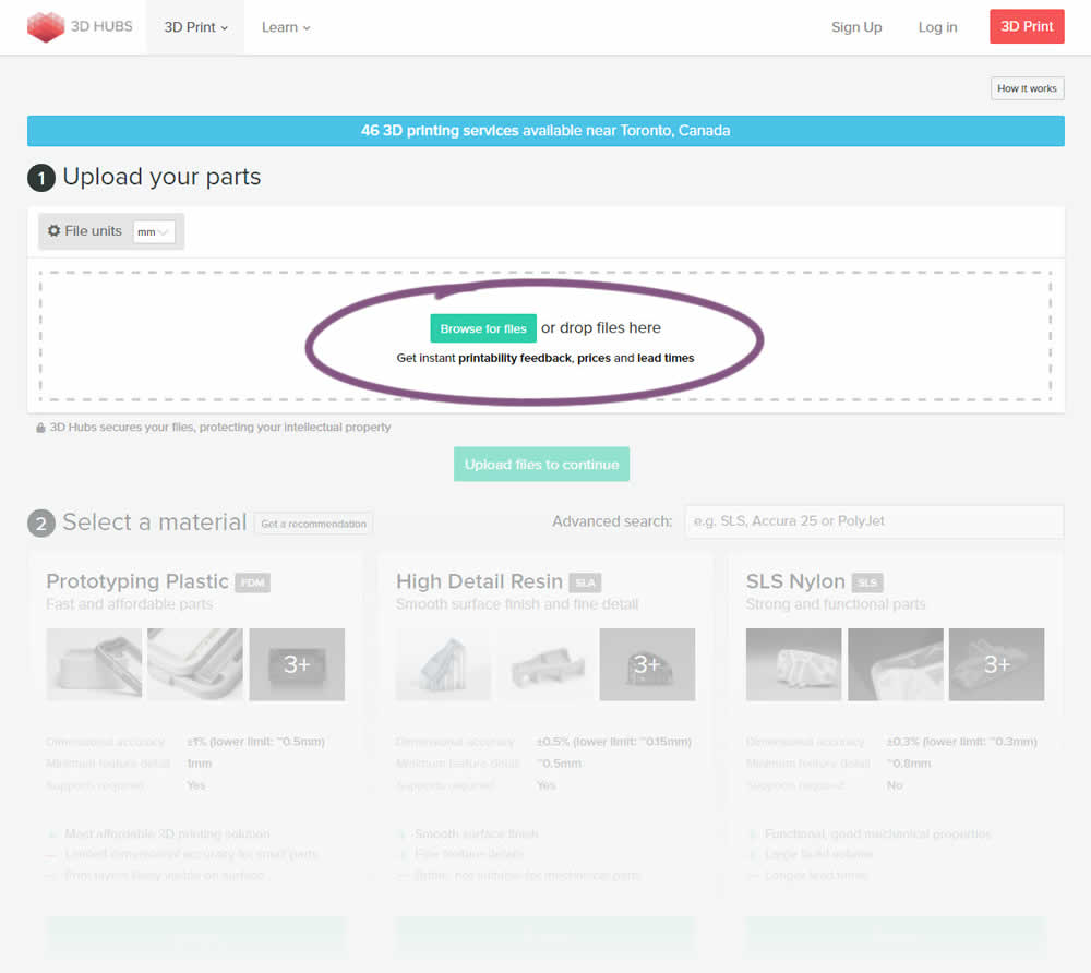
This experiment attempted to increase the number of leads on a lead-funnel. As the first step, users were being asked to upload a file. The control showed the file types that were allowed, whereas the variation changed the copy to show a number of benefits for taking that action. The text-based benefits included the: receiving feedback, prices and lead times.
Test #346 on
by
 Stanley Zuo
Mar 30, 2021
Desktop
Mobile
Home & Landing
Stanley Zuo Tested Pattern #117: Company Logos In Test #346
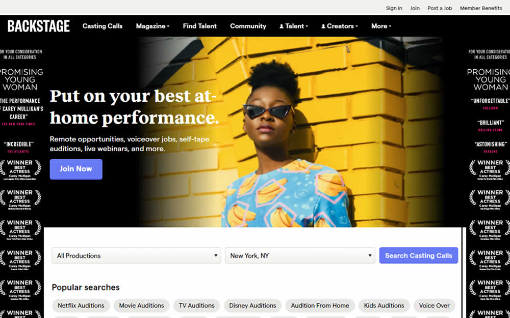
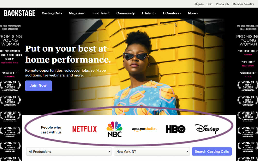
In this homepage experiment, company logos were added to the homepage. These were example clients or companies that Backstage works with and offers casting (job) listing from. Impact on the registration flow and membership checkouts was measured.
Test #345 on
Getninjas.com.br
by
 Rodolfo Lugli
Mar 29, 2021
Desktop
Home & Landing
Rodolfo Lugli Tested Pattern #9: Multiple Steps In Test #345 On Getninjas.com.br

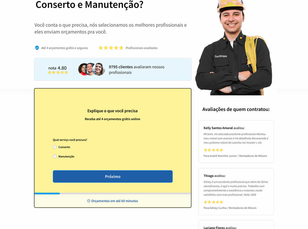
In this experiment, a single long form was broken into at least 3 steps.
Test #343 on
Snocks.com
by
 Samuel Hess
Mar 12, 2021
Desktop
Mobile
Product
Samuel Hess Tested Pattern #122: Zigzag Layout In Test #343 On Snocks.com


In this experiment, the content on a product page was reorganized into a zigzagging (alternating layout) along with reinforcing photos. Impact on adds-to-cart and total sales was measured.
Test #344 on
by
 Jakub Linowski
Mar 11, 2021
Desktop
Checkout
Jakub Linowski Tested Pattern #108: Frequently Asked Questions In Test #344
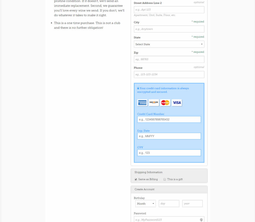

Three common delivery questions were answered at the bottom of a checkout page.
Test #86 on
Vivareal.com.br
by
 Rodrigo Maués
Feb 28, 2021
Mobile
Desktop
Product
Rodrigo Maués Tested Pattern #3: Fewer Form Fields In Test #86 On Vivareal.com.br


In this experiment, the telephone field was removed from a lead form on a property page. Impact on leads was measured.
Test #342 on
Backstage.com
by
 Stanley Zuo
Feb 28, 2021
Desktop
Mobile
Listing
Stanley Zuo Tested Pattern #25: Nagging Results In Test #342 On Backstage.com

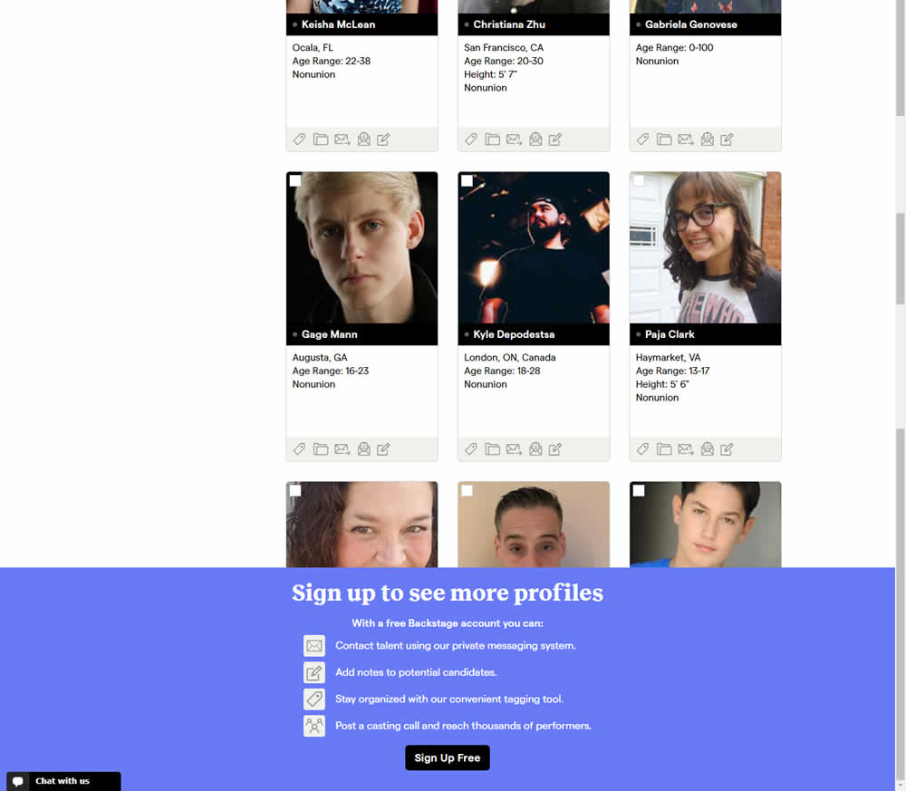
In this experiment, a registration wall was added on a listing page of casting call profiles. The registration wall appeared after the first 9 listings or so and encouraged users to sign up. Impact on registrations was measured, along with an engagement metric of "posting a job".
Test #340 on
by
 Jakub Linowski
Feb 25, 2021
Desktop
Checkout
Jakub Linowski Tested Pattern #114: Less Or More Visible Prices In Test #340
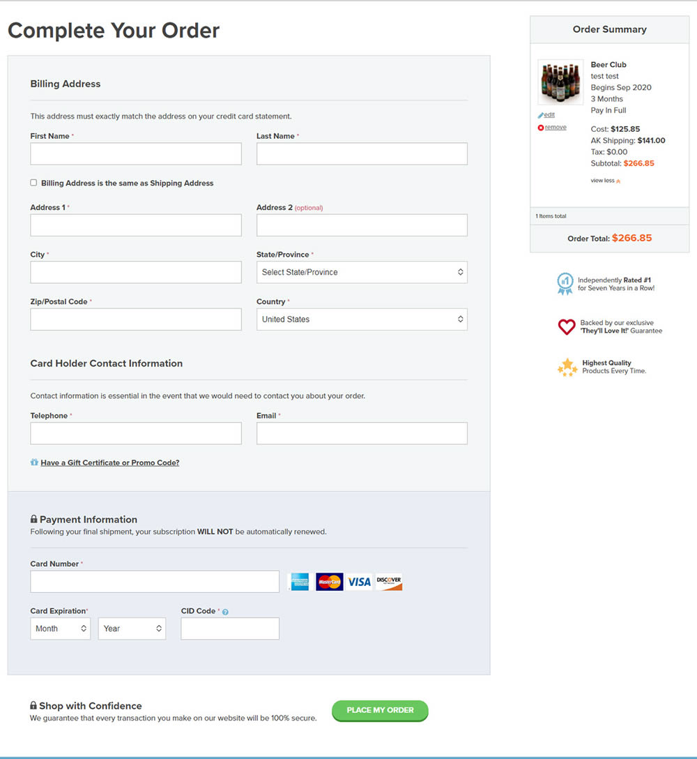
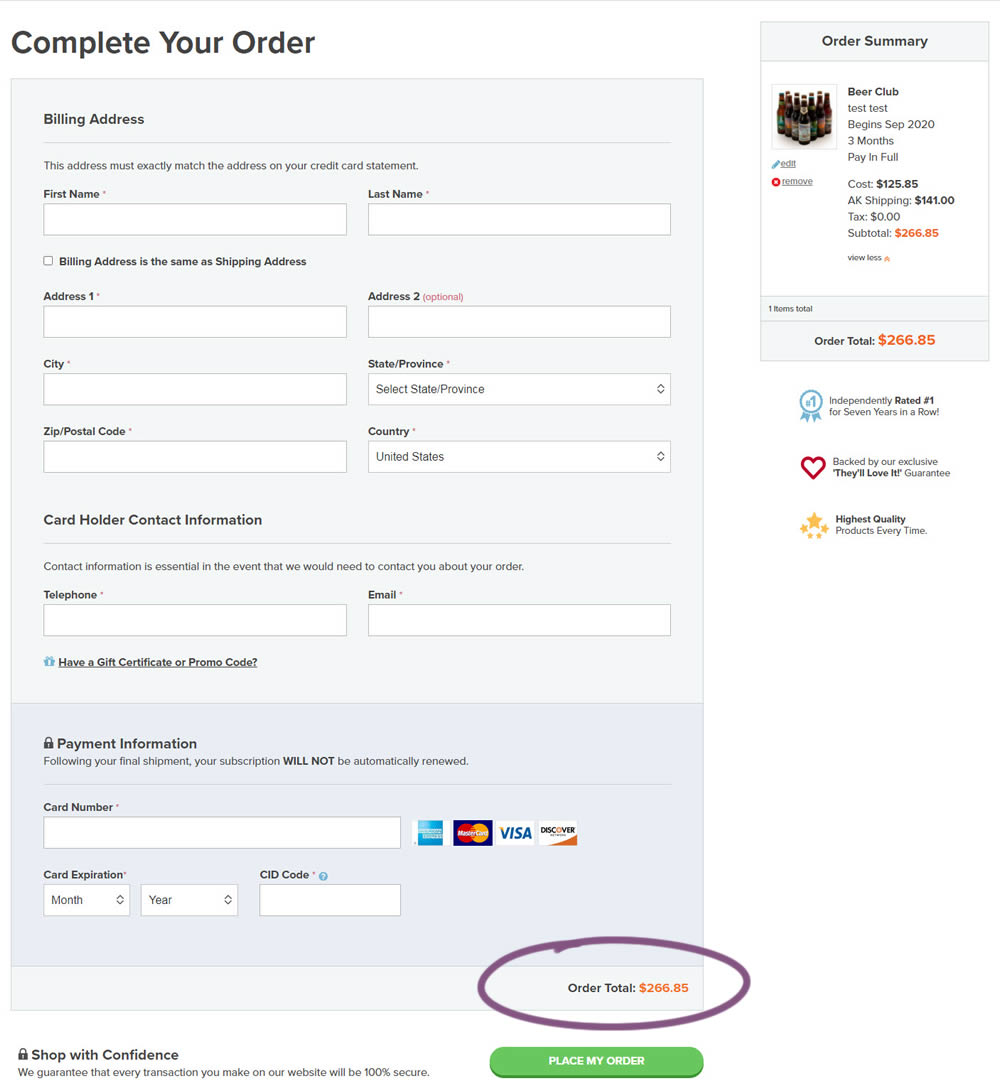
In this experiment, the variation added a second total price at the bottom of the checkout screen just above the checkout button. The impact on sales was measured.
Test #341 on
by
 Alex James
Feb 25, 2021
Desktop
Mobile
Signup
Alex James Tested Pattern #35: Floating Labels In Test #341
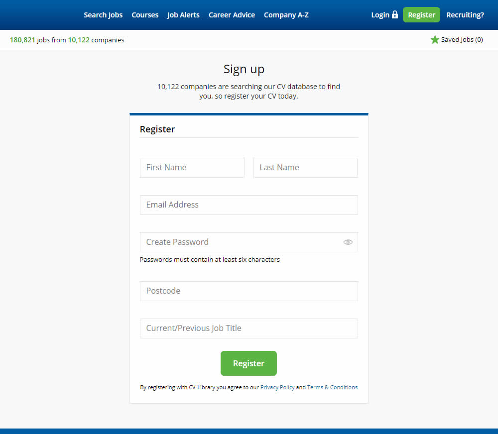

This experiment shows a comparison between floating-field labels vs top-aligned labels. In the control, the form labels first appeared inline and as users would begin typing, they floated to the top of the field. The variation had fixed field labels above the form fields at all times. Impact on signups was measured.
Test #339 on
Expertinstitute.com
by
 Ardit Veliu
Feb 23, 2021
Desktop
Home & Landing
Ardit Veliu Tested Pattern #33: Example Situations In Test #339 On Expertinstitute.com

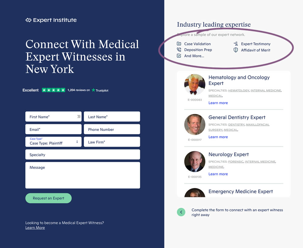
In this experiment, a number of use cases examples were added to illustrate the situations in which experts could help.
Test #338 on
Umbraco.com
by
 Lars Skjold Iversen
Jan 29, 2021
Desktop
Mobile
Home & Landing
Lars Skjold Iversen Tested Pattern #63: Trust Seals In Test #338 On Umbraco.com
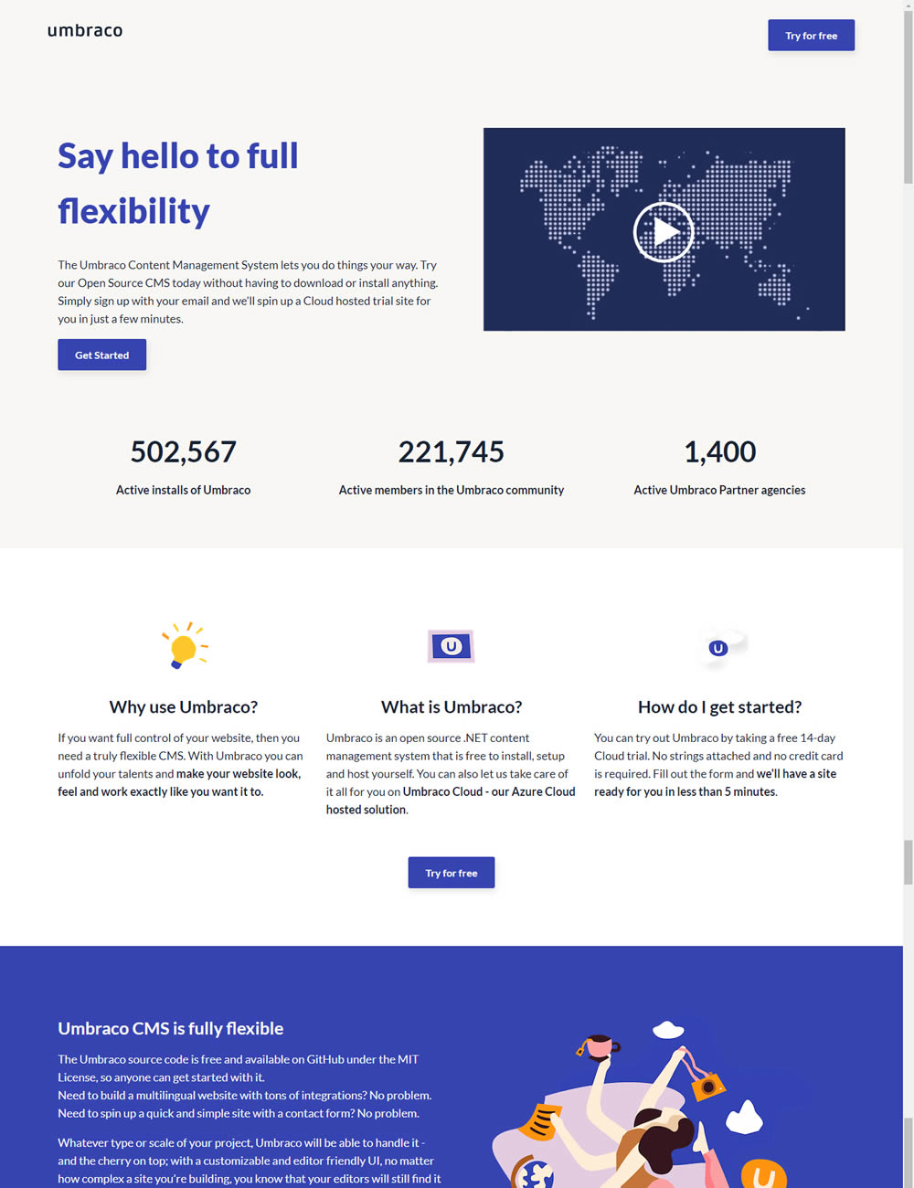
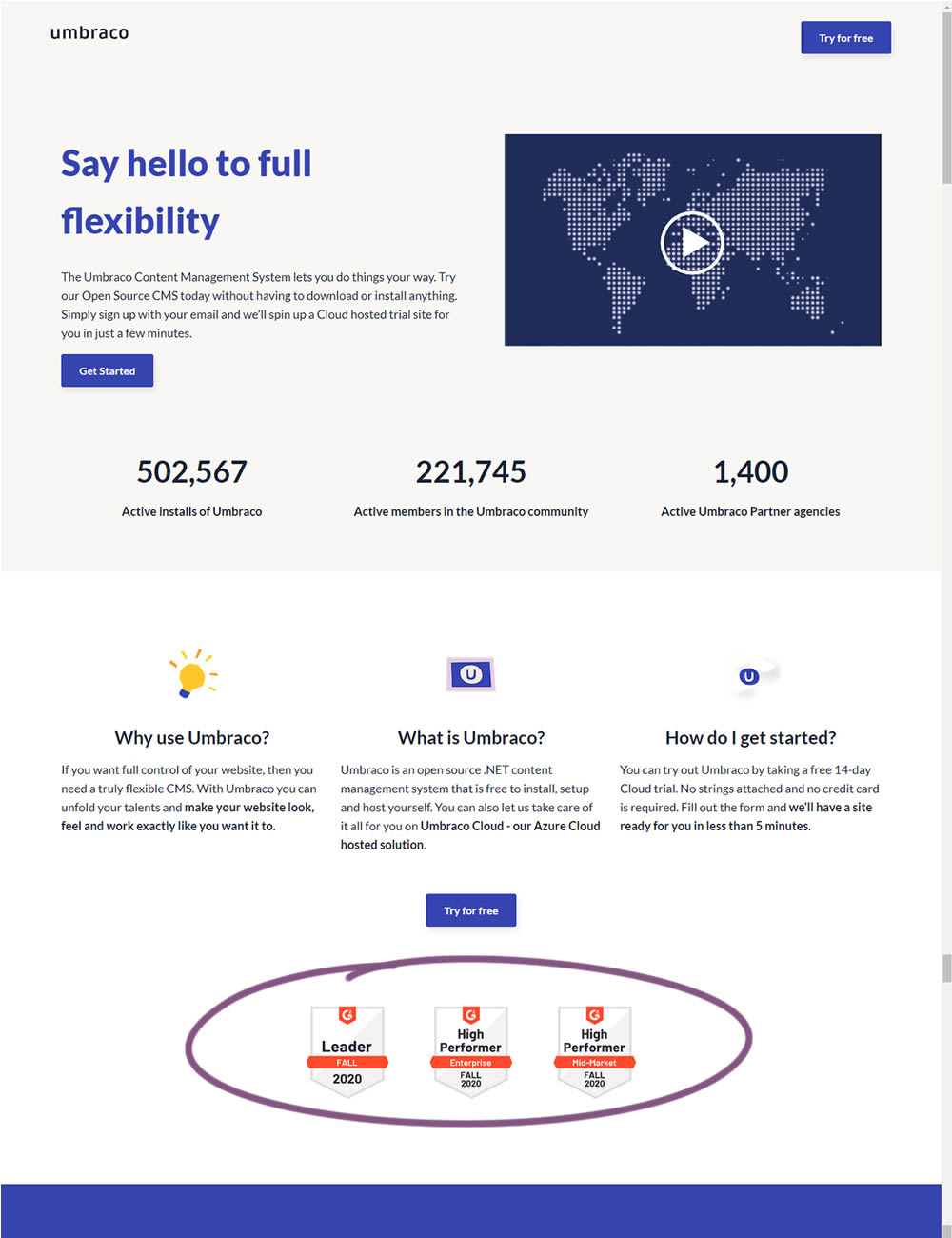
In this experiment, the variation added three G2 badges or awards. The intent was to measure the impact of this change on signups for Umbraco.
Test #336 on
Backstage.com
by
 Stanley Zuo
Jan 28, 2021
Desktop
Mobile
Listing
Stanley Zuo Tested Pattern #51: Shortcut Buttons In Test #336 On Backstage.com
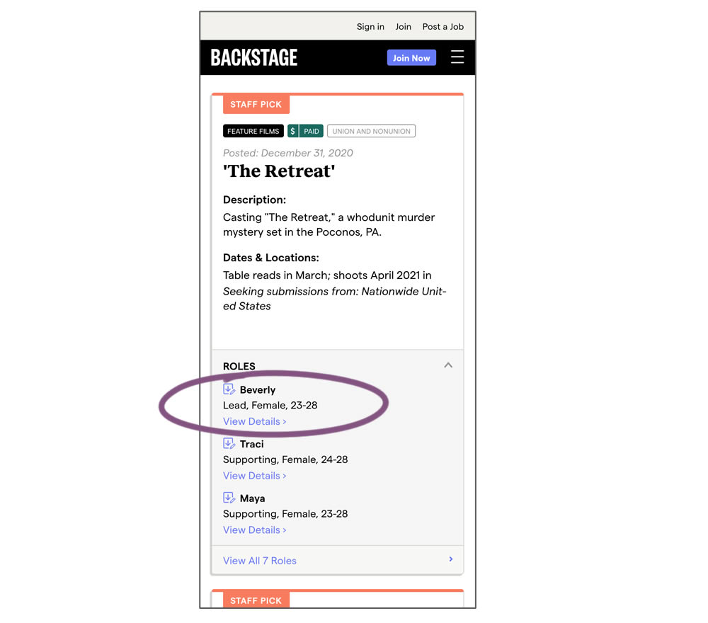
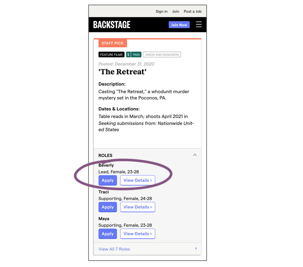
In this experiment, a listing page was expanded to show two actions (apply and view details) instead of a single one (view details only). This variation enabled users with a shortcut action to apply for roles one step earlier (and start membership flows for new users).
Test #337 on
Backstage.com
by
 Stanley Zuo
Jan 28, 2021
Desktop
Mobile
Listing
Stanley Zuo Tested Pattern #51: Shortcut Buttons In Test #337 On Backstage.com
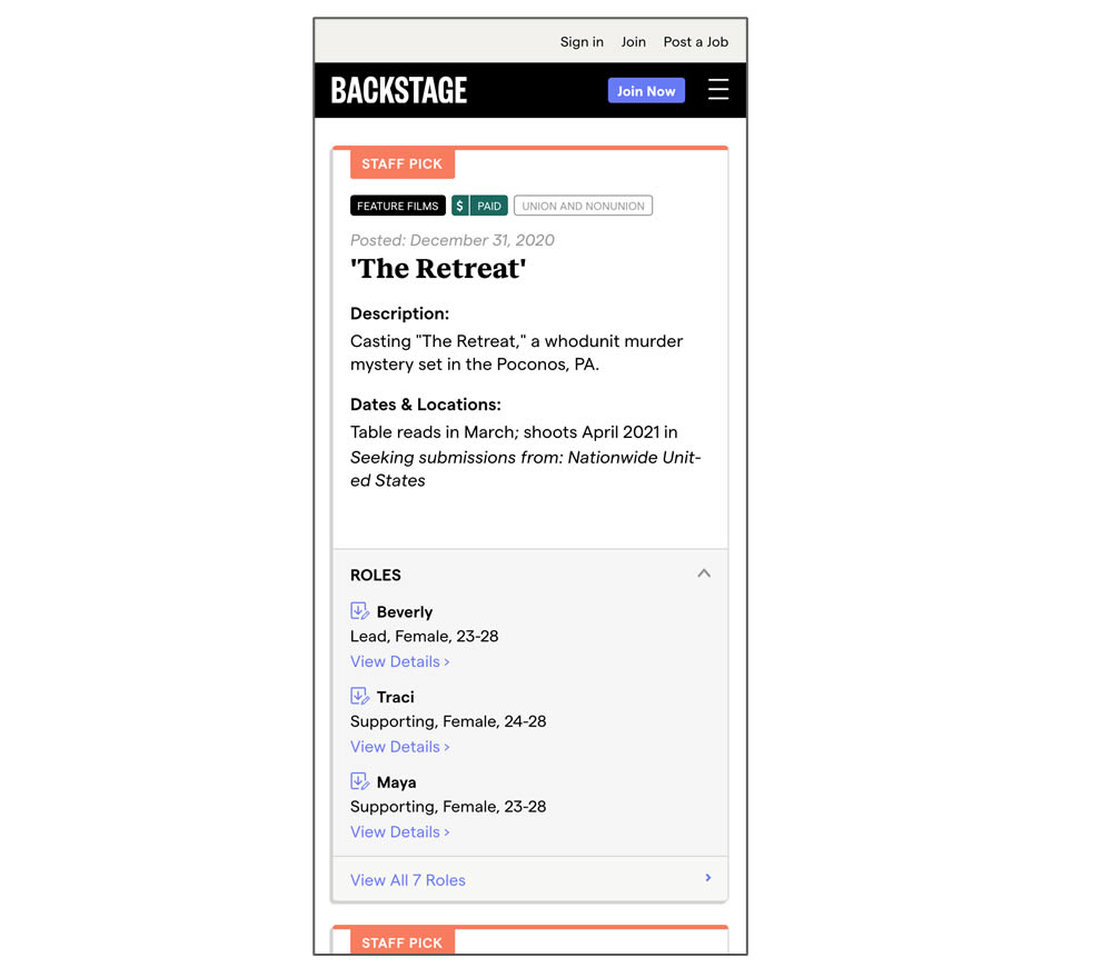
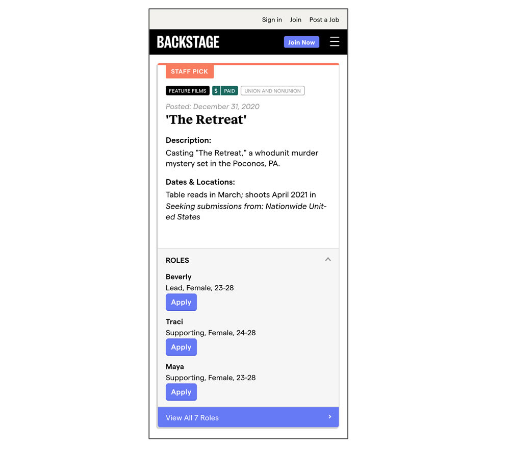
In this experiment, a listing page was expanded to show two actions (apply and view details) instead of a single one (view details only). In the variant, the "view detail" links were replaced with "apply links" starting a job application (and membership flows) sooner.
Test #335 on
by
 Jakub Linowski
Jan 27, 2021
Desktop
Mobile
Home & Landing
Jakub Linowski Tested Pattern #32: Condensed List In Test #335
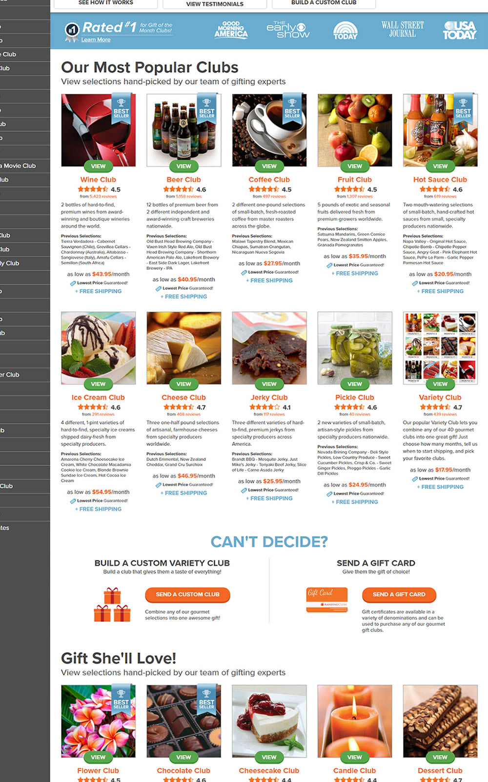
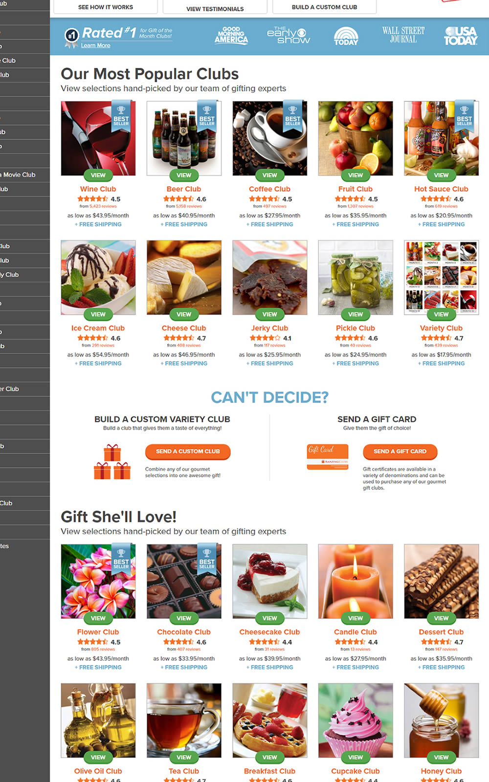
The variation here has more condensed product tiles being shown on a homepage. Two pieces of information were removed: product descriptions and past selections. Impact on product page visits and total sales was measured.
Test #334 on
Thomasnet.com
by
 Kyle Phillips
Jan 25, 2021
Desktop
Mobile
Global
Kyle Phillips Tested Pattern #2: Icon Labels In Test #334 On Thomasnet.com


This experiment measured the impact of adding text labels to three icon-only nav items.
Test #333 on
Expertinstitute.com
by
 Ardit Veliu
Dec 31, 2020
Desktop
Mobile
Home & Landing
Ardit Veliu Tested Pattern #11: Gradual Reassurance In Test #333 On Expertinstitute.com


In this experiment, the variation broke up a lead form into two parts. In the first step users were asked for their state followed by a standard contact form on a second step. All of the states were shown as selectable options. In the control version, the landing page only showed a button which lead to the full form. The experiment measured impact on lead form submissions.
Test #331 on
by
 Jakub Linowski
Dec 30, 2020
Desktop
Mobile
Product
Jakub Linowski Tested Pattern #121: Free Shipping In Test #331

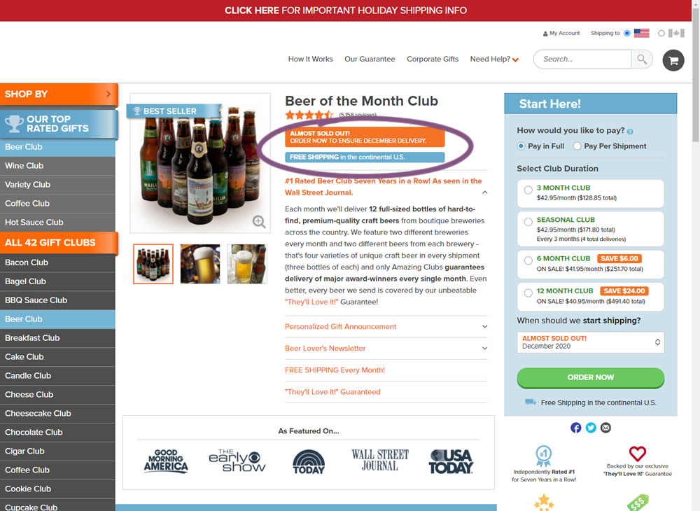
In this little experiment, an extra "Free Shipping" message was added on a product page. It's prominence was increased by using white copy on a darker blue background. Impact on adds-to-cart and total sales was measured.
Test #332 on
by
 Jakub Linowski
Dec 30, 2020
Desktop
Mobile
Product
Jakub Linowski Tested Pattern #121: Free Shipping In Test #332
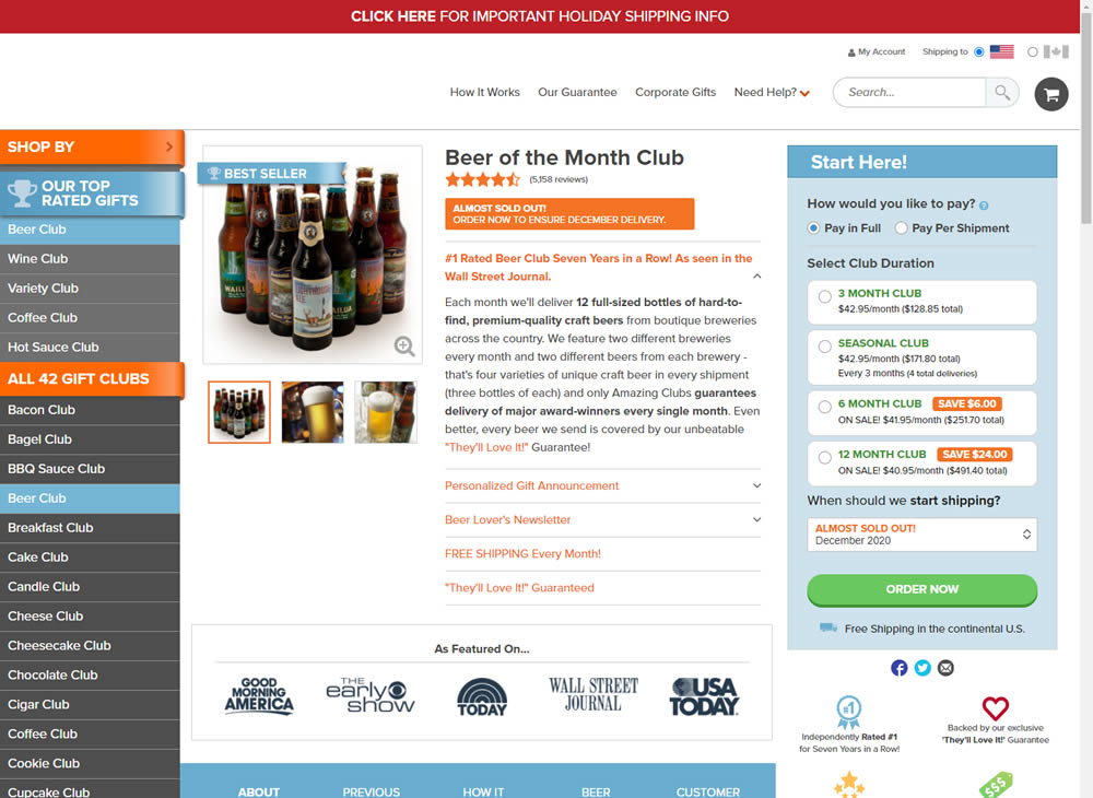
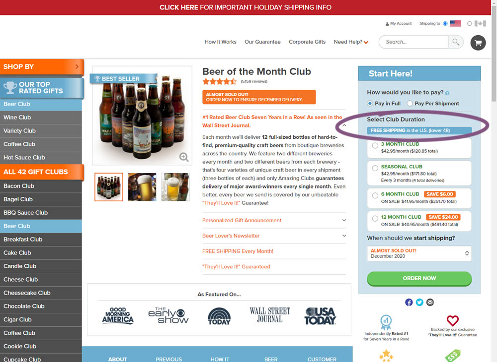
In this experiment, an extra "Free Shipping" message was added on a product page - at the top of the buy box with an add-to-cart call to action. It's prominence was increased by using white copy on a darker blue background. Impact on adds-to-cart and total sales was measured.