All Latest 557 A/B Tests
Become a member to unlock the abiltiy to see the highest impact a/b tests. Being able to see the actual test results and sort by impact allows growth and experimentation teams to take action on the biggest gains first
MOST RECENT TESTS
Test #276 on
Umbraco.com
by
 Lars Skjold Iversen
Dec 31, 2019
Desktop
Mobile
Home & Landing
Lars Skjold Iversen Tested Pattern #111: Field Explanations In Test #276 On Umbraco.com
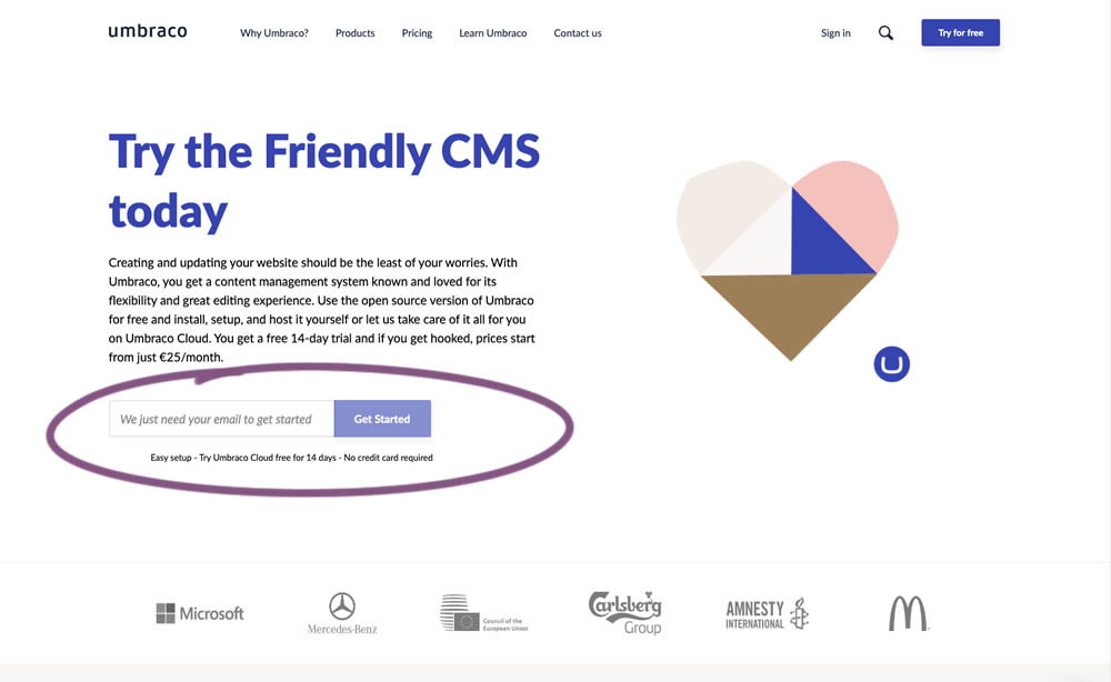
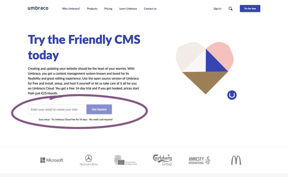
In this experiment, the idea was to move away from copy that was focusing on the needs of the company ("we need your email") towards copy that hinted at a customer benefit ("create your trial").
Test #273 on
Elevate App
by
 Jesse Germinario
Dec 19, 2019
Mobile
Signup
Jesse Germinario Tested Pattern #9: Multiple Steps In Test #273
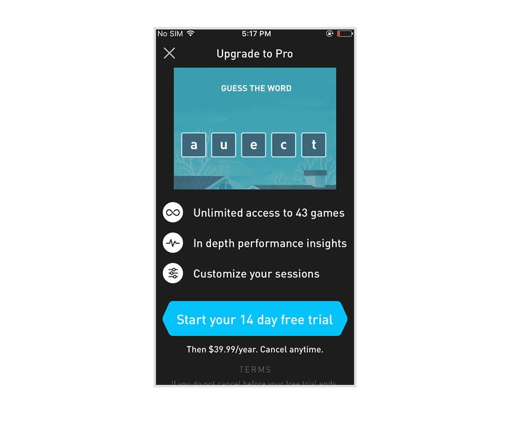
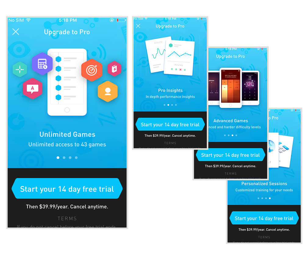
This experiment tests the impact of a different paywall screen on iOS. The current control paywall screen for 100% of iOS users was the animated pro screen. In this screen, users see an animation that gives shows glimpses of several Elevate games in action, as well as a bulleted list of key selling points for Pro. The proposed change (variant B) features a swipeable carousel of pages where each page has an image and some accompanying text explaining a different benefit of subscribing to Pro. The hypothesis is that we can lift conversion by showing users the alternate swiping paywall screen.
Test #274 on
by
 Someone
Dec 16, 2019
Desktop
Mobile
Checkout
Someone Tested Pattern #1: Remove Coupon Fields In Test #274
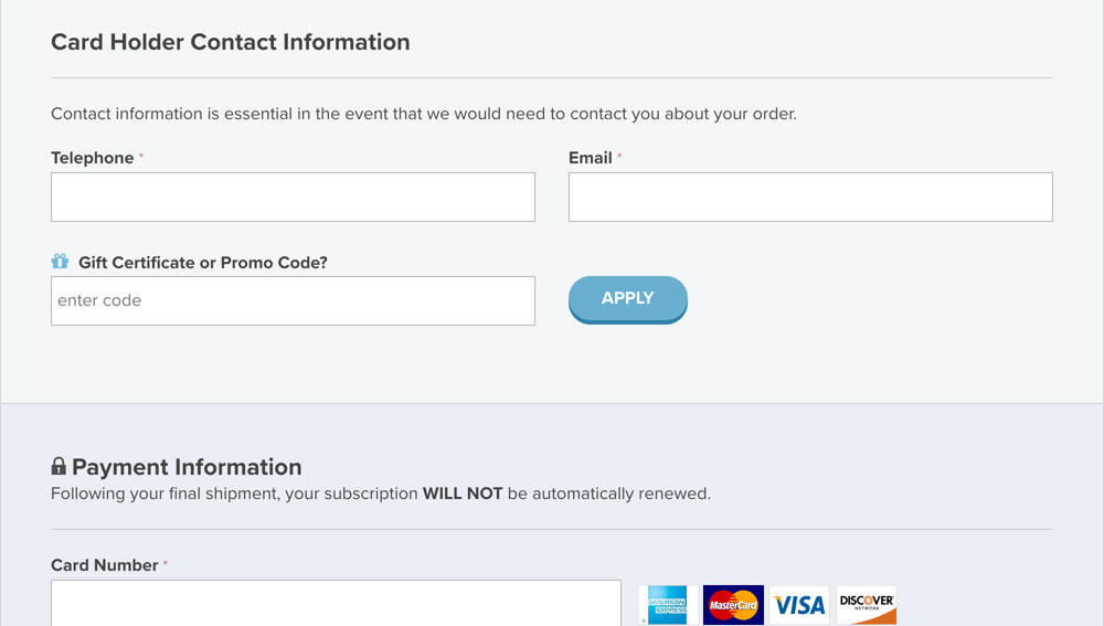
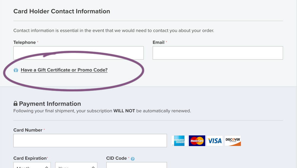
In this experiment, a fully visible coupon field (A) was made less visible by turning it into a default collaped link (B). Clicking on the link caused the coupon field to appear.
Test #272 on
Backstage.com
by
 Stanley Zuo
Dec 03, 2019
Desktop
Pricing
Stanley Zuo Tested Pattern #113: More Or Fewer Plans In Test #272 On Backstage.com


In this experiment, the three pricing plans were condensed into a single recommended plan (annual), with a secondary option to choose the monthly plan.
Test #271 on
Analytics-toolkit.co...
by
 Georgi Z. Georgiev
Nov 24, 2019
Desktop
Mobile
Signup
Georgi Z. Georgiev Tested Pattern #4: Testimonials In Test #271 On Analytics-toolkit.co...
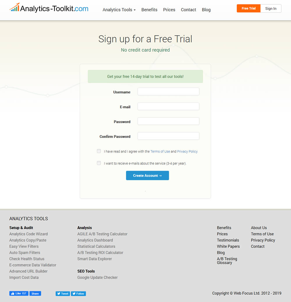
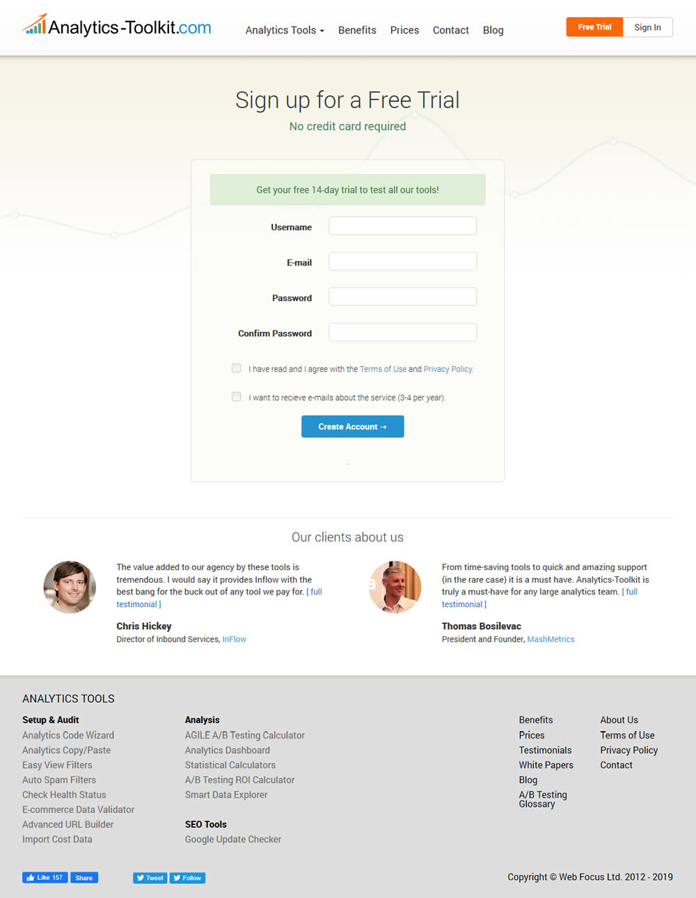
In this experiment, the test variant showed 2 testimonials on the user registration / free trial registration page at Analytics-Toolkit.com
Test #270 on
Dentalplans.com
by
 J.R. Hernandez
Nov 19, 2019
Desktop
Listing
J.R. Hernandez Tested Pattern #37: List Or Grid View In Test #270 On Dentalplans.com
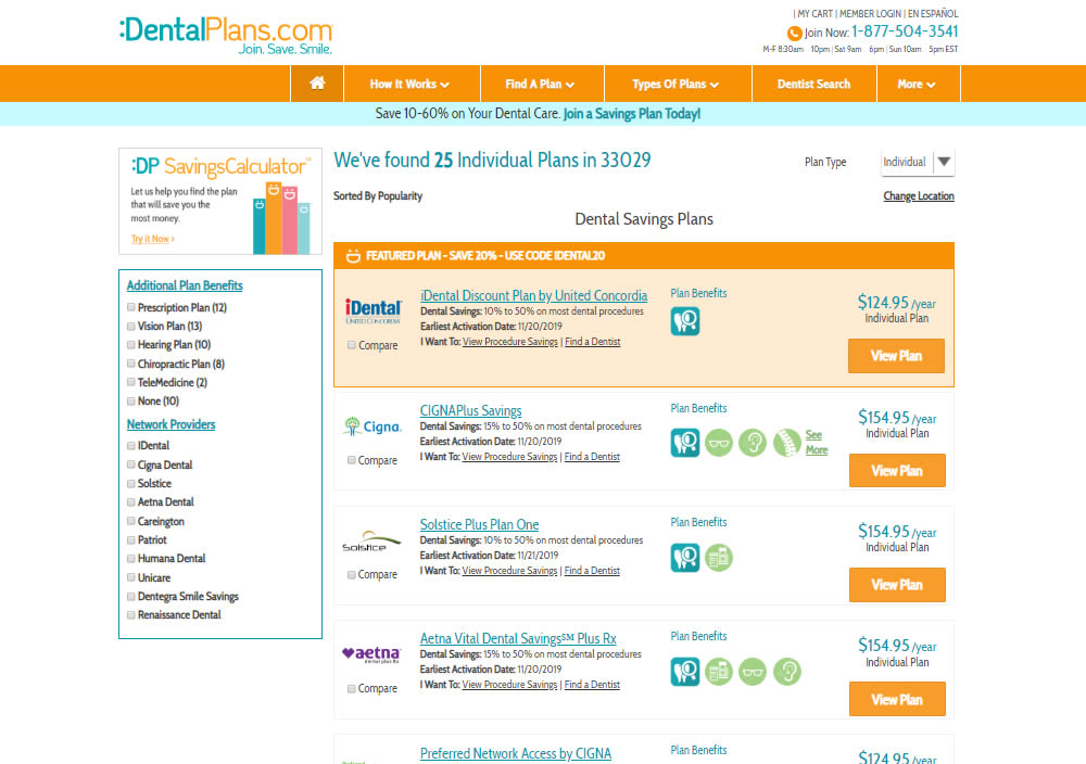
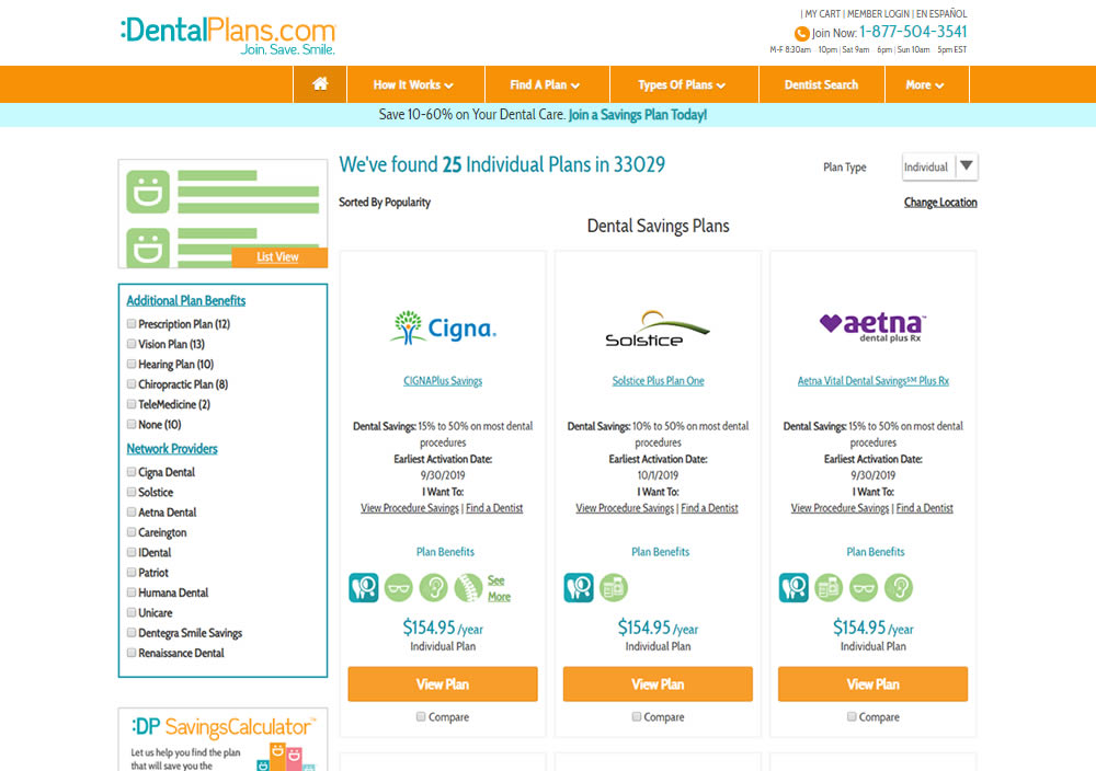
In this experiment, a list view was tested against a grid view.
Test #269 on
Thomasnet.com
by
 Julian Gaviria
Nov 15, 2019
Desktop
Home & Landing
Julian Gaviria Tested Pattern #14: Exposed Menu Options In Test #269 On Thomasnet.com


In this experiment, the variation exposed 6 of the options from the pulldown menu as tabs.
Test #268 on
Backstage.com
by
 Stanley Zuo
Nov 08, 2019
Mobile
Listing
Stanley Zuo Tested Pattern #14: Exposed Menu Options In Test #268 On Backstage.com
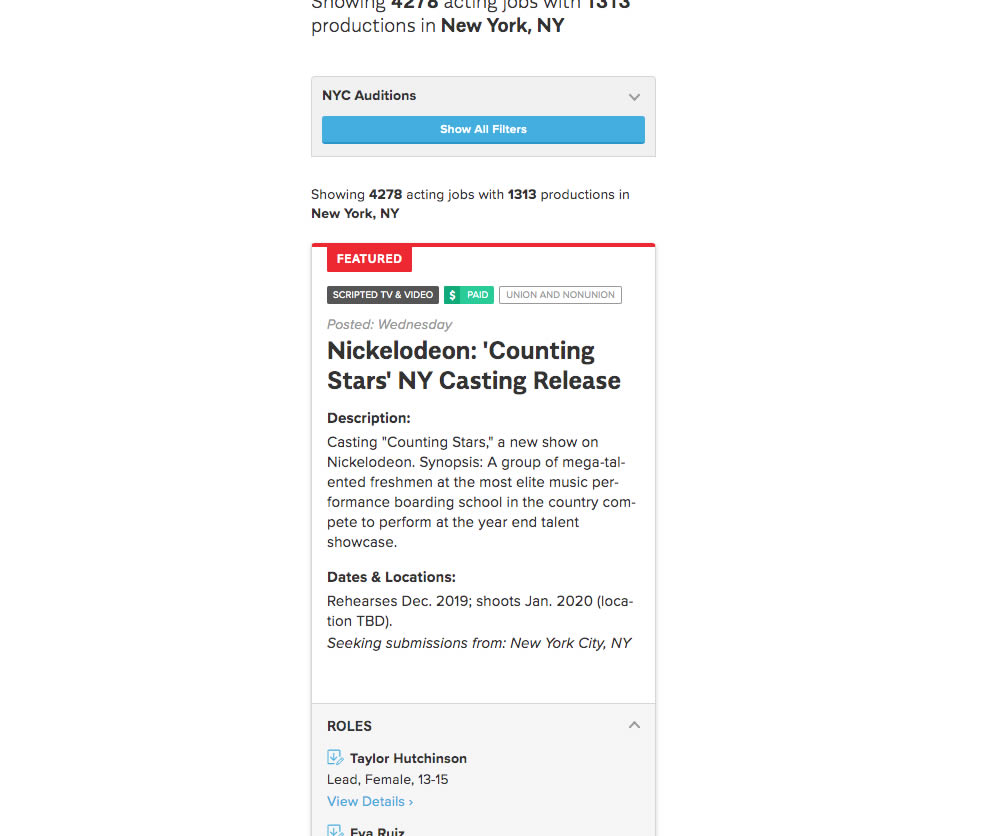
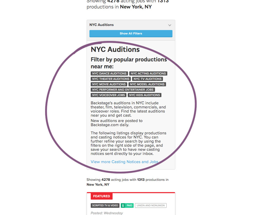
The change in this experiment was an exposed SEO panel (B) with a number of clickable filter options.
Test #267 on
Backstage.com
by
 Stanley Zuo
Nov 05, 2019
Mobile
Checkout
Stanley Zuo Tested Pattern #99: Progress Bar In Test #267 On Backstage.com
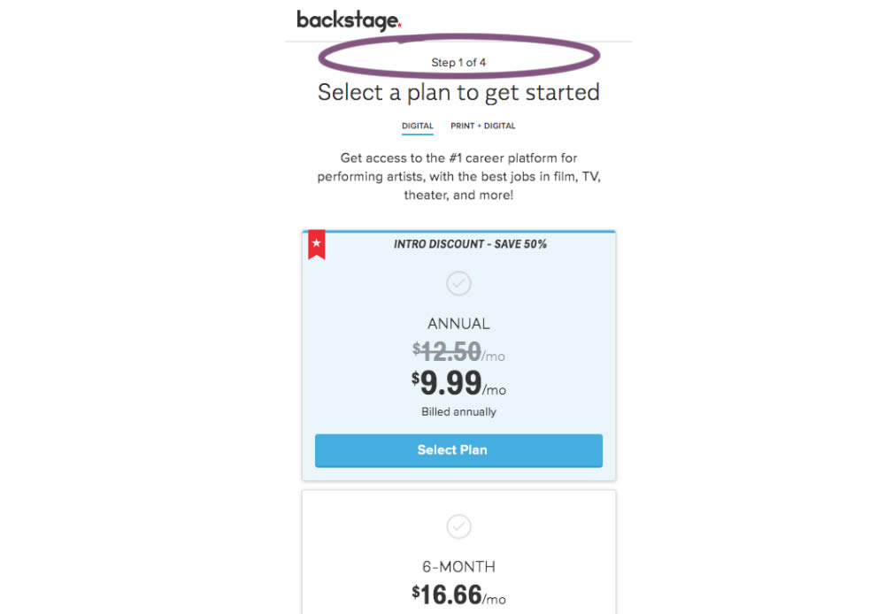
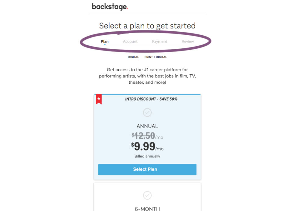
A "Step X of 4" progress bar was tested against a fully visible one that was also clickable.
Test #266 on
by
 Someone
Oct 25, 2019
Desktop
Mobile
Product
Someone Tested Pattern #4: Testimonials In Test #266
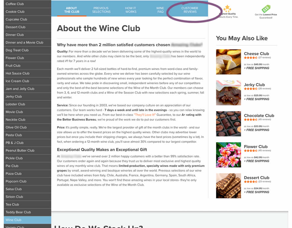
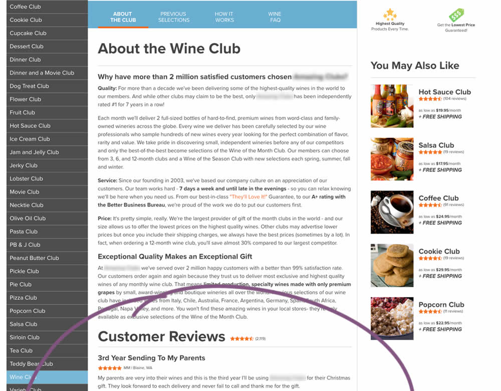
In this experiment, a product page showed customer reviews at the bottom of the page (B) instead of hiding them under a tab (A).
Test #265 on
Poll-app.com
by
 Pierre Olivier Martel
Oct 17, 2019
Desktop
Mobile
Pricing
Pierre Olivier Martel Tested Pattern #112: Lower Price Frames In Test #265 On Poll-app.com
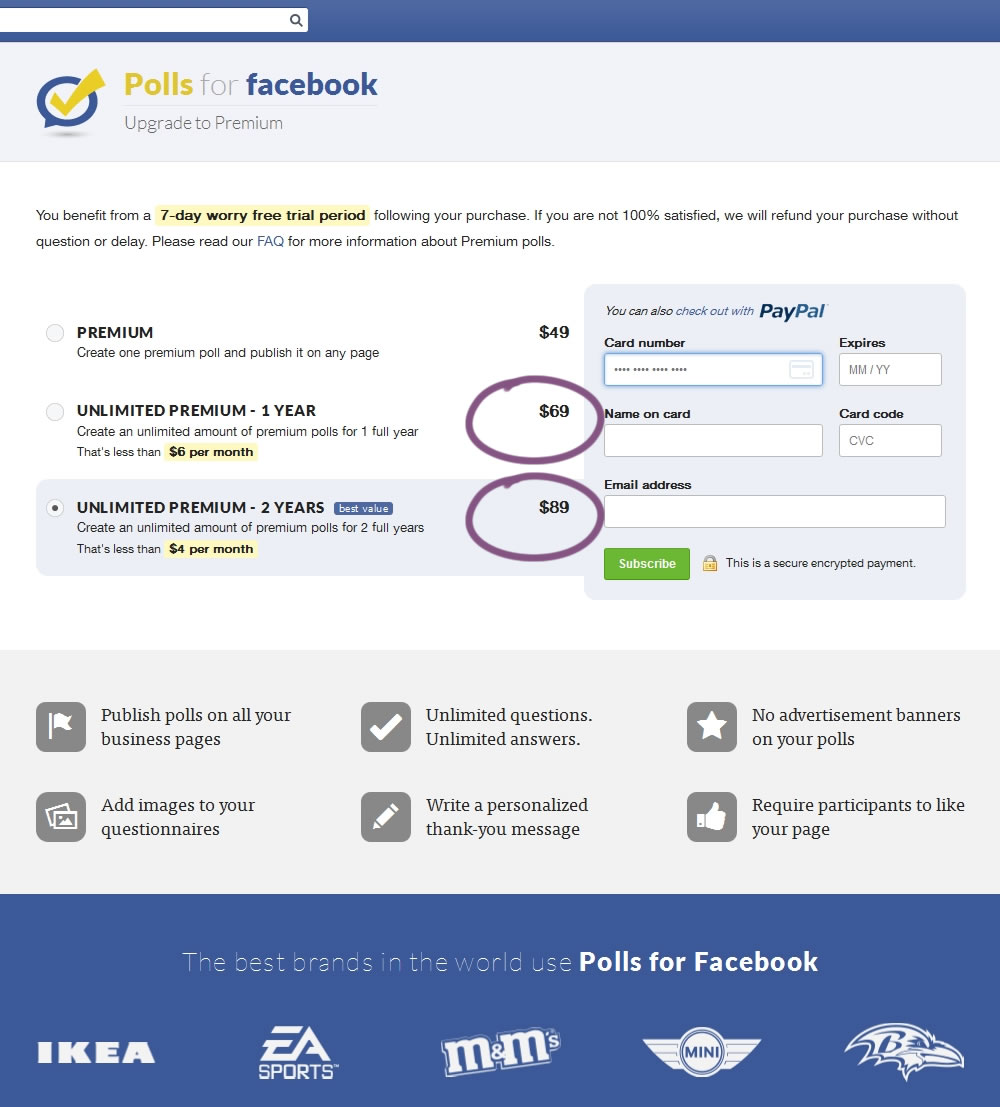
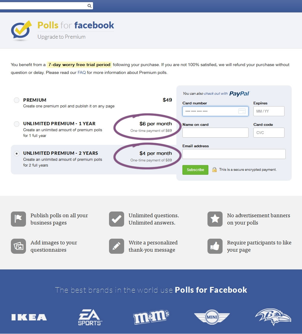
In this experiment, the $69 payment was explained as $6 per month over 1 year, and the $89 was explained as $4 per month over 2 years.
Test #264 on
Kenhub.com
by
 Niels Hapke
Oct 05, 2019
Desktop
Mobile
Global
Niels Hapke Tested Pattern #41: Sticky Call To Action In Test #264 On Kenhub.com
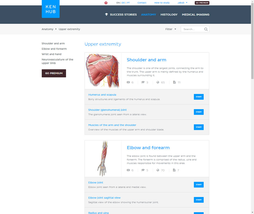
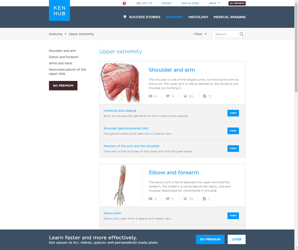
In this experiment users saw a sticky bar advertising the benefits of a Premium account across the bottom of the website, wherever they navigate. The sticky call to action appeared with a 4 second delay and was floating.
Test #263 on
Goodui.org
by
 Jakub Linowski
Oct 04, 2019
Desktop
Mobile
Home & Landing
Jakub Linowski Tested Pattern #22: Empowering Headline In Test #263 On Goodui.org
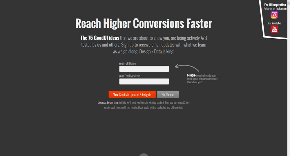
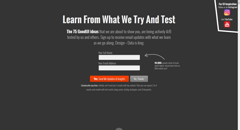
In this experiment a different headline was tested. "Reach Higher Conversions Faster" vs. "Learn From What We Try And Test".
Test #262 on
Thomasnet.com
by
 Julian Gaviria
Oct 03, 2019
Desktop
Mobile
Listing
Julian Gaviria Tested Pattern #32: Condensed List In Test #262 On Thomasnet.com
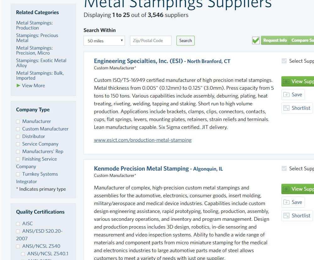
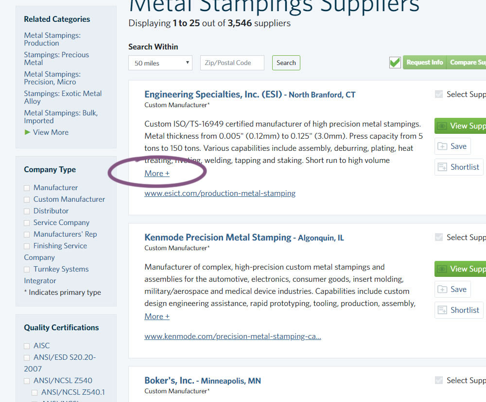
In this experiment, the B version condensed the company listings. This was done by showing less of the description and introducing a "more" and "less" dynamic links that would expand and collapse the description.
Test #105 on
Inktweb.nl
by
 Martijn Oud
Sep 23, 2019
Desktop
Mobile
Signup
Martijn Oud Tested Pattern #111: Field Explanations In Test #105 On Inktweb.nl
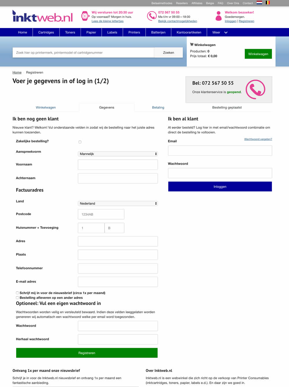
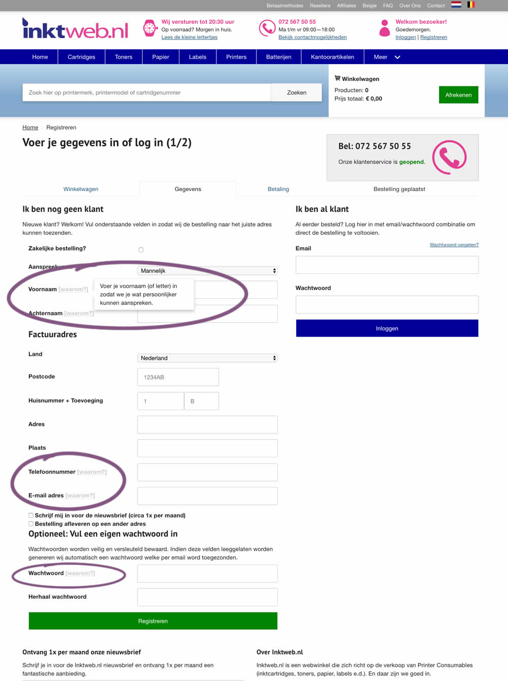
In this experiment, onhover tooltip explanations were added to selected fields (Firstname, Lastname, Phone, Email and Password). One translation example of the Firstname tooltip was the following "Enter your first name (or letter) so that we can address you in a more personal way".
Test #261 on
Valkexclusief.nl
by
 Online Dialogue
Sep 20, 2019
Desktop
Checkout
Online Dialogue Tested Pattern #111: Field Explanations In Test #261 On Valkexclusief.nl
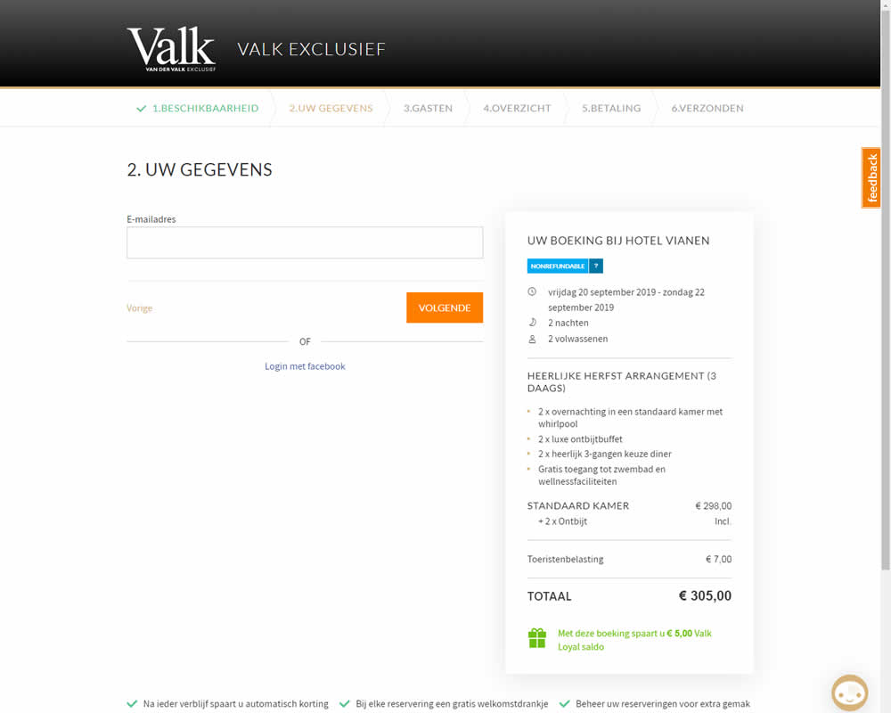
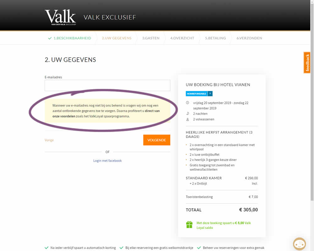
In this experiment on Valk Exclusief's web site, a reason was provided for why the e-mail address is being collected. Google translation of the added text is as follows: "If your e-mail address is not yet known to us, we will ask you to add some missing information. Then you immediately benefit from our benefits such as the ValkLoyal savings program."
Test #260 on
Valkexclusief.nl
by
 Online Dialogue
Sep 16, 2019
Desktop
Home & Landing
Online Dialogue Tested Pattern #45: Benefit Bar In Test #260 On Valkexclusief.nl
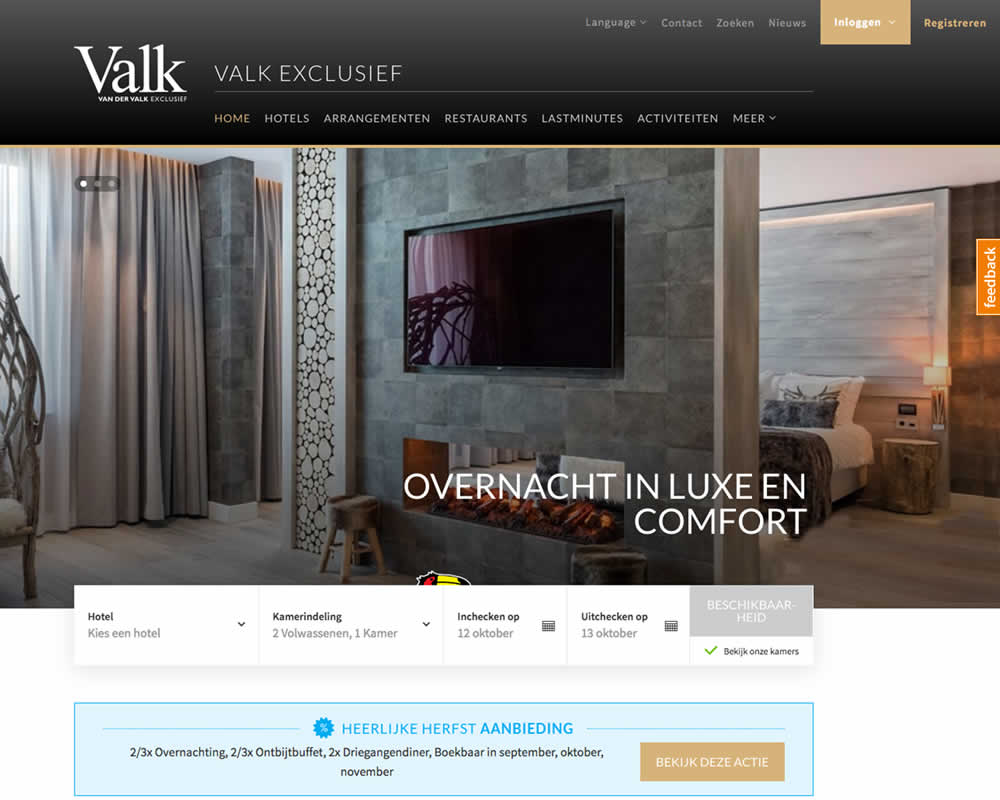
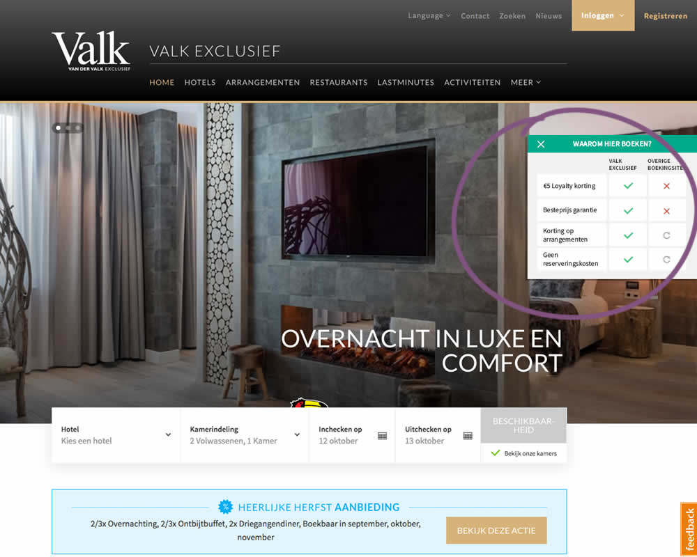
In this experiment on Valk Exclusief's web site, a transparent overview of the benefits for booking hotels was shown. The copy translates to: "Why should you book here? - 5€ Loyalty Discount - Best Price Guarantee - Discount On Packages - No Reservation Costs. Valk is a 150 year hotel chain in the Netherlands.
Test #258 on
Thomasnet.com
by
 Julian Gaviria
Sep 12, 2019
Desktop
Mobile
Signup
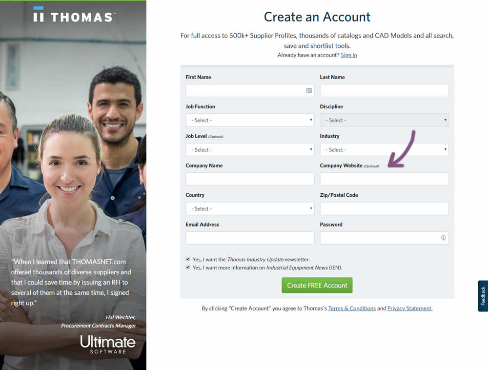
Julian Gaviria Tested Pattern #110: Optional Field Labels In Test #258 On Thomasnet.com

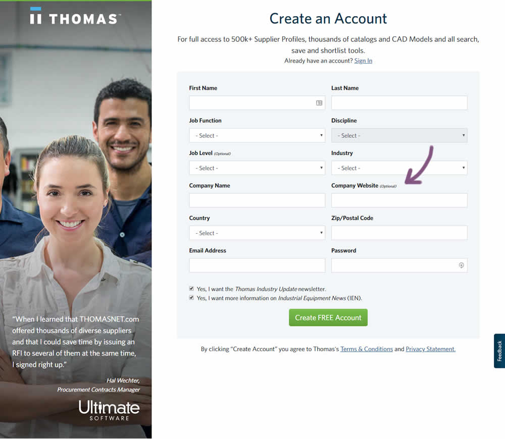
In this variation an optional field label was added.
Test #259 on
Thomasnet.com
by
 Julian Gaviria
Sep 12, 2019
Desktop
Mobile
Signup
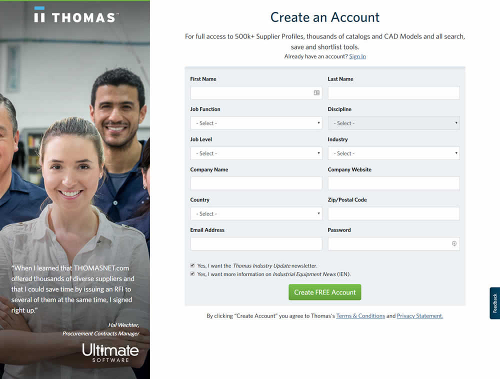
Julian Gaviria Tested Pattern #110: Optional Field Labels In Test #259 On Thomasnet.com
Test #257 on
Thomasnet.com
by
 Julian Gaviria
Sep 09, 2019
Desktop
Mobile
Signup
Julian Gaviria Tested Pattern #109: Required Field Labels In Test #257 On Thomasnet.com
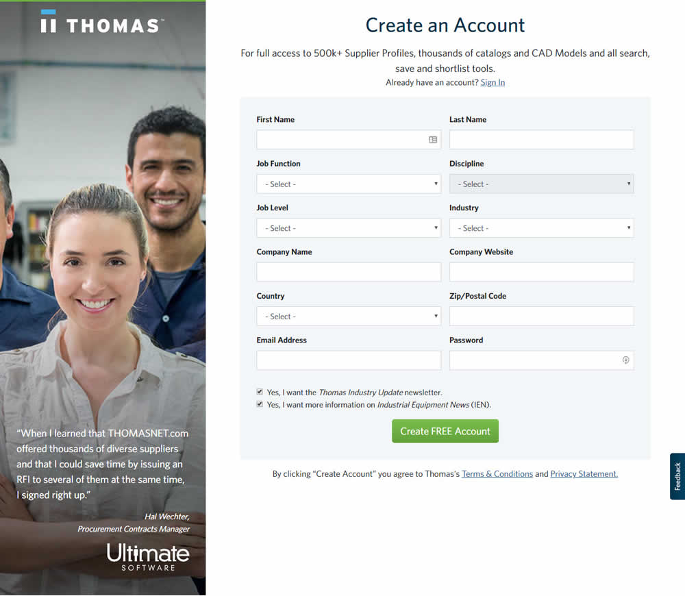

In this followup experiment, field labels without and with a marked asterisk were tested.