All Latest 556 A/B Tests
Become a member to unlock the abiltiy to see the highest impact a/b tests. Being able to see the actual test results and sort by impact allows growth and experimentation teams to take action on the biggest gains first
MOST RECENT TESTS
Test #464 on
Expertinstitute.com
by
 Ardit Veliu
Mar 31, 2023
Desktop
Mobile
Home & Landing
Ardit Veliu Tested Pattern #7: Social Counts In Test #464 On Expertinstitute.com
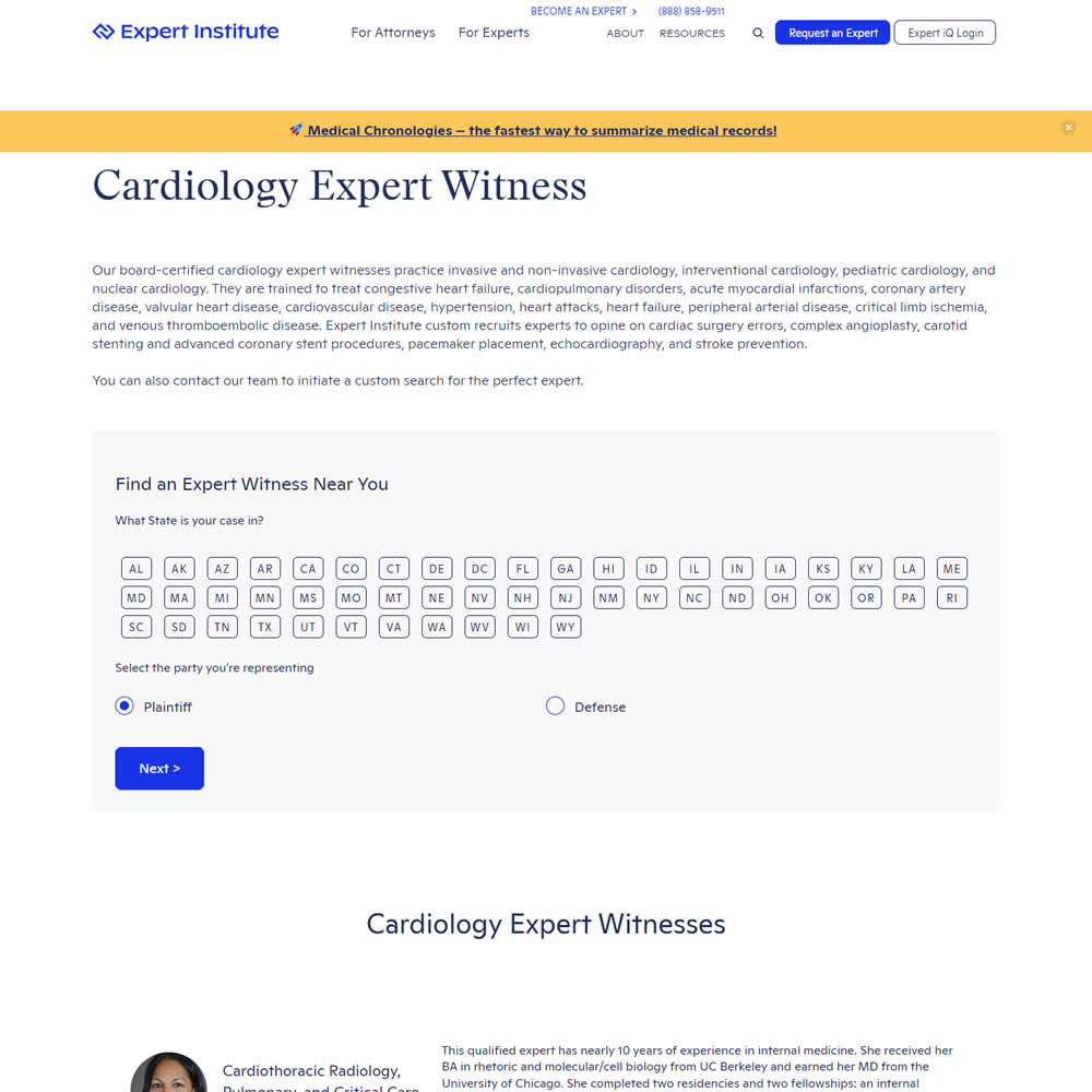
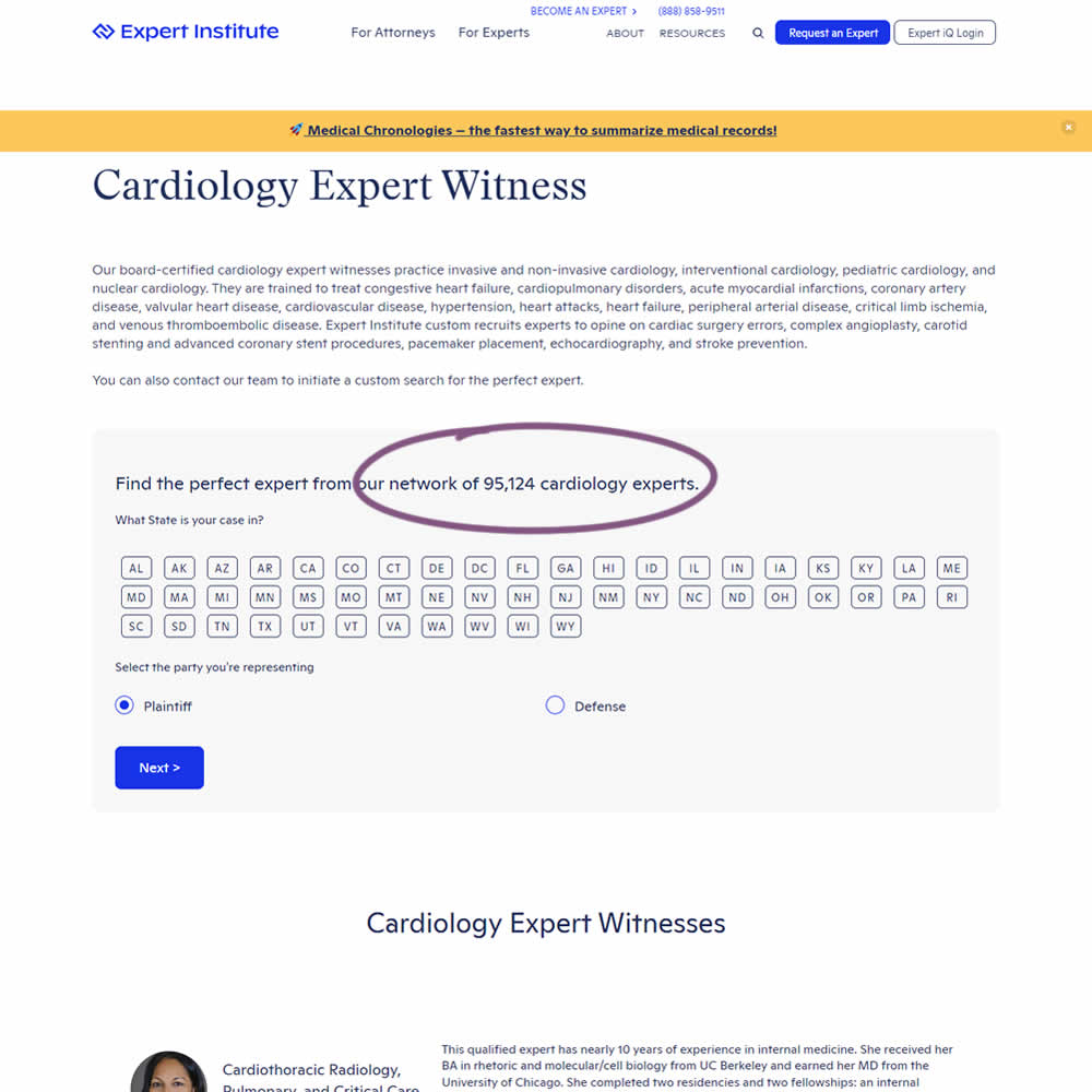
In this experiment, copy was added which showed the number of experts (in a given category) a person may gain access to after filling out a lead form. The context of this is a lead-gen landing page where people are seeking experts for legal purposes. Impact on initial progression (of a multi step form) and completed leads was measured.
Test #463 on
Volders.de
by
 Daria Kurchinskaia
Mar 25, 2023
Desktop
Checkout
Daria Kurchinskaia Tested Pattern #115: Pricing Comparison Table In Test #463 On Volders.de
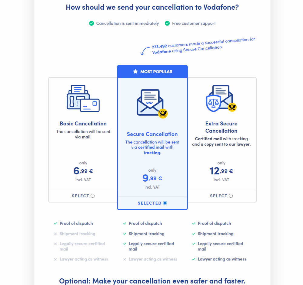

This experiment explored a pricing layout that enabled more feature comparisons. It also conveyed more clearly which features were missing between plans. The test has been inspired by this Netflix experiment. Impact on sales was measured.
Test #462 on
by
 Jakub Linowski
Mar 24, 2023
Desktop
Mobile
Product
Jakub Linowski Tested Pattern #128: Standard Or Superscript Price Format In Test #462

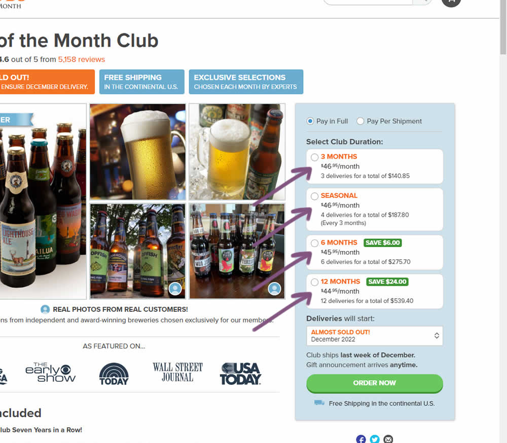
In this experiment, standard $ signs and cents were formatted into a smaller superscript. Impact on add-to-cart and sales was measured.
Test #461 on
Snocks.com
by
 Melina Hess
Mar 23, 2023
Mobile
Product
Melina Hess Tested Pattern #15: Bulleted Reassurances In Test #461 On Snocks.com

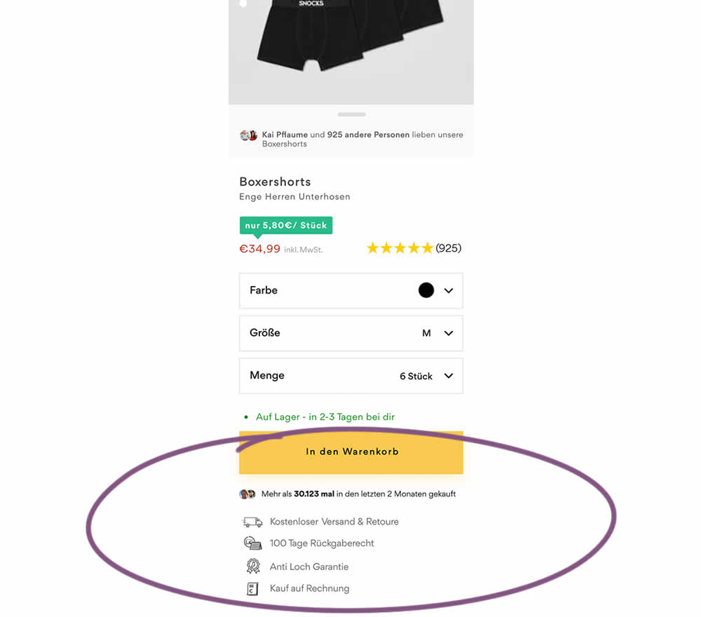
In this product detail page experiment, reassurances under the add-to-cart button were rearranged. The control contained copy about: free shipping and free returns formatted as two gray boxes, with a variety of payment methods and their corresponding logos underneath.
The variation used a more convention bulleted, line-by-line format. It also contained free shipping and returns, but also elaborated with "100 day returns", an "anti-hole guarantee", and "purchase with invoice" (perhaps more popular in Germany?). Impact on sales was measured.
Test #460 on
Backstage.com
by
 Stanley Zuo
Mar 21, 2023
Mobile
Listing
Stanley Zuo Tested Pattern #41: Sticky Call To Action In Test #460 On Backstage.com
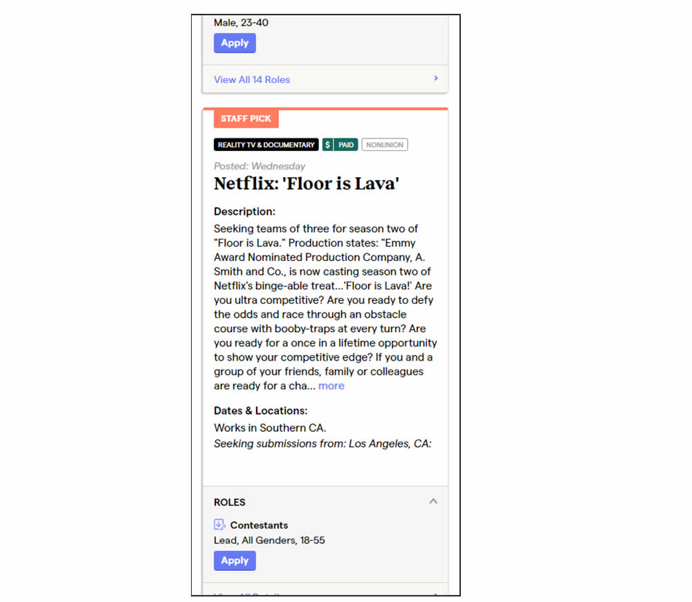
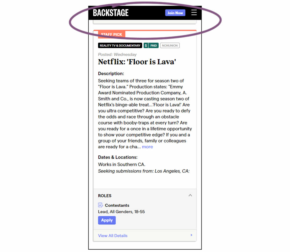
In this experiment, a floating top navigation was shown with a "Join" button. In the control, the navigation was only visible at the top of the page. Also keep in mind that signup starts were also triggered throughout multiple CTAs throughout the page and from particular job detail pages. The a/b test ran on a listing page of Backstage - a casting call job site. Impact on signups and checkouts was measured.
Test #459 on
Snocks.com
by
 Melina Hess
Feb 28, 2023
Desktop
Mobile
Listing
Melina Hess Tested Pattern #36: Fewer Or More Results In Test #459 On Snocks.com
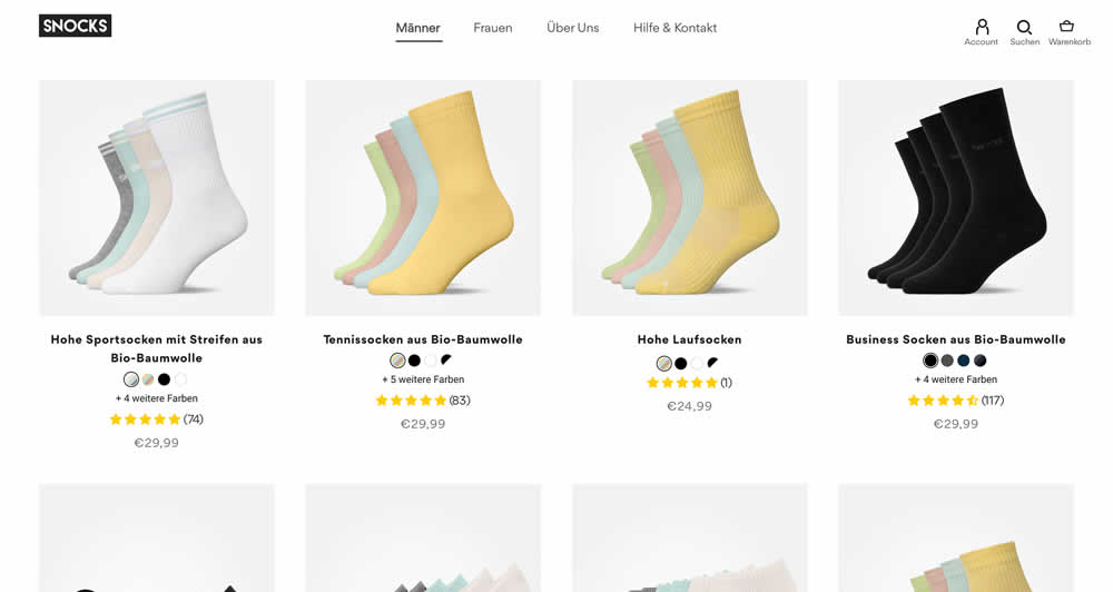
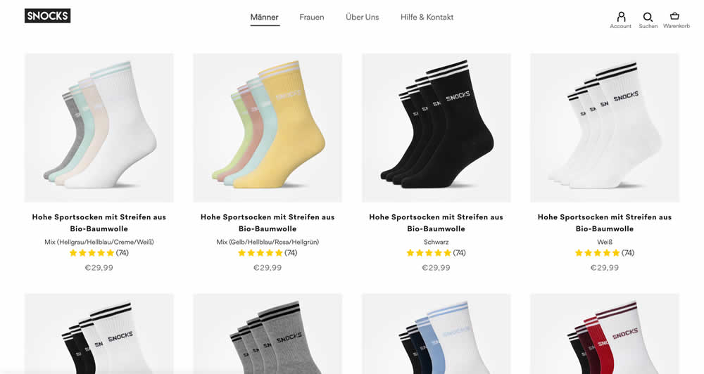
In this listing page experiment, color sets of the same product were tested against individual products with unique colors (with additional product tiles). Essentially, the A version here contained fewer product items (with color sets), while the B version contained more results and tiles (with grouped products). Impact on total sales was measured.
(The original control and variation was inverted, but was flipped to match the fewer or more results pattern).
Test #458 on
Volders.de
by
 Daria Kurchinskaia
Feb 27, 2023
Desktop
Mobile
Checkout
Daria Kurchinskaia Tested Pattern #103: Money Back Guarantee In Test #458 On Volders.de
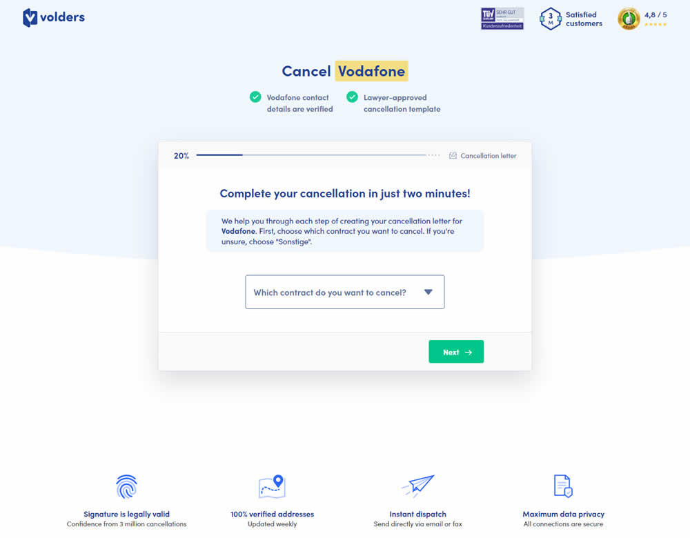
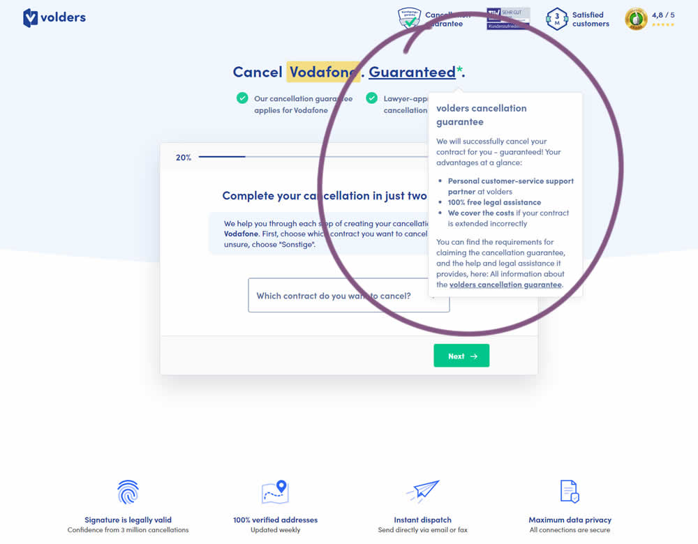
In this experiment, a cancelation guarantee was added believing it would make users feel safer while canceling their contracts with Volders (the paid service being offered). The variation appended a Guarantee in the headline as a hyperlink with an explanatory tooltip shown on hover. This variation change was added to multiple screens throughout the checkout flow (a 5 step process).
Test #457 on
by
 Jakub Linowski
Feb 26, 2023
Desktop
Mobile
Shopping Cart
Jakub Linowski Tested Pattern #64: Tunnel In Test #457
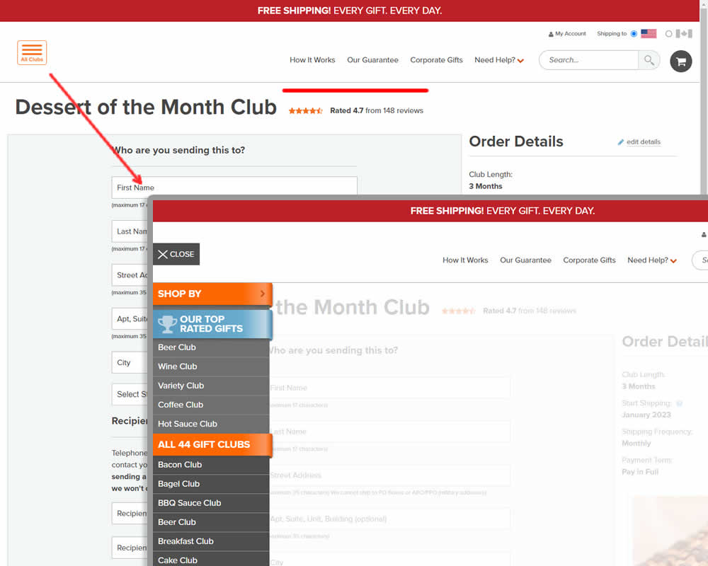

In this experiment, hamburger navigation with product links, was removed from the shopping / add to cart page. Tertiary links (How It Works, Guarantee details and support pages) were also removed, while a "Secure Checkout" message was brought into the header. This header version was already present on the next checkout page, and was copied over one step earlier. The idea was to keep customers within the checkout flow. Impact on sales was measured.
Test #456 on
Aboalarm.de
by
 Daria Kurchinskaia
Feb 23, 2023
Desktop
Mobile
Signup
Daria Kurchinskaia Tested Pattern #28: Easiest Fields First In Test #456 On Aboalarm.de


In this experiment, a more difficult step of a contract cancelation service flow was rearranged toward a later step. In the variation, the easier step (hypothetically) with personal details and address fields was placed as the first step. Whereas the step with contract or account numbers (hypothetically more difficult) were placed as the second step.
Test #455 on
Expertinstitute.com
by
 Ardit Veliu
Feb 16, 2023
Desktop
Mobile
Home & Landing
Ardit Veliu Tested Pattern #117: Company Logos In Test #455 On Expertinstitute.com
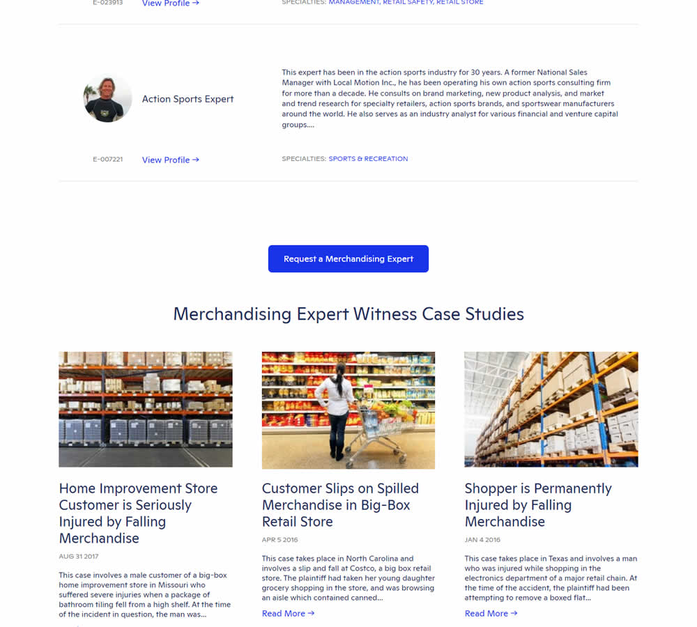
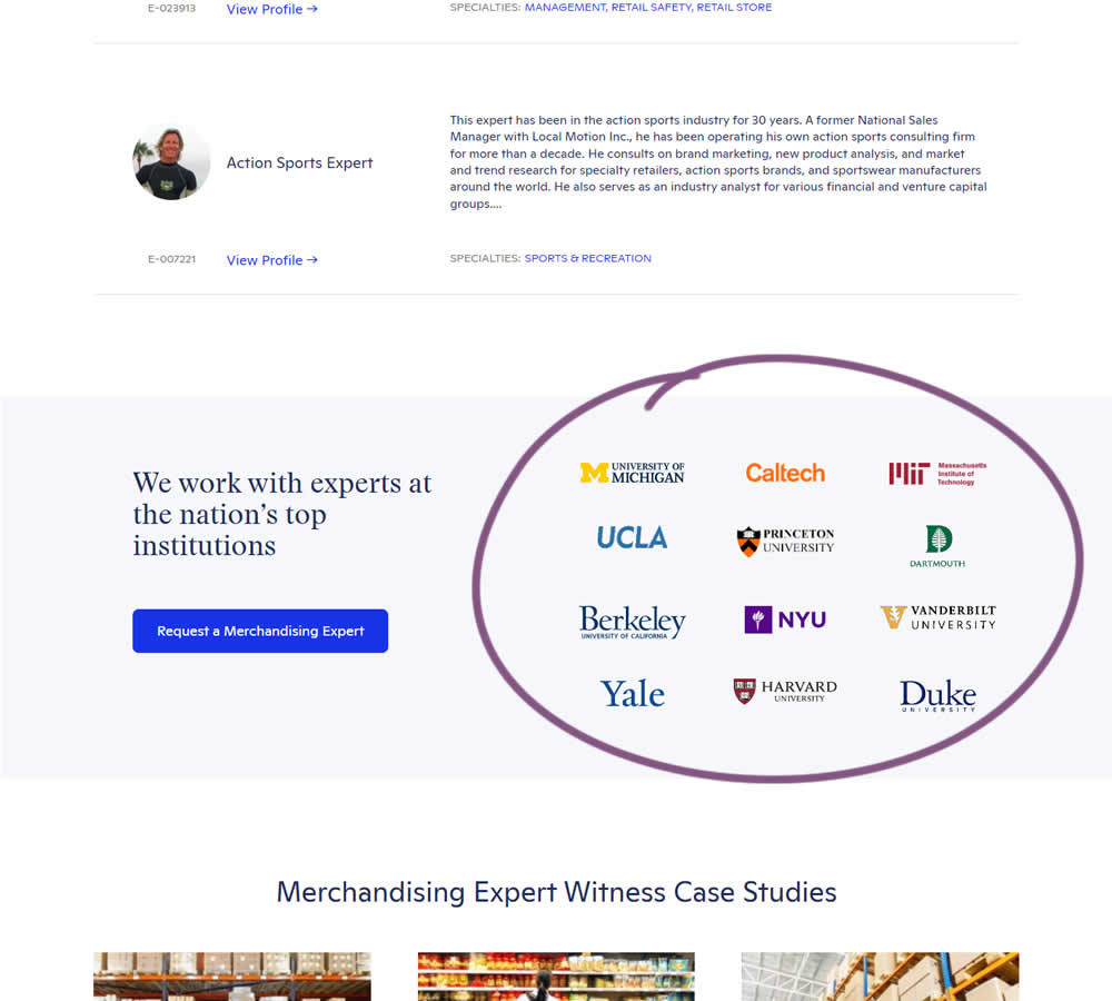
In this experiment, supporting university logos were appended near the primary call to action for additional credibility. These logos were placed around the middle of long landing pages on Expert Institute's web site (where experts for legal advice are searched). Impact on total leads was measured.
Test #453 on
by
 Jakub Linowski
Jan 31, 2023
Desktop
Mobile
Shopping Cart
Jakub Linowski Tested Pattern #64: Tunnel In Test #453
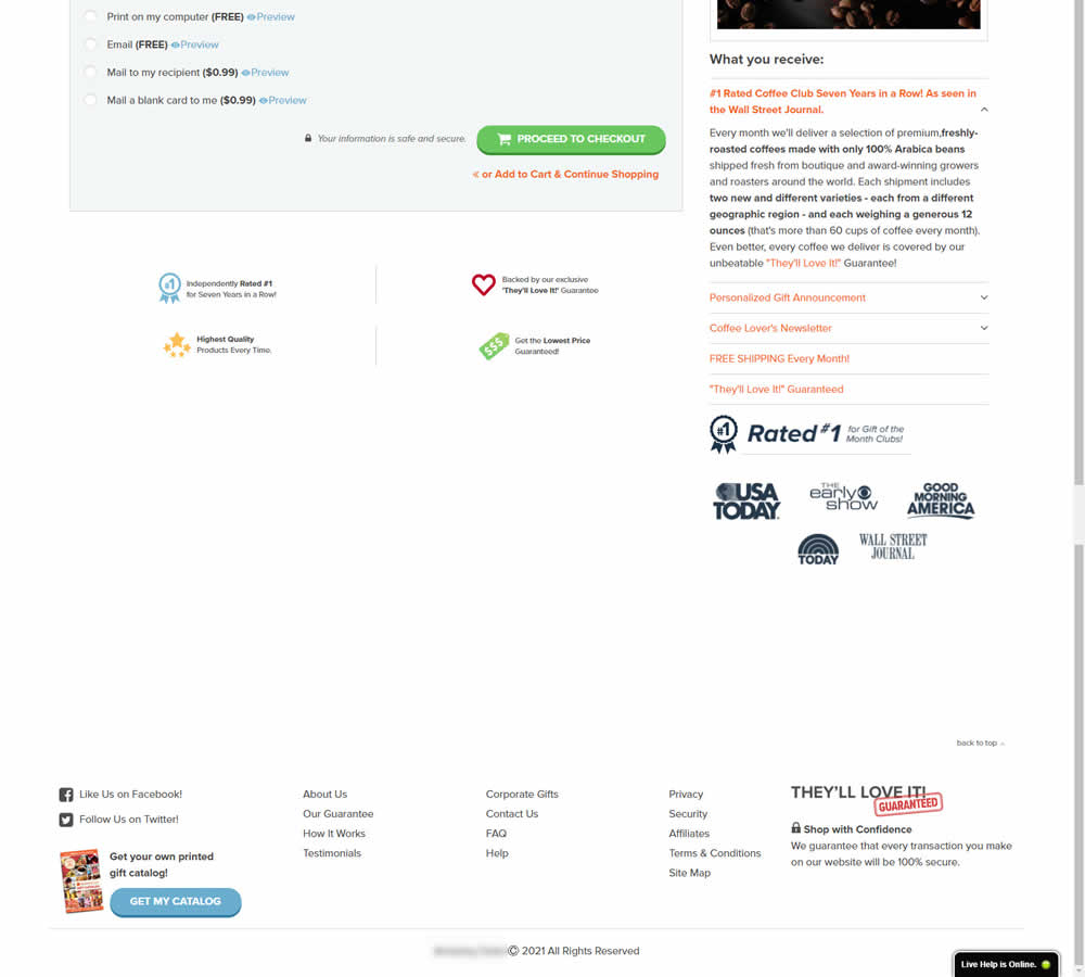

In this experiment, the footer was simplified with multiple elements being removed (catalog request, secondary links, and a guarantee). Additionally, a more prominent phone number was also displayed.
Test #454 on
Trenyrkarna.cz
by
 Ondřej Ilinčev
Jan 31, 2023
Desktop
Mobile
Shopping Cart
Ondřej Ilinčev Tested Pattern #64: Tunnel In Test #454 On Trenyrkarna.cz


In this shopping cart experiment, a tall footer was completely removed. The footer contained elements such as: app download links, a newsletter signup, secondary web site links, trust symbols, social media icons and company contant information. Impact on sales was measured.
Test #452 on
Volders.de
by
 Daria Kurchinskaia
Jan 30, 2023
Desktop
Mobile
Checkout
Daria Kurchinskaia Tested Pattern #62: Urgent Next Day Delivery In Test #452 On Volders.de


In this experiment, a count down timer was added near the top of a checkout page. The timer was only shown before 1pm and clarified that the serivce (contract cancellation) will be initiated on the same day if users act before a cut off time. Impact on completed payments was measured.
Test #451 on
Fluke.com
by
 Marika Francisco
Jan 25, 2023
Desktop
Product
Marika Francisco Tested Pattern #115: Pricing Comparison Table In Test #451 On Fluke.com
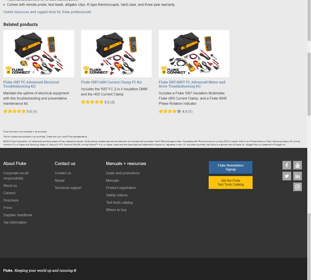
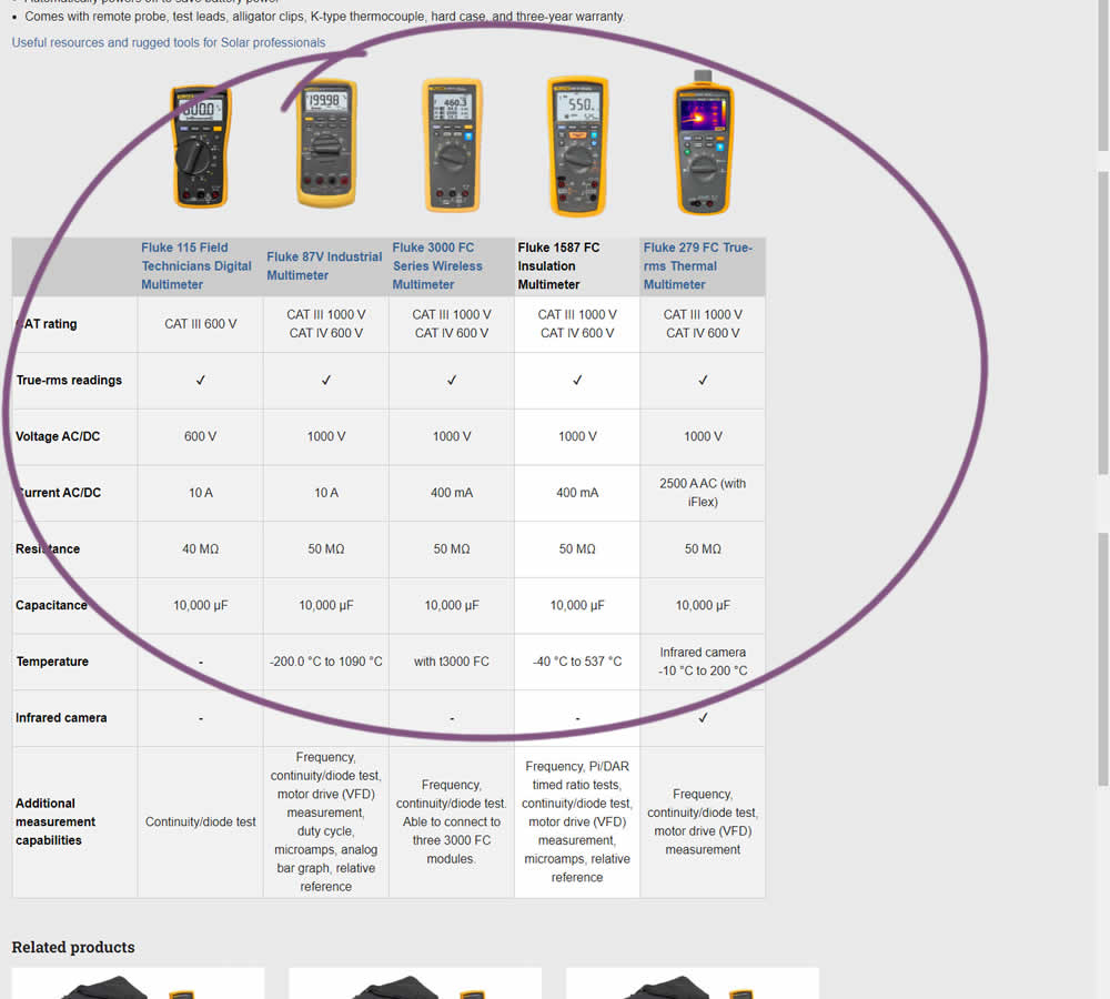
In this experiment, a product comparison table was added in the middle of a product detail page. The comparison table contained products from the same class or family of products. Clicking on the photo thumbnails also allowed customers to visit the specific detail page. Impact on adds to cart and transactions was measured.
Test #450 on
Trenyrkarna.cz
by
 Ondřej Ilinčev
Jan 20, 2023
Desktop
Shopping Cart
Ondřej Ilinčev Tested Pattern #64: Tunnel In Test #450 On Trenyrkarna.cz
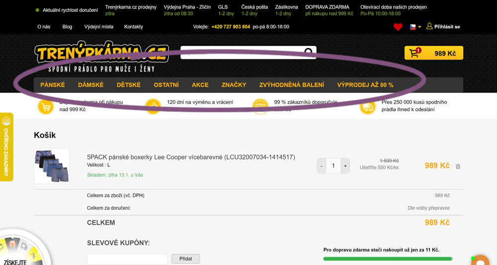
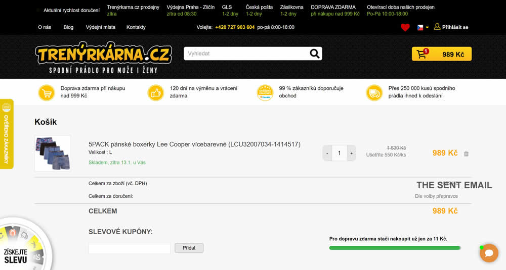
In this experiment, top category navigation (with fly out categories) was removed from the shopping cart of an online store. Impact on sale transactions was measured.
Test #449 on
Snocks.com
by
 Melina Hess
Dec 31, 2022
Desktop
Mobile
Product
Melina Hess Tested Pattern #78: Tags, Badges And Structured Information In Test #449 On Snocks.com
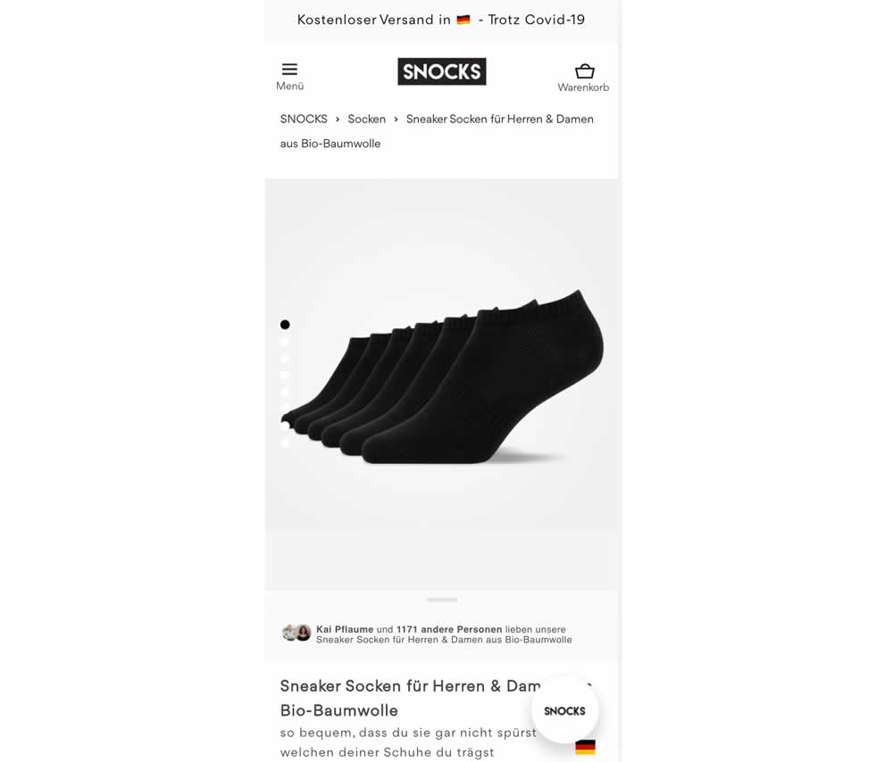
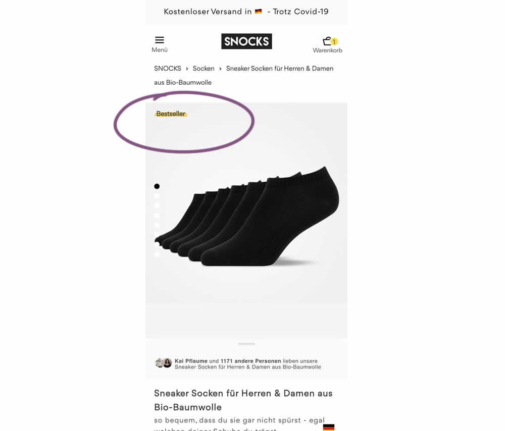
In this experiment, bestselling product colors were highlighted with a bestseller badge on product listing and product detail pages.
Test #448 on
Zapimoveis.com.br
by
 Vinicius Barros Peixoto
Dec 30, 2022
Desktop
Mobile
Product
Vinicius Barros Peixoto Tested Pattern #21: What It's Worth In Test #448 On Zapimoveis.com.br
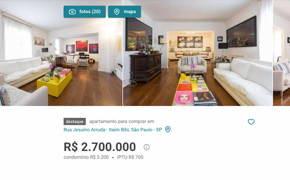
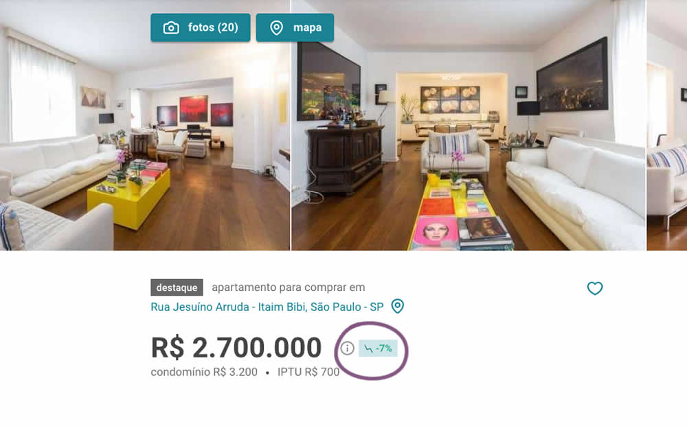
In this experiment, the B variation showed the relative discount in price from within the most recent 12 months as a percentage point. A tooltip was also shown which explained this message on hover.
Test #447 on
Vivareal.com.br
by
 Vinicius Barros Peixoto
Dec 23, 2022
Mobile
Listing
Vinicius Barros Peixoto Tested Pattern #18: Single Or Alternative Buttons In Test #447 On Vivareal.com.br

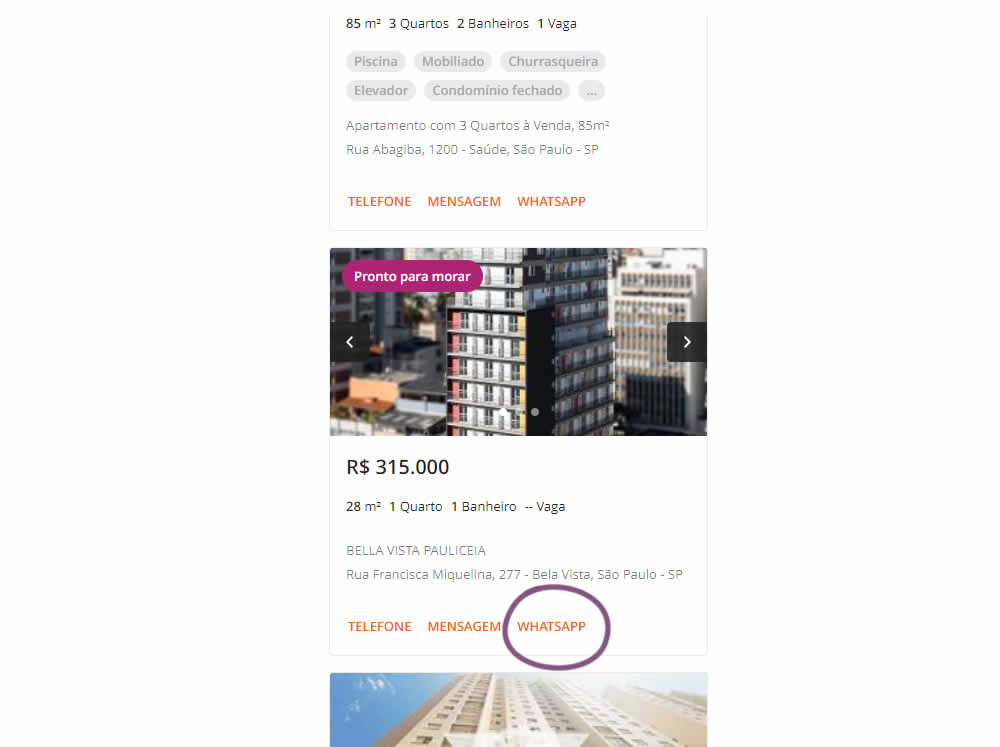
In this experiment, an additional call to action (Whatsapp link) was added on a listing page of one of Brazil's largest real estate sites.In the variation the 3 calls to action include: a link that launched the phone interaction, a general contact lead form, and finally the Whatsapp link (added in the variant). Impact on total lead starts and completions was measured.
Test #446 on
by
 Jakub Linowski
Dec 15, 2022
Desktop
Mobile
Product
Jakub Linowski Tested Pattern #18: Single Or Alternative Buttons In Test #446

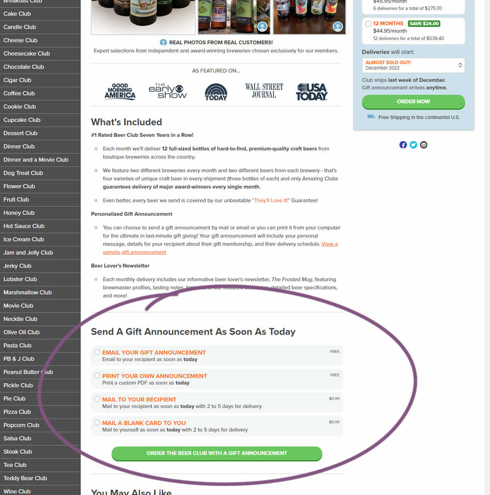
In this experiment, an additional purchase trigger was added - the ability to start by chosing a gift announcement option. In the control, this same question was asked further in the purchase funnel (after adding to cart). In the variation, this question was surfaced earlier as an alternative way of starting the purchase. Impact on total sales was measured.
Test #445 on
Phorest.com
by
 Sorcha Mullis
Dec 14, 2022
Desktop
Mobile
Home & Landing
Sorcha Mullis Tested Pattern #33: Example Situations In Test #445 On Phorest.com
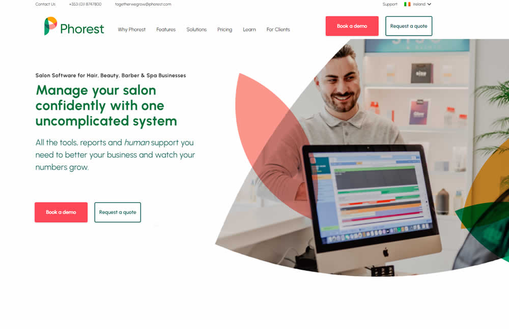

In this experiment, five clickable feature elements were surfaced on the homepage. Clicking on any of these 5 elements launched an Instastory-like short 10 second video in full screen. These videos explained the key features of the software being offered. Impact on lead generation was measured.