All Latest 556 A/B Tests
Become a member to unlock the abiltiy to see the highest impact a/b tests. Being able to see the actual test results and sort by impact allows growth and experimentation teams to take action on the biggest gains first
MOST RECENT TESTS
Test #444 on
by
 Melina Hess
Nov 30, 2022
Mobile
Product
Melina Hess Tested Pattern #41: Sticky Call To Action In Test #444

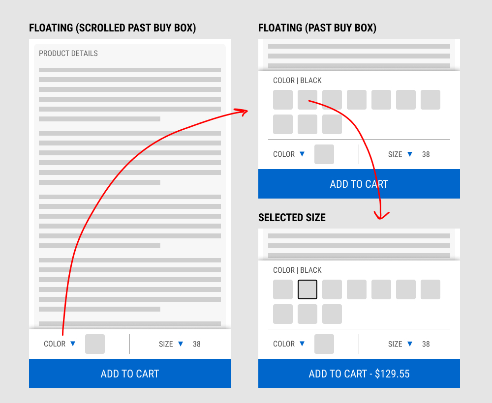
In this experiment, a floating add-to-cart with two product choices (color and size) were added on a product page. This appeared only after scrolling past the existing / embedded product selection buy box.
The floating add-to-cart widget had another layer of complexity in that it allowed customers to make a size and color selection with an expandable fly out. Making a selection would also append the total price to the add-to-cart button label.
Impact on total transactions was measured.
Test #443 on
Volders.de
by
 Daria Kurchinskaia
Nov 27, 2022
Desktop
Mobile
Home & Landing
Daria Kurchinskaia Tested Pattern #4: Testimonials In Test #443 On Volders.de

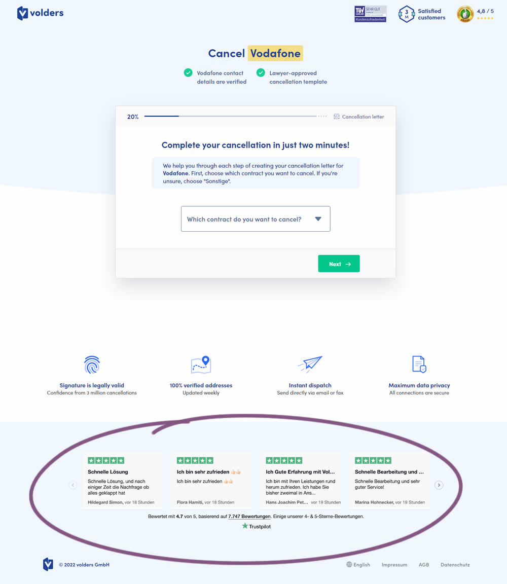
In this experiment, four TrustPilot reviews were appended at the bottom of landing pages of a contract cancelation service (paid). These reviews were also shown throughout the complete signup funnel (4 more steps). Impact on progression (step 2) and final completed purchases were measured.
Test #442 on
Volders.de
by
 Daria Kurchinskaia
Nov 27, 2022
Desktop
Mobile
Home & Landing
Daria Kurchinskaia Tested Pattern #4: Testimonials In Test #442 On Volders.de


In this experiment, three testimonials were appended at the bottom of landing pages of a contract cancelation service (paid). These testimonials were also shown throughout the complete signup funnel (4 more steps). Impact on progression (step 2) and final completed purchases were measured.
Test #441 on
by
 Melina Hess
Nov 23, 2022
Desktop
Mobile
Product
Melina Hess Tested Pattern #41: Sticky Call To Action In Test #441
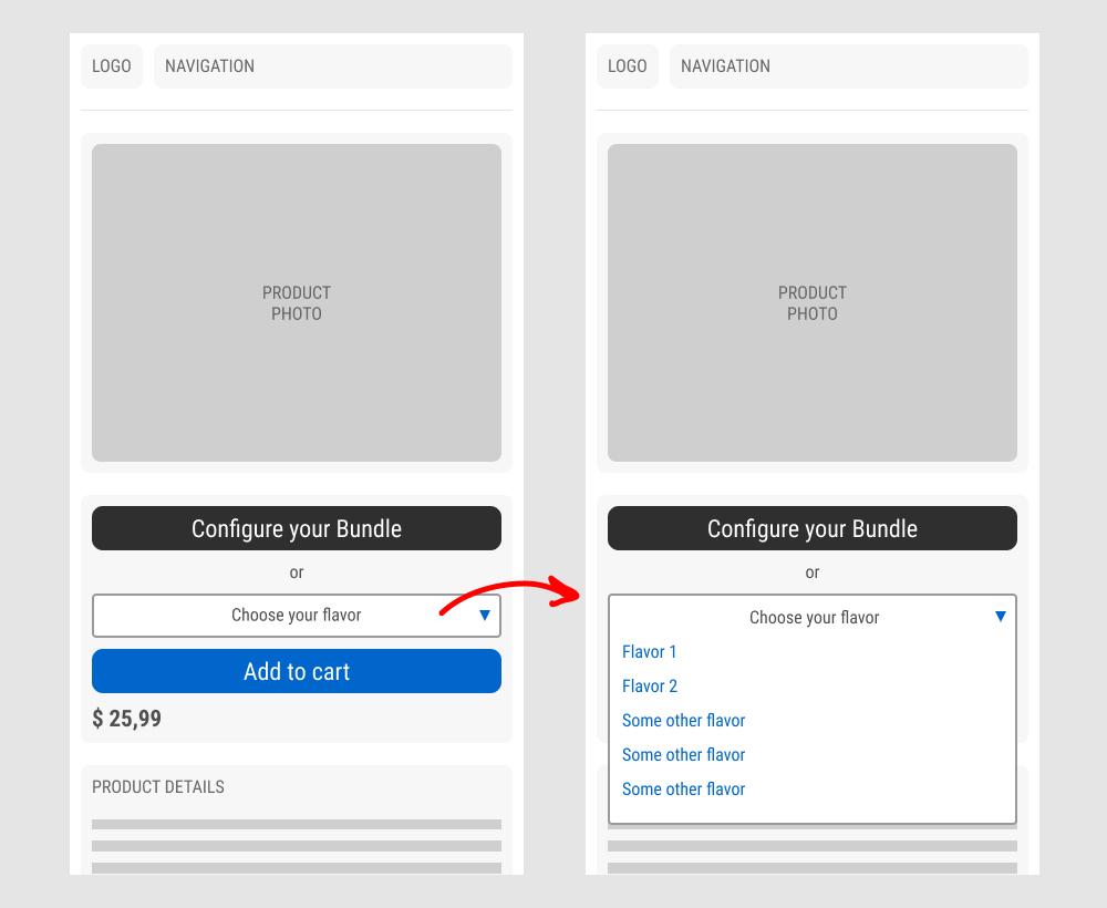
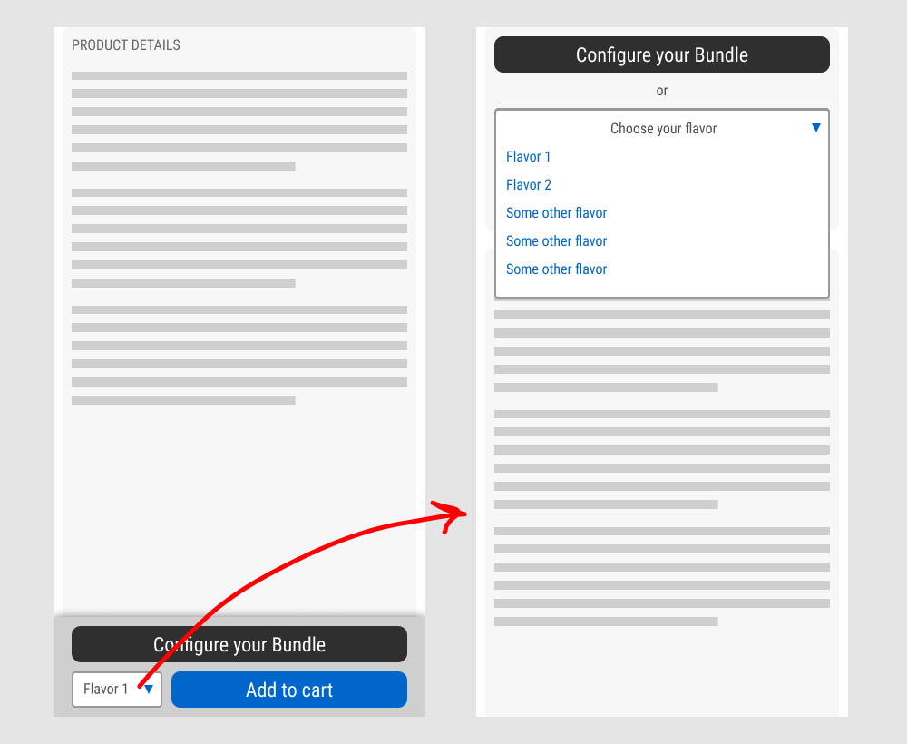
In this experiment, a floating sticky bar was added on product pages. The sticky elements only appeared after users scrolled beyond the fixed buy box area that is relatively high on the page (visible on the control screenshot). The sticky bar contained three elements: a button to configure up to three product choices, a flavor selection pulldown, and the add-to-cart button.
In the variation, when users clicked on the flavor pulldown three things happened. First, they were anchored back to the top of the buy box. Second, the floating sticky disappeared. And third, the flavors pulldown automatically expanded (overlapping the original primary add-to-cart button).
The control did not have any of the sticky behaviors.
Impact to total sales was measured.
Test #440 on
Formelskin.de
by
 Alexander Krieger
Nov 17, 2022
Mobile
Signup
Alexander Krieger Tested Pattern #49: Above The Fold Call To Action In Test #440 On Formelskin.de
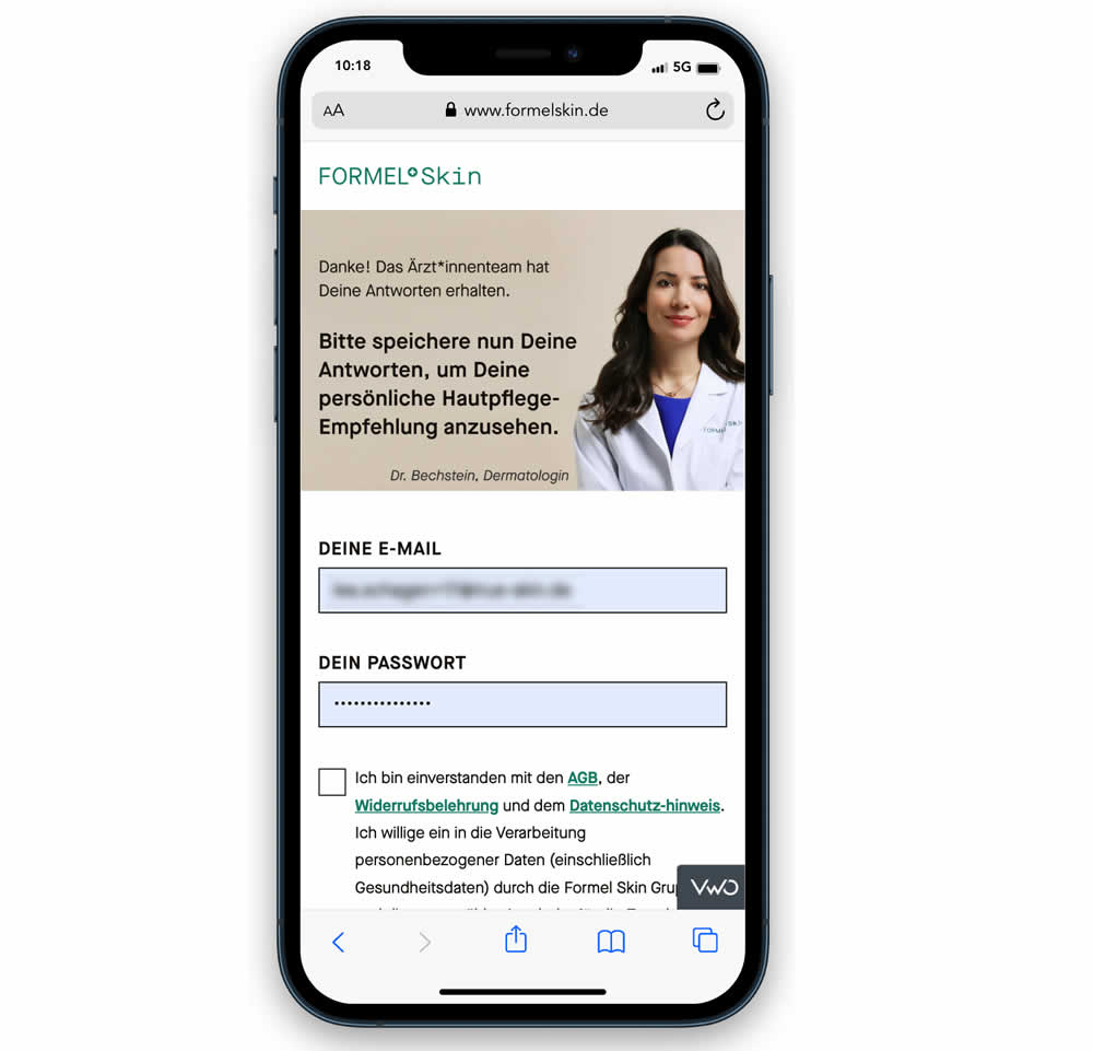
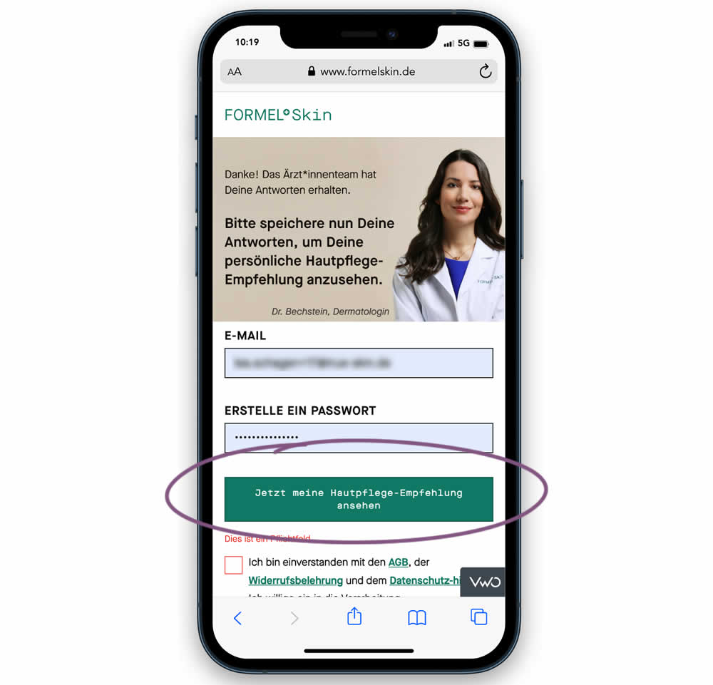
In this experiment, the call to action or button was raised above the legal text to be visible right away without scrolling. Additionally a error message was added for users that did not activate the checkbox to remind them that this is mandatory. Impact on signups and eventual follow-through to purchases (3 steps later) was measured.
Test #439 on
Designlab.com
by
 Daniel Shapiro
Oct 31, 2022
Desktop
Mobile
Home & Landing
Daniel Shapiro Tested Pattern #18: Single Or Alternative Buttons In Test #439 On Designlab.com


This was a larger leap experiment with numerous changes to the header part of a design program landing page. One of the key changes however was a shift from a single to multiple call to actions for lead generation. In the control, all potential leads would first funnel through a single syllabus download flow. In the variation, users were given three visible choices: download syllabus, webinar signup and/or book a live call with admissions. Impact on overall generated leads was measured, as well as paid enrollments.
Test #437 on
Vivareal.com.br
by
 Rodrigo Maués
Oct 28, 2022
Desktop
Mobile
Listing
Rodrigo Maués Tested Pattern #18: Single Or Alternative Buttons In Test #437 On Vivareal.com.br


In this experiment, an additional and alternative text based call to action link was added on real estate properity listings. Instead of only having "Ligar" ("Call"), "Enviar mensagem" was also appended ("Send Message"). This additional link lead to a lead-gen form.
Test #438 on
Phorest.com
by
 Sorcha Mullis
Oct 28, 2022
Desktop
Mobile
Home & Landing
Sorcha Mullis Tested Pattern #18: Single Or Alternative Buttons In Test #438 On Phorest.com

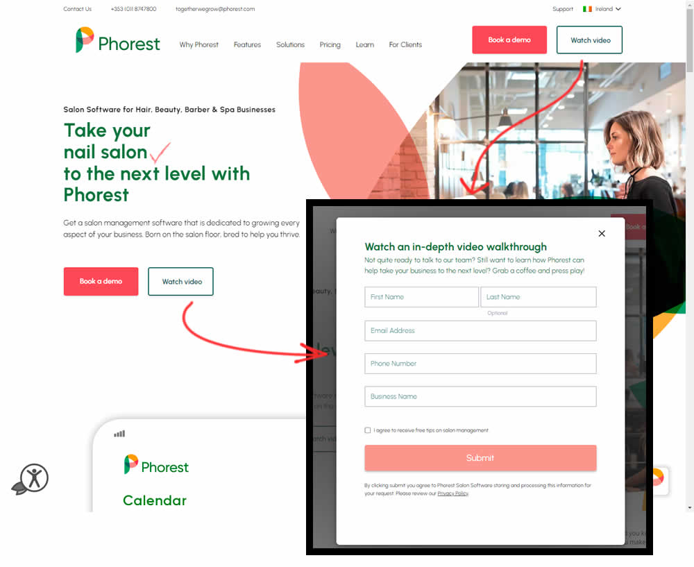
In this experiment, the addition of a secondary CTA for lead generation in the nav and the hero were tested. The additional button invited users to watch a gated demo video (approx 12 minutes). Clicking the CTA triggered a pop-up form collecting some basic contact information before the user could access the video page. Total leads were measured with lead form submittions.
Test #436 on
Designlab.com
by
 Daniel Shapiro
Oct 25, 2022
Desktop
Mobile
Home & Landing
Daniel Shapiro Tested Pattern #7: Social Counts In Test #436 On Designlab.com

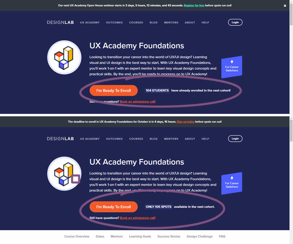
In this experiment, social proof and scarcity messages were shown on a course enrollment landing page. When students were starting to sign up at the beginning of each month (with greater availability), a simpler "X students have already enrolled in the next cohort" message was used.
Later in the month when fewer spots were available, a more scarce message was used with the following copy "ONLY X SPOTS available in the next cohort".
In both cases, the numbers were accurate and dynamically updated.
Test #435 on
Volders.de
by
 Daria Kurchinskaia
Oct 17, 2022
Desktop
Mobile
Checkout
Daria Kurchinskaia Tested Pattern #9: Multiple Steps In Test #435 On Volders.de
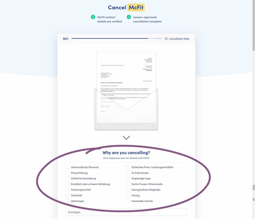
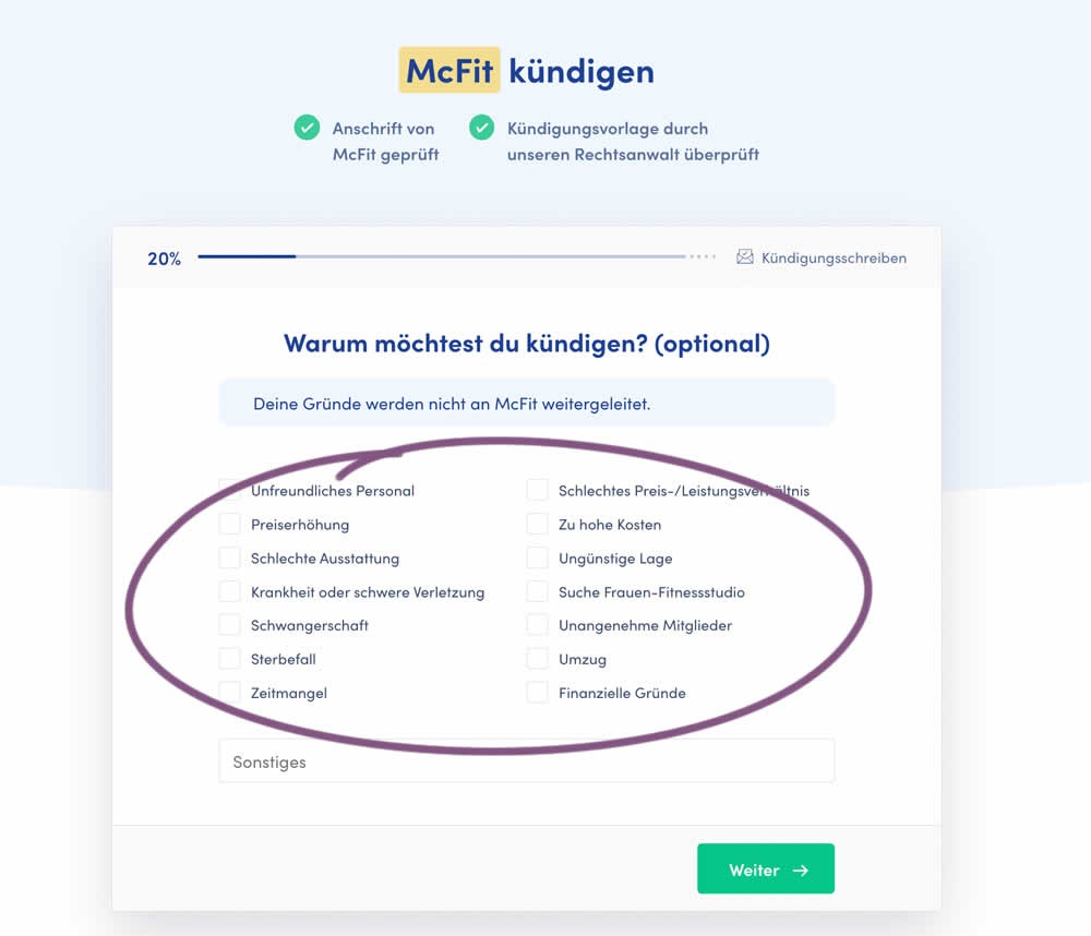
In this experiment, a question about a customer's reason for purchase was broken out into a separate step and moved earlier in the process. In the control, this question was asked in the final checkout step along with a plan selection (Step 4 of 4). In the variation, this question was shifted as a standalone first step (Step 1 of 5). Impact on completed purchases was measured (for a contract cancellation service in this case).
Test #433 on
Expertinstitute.com
by
 Ardit Veliu
Sep 30, 2022
Desktop
Mobile
Signup
Ardit Veliu Tested Pattern #20: Canned Response In Test #433 On Expertinstitute.com
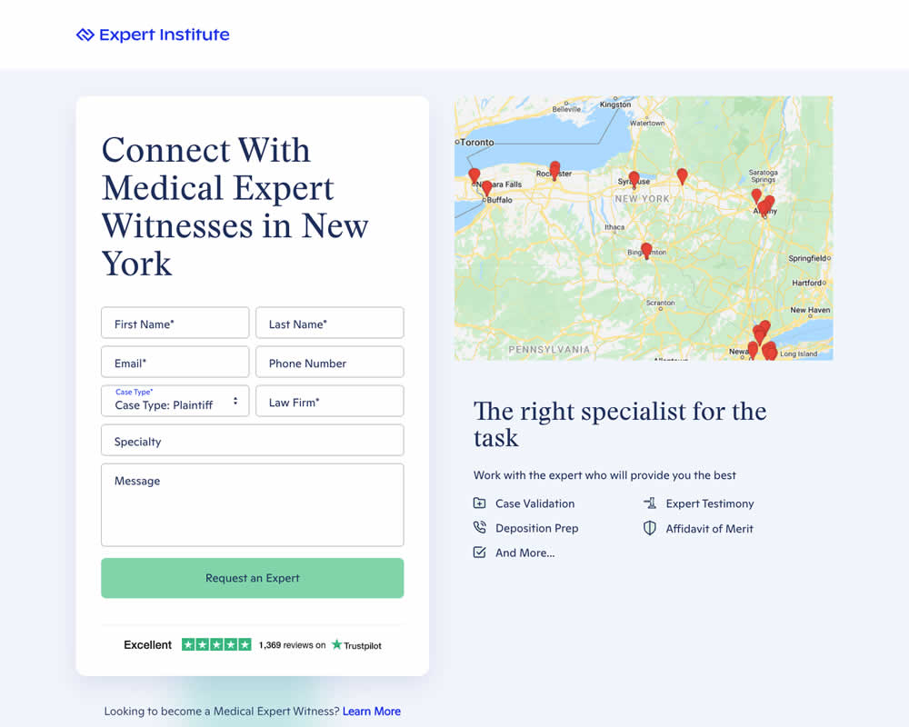

In this experiment a dynamic canned response was added to a lead form. The contents of the copy reflected a handful of user choices from other form field selections. Impact on leads / form submissions was measured.
Test #434 on
Learnwithhomer.com
by
 Stanley Zuo
Sep 30, 2022
Mobile
Signup
Stanley Zuo Tested Pattern #66: Complementary Upsell In Test #434 On Learnwithhomer.com
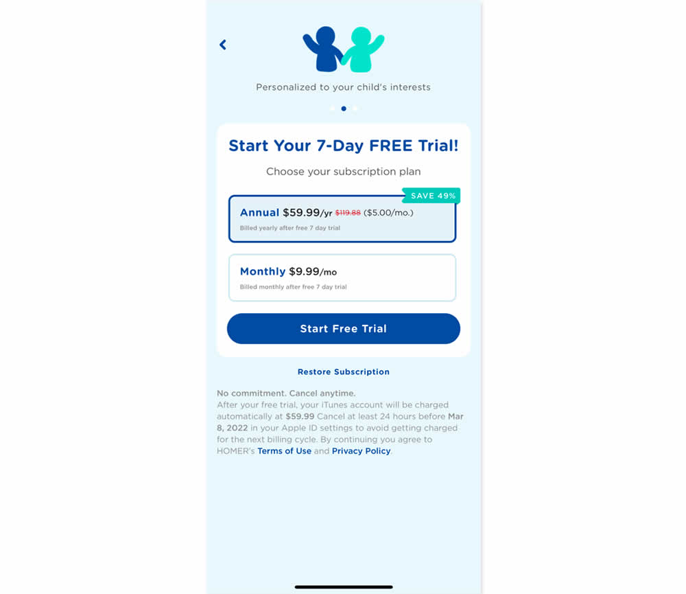
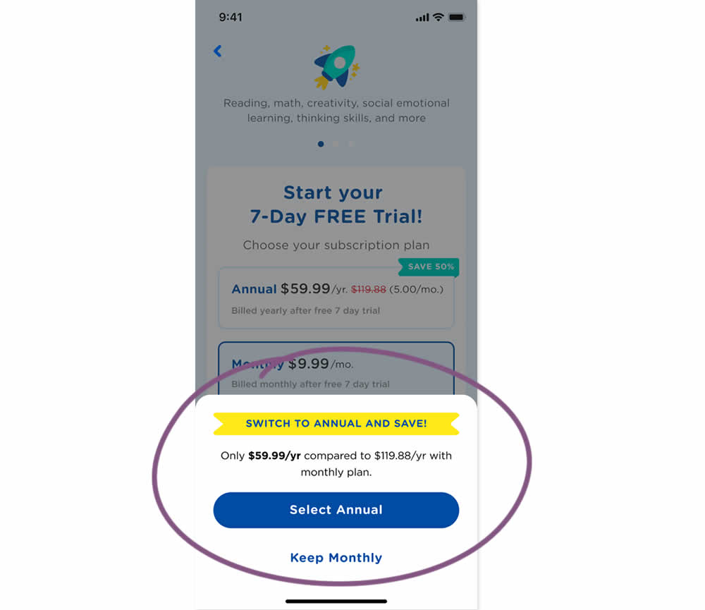
In this experiment, an upsell modal appeared during a signup funnel. In the variation, if users did not select a monthly plan, they were nudged to an annual one. Impact on overall and annual signups was measured.
Test #432 on
Snocks.com
by
 Melina Hess
Sep 29, 2022
Mobile
Global
Melina Hess Tested Pattern #94: Visible Search In Test #432 On Snocks.com

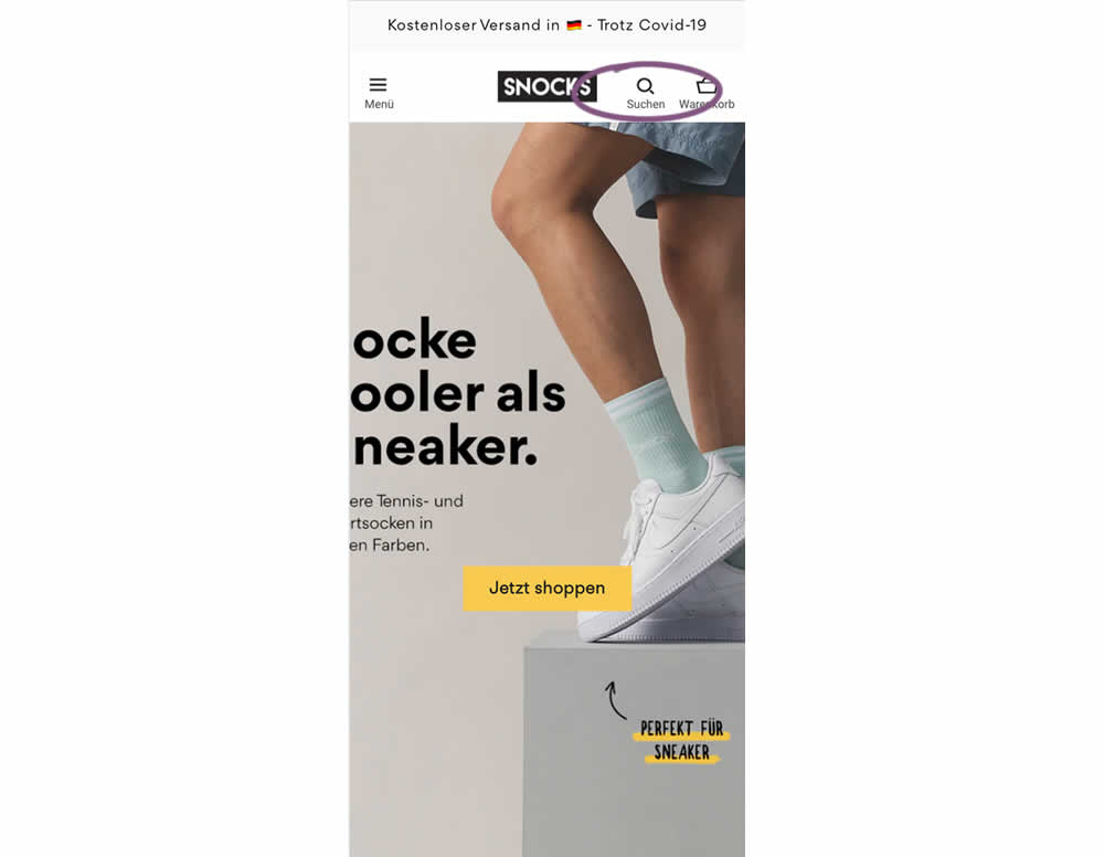
In this experiment, search functionality was added in the variation, globally on mobile. Impact on sales was measured
Test #431 on
Volders.de
by
 Daria Kurchinskaia
Sep 23, 2022
Desktop
Mobile
Pricing
Daria Kurchinskaia Tested Pattern #21: What It's Worth In Test #431 On Volders.de
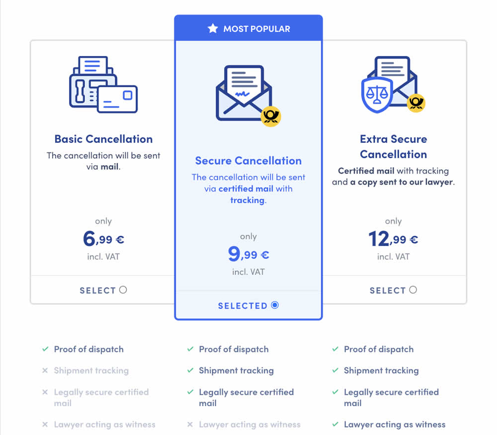
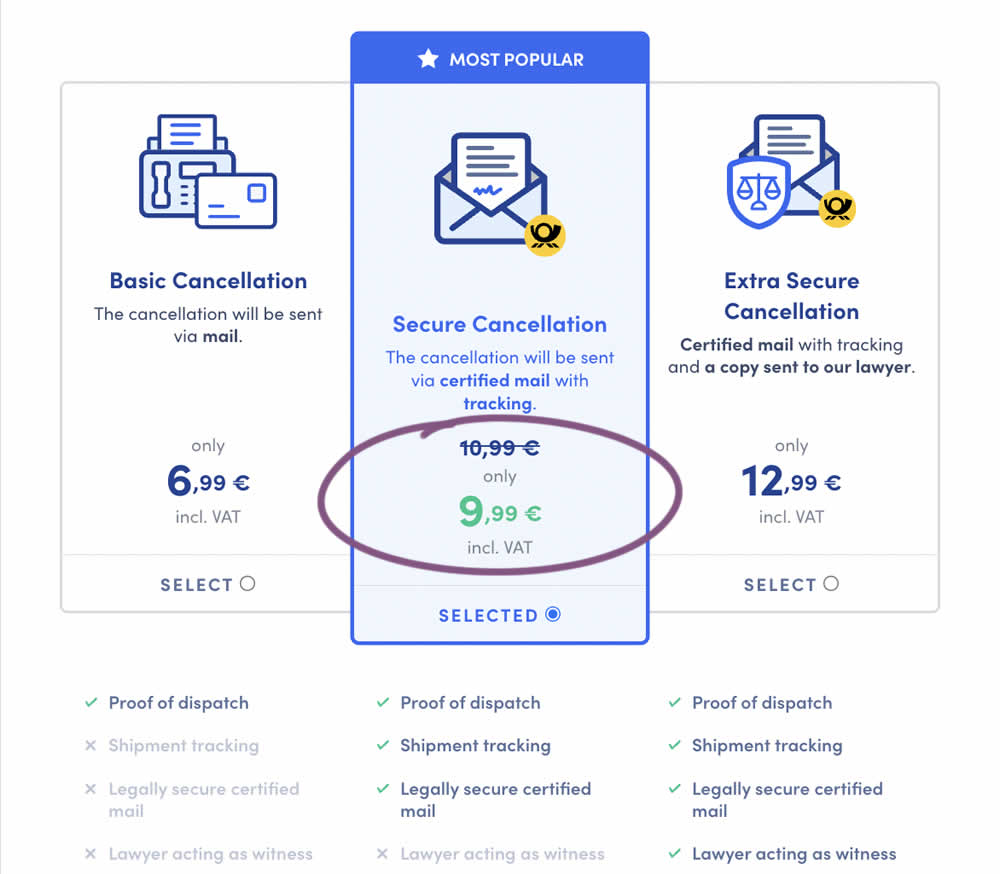
In this experiment, a historically higher price point was added as a crossed out anchor. The control only showed the current price. The variation showed the current price with the higher price crossed out. Impact on sales was measured.
Test #430 on
by
 Jakub Linowski
Sep 20, 2022
Desktop
Product
Jakub Linowski Tested Pattern #26: Cart Reminder And Recently Viewed In Test #430
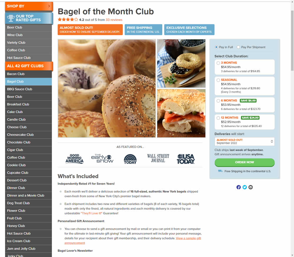
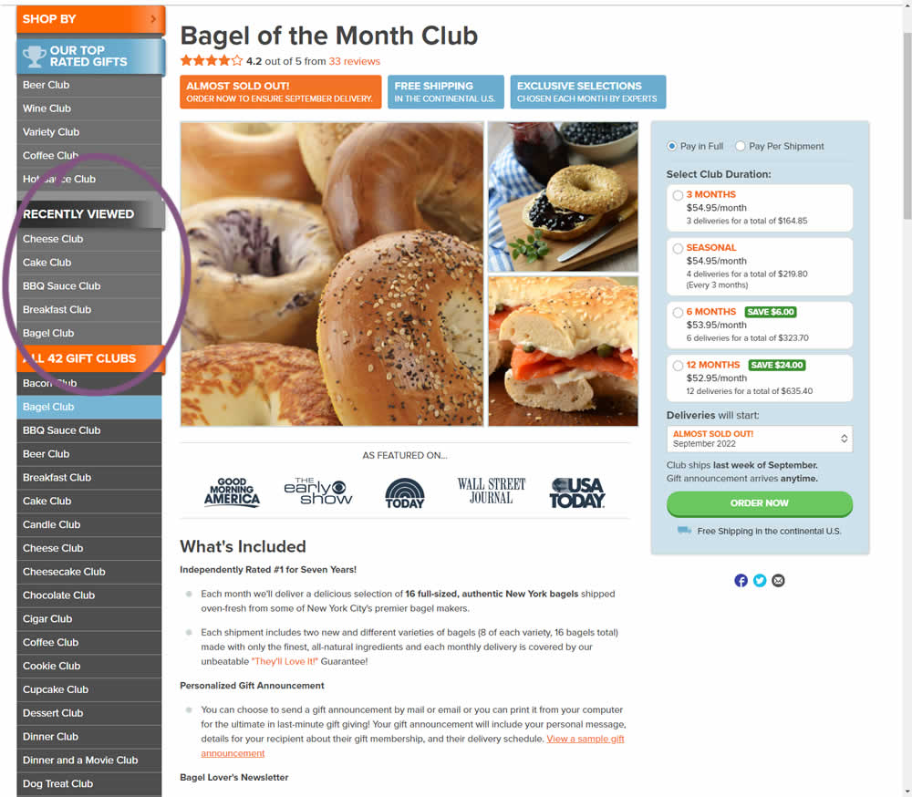
In this experiment, up to 5 recently viewed product pages would appear on the left hand navigation. The idea was to make it easier for users get back to what they were looking at in case they were browsing. These recently viewed products were not visibile in the control. Impact on adds-to-cart and completed transactions was measured.
Test #428 on
Volders.de
by
 Daria Kurchinskaia
Aug 16, 2022
Desktop
Mobile
Signup
Daria Kurchinskaia Tested Pattern #26: Cart Reminder And Recently Viewed In Test #428 On Volders.de
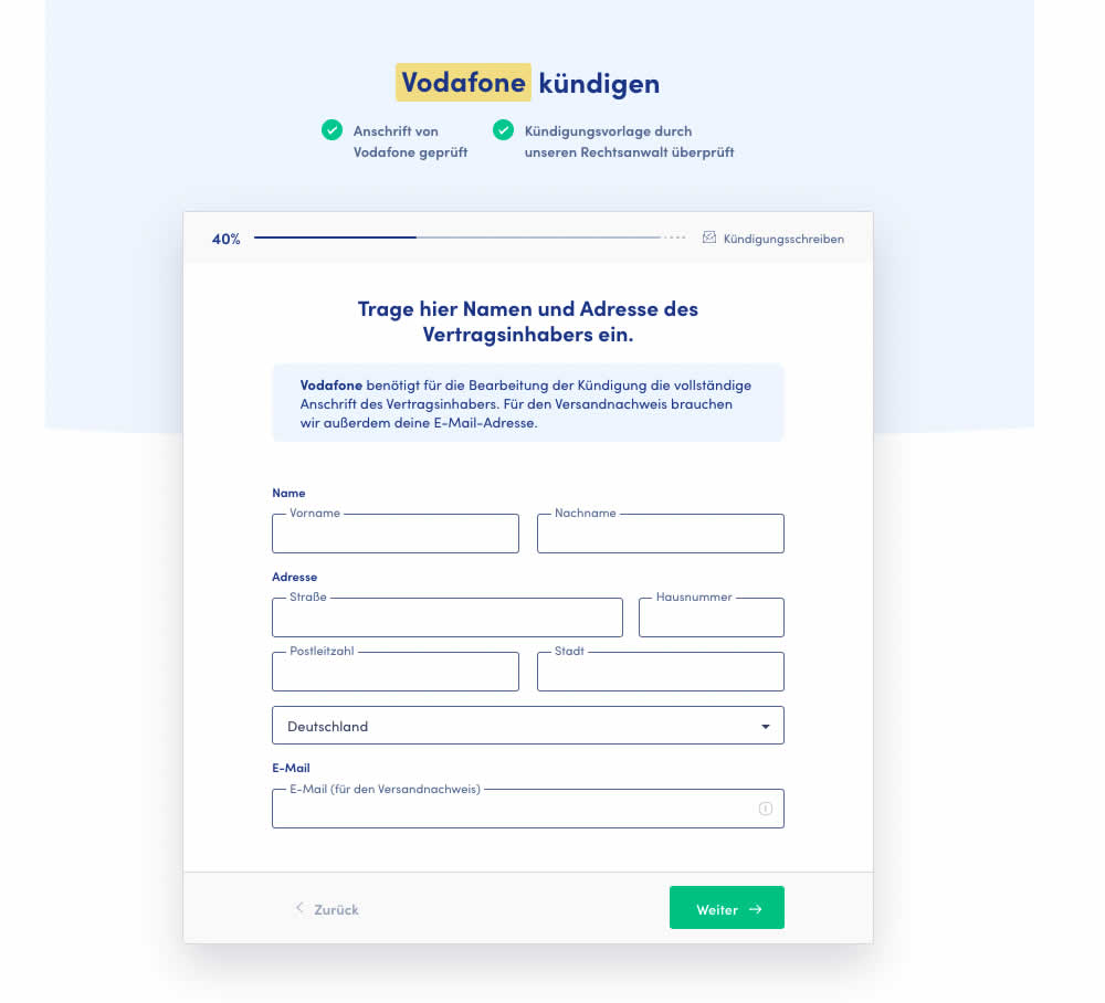

In this test 1) a passive hint communicated to users that their data will be saved for 7 days for them to be able to continue their cancellation later and 2) dropped off users were targeted with an email campaign within the first 4 hours after drop off. The reminder email linked users to a shipping page (checkout page) without them requiring to fill out their personal, contract information one more time.
Test #429 on
Snocks.com
by
 Melina Hess
Aug 16, 2022
Mobile
Desktop
Product
Melina Hess Tested Pattern #121: Free Shipping In Test #429 On Snocks.com

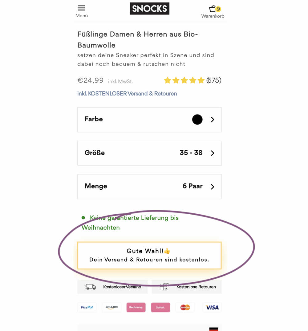
Upon clicking the Add-To-Cart button, the button label changed to a cheering message which congratulated the user on his choice and ensuring that shipping is free. Translation: "Good choice. Your shipping and returns are free."
Test #427 on
Designlab.com
by
 Daniel Shapiro
Aug 10, 2022
Desktop
Mobile
Checkout
Daniel Shapiro Tested Pattern #28: Easiest Fields First In Test #427 On Designlab.com
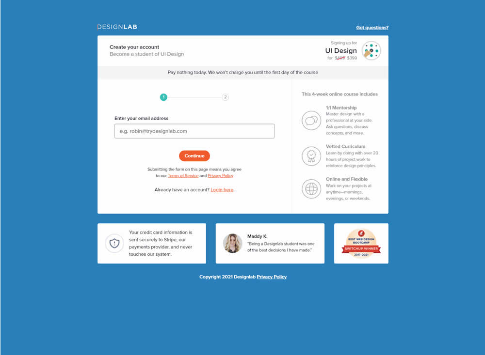
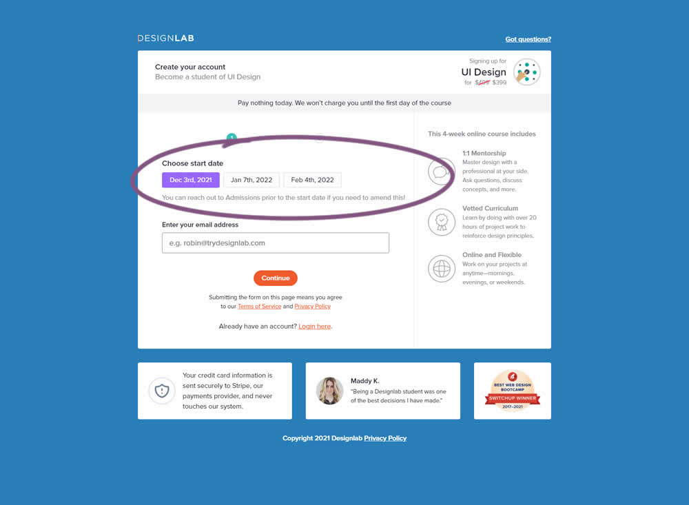
In this experiment, the course enrollment start date was moved from step 2 to step 1 of an enrollment / checkout flow. The test was run by Designlab - that offers design courses and education with a strong element of mentorship. Impact on progression to next step and completed transactions were measured.
Test #426 on
Phorest.com
by
 Sorcha Mullis
Aug 09, 2022
Desktop
Mobile
Home & Landing
Sorcha Mullis Tested Pattern #9: Multiple Steps In Test #426 On Phorest.com
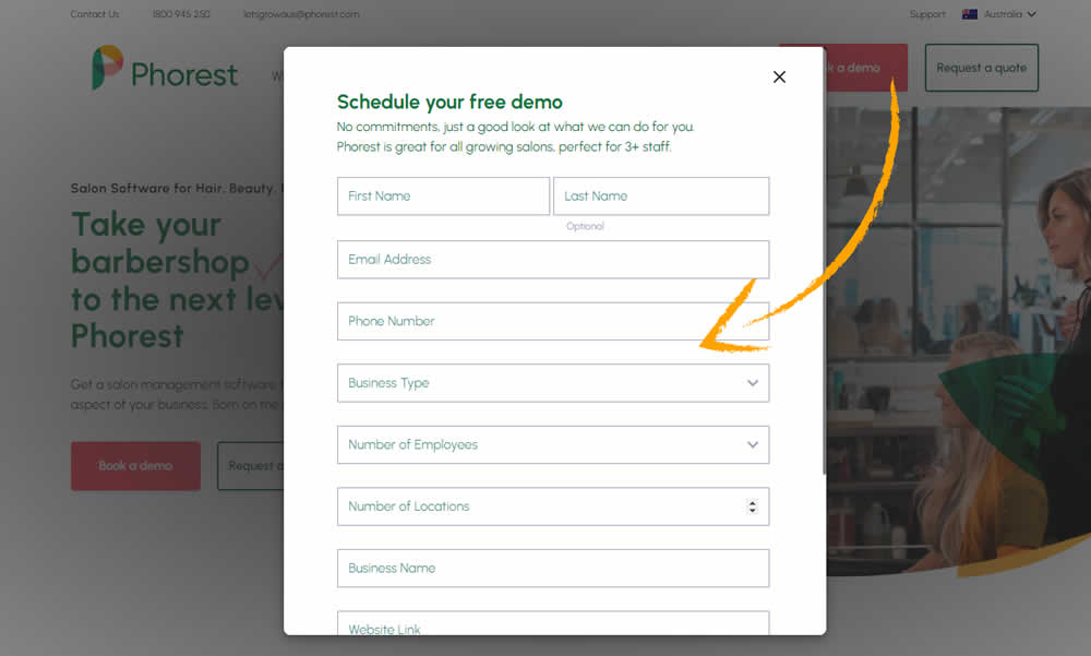

In this experiment, a single step popup modal was tested against a 4 step sign up funnel. Users entered the experiment on the homepage and the behavior of the two buttons, book a demo and get a quote, was adjusted. Impact on leads was measured.
Test #425 on
by
 Jakub Linowski
Aug 03, 2022
Desktop
Product
Jakub Linowski Tested Pattern #41: Sticky Call To Action In Test #425
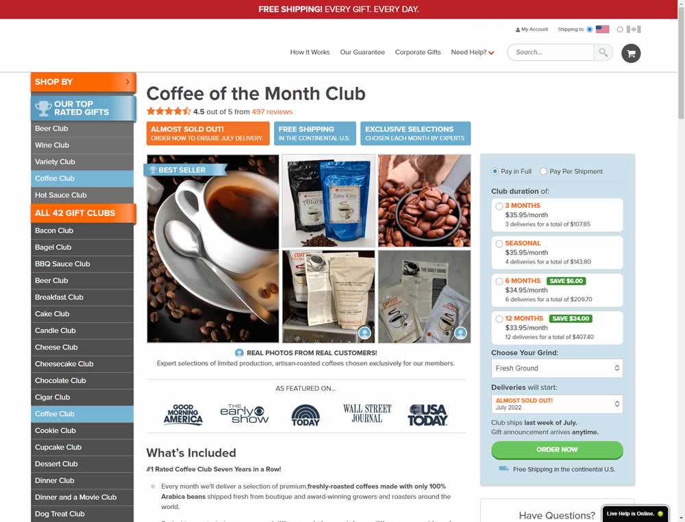

In this experiment, the complete buy box on a product detail page, floated along as users scrolled through the long screen. The variation made sure the product choice and order now button was always visible. Impact on adds-to-cart and sales was measured.