All Latest 556 A/B Tests
Become a member to unlock the abiltiy to see the highest impact a/b tests. Being able to see the actual test results and sort by impact allows growth and experimentation teams to take action on the biggest gains first
MOST RECENT TESTS
Test #414 on
Volders.de
by
 Frederik Fröhle
May 31, 2022
Desktop
Mobile
Checkout
Frederik Fröhle Tested Pattern #98: Auto Suggest In Test #414 On Volders.de
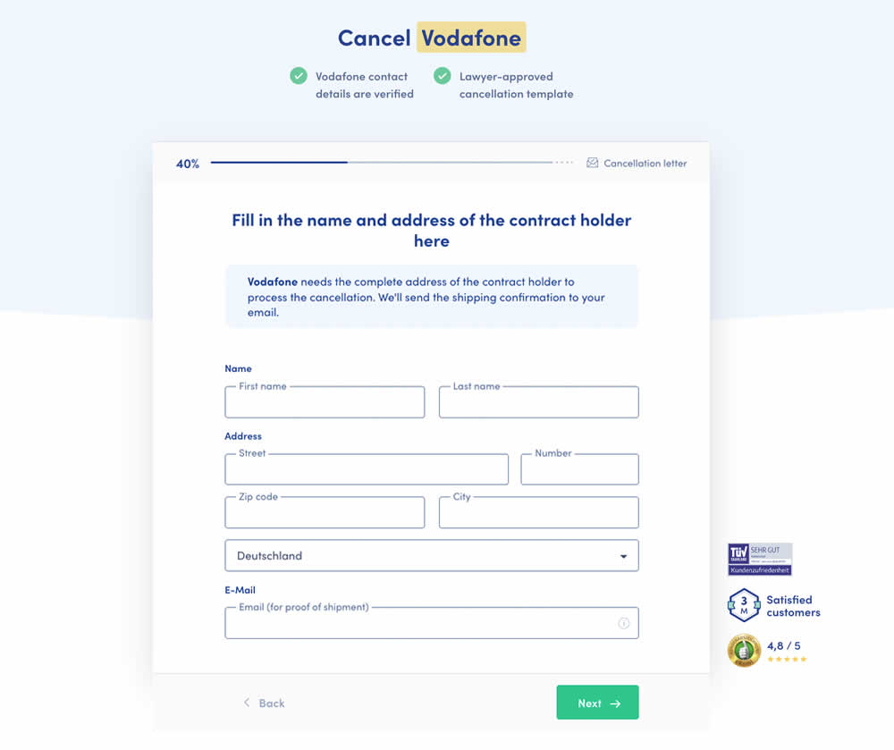
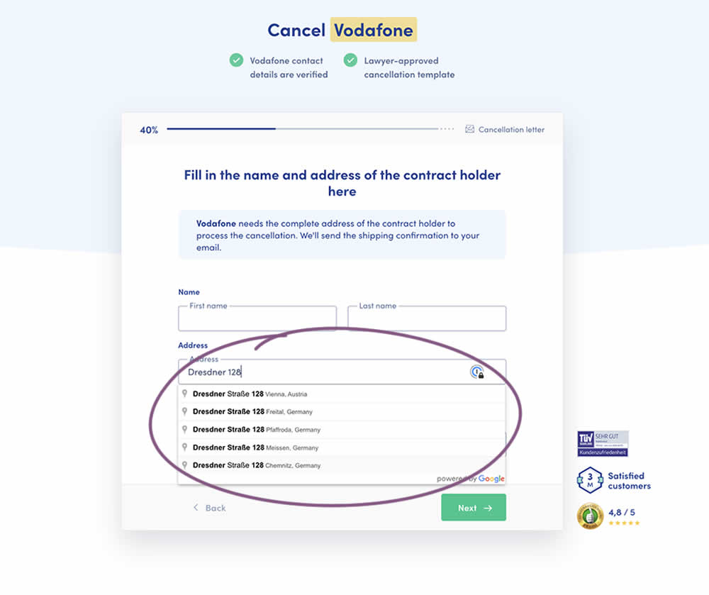
Does adding Google's address auto complete functionality to an address field help with higher form completions? This auto fill feature has been tested in the variation of a contract cancellation funnel. After selecting an auto completed address from a pulldown menu, the following fields were preselected: house number, zip code, city and country (potentially lowering friction?). Impact on successful form completions (contract cancellations) has been measured. Notice how the form also expanded progressively upon selecting the complete address in the variation.
Test #412 on
Volders.de
by
 Frederik Fröhle
May 16, 2022
Desktop
Mobile
Checkout
Frederik Fröhle Tested Pattern #15: Bulleted Reassurances In Test #412 On Volders.de
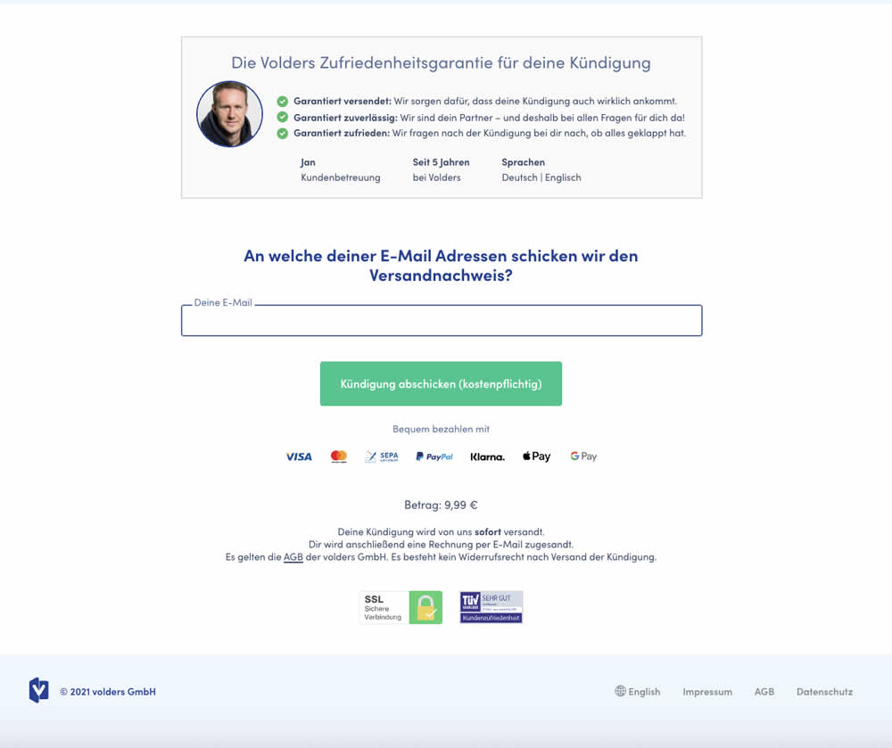

The Volders experimentation team assumed that adding information about how long it might take to get a cancellation confirmation near a CTA Button would result in higher cancellation requests (the paid service being offered).
The variation contained additional copy translated from German to: "Most of our users receive their cancellation confirmation from <vendor> within 14 days by email or letter."
Test #403 on
by
 Jakub Linowski
Mar 29, 2022
Desktop
Mobile
Checkout
Jakub Linowski Tested Pattern #42: Countdown Timer In Test #403

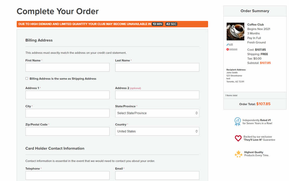
In this experiment, an urgency related message with a dynamic countdown timer was added on the final checkout screen. Impact on sales was measured.
Test #399 on
by
 Jakub Linowski
Feb 27, 2022
Desktop
Mobile
Checkout
Jakub Linowski Tested Pattern #35: Floating Labels In Test #399

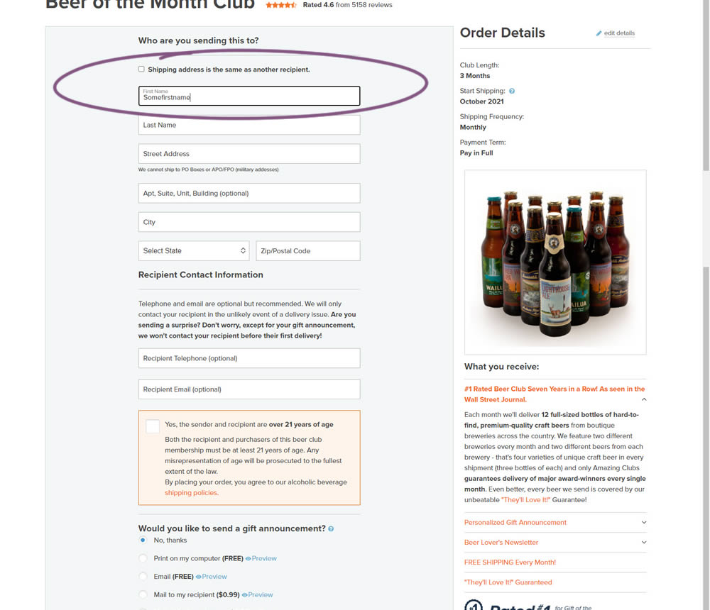
In this experiment, top-aligned field labels were tested against floating labels (with labels floating inside the form field itself).
Test #390 on
Snocks.com
by
 Melina Hess
Dec 21, 2021
Desktop
Mobile
Checkout
Melina Hess Tested Pattern #106: Back Buttons In Test #390 On Snocks.com
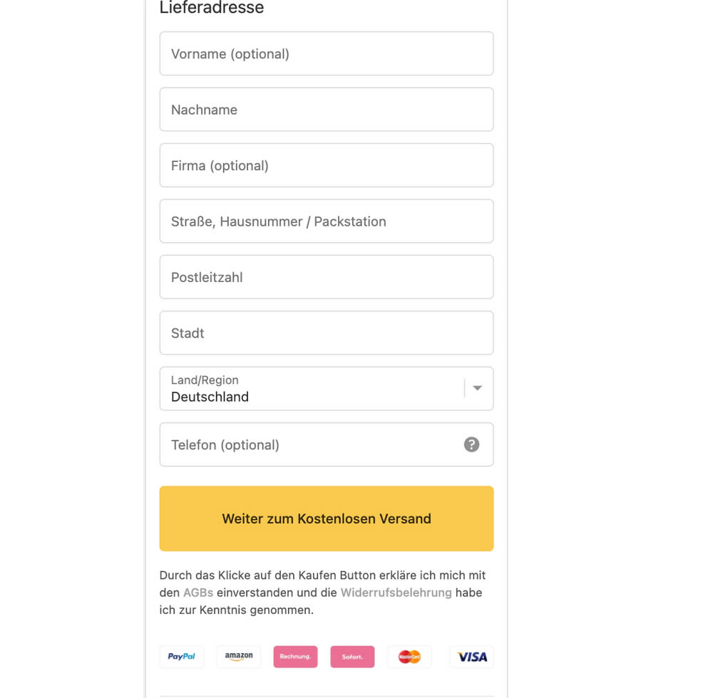
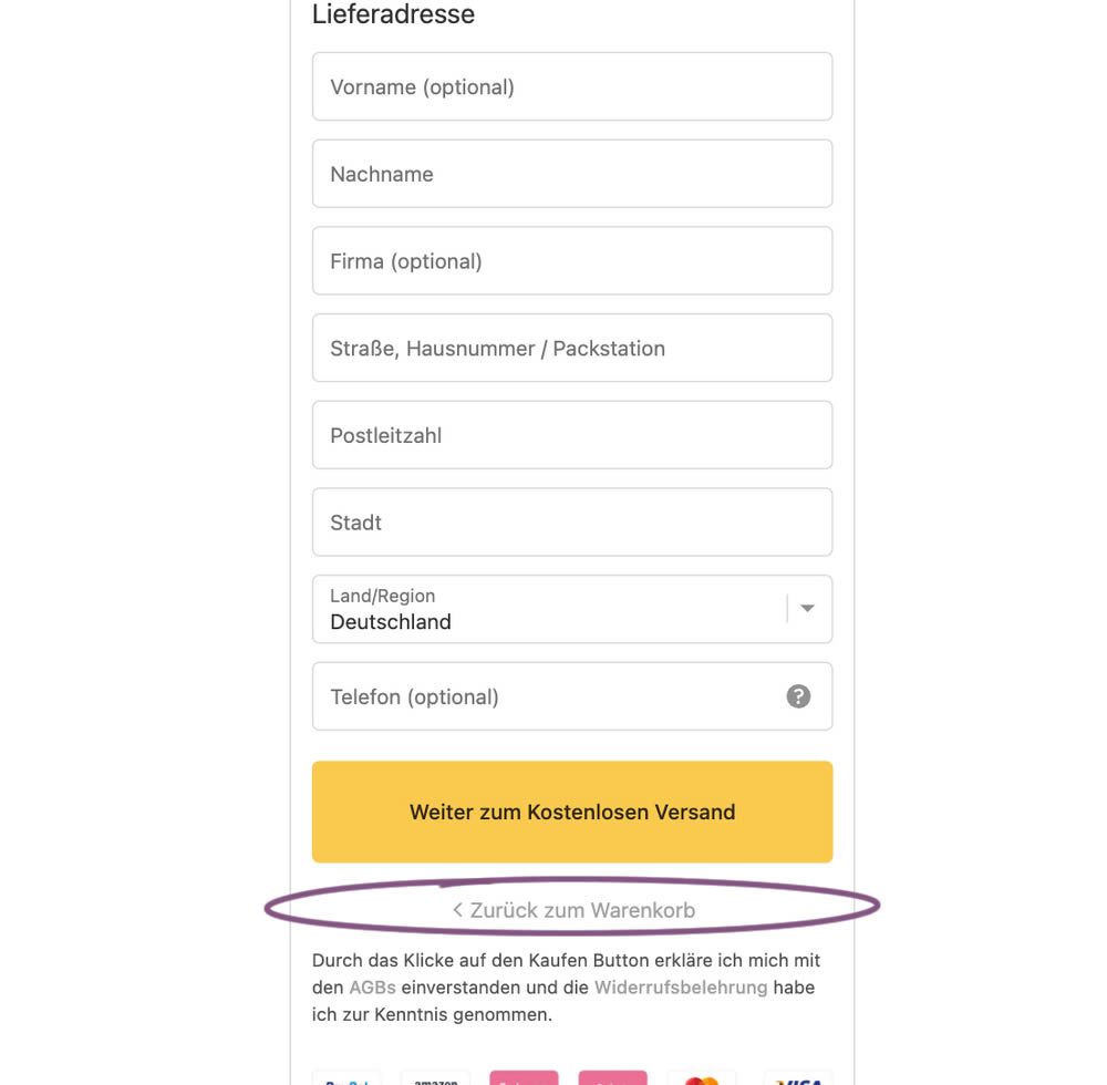
In this experiment, the variation has a "Back To Shopping Cart" link right underneath the checkout button. Impact on sales was measured.
Test #389 on
Svsound.com
by
 Keenan Davis
Dec 16, 2021
Desktop
Mobile
Checkout
Keenan Davis Tested Pattern #1: Remove Coupon Fields In Test #389 On Svsound.com
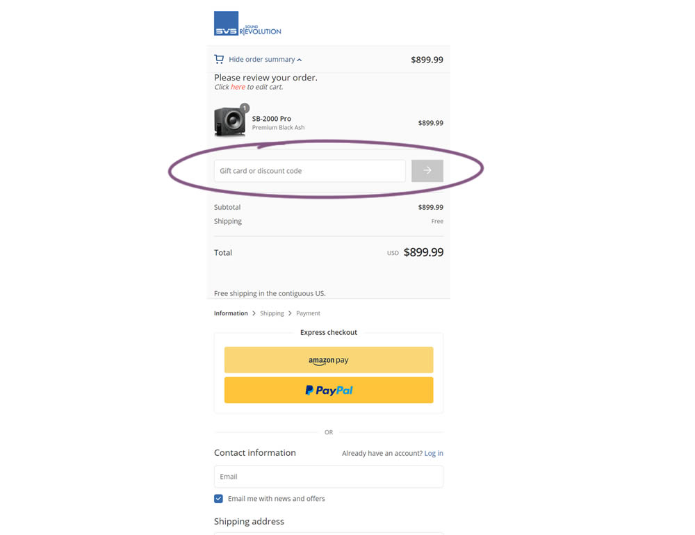
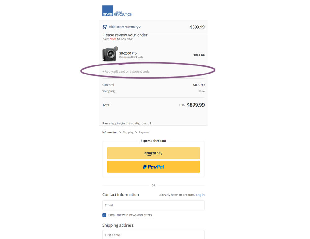
In this simple experiment, a highly visible coupon field was replaced with a less visible (but clickable) link in the variation. Clicking on the link would show the coupon field. Impact on sales and revenue was measured.
Test #383 on
by
 Jakub Linowski
Nov 11, 2021
Desktop
Checkout
Jakub Linowski Tested Pattern #123: Single Or Double Column Form Fields In Test #383

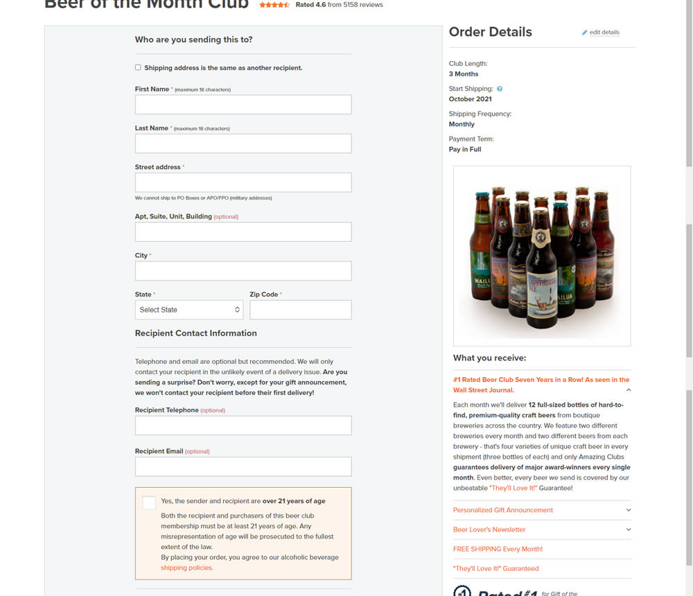
In this simple [inverted] experiment, the variation organized the form fields into a single column. The control had two columns of form fields.
Test #344 on
by
 Jakub Linowski
Mar 11, 2021
Desktop
Checkout
Jakub Linowski Tested Pattern #108: Frequently Asked Questions In Test #344
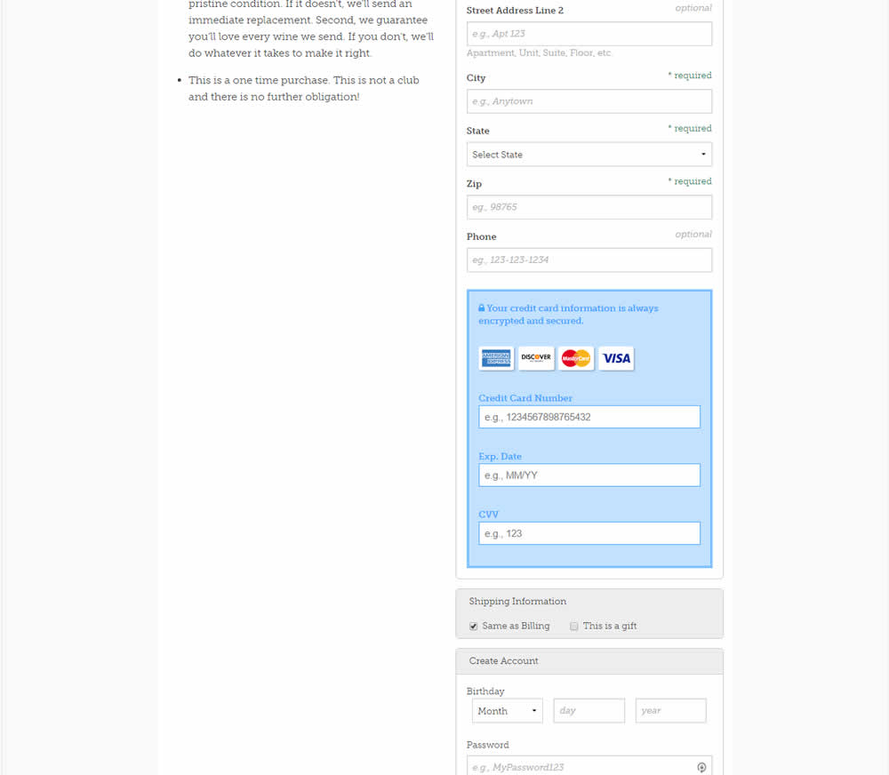

Three common delivery questions were answered at the bottom of a checkout page.
Test #340 on
by
 Jakub Linowski
Feb 25, 2021
Desktop
Checkout
Jakub Linowski Tested Pattern #114: Less Or More Visible Prices In Test #340
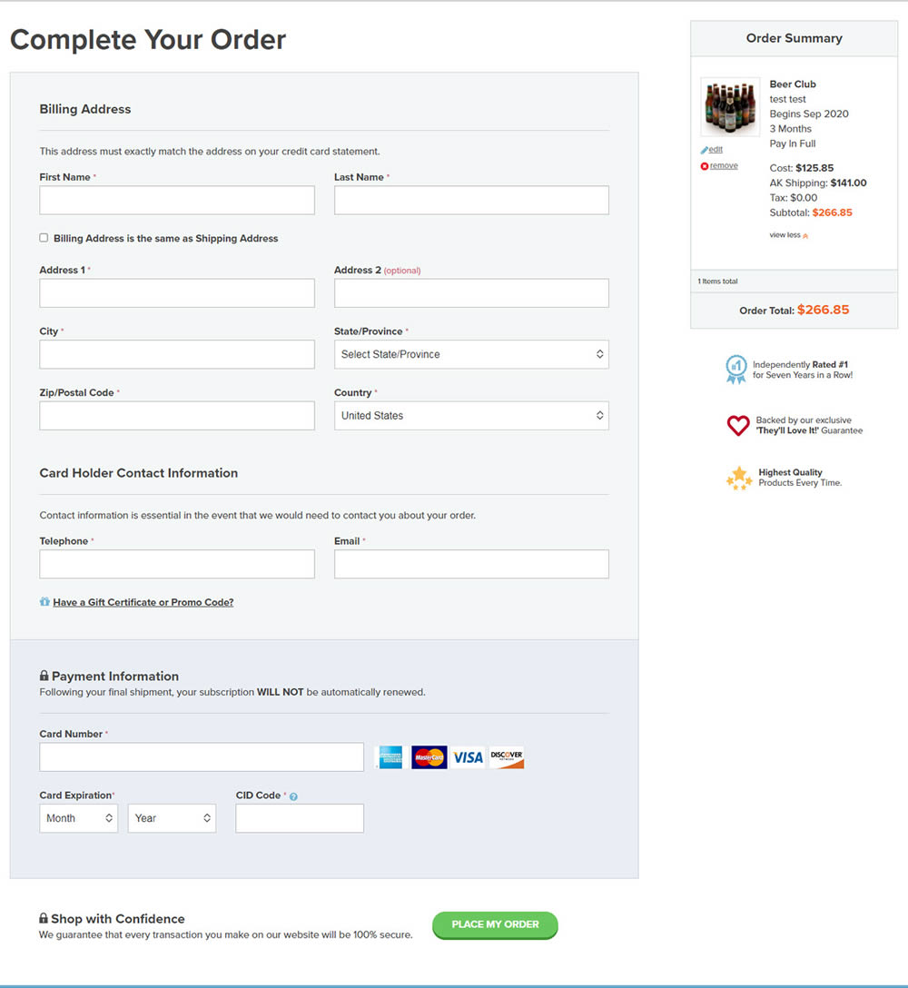
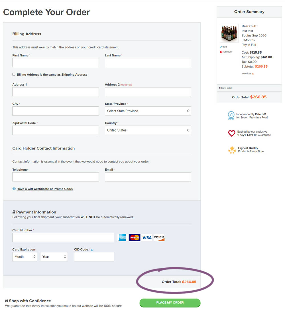
In this experiment, the variation added a second total price at the bottom of the checkout screen just above the checkout button. The impact on sales was measured.
Test #320 on
by
 Jakub Linowski
Oct 20, 2020
Desktop
Checkout
Jakub Linowski Tested Pattern #49: Above The Fold Call To Action In Test #320

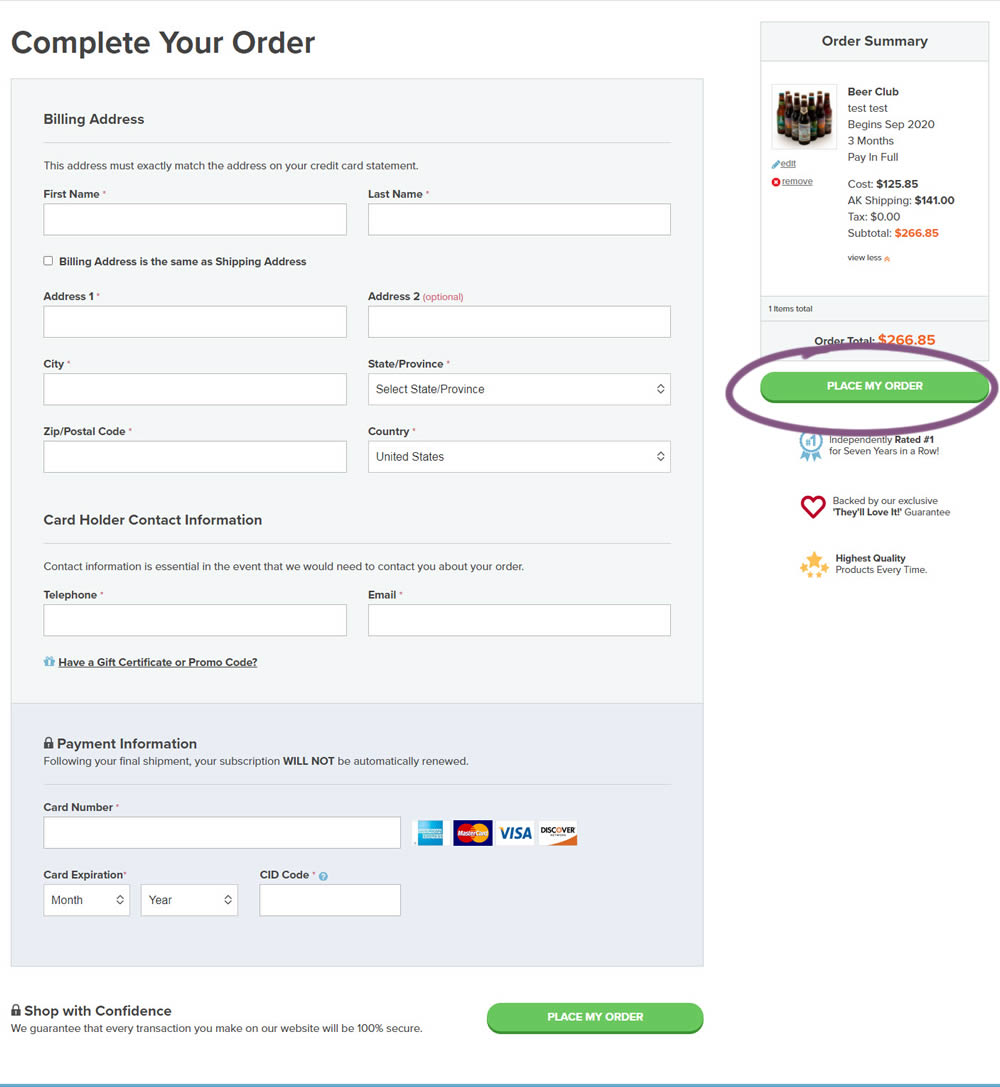
An extra "Place Order" button was duplicated above the fold on this checkout page. The control had a similar button further down at the bottom of the screen. The impact on total sales was measured from this change.
Test #61 on
by
 Someone
Jun 26, 2020
Desktop
Checkout
Someone Tested Pattern #9: Multiple Steps In Test #61
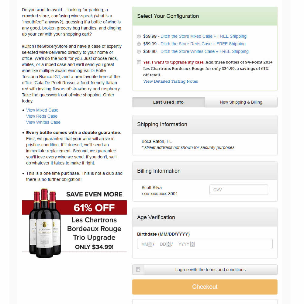
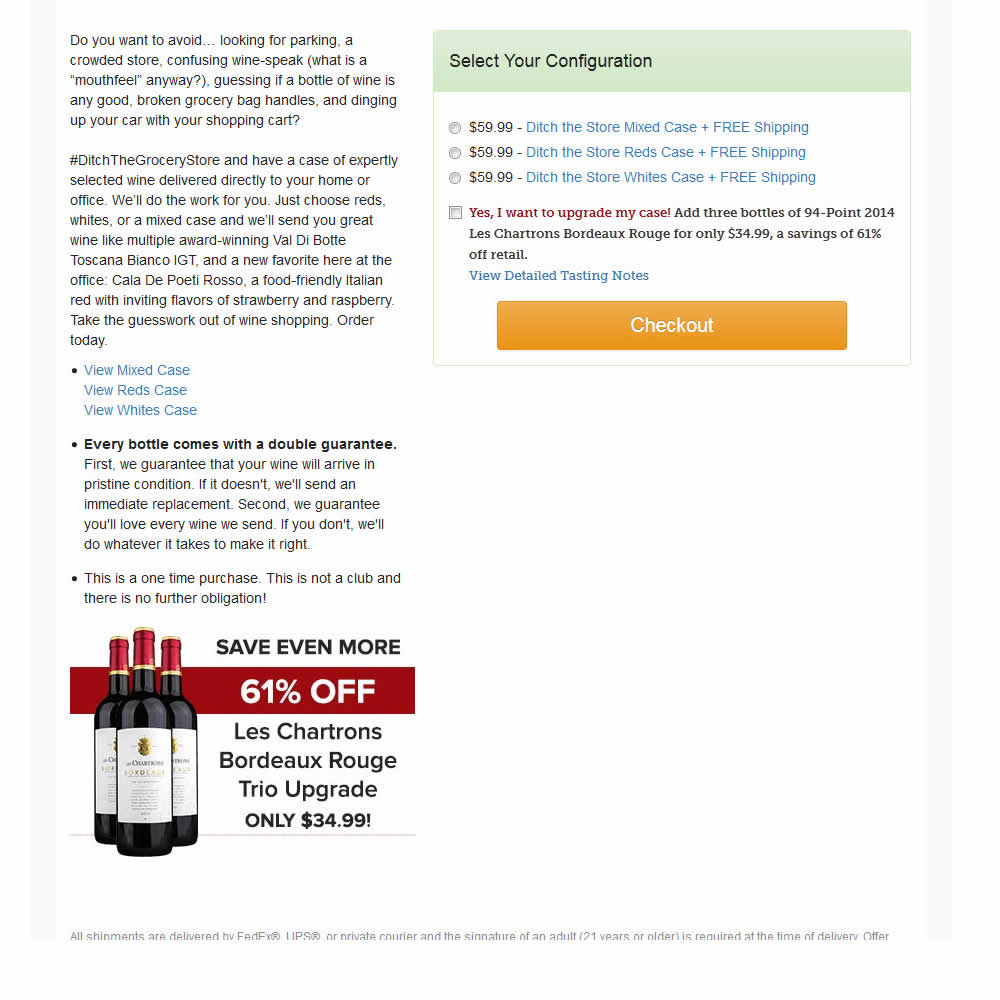
In this experiment, a single screen checkout was turned into a series of smaller steps in variation B. This was achieved by showing fewer fields on the first step, and shifting the remaining ones into a 3 step modal popup. The experiment measured successful transactions (sales).
Test #274 on
by
 Someone
Dec 16, 2019
Desktop
Mobile
Checkout
Someone Tested Pattern #1: Remove Coupon Fields In Test #274
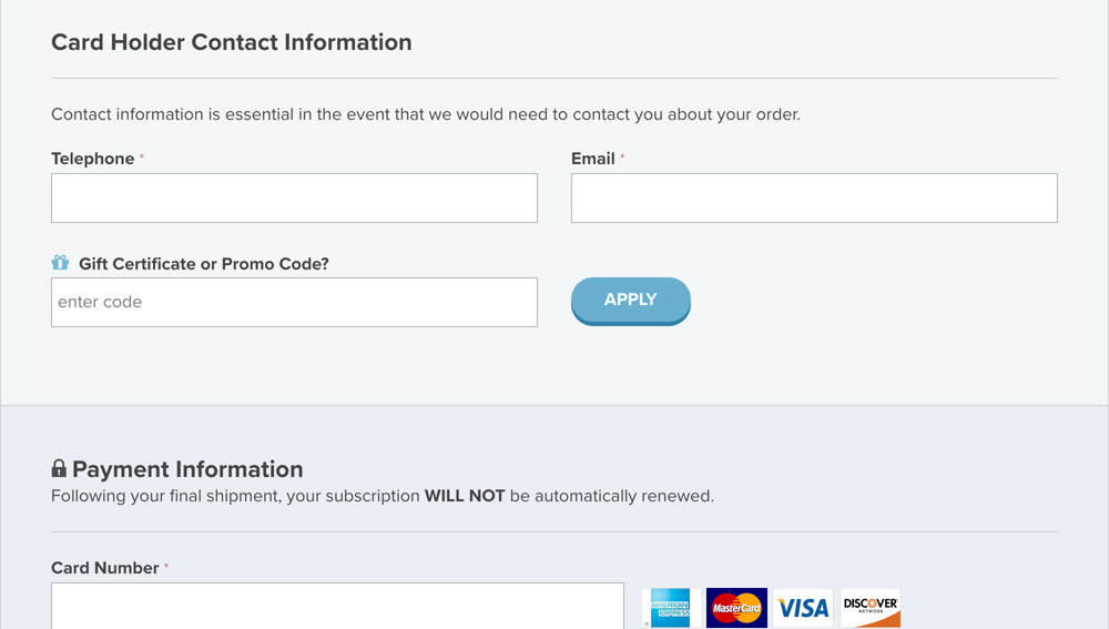
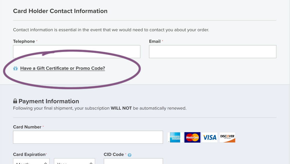
In this experiment, a fully visible coupon field (A) was made less visible by turning it into a default collaped link (B). Clicking on the link caused the coupon field to appear.
Test #267 on
Backstage.com
by
 Stanley Zuo
Nov 05, 2019
Mobile
Checkout
Stanley Zuo Tested Pattern #99: Progress Bar In Test #267 On Backstage.com
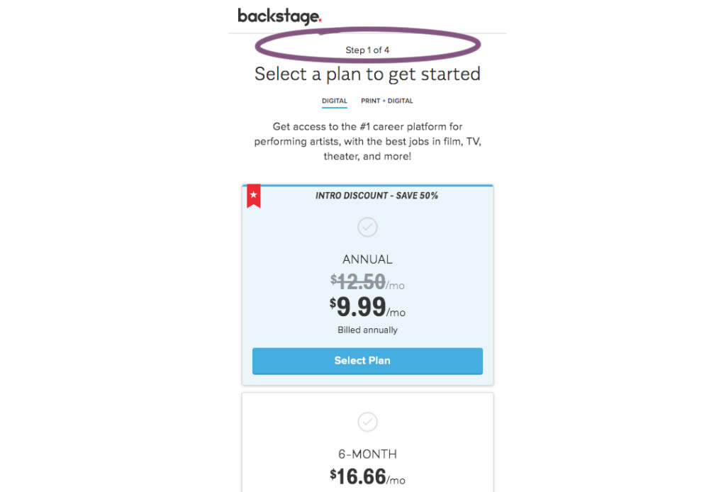
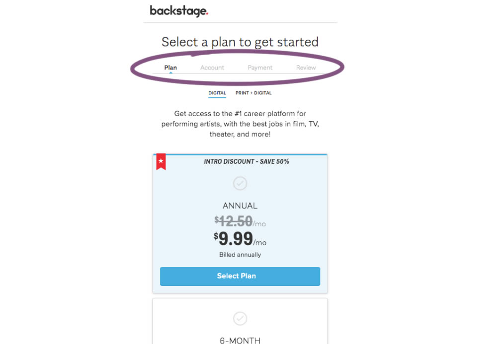
A "Step X of 4" progress bar was tested against a fully visible one that was also clickable.
Test #261 on
Valkexclusief.nl
by
 Online Dialogue
Sep 20, 2019
Desktop
Checkout
Online Dialogue Tested Pattern #111: Field Explanations In Test #261 On Valkexclusief.nl
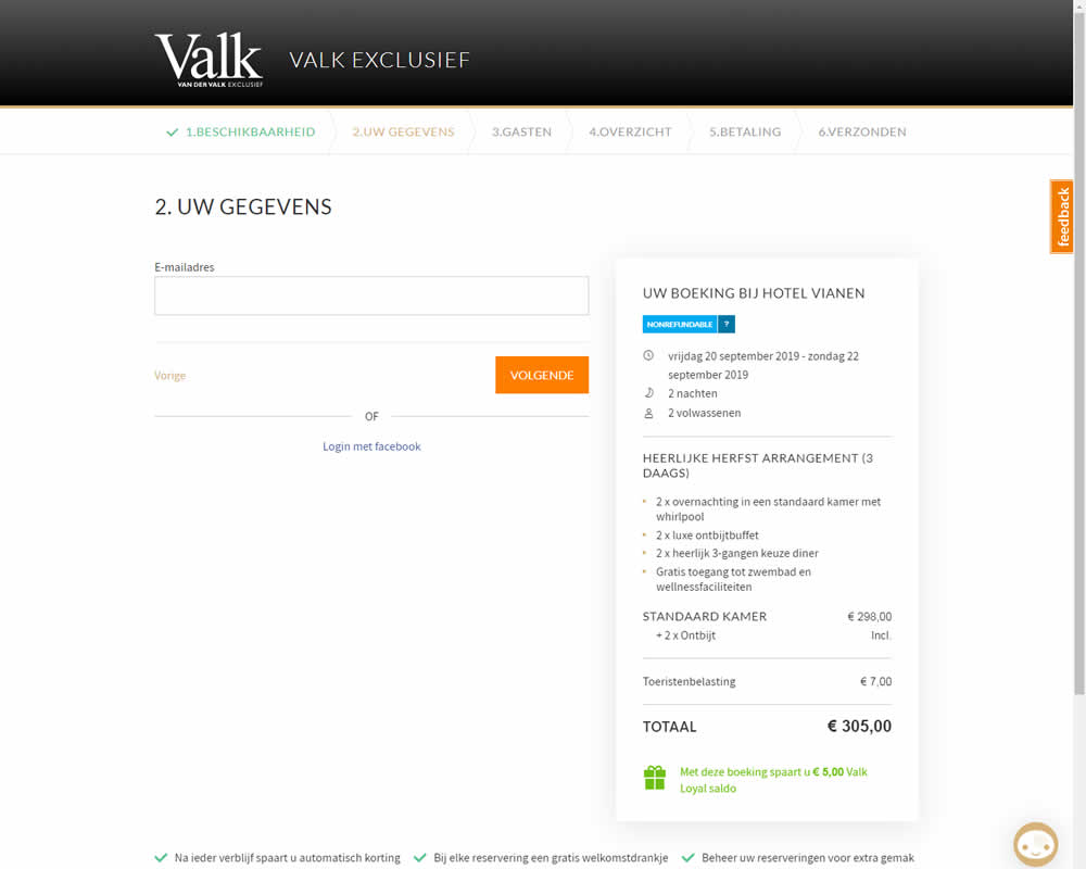
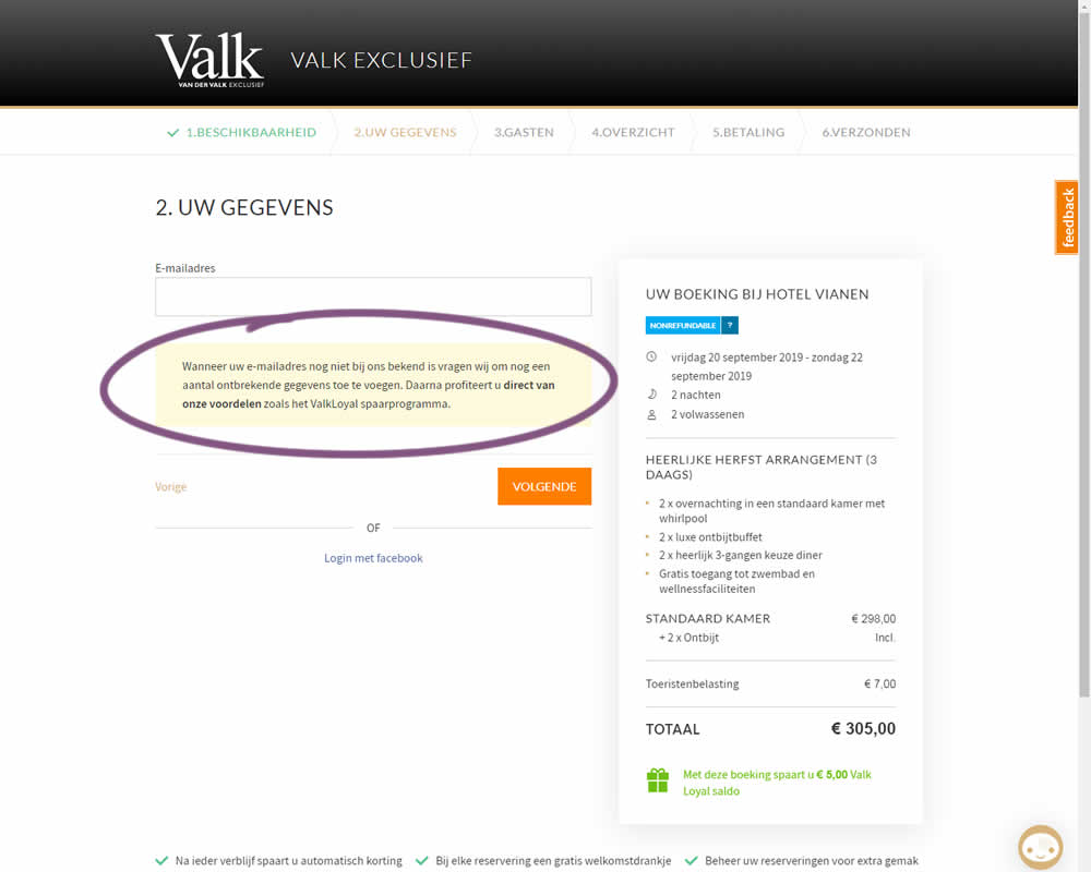
In this experiment on Valk Exclusief's web site, a reason was provided for why the e-mail address is being collected. Google translation of the added text is as follows: "If your e-mail address is not yet known to us, we will ask you to add some missing information. Then you immediately benefit from our benefits such as the ValkLoyal savings program."
Test #232 on
Yoast.com
by
 Sjardo Janssen
Mar 15, 2019
Desktop
Mobile
Checkout
Sjardo Janssen Tested Pattern #6: Customer Star Ratings In Test #232 On Yoast.com
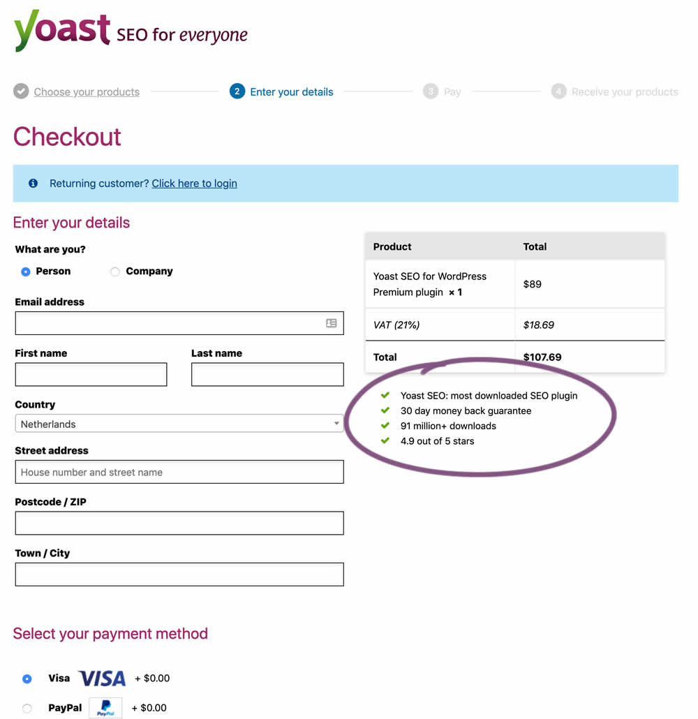
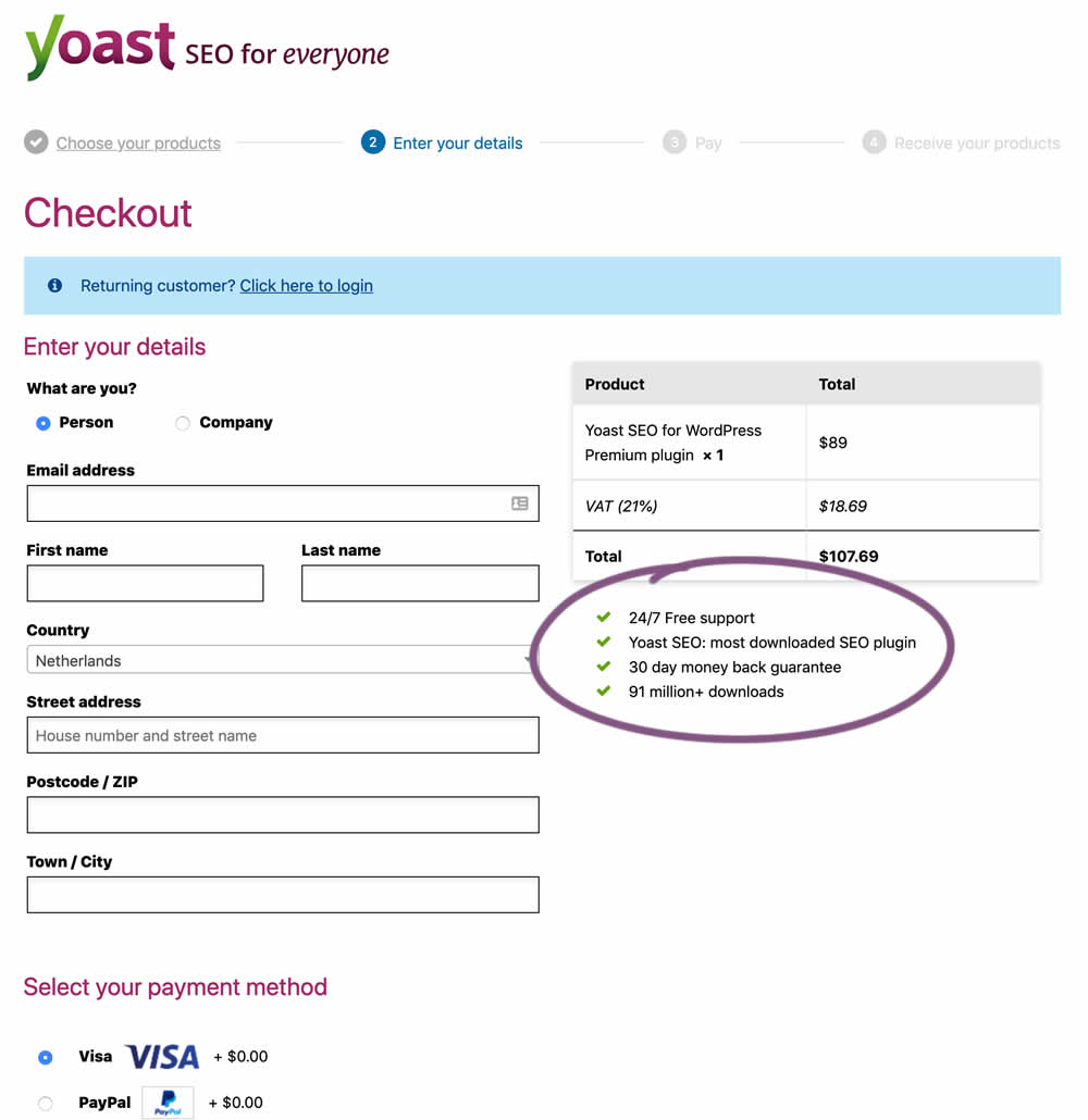
In this experiment, the Yoast team replaced one of the bulleted reassurances on their checkout page ("4.9 out of 5 stars" vs "24/7 Free support"). Raising the question - is free support or high reviews valued more? - Thanks Sjardo & Meike for sharing!
Test #229 on
by
 Jakub Linowski
Mar 08, 2019
Desktop
Mobile
Checkout
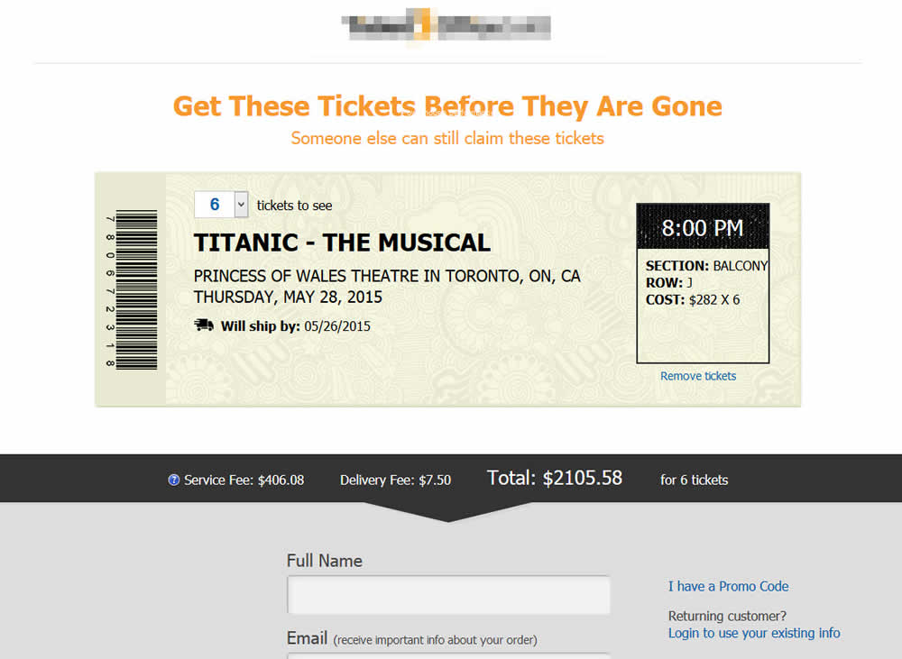
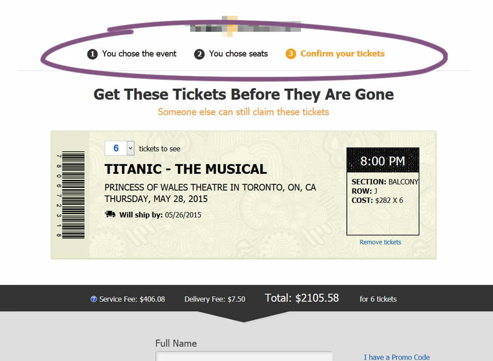
Jakub Linowski Tested Pattern #99: Progress Bar In Test #229
Test #228 on
by
 Jakub Linowski
Mar 05, 2019
Desktop
Mobile
Checkout
Jakub Linowski Tested Pattern #99: Progress Bar In Test #228

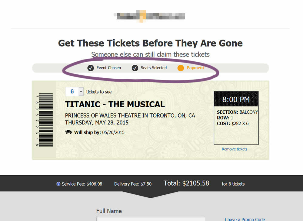
The variation added a progress bar to one of the checkout steps for a ticket ordering site.
Test #49 on
Menufy.com
by
 Aleksandr Elesev
Oct 26, 2018
Desktop
Mobile
Checkout
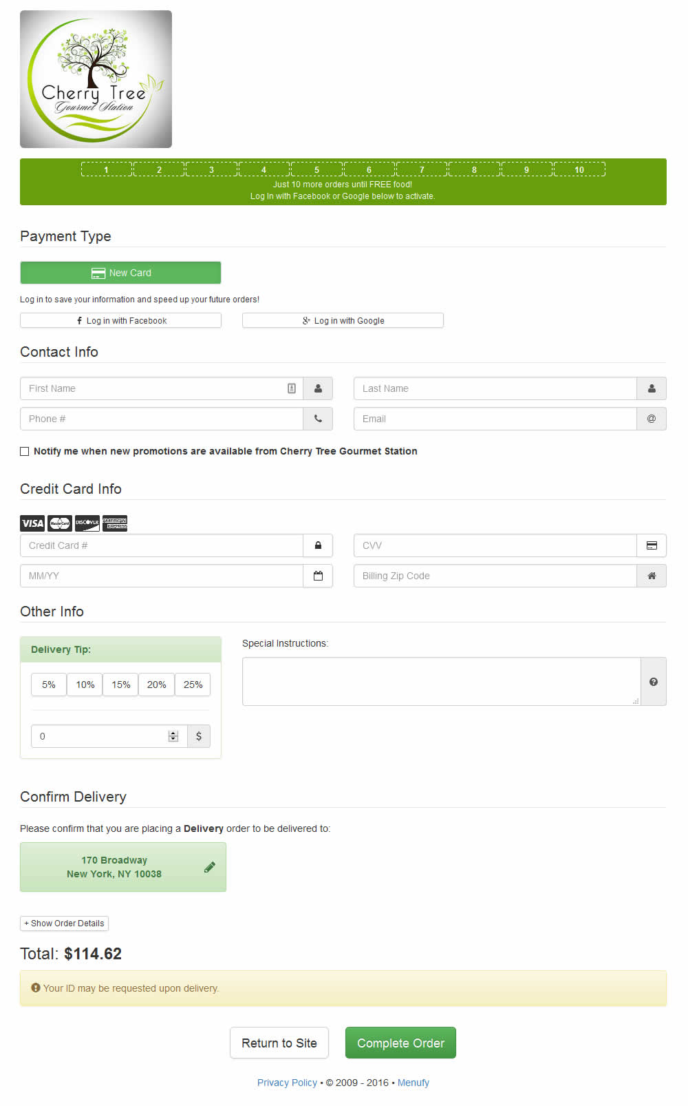
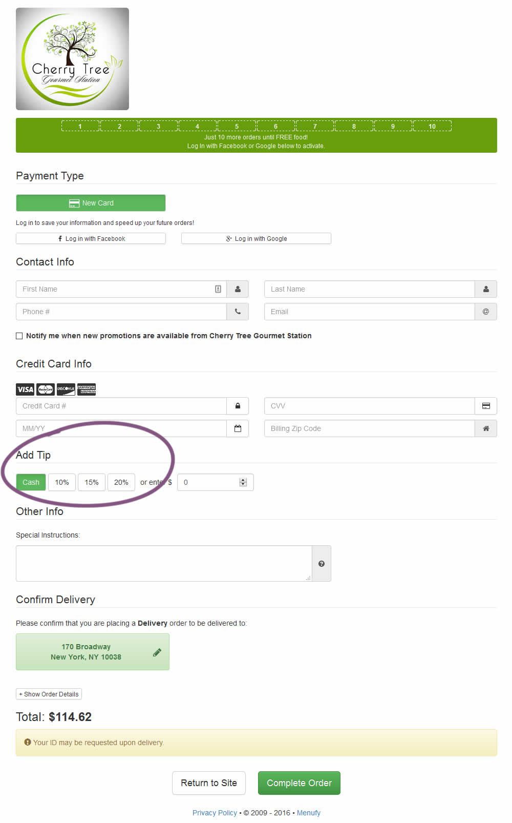
Aleksandr Elesev Tested Pattern #46: Pay Later In Test #49 On Menufy.com
Test #202 on
Kenhub.com
by
 Niels Hapke
Oct 01, 2018
Desktop
Mobile
Checkout
Niels Hapke Tested Pattern #13: Centered Forms & Buttons In Test #202 On Kenhub.com
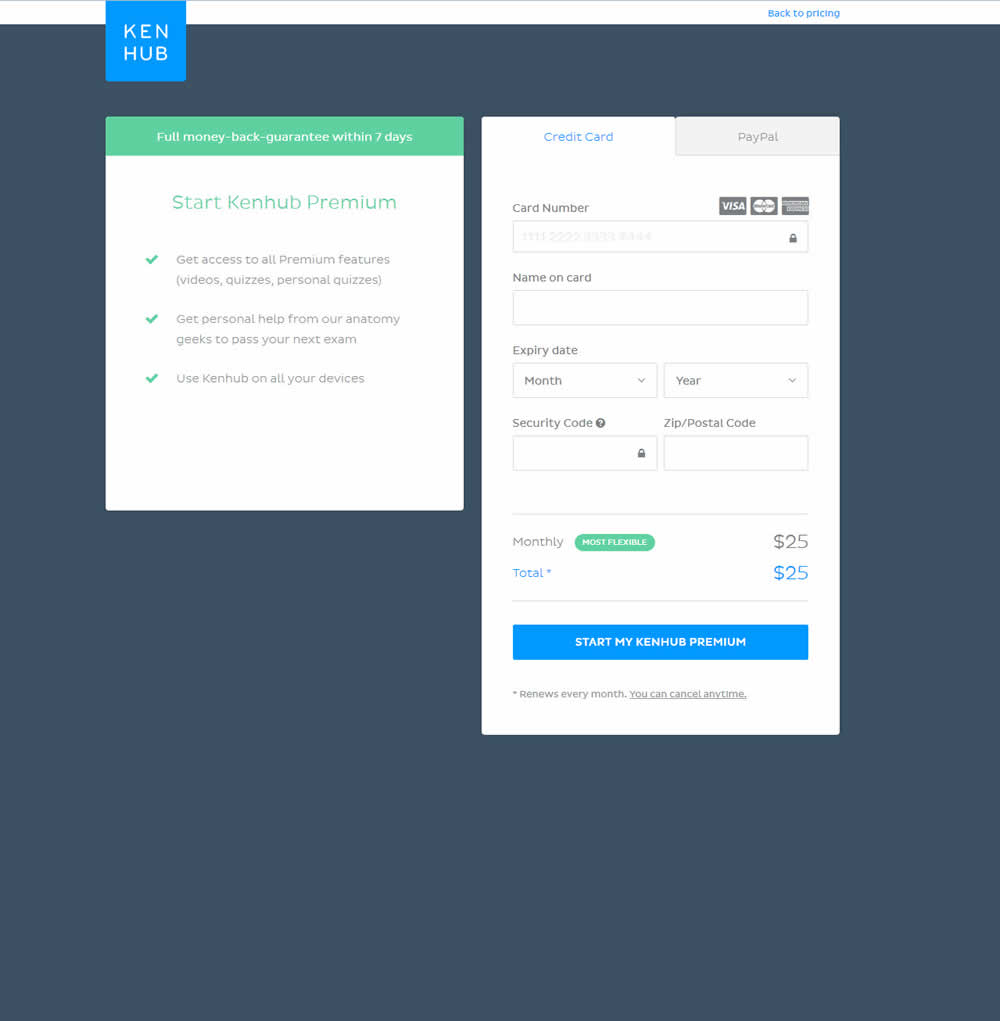
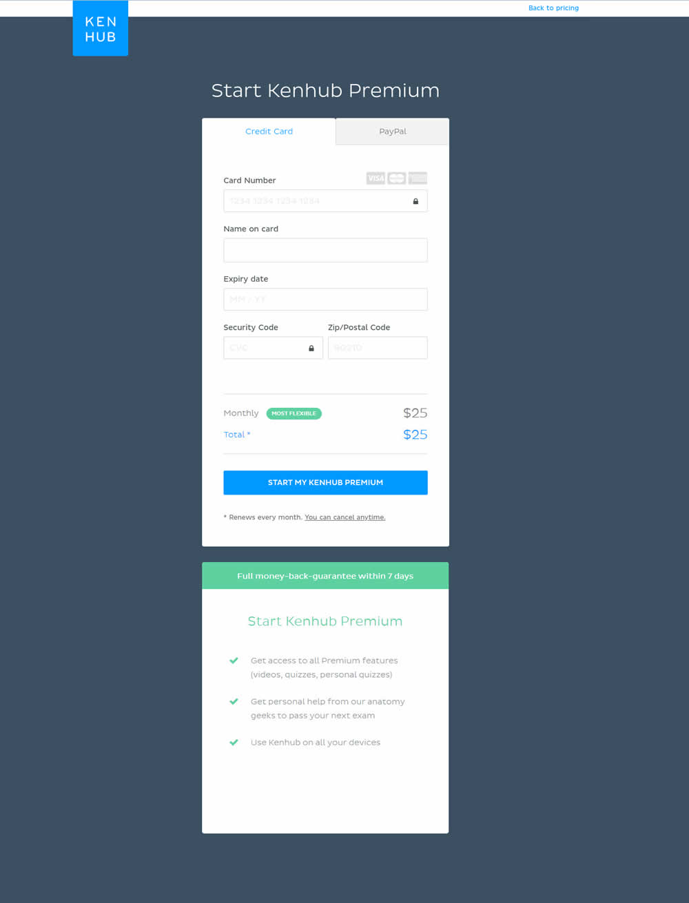
In this experiment, the form layout was adjusted by shifting the side benefits further down below the form.
Test #176 on
Kenhub.com
by
 Niels Hapke
May 16, 2018
Desktop
Mobile
Checkout
Niels Hapke Tested Pattern #4: Testimonials In Test #176 On Kenhub.com
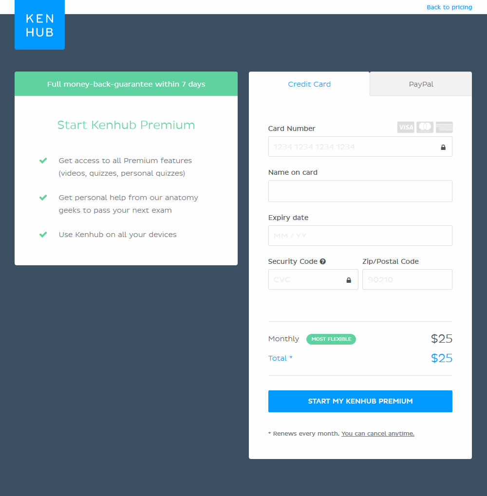
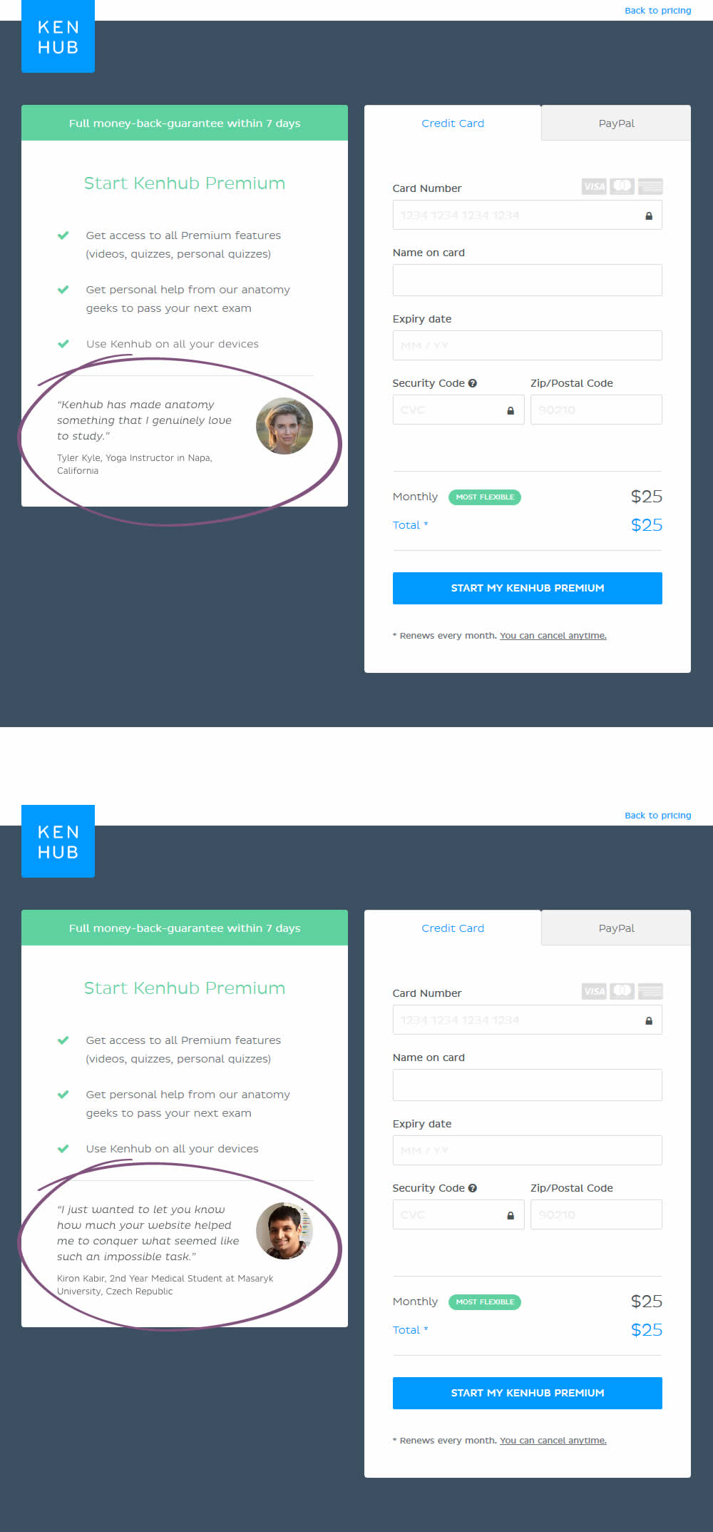
In this experiment, testimonials were added on a checkout screen.