All Latest 543 A/B Tests
Become a member to unlock the abiltiy to see the highest impact a/b tests. Being able to see the actual test results and sort by impact allows growth and experimentation teams to take action on the biggest gains first
MOST RECENT TESTS
Test #442 on
Volders.de
by
 Daria Kurchinskaia
Nov 27, 2022
Desktop
Mobile
Home & Landing
Daria Kurchinskaia Tested Pattern #4: Testimonials In Test #442 On Volders.de


In this experiment, three testimonials were appended at the bottom of landing pages of a contract cancelation service (paid). These testimonials were also shown throughout the complete signup funnel (4 more steps). Impact on progression (step 2) and final completed purchases were measured.
Test #443 on
Volders.de
by
 Daria Kurchinskaia
Nov 27, 2022
Desktop
Mobile
Home & Landing
Daria Kurchinskaia Tested Pattern #4: Testimonials In Test #443 On Volders.de

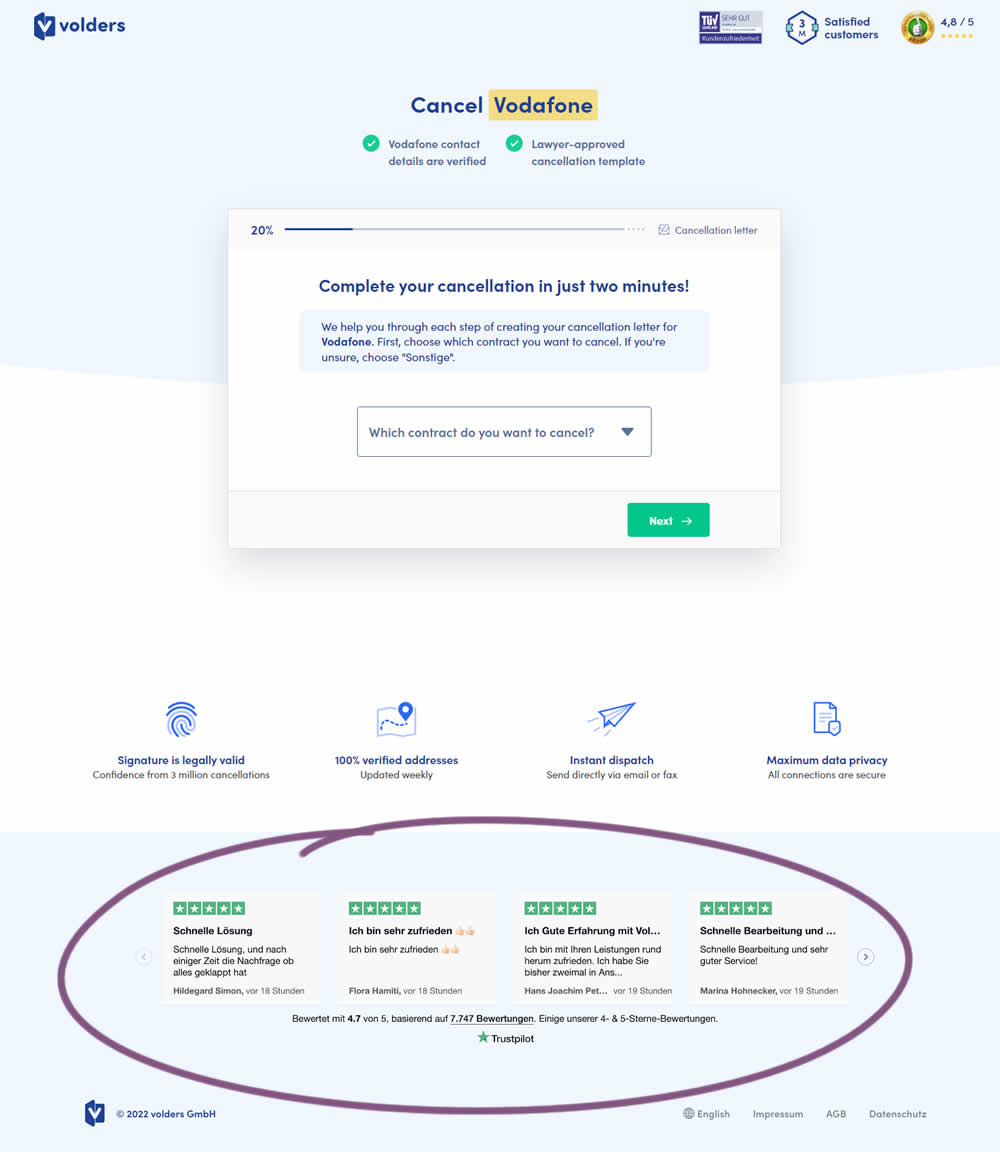
In this experiment, four TrustPilot reviews were appended at the bottom of landing pages of a contract cancelation service (paid). These reviews were also shown throughout the complete signup funnel (4 more steps). Impact on progression (step 2) and final completed purchases were measured.
Test #439 on
Designlab.com
by
 Daniel Shapiro
Oct 31, 2022
Desktop
Mobile
Home & Landing
Daniel Shapiro Tested Pattern #18: Single Or Alternative Buttons In Test #439 On Designlab.com


This was a larger leap experiment with numerous changes to the header part of a design program landing page. One of the key changes however was a shift from a single to multiple call to actions for lead generation. In the control, all potential leads would first funnel through a single syllabus download flow. In the variation, users were given three visible choices: download syllabus, webinar signup and/or book a live call with admissions. Impact on overall generated leads was measured, as well as paid enrollments.
Test #438 on
Phorest.com
by
 Sorcha Mullis
Oct 28, 2022
Desktop
Mobile
Home & Landing
Sorcha Mullis Tested Pattern #18: Single Or Alternative Buttons In Test #438 On Phorest.com

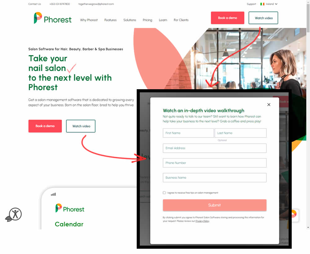
In this experiment, the addition of a secondary CTA for lead generation in the nav and the hero were tested. The additional button invited users to watch a gated demo video (approx 12 minutes). Clicking the CTA triggered a pop-up form collecting some basic contact information before the user could access the video page. Total leads were measured with lead form submittions.
Test #436 on
Designlab.com
by
 Daniel Shapiro
Oct 25, 2022
Desktop
Mobile
Home & Landing
Daniel Shapiro Tested Pattern #7: Social Counts In Test #436 On Designlab.com

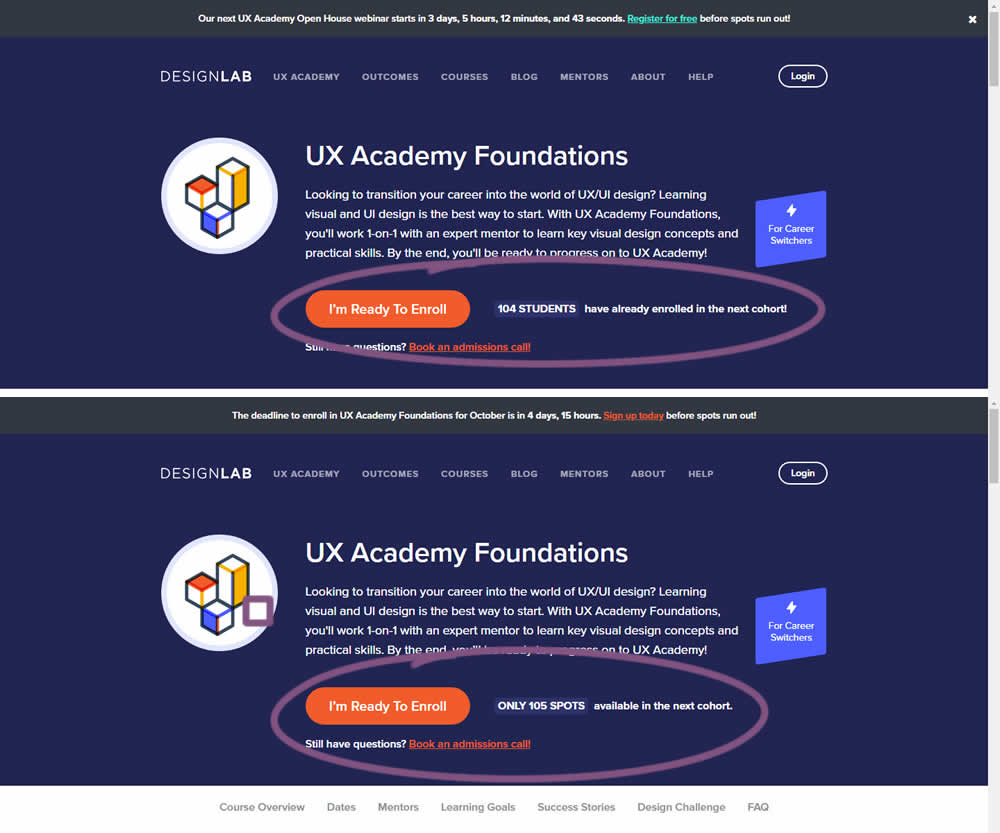
In this experiment, social proof and scarcity messages were shown on a course enrollment landing page. When students were starting to sign up at the beginning of each month (with greater availability), a simpler "X students have already enrolled in the next cohort" message was used.
Later in the month when fewer spots were available, a more scarce message was used with the following copy "ONLY X SPOTS available in the next cohort".
In both cases, the numbers were accurate and dynamically updated.
Test #426 on
Phorest.com
by
 Sorcha Mullis
Aug 09, 2022
Desktop
Mobile
Home & Landing
Sorcha Mullis Tested Pattern #9: Multiple Steps In Test #426 On Phorest.com
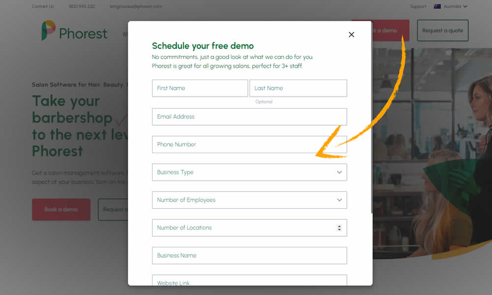

In this experiment, a single step popup modal was tested against a 4 step sign up funnel. Users entered the experiment on the homepage and the behavior of the two buttons, book a demo and get a quote, was adjusted. Impact on leads was measured.
Test #423 on
Expertinstitute.com
by
 Ardit Veliu
Jul 26, 2022
Desktop
Mobile
Home & Landing
Ardit Veliu Tested Pattern #110: Optional Field Labels In Test #423 On Expertinstitute.com

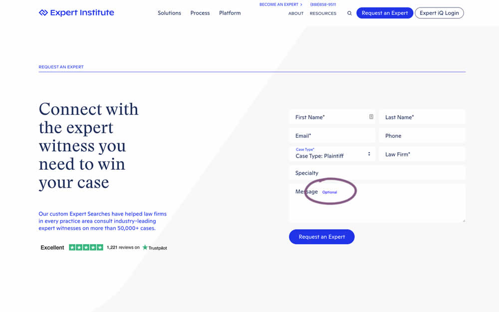
In this experiment, an "optional" label was shown near a message form field. Impact on overall leads was measured (requesting experts).
Test #419 on
by
 Jakub Linowski
Jun 29, 2022
Desktop
Home & Landing
Jakub Linowski Tested Pattern #68: Welcome Discount In Test #419

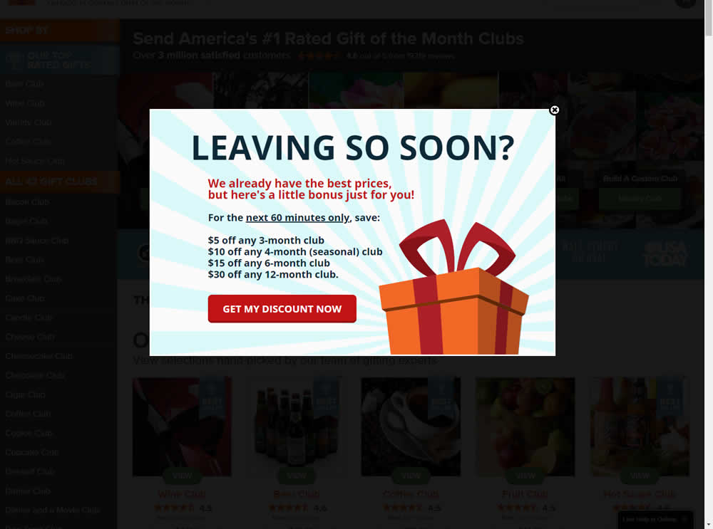
In this experiment, the presence of a discount modal (bigger discount for larger purchases) was tested on home and product pages. The trigger happend after a scroll down, a few second pause, and a mouse scroll up interaction. Impact on sales was measured.
Test #418 on
Online.metro-cc.ru
by
 Andrey Andreev
Jun 28, 2022
Desktop
Mobile
Home & Landing
Andrey Andreev Tested Pattern #135: Product Categories In Test #418 On Online.metro-cc.ru

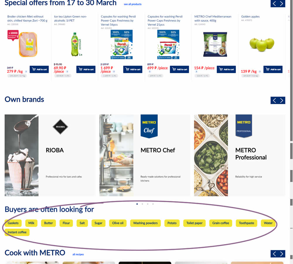
In this experiment, popular product category links were added near the bottom of the homepage of an online grocery store - Metro. Impact on completed sales was measured.
Test #410 on
Designlab.com
by
 Daniel Shapiro
May 05, 2022
Desktop
Mobile
Home & Landing
Daniel Shapiro Tested Pattern #29: Surfaced Content In Test #410 On Designlab.com
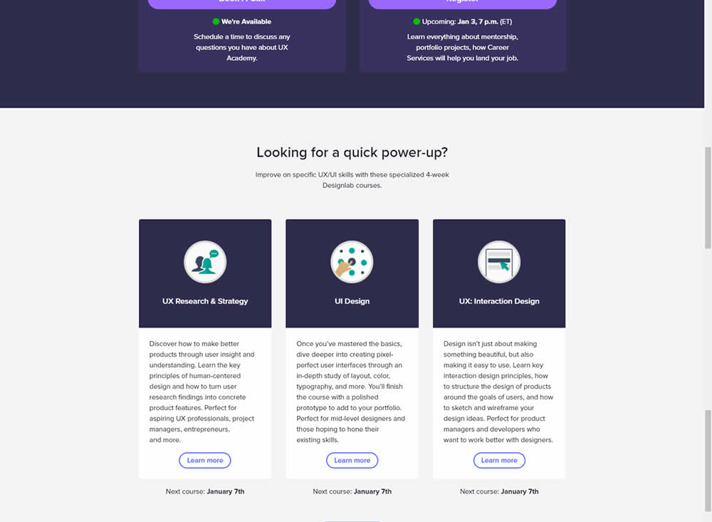

Does linking to a product detail page help? Or should a homepage simply focus on generic lead generation? In this homepage experiment, the presence of a component with a link to a detailed course landing page was tested. Impact on course enrollments was measured.
Test #401 on
Learnwithhomer.com
by
 Stanley Zuo
Mar 11, 2022
Desktop
Home & Landing
Stanley Zuo Tested Pattern #58: Full Height False Bottom In Test #401 On Learnwithhomer.com
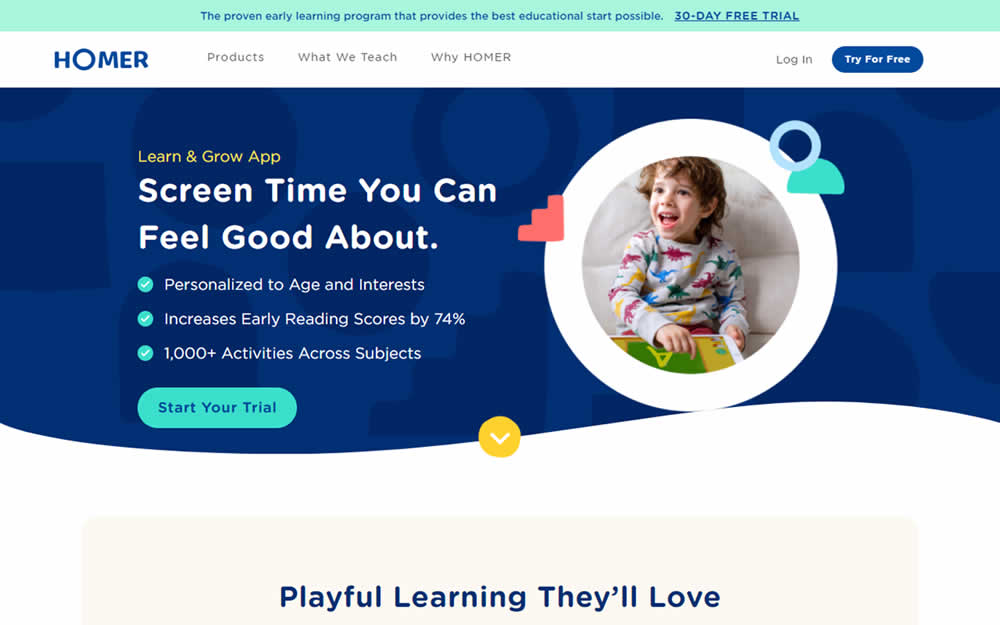
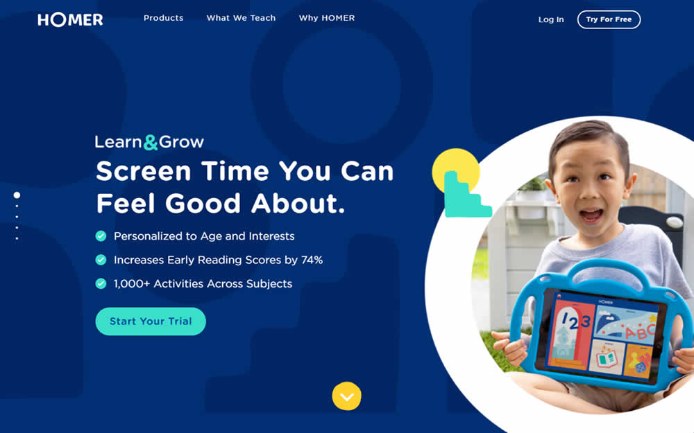
Here the experiment contained a layout change. Standard content components with varied heights were tested against sections with false bottoms. That is the conntent blocks in the variation took up 100% height of the viewport. This change was also applied throughout the rest of the content blocks. Impact on overall signup rates was measured.
Test #381 on
Expertinstitute.com
by
 Ardit Veliu
Oct 30, 2021
Desktop
Mobile
Home & Landing
Ardit Veliu Tested Pattern #49: Above The Fold Call To Action In Test #381 On Expertinstitute.com


In this experiment, an extra button to a signup lead form was placed above the fold. In the control, the same button appeared further down on the page.
Test #380 on
Getninjas.com.br
by
 Rodolfo Lugli
Oct 27, 2021
Desktop
Mobile
Home & Landing
Rodolfo Lugli Tested Pattern #21: What It's Worth In Test #380 On Getninjas.com.br
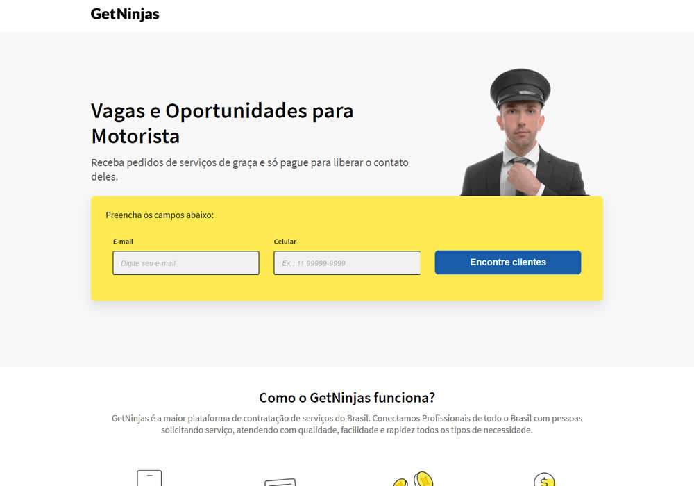

In this experimemt, the average $ gain from a performed service category was shown on a landing page. Impact on leads was measured (people who would be signing up to offer a particular service).
Test #374 on
Expertinstitute.com
by
 Ardit Veliu
Sep 15, 2021
Desktop
Mobile
Home & Landing
Ardit Veliu Tested Pattern #9: Multiple Steps In Test #374 On Expertinstitute.com
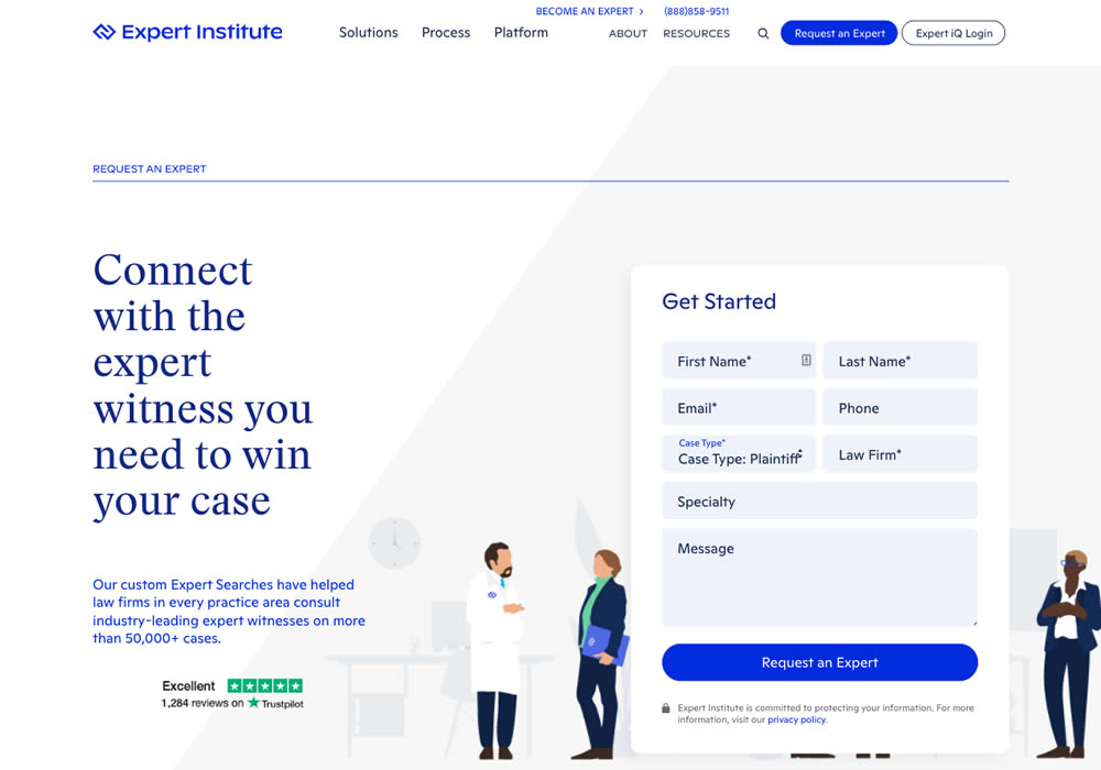

In this experiment, a lead form with numerous fields shown all at once, was broken down into 3 steps. The first step only asked for a Specialty choice that expanded into a list of options. Impact on full form completions was measured.
Test #369 on
Getninjas.com.br
by
 Rodolfo Lugli
Aug 05, 2021
Desktop
Mobile
Home & Landing
Rodolfo Lugli Tested Pattern #7: Social Counts In Test #369 On Getninjas.com.br

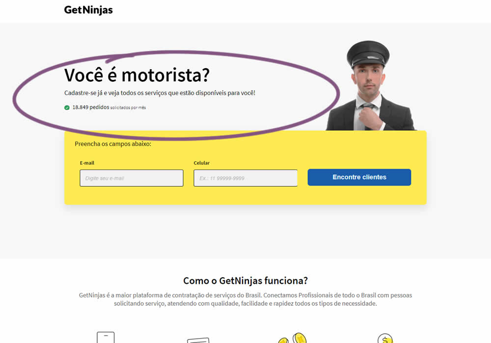
In this experimemt, the number of service requests per month were shown that people can expect after signing up in a given category. Impact on leads was measured (people who would be signing up to offer a particular service).
Test #368 on
Mvideo.ru
by
 Andrey Andreev
Aug 02, 2021
Desktop
Home & Landing
Andrey Andreev Tested Pattern #135: Product Categories In Test #368 On Mvideo.ru
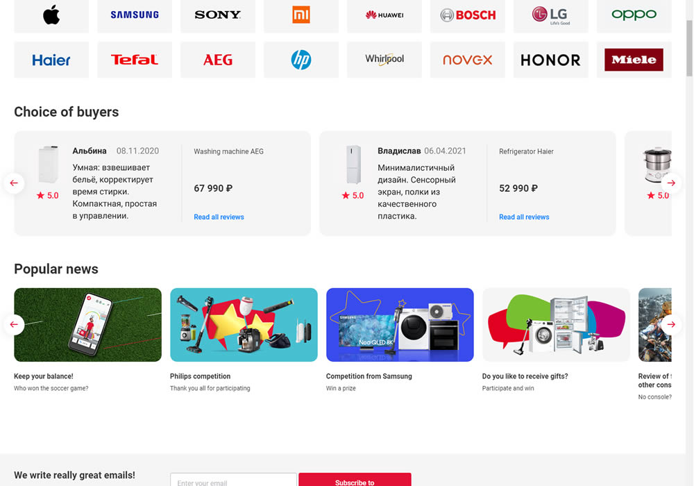
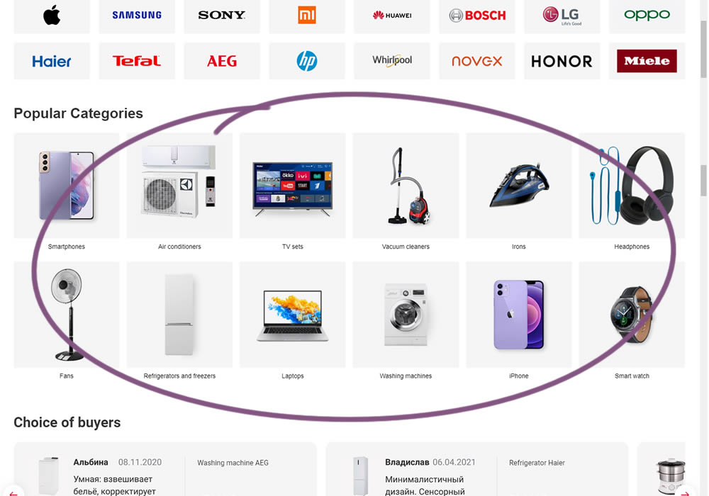
In this experiment, popular categories were added at the bottom of a long ecommerce homepage. Impact on total sales was measured.
Test #358 on
Preply.com
by
 Gleb Hodorovskiy
Jun 03, 2021
Desktop
Home & Landing
Gleb Hodorovskiy Tested Pattern #58: Full Height False Bottom In Test #358 On Preply.com
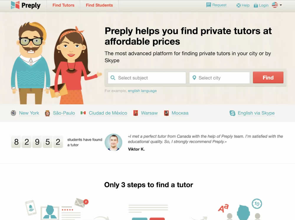
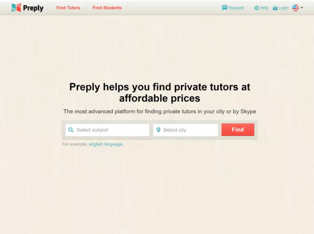
In this experiment, the header section of the homepage drastically focused around the call to action. This was done by removing elements and forcing a false bottom.
Test #356 on
Mvideo.ru
by
 Andrey Andreev
May 29, 2021
Desktop
Mobile
Home & Landing
Andrey Andreev Tested Pattern #135: Product Categories In Test #356 On Mvideo.ru

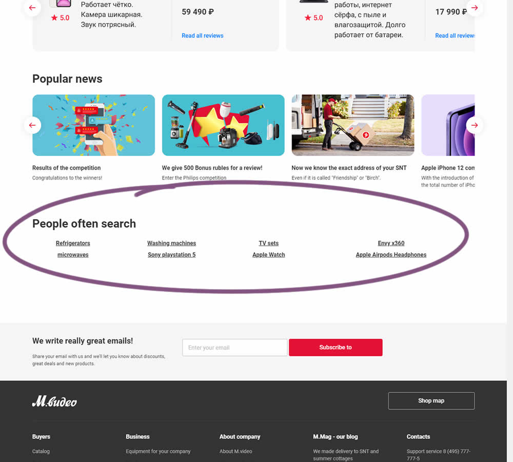
In this experiment, popular search terms were added at the bottom of a long e-commerce homepage. Hence, the variation showed additional search triggers that lead to results pages. (Translated from Russian using Google Translate)
Test #355 on
by
 Jakub Linowski
May 28, 2021
Desktop
Mobile
Home & Landing
Jakub Linowski Tested Pattern #79: Product Highlights In Test #355


In this experiment, an extra product choice was added to the header of a homepage. Instead of only highlighting a set of four specific products, the option to build custom variety one, was added.
Test #351 on
Baremetrics.com
by
 Brian Sierakowski
Apr 30, 2021
Desktop
Mobile
Home & Landing
Brian Sierakowski Tested Pattern #11: Gradual Reassurance In Test #351 On Baremetrics.com

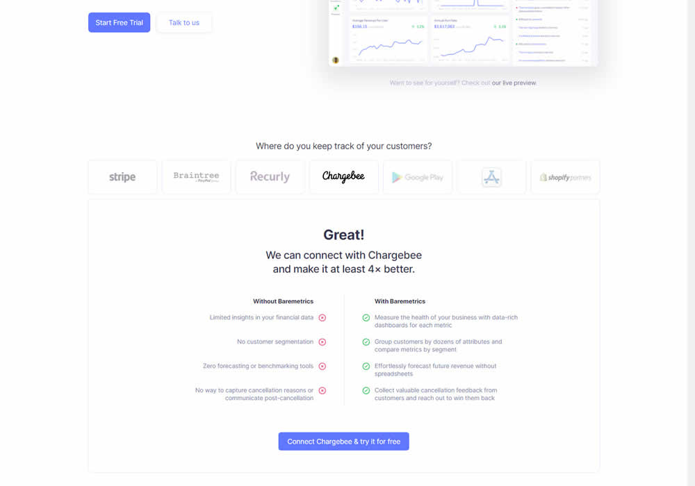
In this experiment, static integration logos were replaced with selectable ones that reassured users to signup. After clicking an integration logo, a comparison chart would appear showing how Baremetrics improves upon a selected payment processor, along with a call to signup. Impact on signups was measured.