All Latest 550 A/B Tests
Become a member to unlock the abiltiy to see the highest impact a/b tests. Being able to see the actual test results and sort by impact allows growth and experimentation teams to take action on the biggest gains first
MOST RECENT TESTS
Test #348 on
Flukenetworks.com
by
 Marika Francisco
Apr 22, 2021
Desktop
Home & Landing
Marika Francisco Tested Pattern #97: Bigger Form Fields In Test #348 On Flukenetworks.com

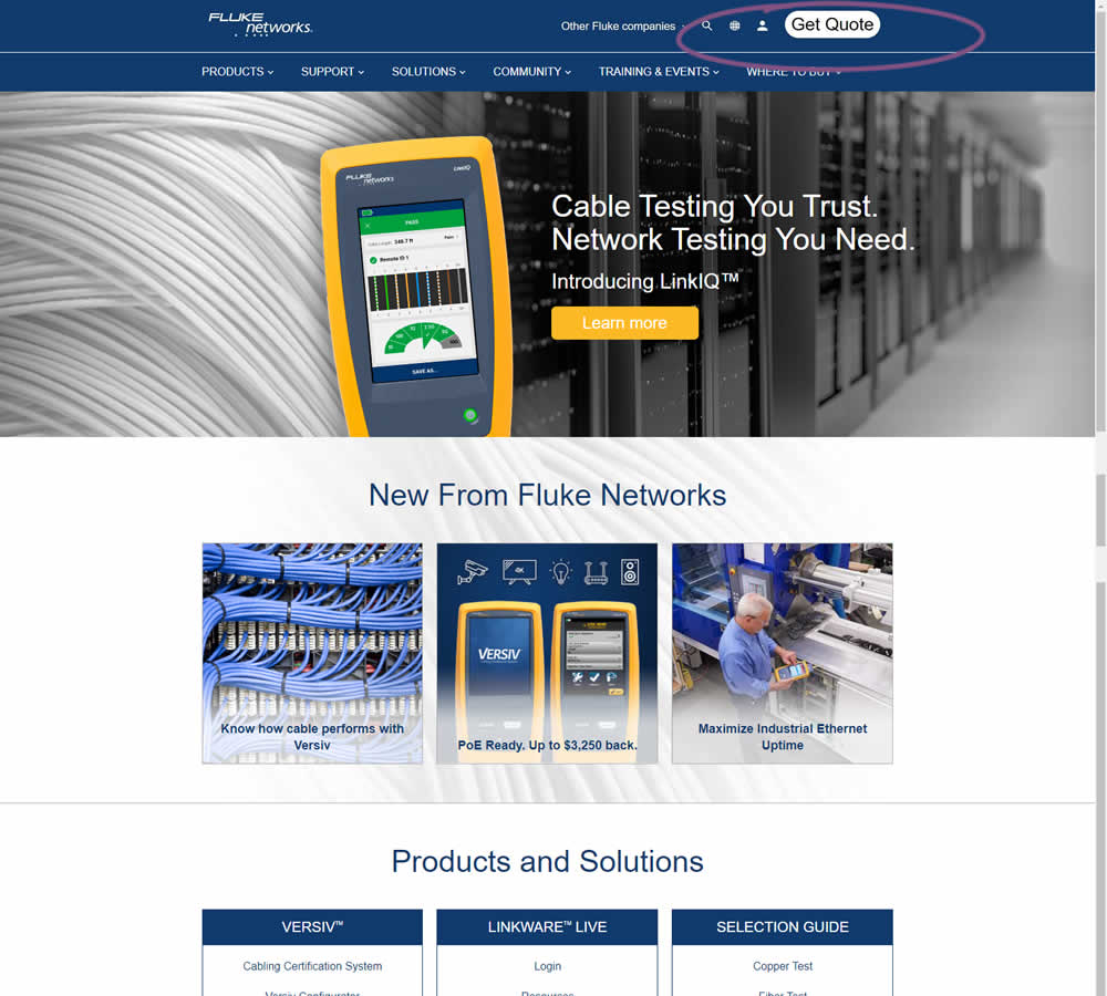
In this simple experiment, the size of the "Get Quote" button in the top navigation was increased.
Test #347 on
by
 Jakub Linowski
Apr 07, 2021
Desktop
Mobile
Home & Landing
Jakub Linowski Tested Pattern #26: Cart Reminder And Recently Viewed In Test #347


In this experiment, when customers viewed a product and returned to the homepage, they would then see the most recently viewed one - a delicate nudge. The experiment ran with full traffic and impact on sales was measured.
Test #346 on
by
 Stanley Zuo
Mar 30, 2021
Desktop
Mobile
Home & Landing
Stanley Zuo Tested Pattern #117: Company Logos In Test #346
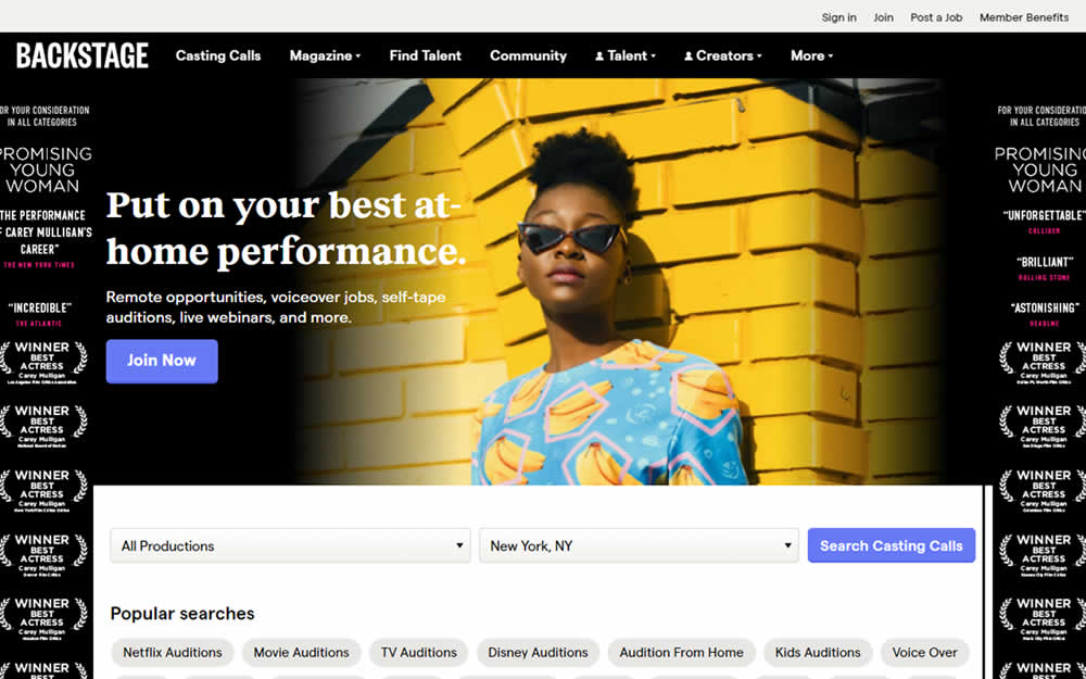
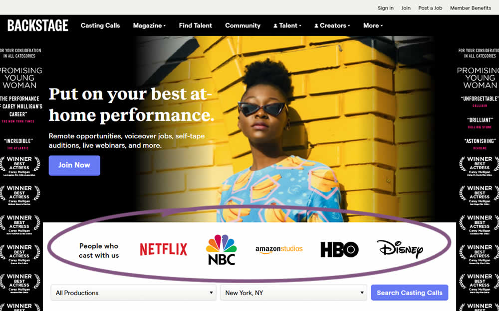
In this homepage experiment, company logos were added to the homepage. These were example clients or companies that Backstage works with and offers casting (job) listing from. Impact on the registration flow and membership checkouts was measured.
Test #345 on
Getninjas.com.br
by
 Rodolfo Lugli
Mar 29, 2021
Desktop
Home & Landing
Rodolfo Lugli Tested Pattern #9: Multiple Steps In Test #345 On Getninjas.com.br

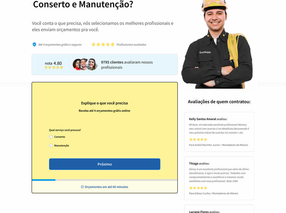
In this experiment, a single long form was broken into at least 3 steps.
Test #339 on
Expertinstitute.com
by
 Ardit Veliu
Feb 23, 2021
Desktop
Home & Landing
Ardit Veliu Tested Pattern #33: Example Situations In Test #339 On Expertinstitute.com

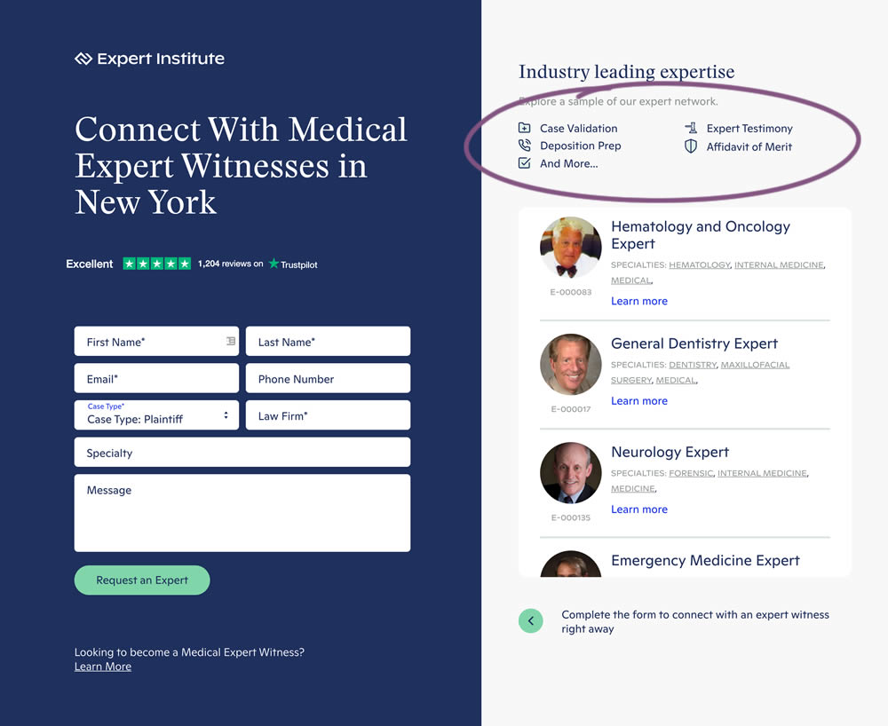
In this experiment, a number of use cases examples were added to illustrate the situations in which experts could help.
Test #338 on
Umbraco.com
by
 Lars Skjold Iversen
Jan 29, 2021
Desktop
Mobile
Home & Landing
Lars Skjold Iversen Tested Pattern #63: Trust Seals In Test #338 On Umbraco.com
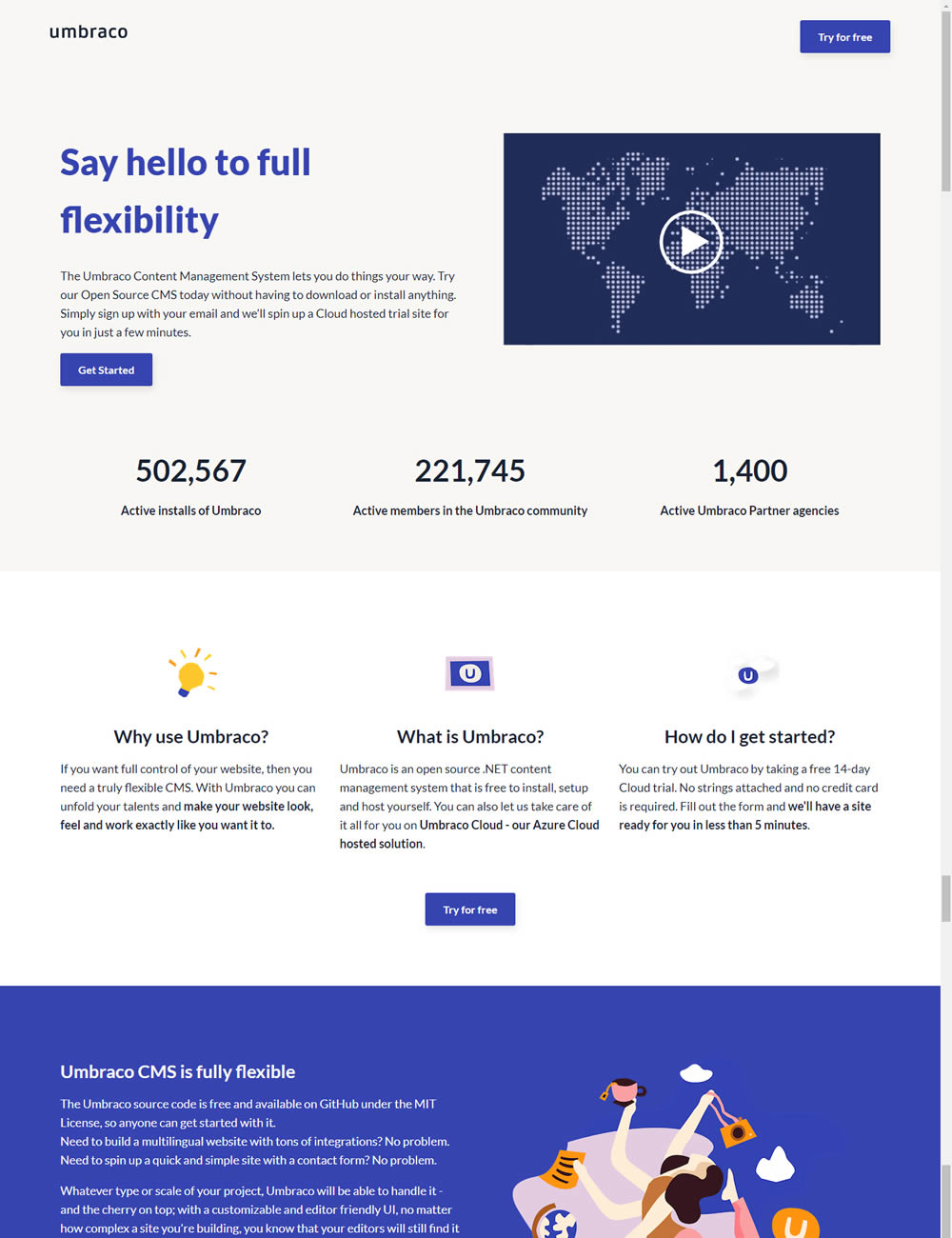
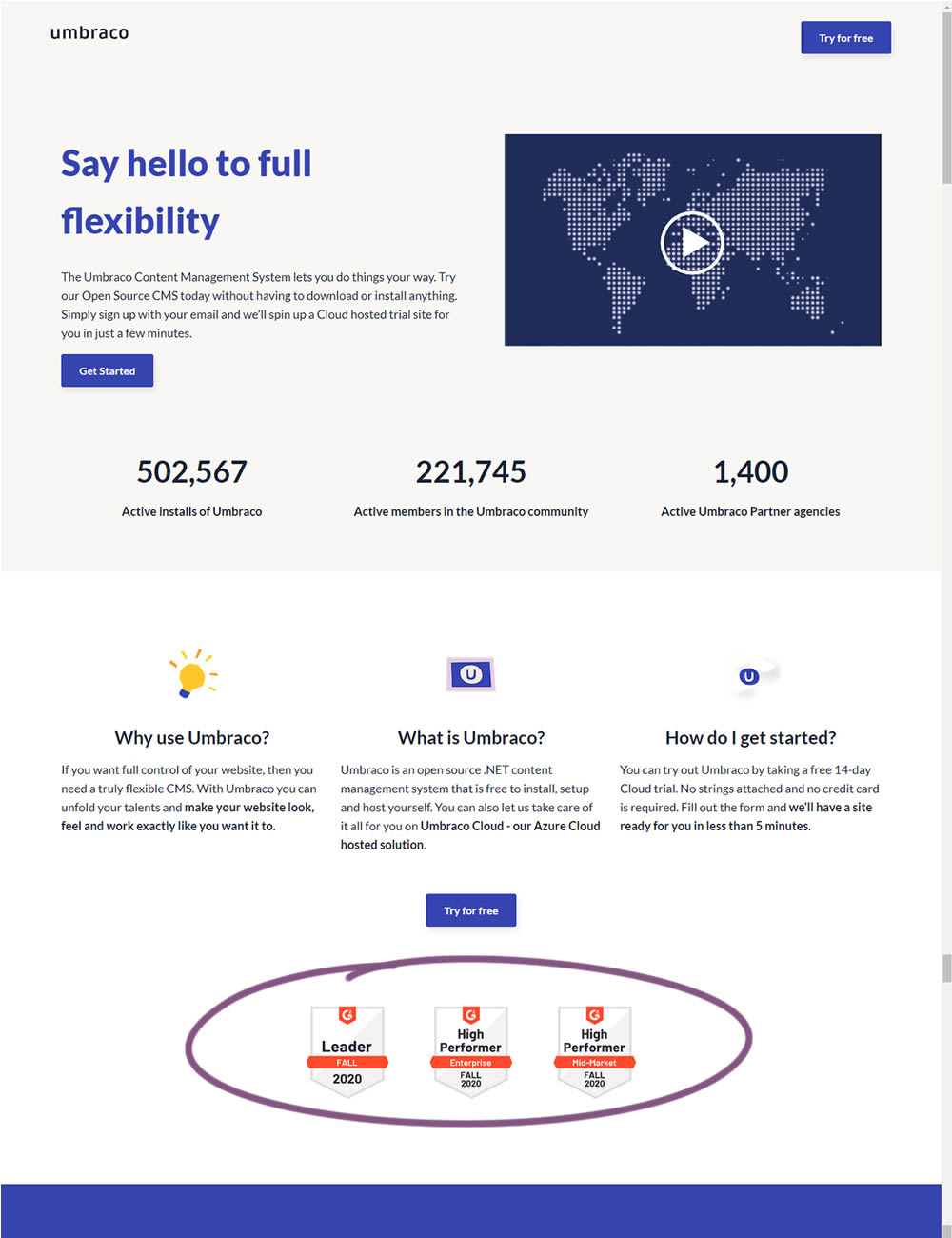
In this experiment, the variation added three G2 badges or awards. The intent was to measure the impact of this change on signups for Umbraco.
Test #335 on
by
 Jakub Linowski
Jan 27, 2021
Desktop
Mobile
Home & Landing
Jakub Linowski Tested Pattern #32: Condensed List In Test #335
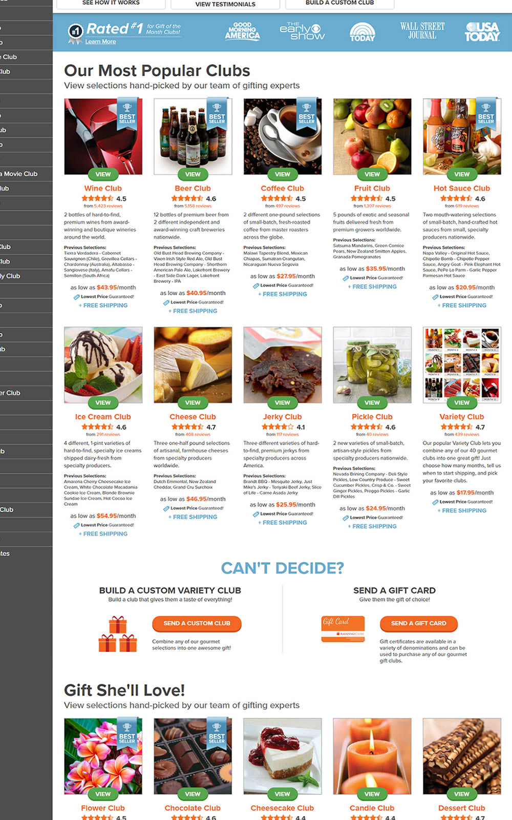
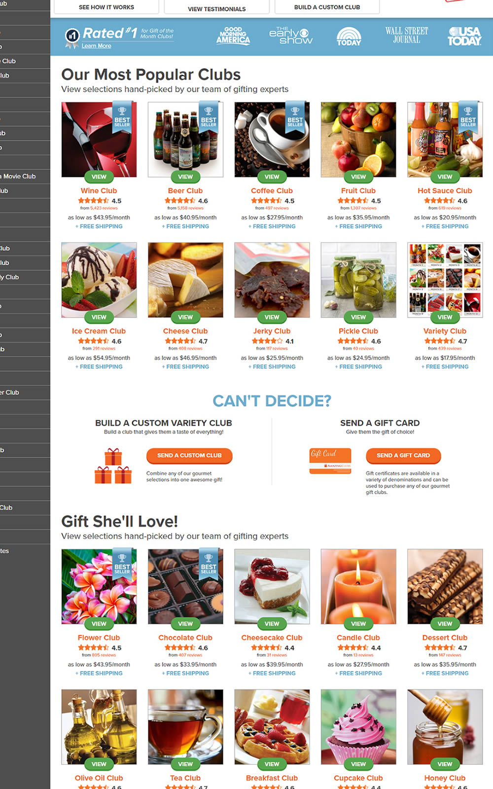
The variation here has more condensed product tiles being shown on a homepage. Two pieces of information were removed: product descriptions and past selections. Impact on product page visits and total sales was measured.
Test #333 on
Expertinstitute.com
by
 Ardit Veliu
Dec 31, 2020
Desktop
Mobile
Home & Landing
Ardit Veliu Tested Pattern #11: Gradual Reassurance In Test #333 On Expertinstitute.com

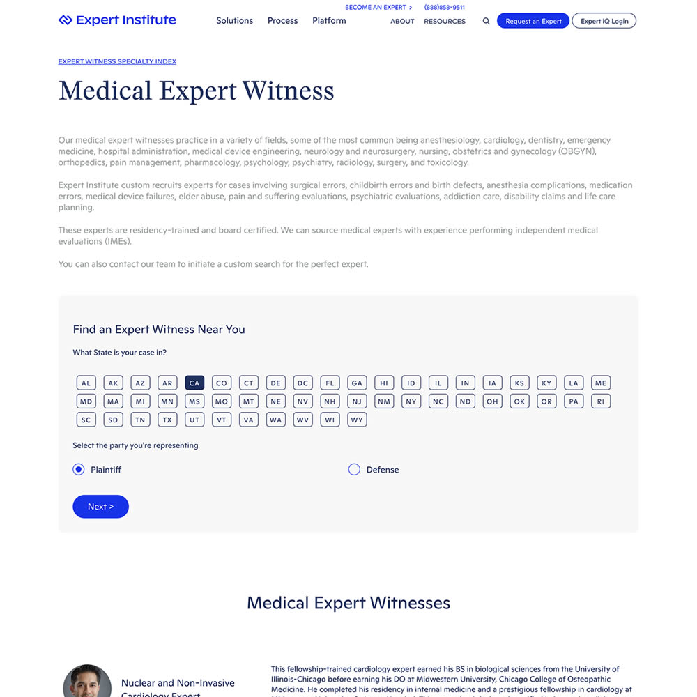
In this experiment, the variation broke up a lead form into two parts. In the first step users were asked for their state followed by a standard contact form on a second step. All of the states were shown as selectable options. In the control version, the landing page only showed a button which lead to the full form. The experiment measured impact on lead form submissions.
Test #329 on
Snocks.com
by
 Samuel Hess
Dec 23, 2020
Mobile
Home & Landing
Samuel Hess Tested Pattern #14: Exposed Menu Options In Test #329 On Snocks.com
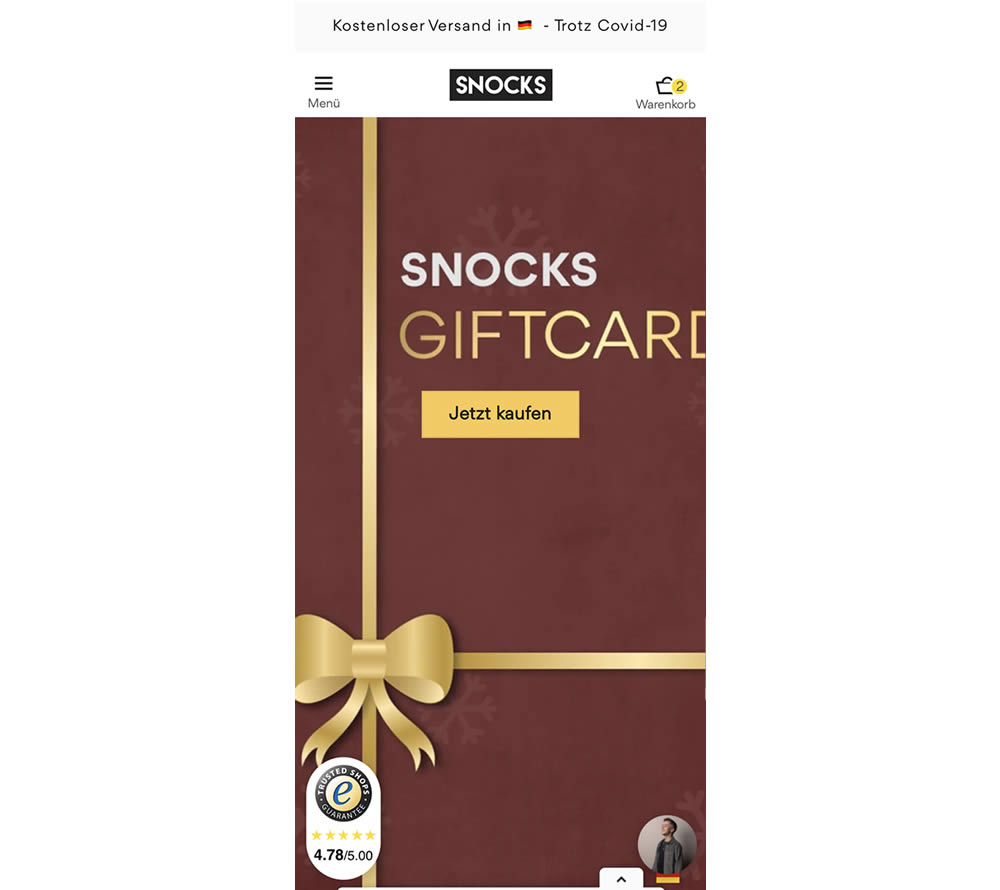
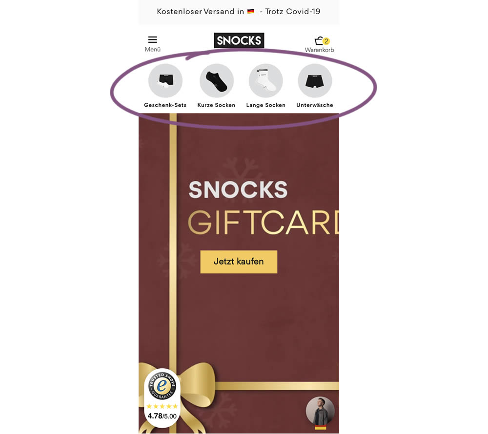
In this homepage experiment, a series of product categories were shown more visible near the top of the screen (instead of only being shown inside the hamburger menu). They linked up to corresponding listing pages with such items as: gifts, short socks, long socks, and underwear. Impact on adds-to-cart and total sales was measured.
Test #328 on
Umbraco.com
by
 Lars Skjold Iversen
Dec 21, 2020
Desktop
Mobile
Home & Landing
Lars Skjold Iversen Tested Pattern #60: Repeated Bottom Call To Action In Test #328 On Umbraco.com
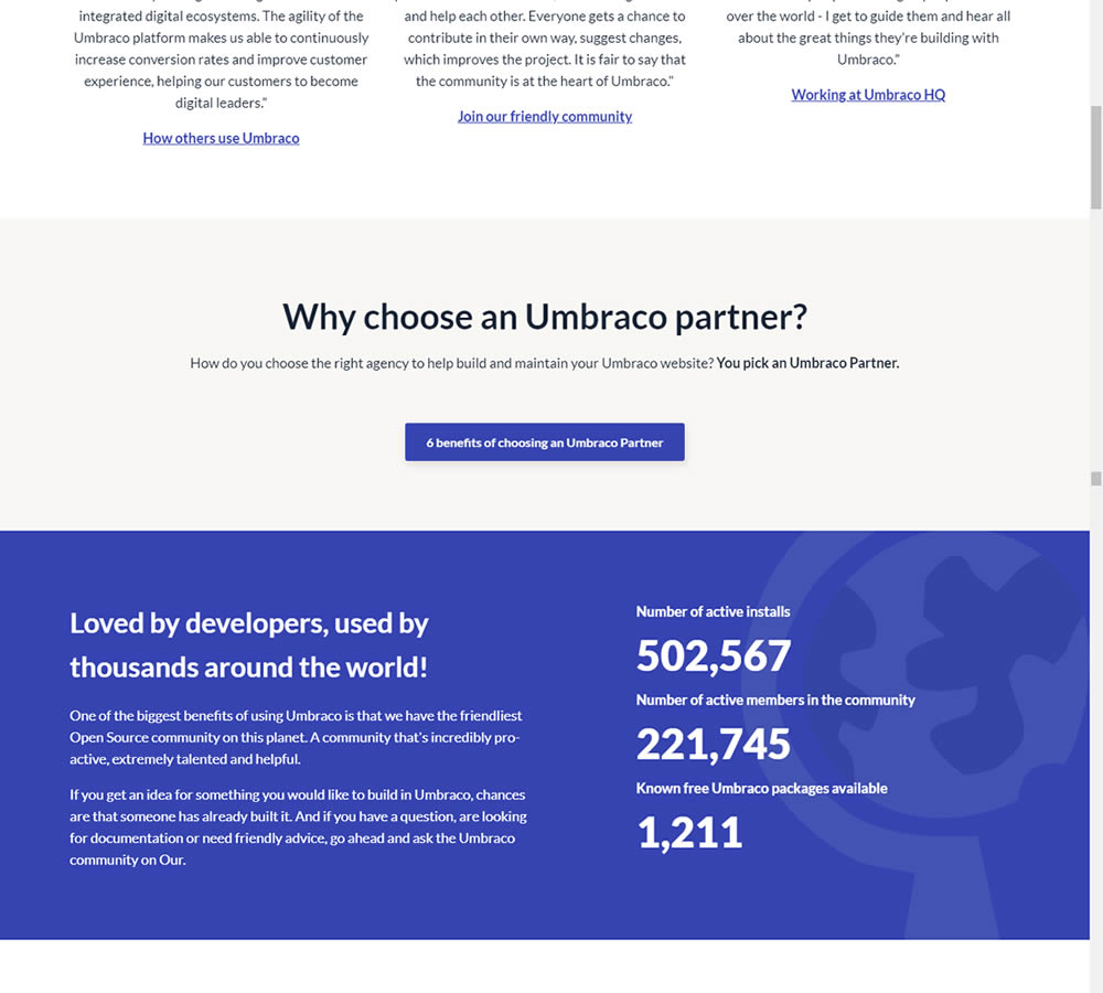
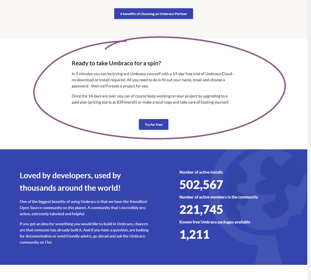
In this experiment, a trial signup section was added at the bottom of Umbraco's long homepage (CMS business). The experiment measured the impact on trial signups.
Test #10 on
Tradegecko.com
by
 Syed AtiF Husain
Nov 30, 2020
Desktop
Home & Landing
Syed AtiF Husain Tested Pattern #10: Postponed Modal Forms In Test #10 On Tradegecko.com

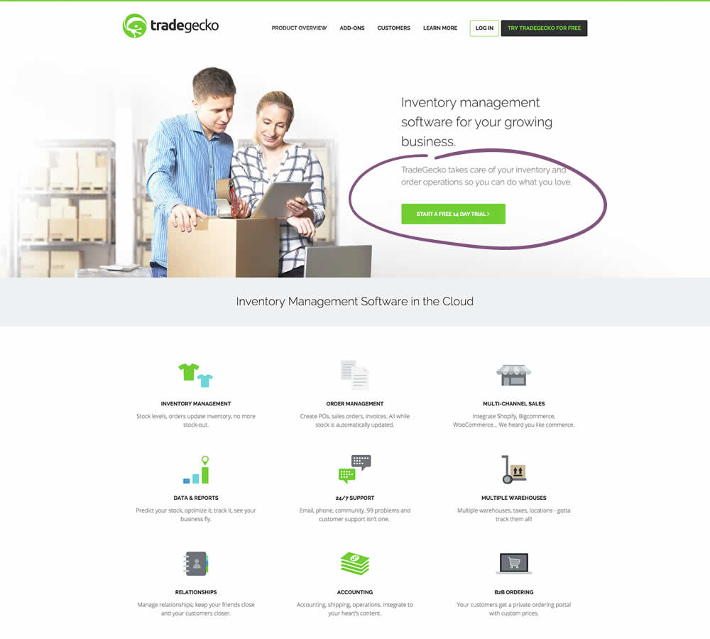
In this experiment, 3 form fields were removed (postponed to a next step) from the homepage leaving only a "Start Trail" button. When users clicked on the "Start A Free 14 Day Trial" button, in both the control and variation they've seen the same next registration page with all of the fields. The registration page repeated the same fields with their corresponding values, as well as asked for a password as an extra field. The experiment measured successful leads.
Test #316 on
Trydesignlab.com
by
 Daniel Shapiro
Sep 24, 2020
Desktop
Mobile
Home & Landing
Daniel Shapiro Tested Pattern #22: Empowering Headline In Test #316 On Trydesignlab.com


In this experiment, the headline was changed to focus more on the end-goal of the UX Academy program - that of landing your first UI/UX role.
Test #313 on
Trydesignlab.com
by
 Daniel Shapiro
Aug 19, 2020
Desktop
Mobile
Home & Landing
Daniel Shapiro Tested Pattern #11: Gradual Reassurance In Test #313 On Trydesignlab.com
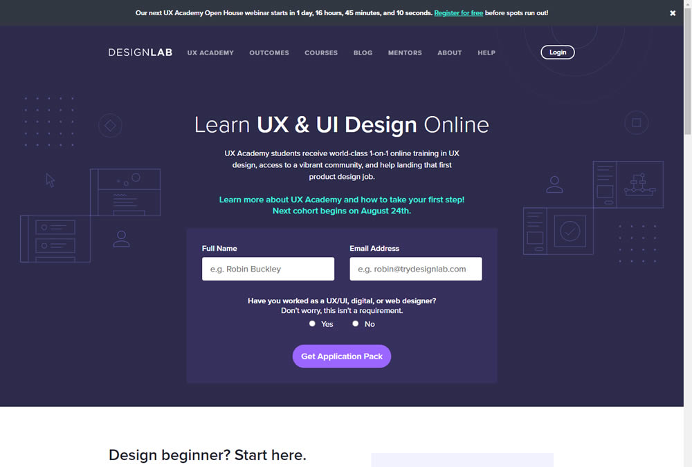
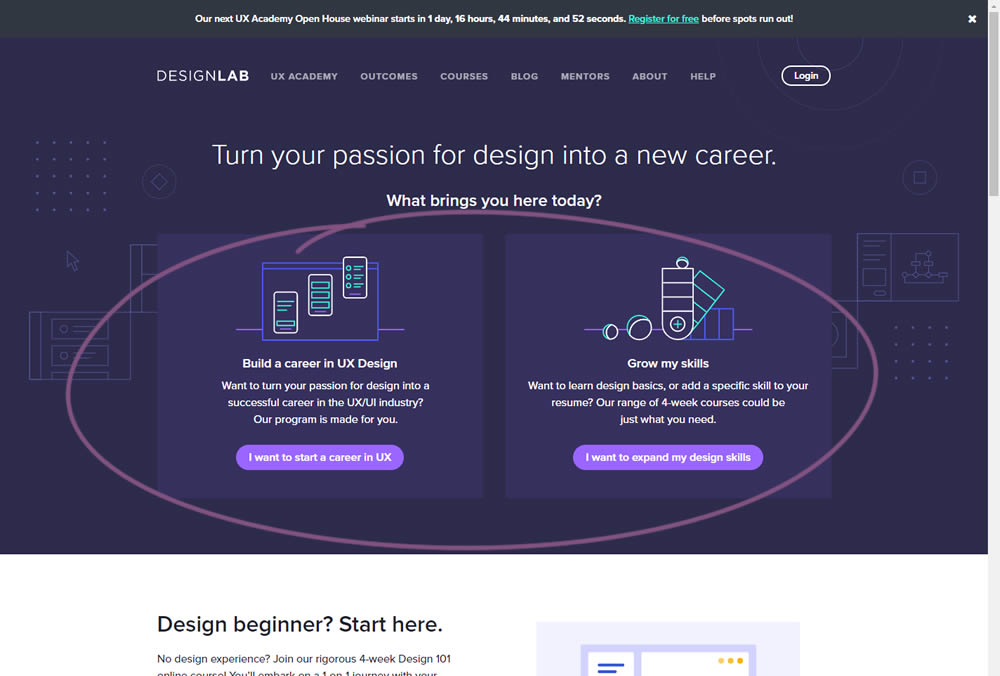
In this experiment, instead of showing a single-focused lead form (for the UX Academy Program), users were asked to express a wider set of choices first (for the UX Academy or shortter set of skill-based courses). The experiment measured overall leads for both types of programs.
Test #311 on
Backstage.com
by
 Stanley Zuo
Aug 11, 2020
Desktop
Mobile
Home & Landing
Stanley Zuo Tested Pattern #118: Category Images In Test #311 On Backstage.com
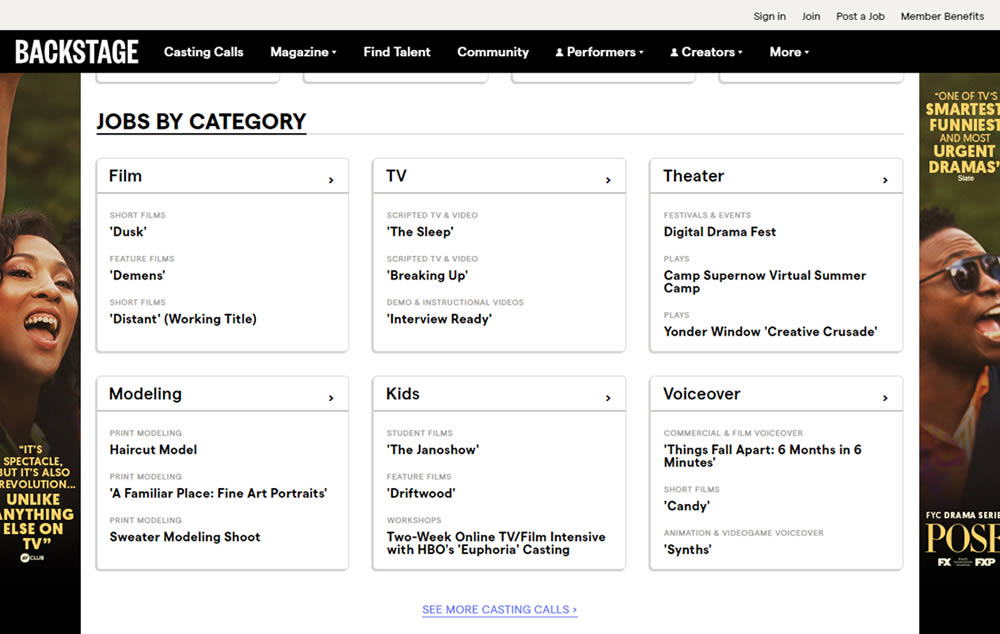
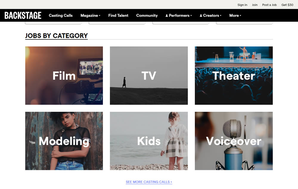
In this experiment, category links (linking to casting call search results) were replaced with tile images. In addition, 2 levels of categories were also replaced with a single text link for each tile. Finally, the font size of the link titles was also increased.
Test #308 on
Umbraco.com
by
 Lars Skjold Iversen
Jul 23, 2020
Desktop
Home & Landing
Lars Skjold Iversen Tested Pattern #4: Testimonials In Test #308 On Umbraco.com
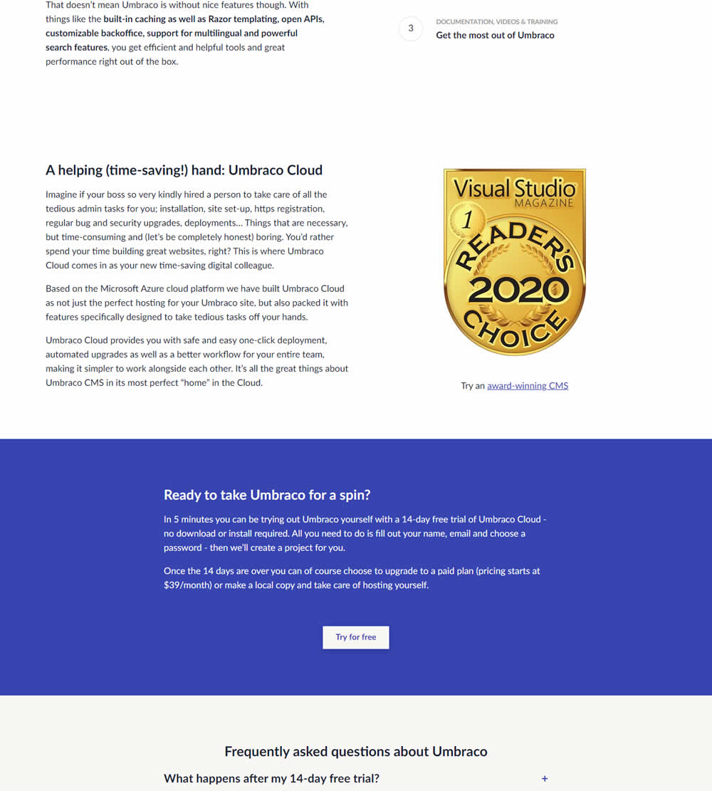
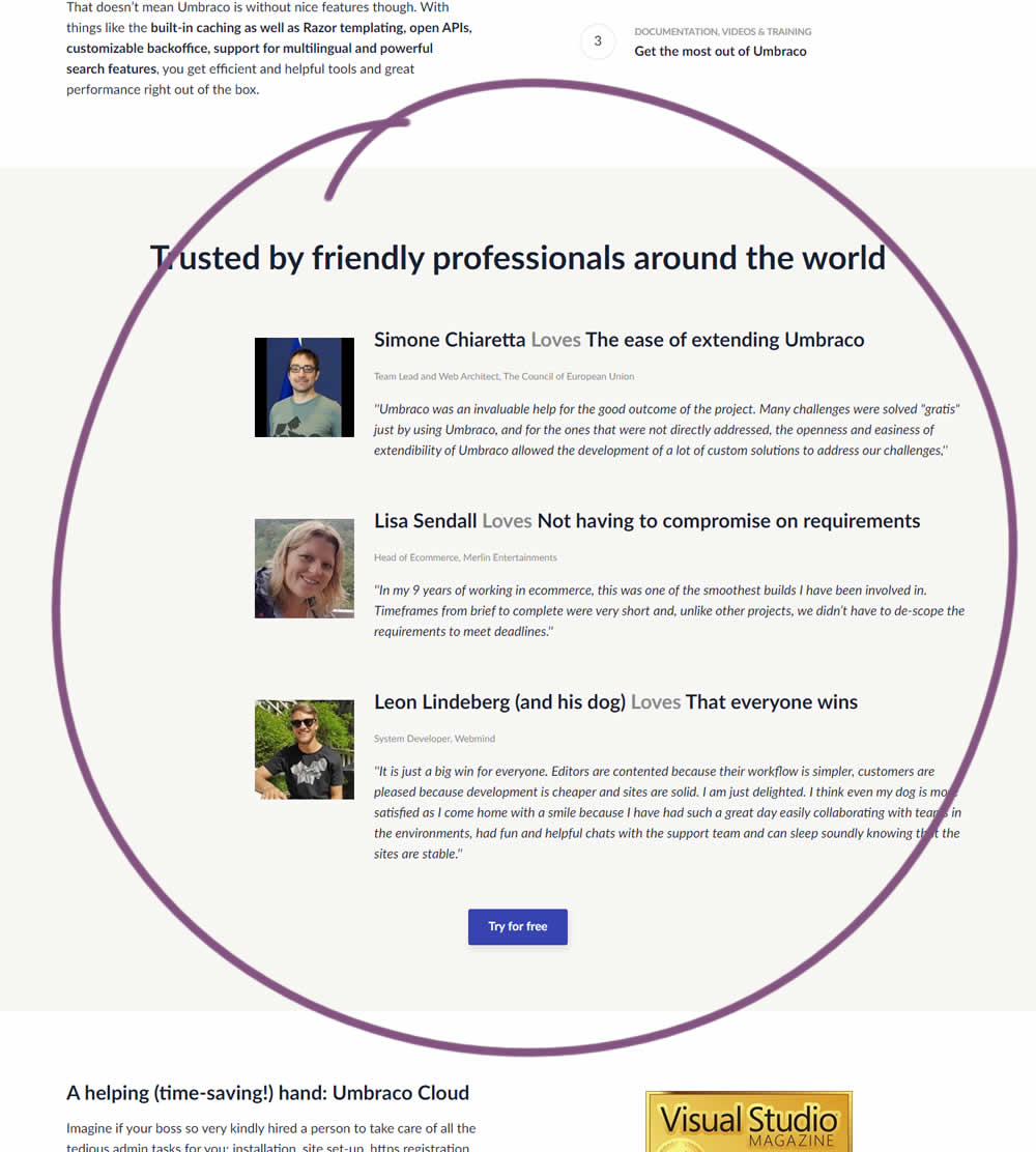
In this experiment, three testimonials were added mid way though on a CMS landing page. At the end of the customer testimonials an additional trial signup button was also added - which was also the primary metric.
Test #305 on
Volders.de
by
Michal Fiech
Jun 30, 2020
Mobile
Desktop
Home & Landing
Michal Fiech Tested Pattern #94: Visible Search In Test #305 On Volders.de
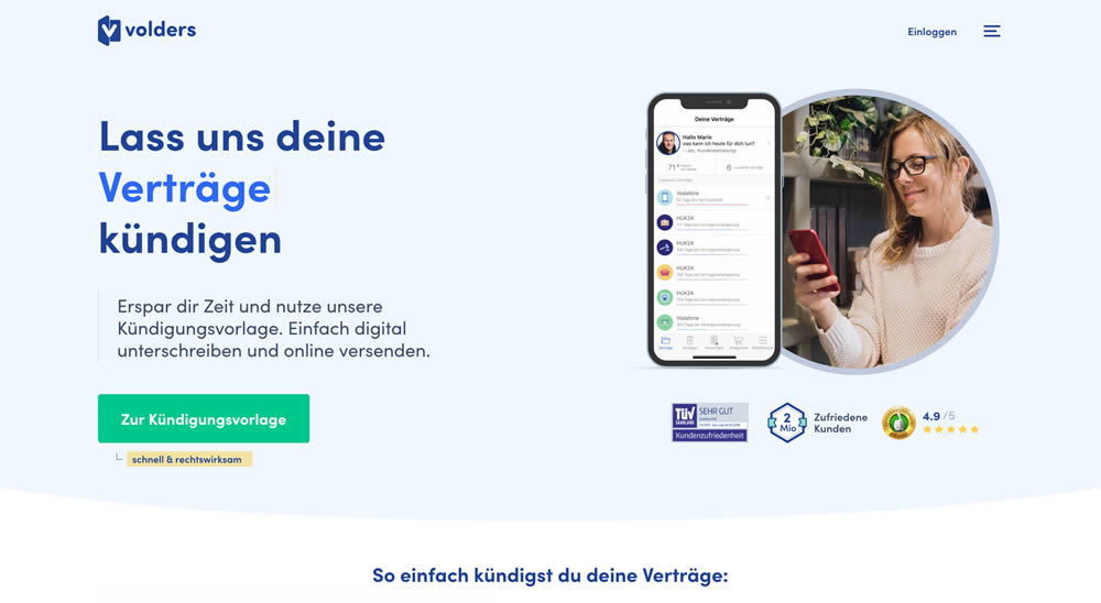
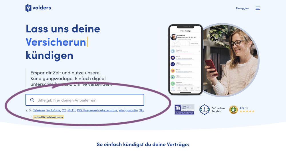
In this experiment, a search input field (to look for companies) along with most popular links (also company names) were displayed on the homepage of a leading contract cancellation service. The control (A) version instead had a button that sent users to a next page where the same selection could be made - only later. The measurable success criteria were the number of paid cancellations - a few steps down the funnel.
Test #297 on
Trydesignlab.com
by
 Daniel Shapiro
May 04, 2020
Desktop
Home & Landing
Daniel Shapiro Tested Pattern #41: Sticky Call To Action In Test #297 On Trydesignlab.com


In this experiment, a sticky "Enroll" button was shown on a course landing page. The button lead to a payment funnel to allow enrolling/paying for a course. The exeperiment measured inital progression into this funnel as well as the deeper completed sales metric.
Test #288 on
Kenhub.com
by
 Niels Hapke
Mar 05, 2020
Desktop
Mobile
Home & Landing
Niels Hapke Tested Pattern #117: Company Logos In Test #288 On Kenhub.com
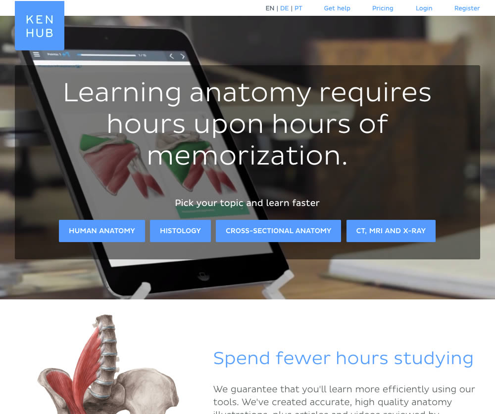
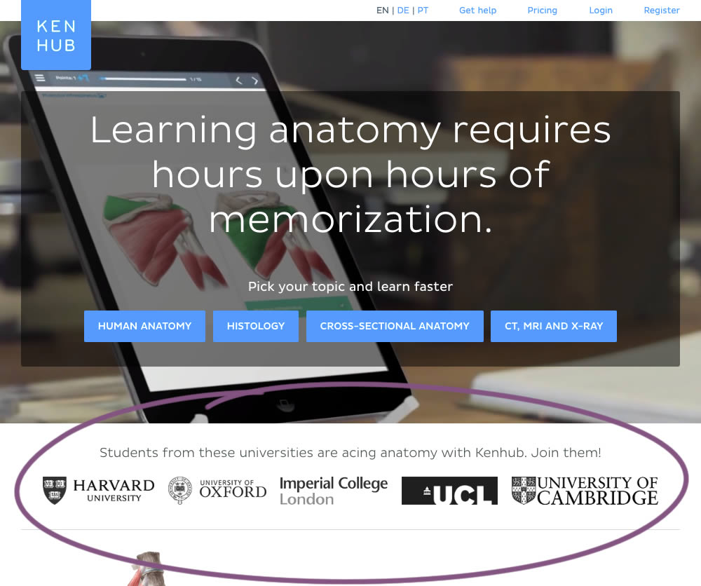
In this experiment, customer logos (of universities attended by students using Kenhub) were placed on a homepage. The experiment tested for the effect on registration visits, and premium subscription starts.
Test #286 on
Volders.de
by
 Alexander Krieger
Feb 28, 2020
Desktop
Mobile
Home & Landing
Alexander Krieger Tested Pattern #9: Multiple Steps In Test #286 On Volders.de
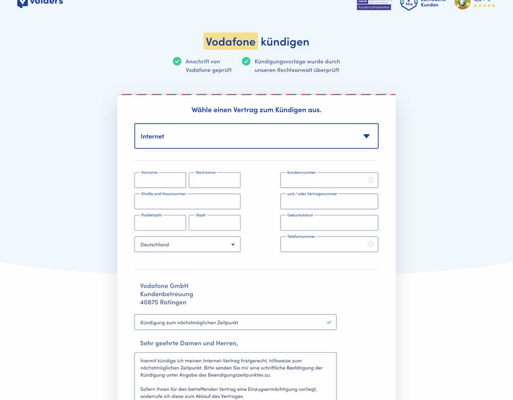
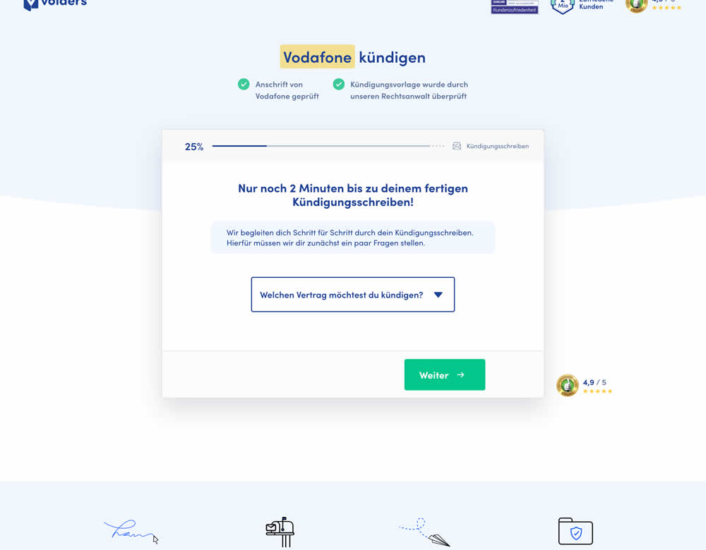
In this experiment, a long contract cancellation landing page (control) was broken down into 4 steps with 1 final summary step (variation).
Test #279 on
Umbraco.com
by
 Lars Skjold Iversen
Jan 16, 2020
Desktop
Mobile
Home & Landing
Lars Skjold Iversen Tested Pattern #79: Product Highlights In Test #279 On Umbraco.com
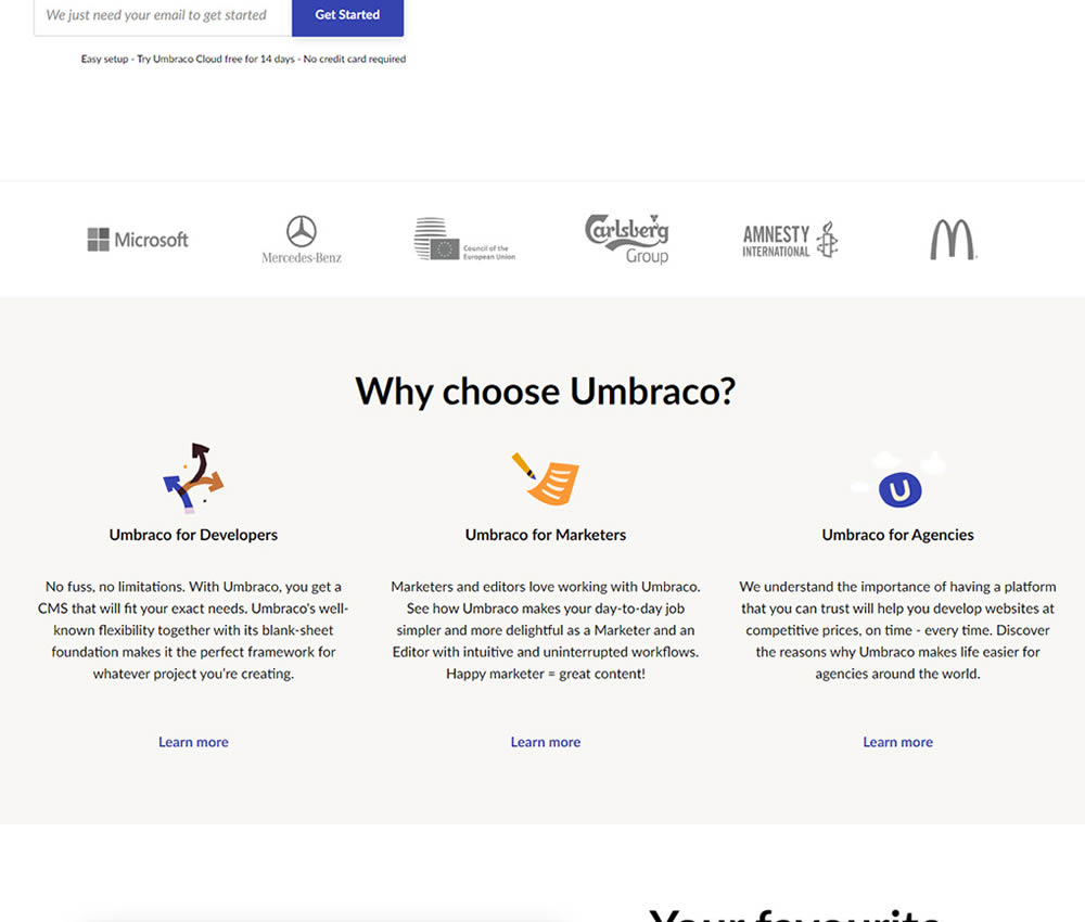
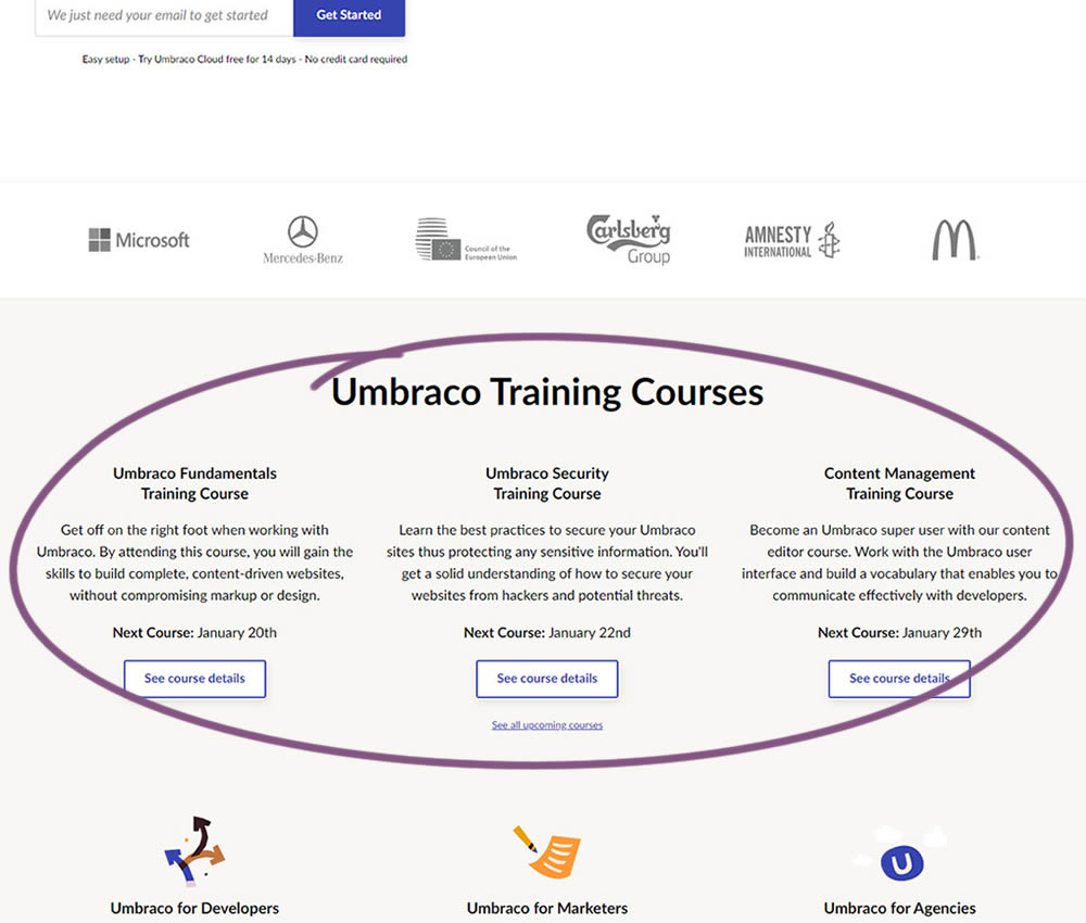
In this experiment, 3 additional course links with descriptions were added to the homepage. The idea was to increase course sales aside of the Saas subscription signups.