All Latest 556 A/B Tests
Become a member to unlock the abiltiy to see the highest impact a/b tests. Being able to see the actual test results and sort by impact allows growth and experimentation teams to take action on the biggest gains first
MOST RECENT TESTS
Test #237 on
Goodui.org
by
 Jakub Linowski
Apr 29, 2019
Desktop
Mobile
Listing
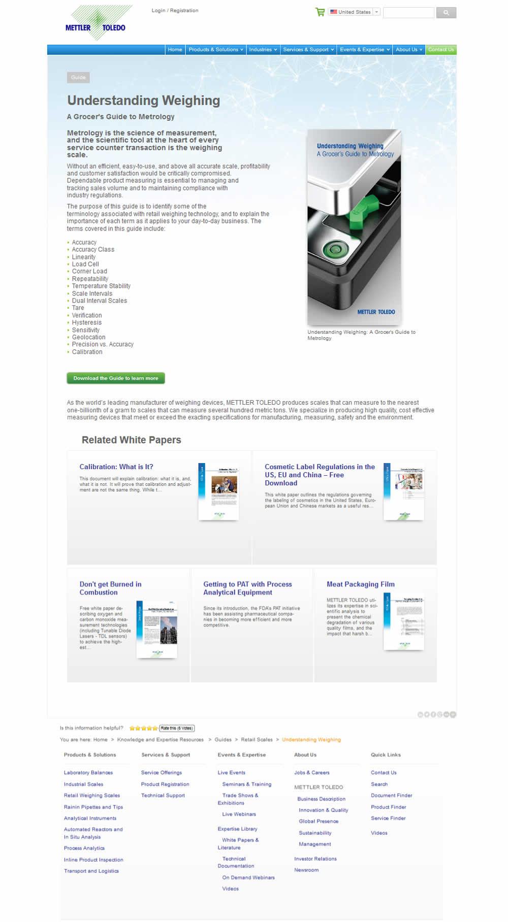
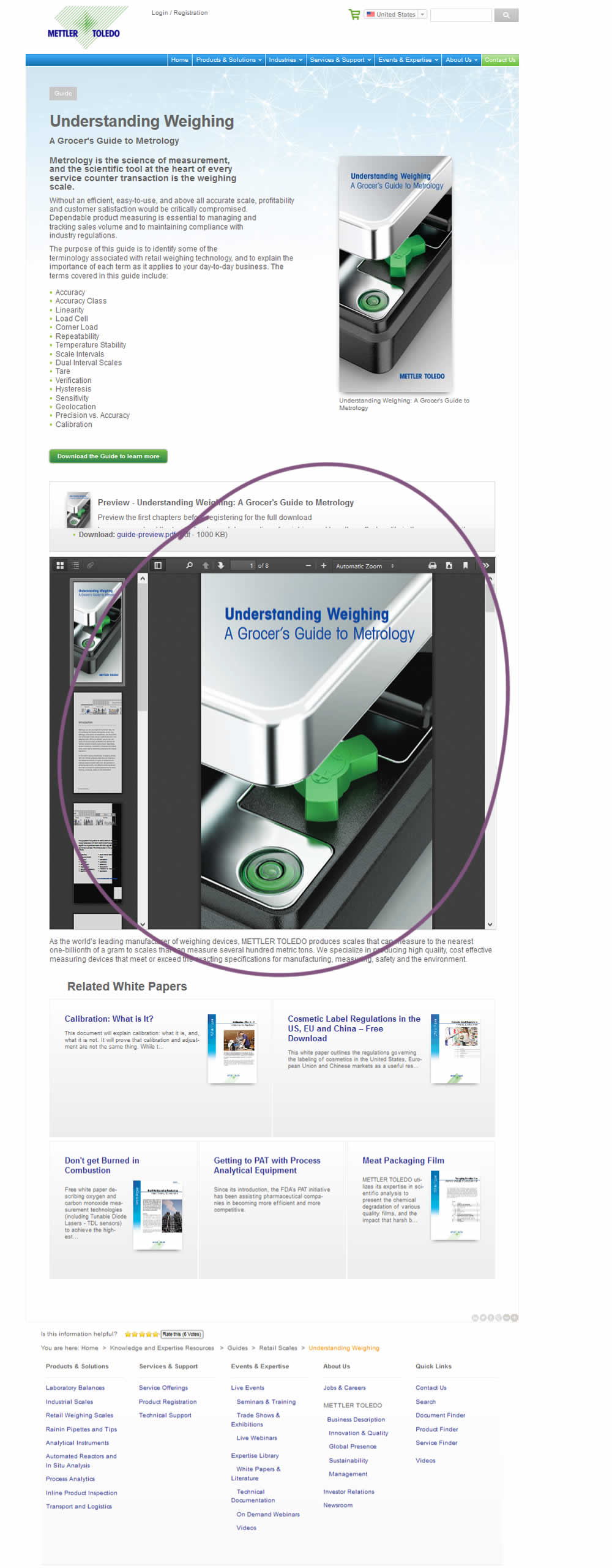
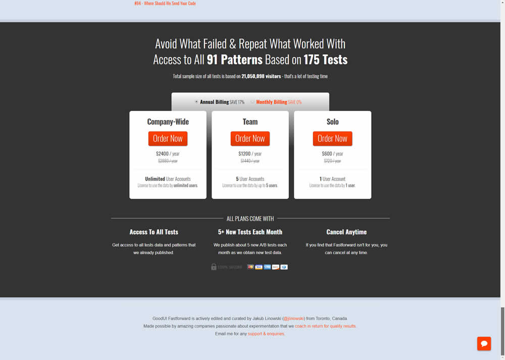
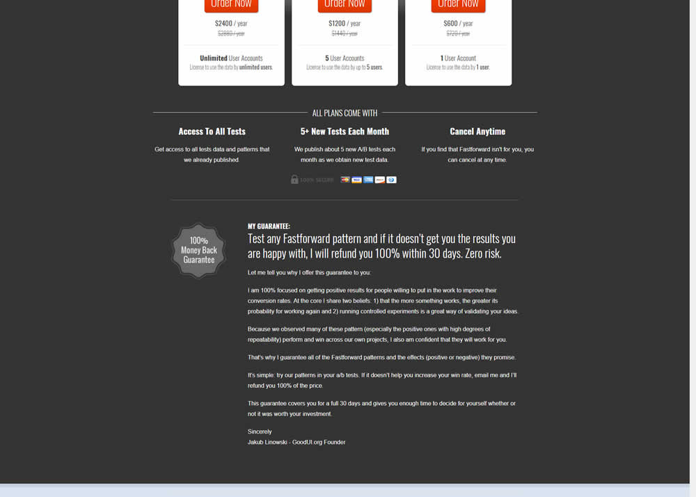
Jakub Linowski Tested Pattern #103: Money Back Guarantee In Test #237 On Goodui.org
Test #236 on
by
 Alex James
Apr 04, 2019
Desktop
Signup
Alex James Tested Pattern #9: Multiple Steps In Test #236
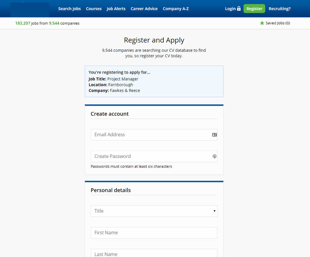
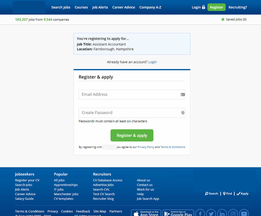
In this experiment a single screen signup process was broken into 2 separate steps: account creation & details.
Test #235 on
Thomasnet.com
by
 Julian Gaviria
Apr 02, 2019
Desktop
Mobile
Home & Landing
Julian Gaviria Tested Pattern #102: Expanded Or Condensed Layout In Test #235 On Thomasnet.com
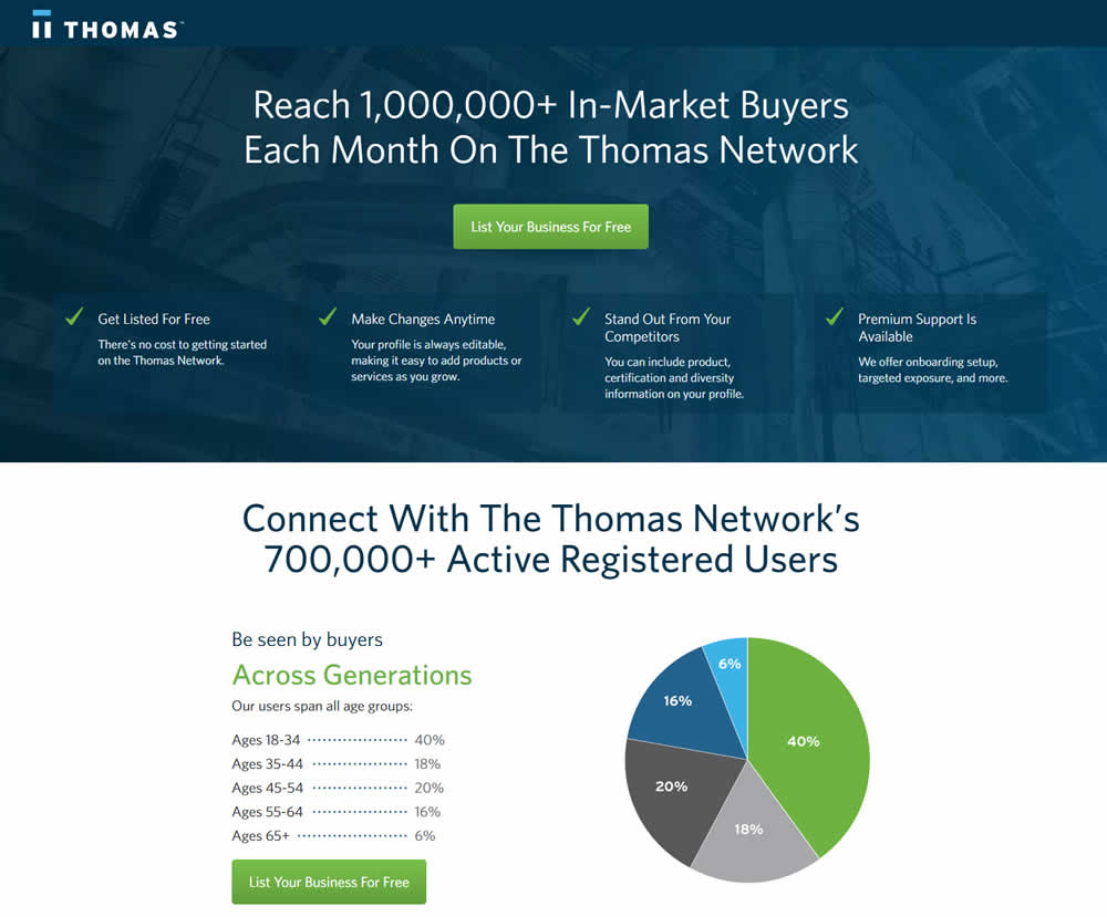
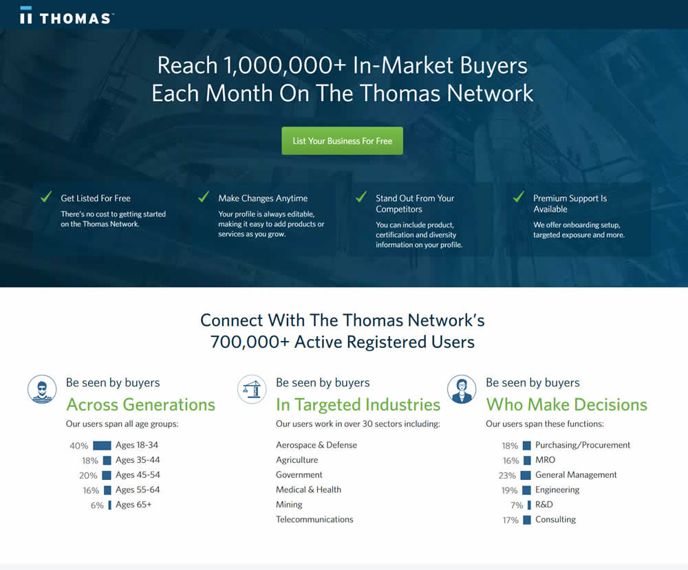
In this experiment, the layout was condensed from a taller to a shorter one.
Test #233 on
Annonce.cz
by
 Ondřej Ilinčev
Apr 01, 2019
Desktop
Signup
Ondřej Ilinčev Tested Pattern #100: Postponed Registration In Test #233 On Annonce.cz
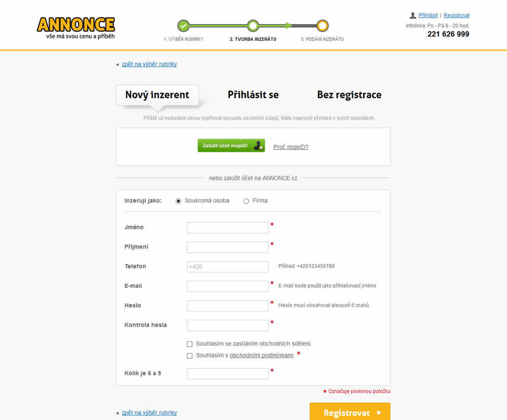
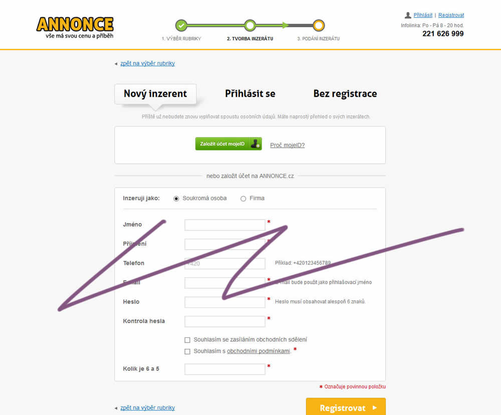
In this experiment, the old flow had a login / register / guest checkout as a second step. The variant B flow removed this step and treated everyone as a guest (and later offered to login / register). In the B version guests had a voluntary registration on the thank you page and in a confirmation email.
Test #234 on
by
 Alex James
Apr 01, 2019
Desktop
Listing
Alex James Tested Pattern #101: Search Keyword Highlighting In Test #234

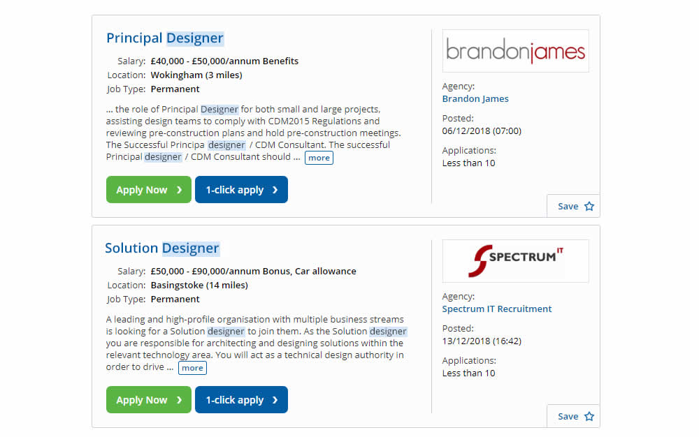
In this experiment, a different style for keyword highlighting was used.
Test #232 on
Yoast.com
by
 Sjardo Janssen
Mar 15, 2019
Desktop
Mobile
Checkout
Sjardo Janssen Tested Pattern #6: Customer Star Ratings In Test #232 On Yoast.com
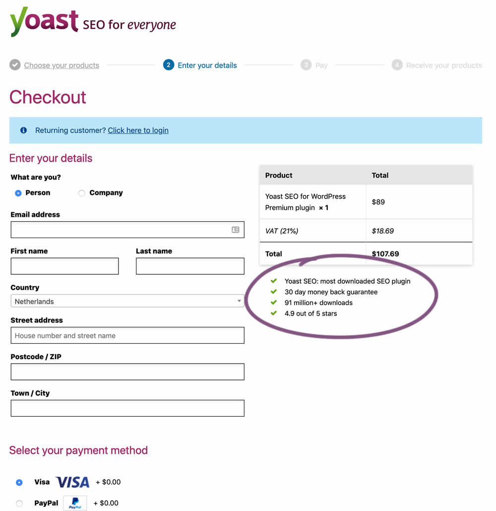
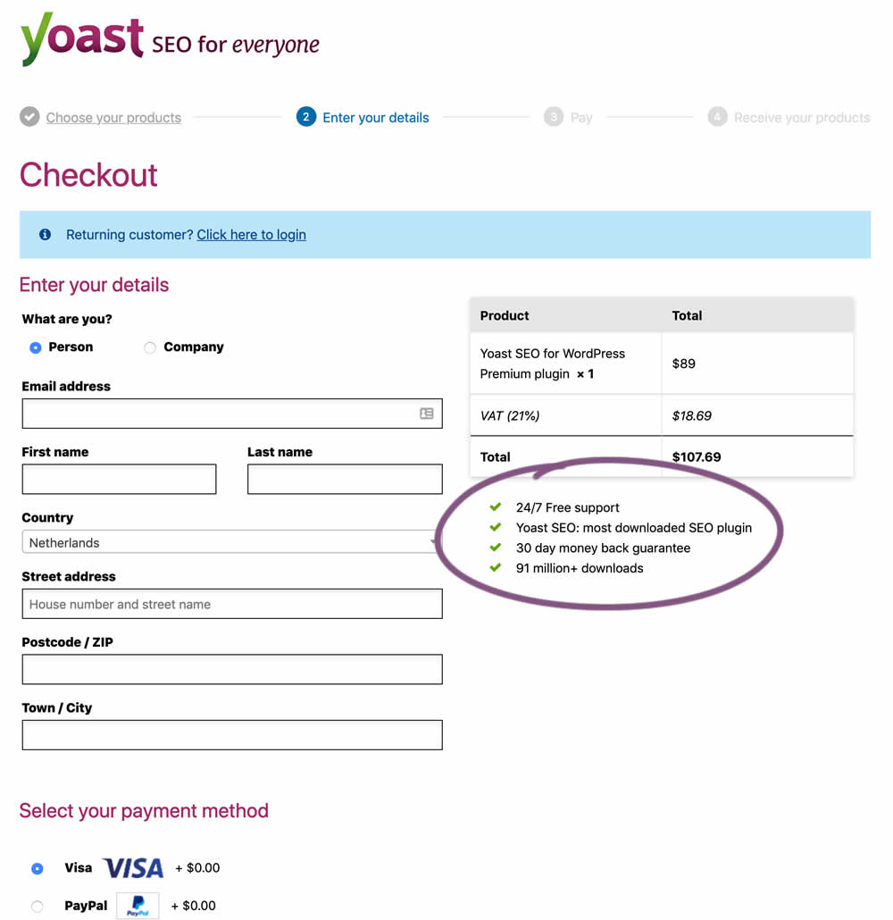
In this experiment, the Yoast team replaced one of the bulleted reassurances on their checkout page ("4.9 out of 5 stars" vs "24/7 Free support"). Raising the question - is free support or high reviews valued more? - Thanks Sjardo & Meike for sharing!
Test #231 on
Glass.net
by
 Mark Freedle
Mar 14, 2019
Desktop
Mobile
Signup
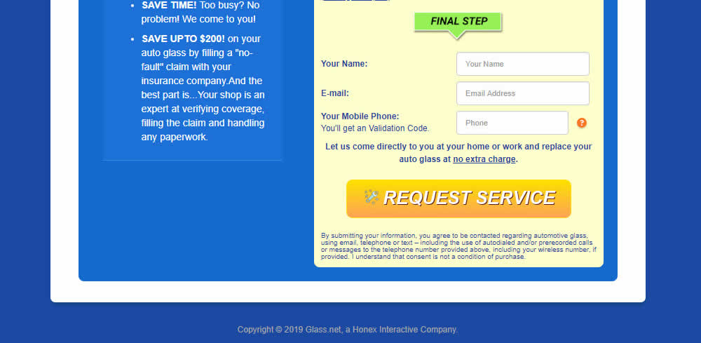
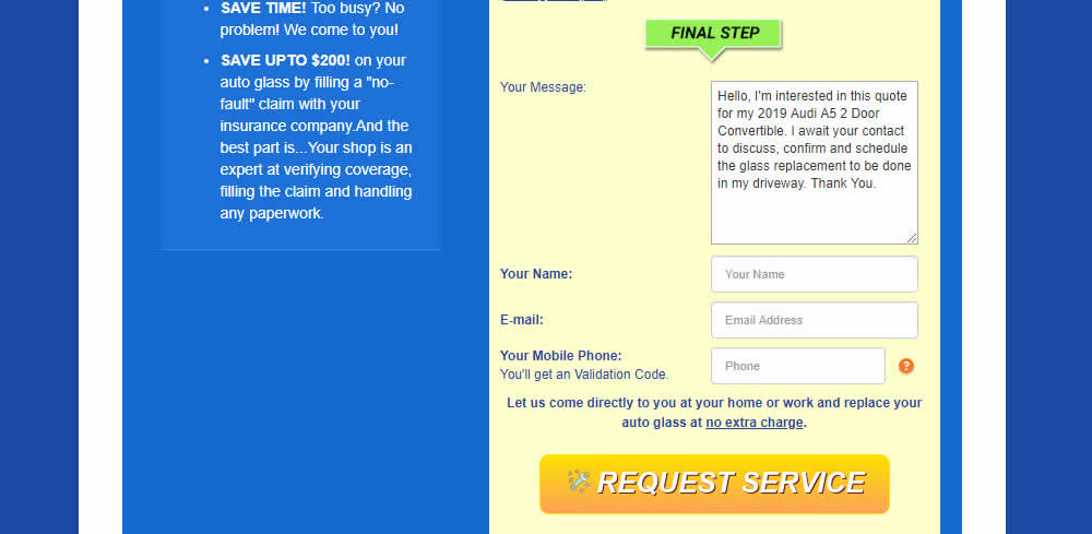
Mark Freedle Tested Pattern #20: Canned Response In Test #231 On Glass.net
Test #230 on
Goodui.org
by
 Jakub Linowski
Mar 09, 2019
Desktop
Mobile
Listing
Jakub Linowski Tested Pattern #56: Hover Button In Test #230 On Goodui.org
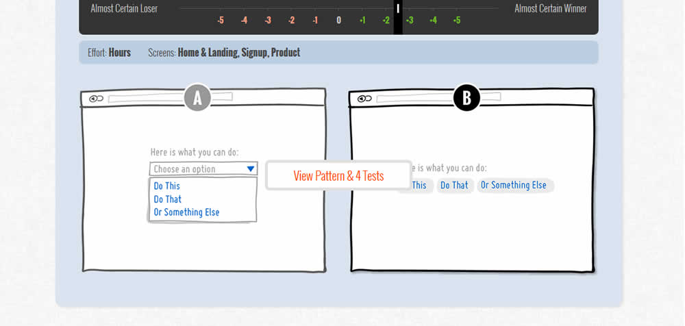
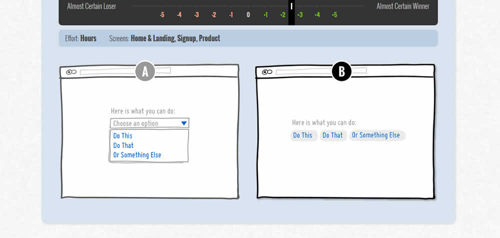
In this test we tested onhover buttons (variant) versus more traditional always exposed and visible ones.
Test #229 on
by
 Jakub Linowski
Mar 08, 2019
Desktop
Mobile
Checkout
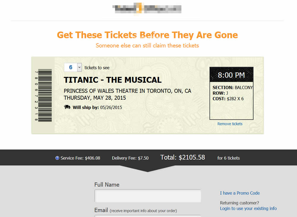
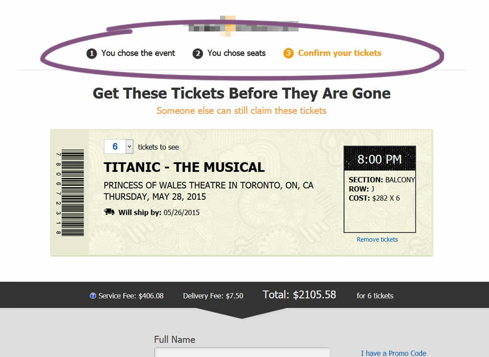
Jakub Linowski Tested Pattern #99: Progress Bar In Test #229
Test #228 on
by
 Jakub Linowski
Mar 05, 2019
Desktop
Mobile
Checkout
Jakub Linowski Tested Pattern #99: Progress Bar In Test #228

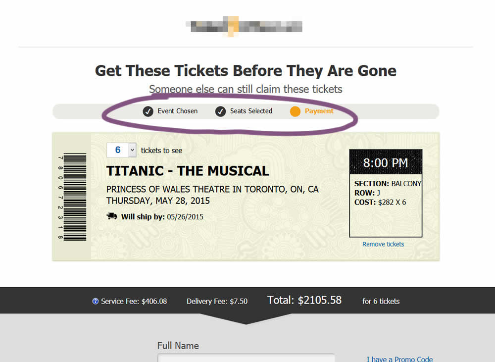
The variation added a progress bar to one of the checkout steps for a ticket ordering site.
Test #227 on
Volders.de
by
 Alexander Krieger
Mar 04, 2019
Desktop
Signup
Alexander Krieger Tested Pattern #99: Progress Bar In Test #227 On Volders.de
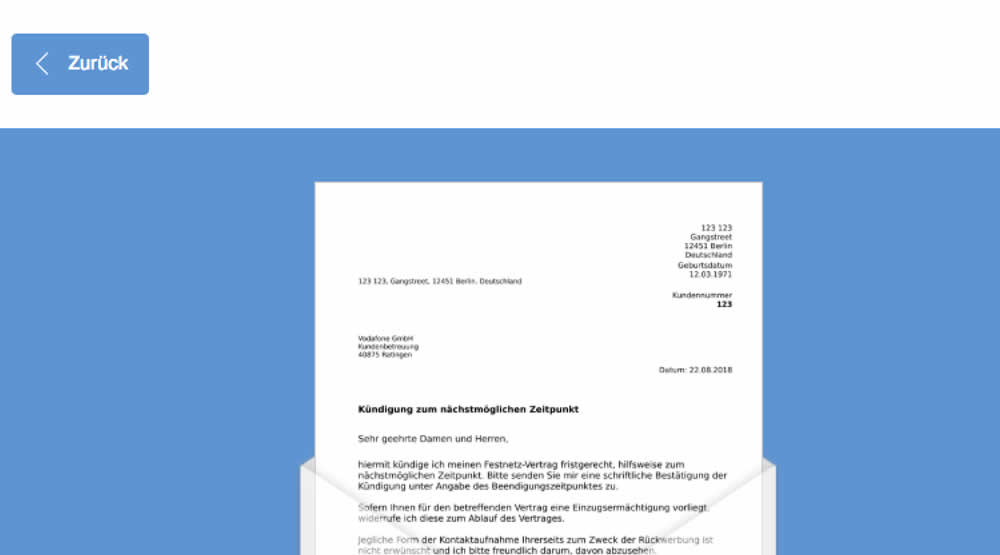
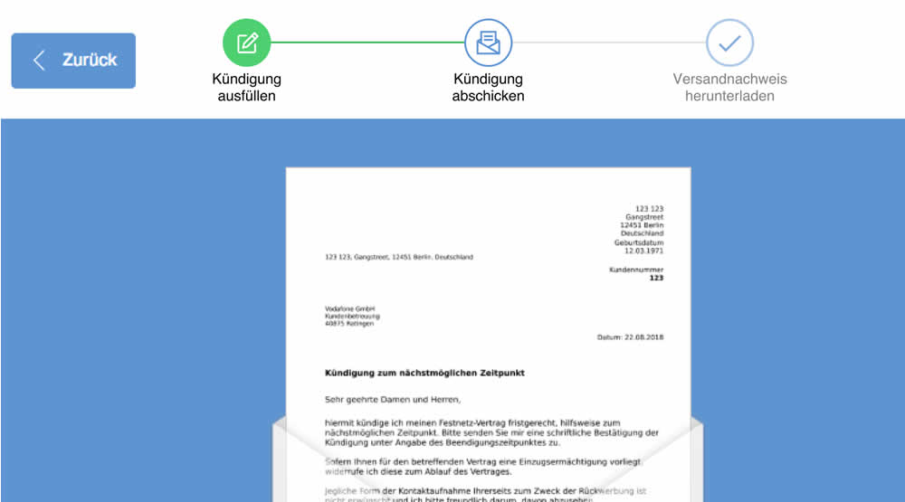
In this experiment, a simple progress bar was added to a 2nd step of contract cancellation funnel. The progress bar used separate styles to show which steps were completed, what the current step was, as well as the future step.
Translation of the 3 steps from German are as follows:
- Fill out the termination
- Send termination
- Proof of termination
Test #226 on
Microsoft.com
by
 Ronny Kohavi
Feb 18, 2019
Desktop
Product
Ronny Kohavi Tested Pattern #96: Single Focus Photos In Test #226 On Microsoft.com
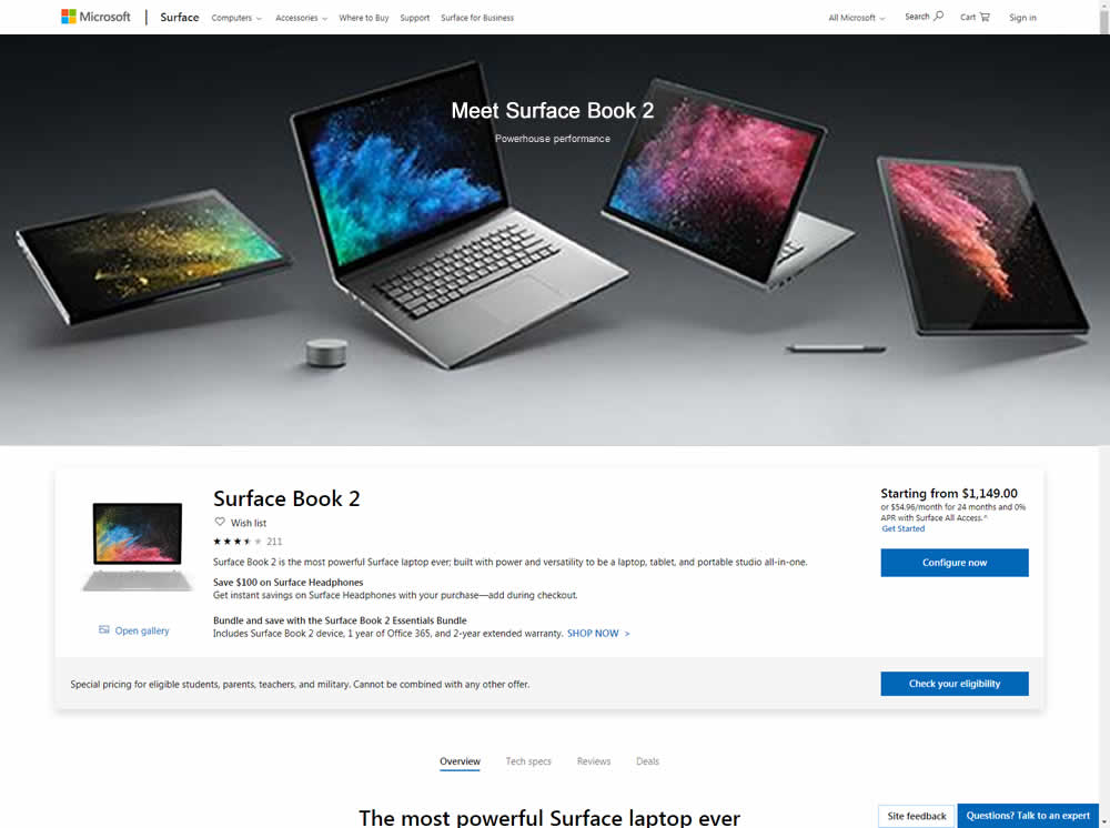
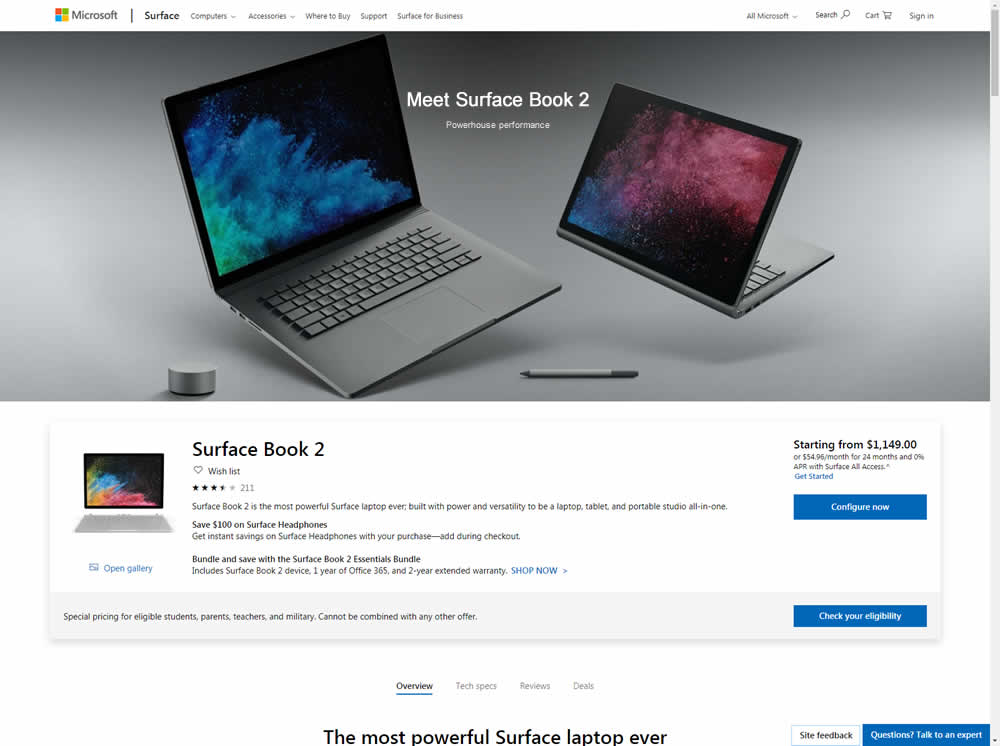
Microsoft Store ran an experiment on the Surface Book 2 product page. The treatment showed a hero image with fewer, yet larger product photos
Test #225 on
by
 Devesh Khanal
Feb 17, 2019
Desktop
Product
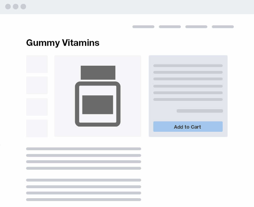
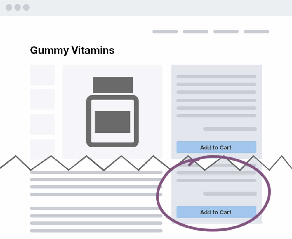
Devesh Khanal Tested Pattern #41: Sticky Call To Action In Test #225
Test #224 on
by
 Alex James
Feb 11, 2019
Desktop
Home & Landing
Alex James Tested Pattern #3: Fewer Form Fields In Test #224
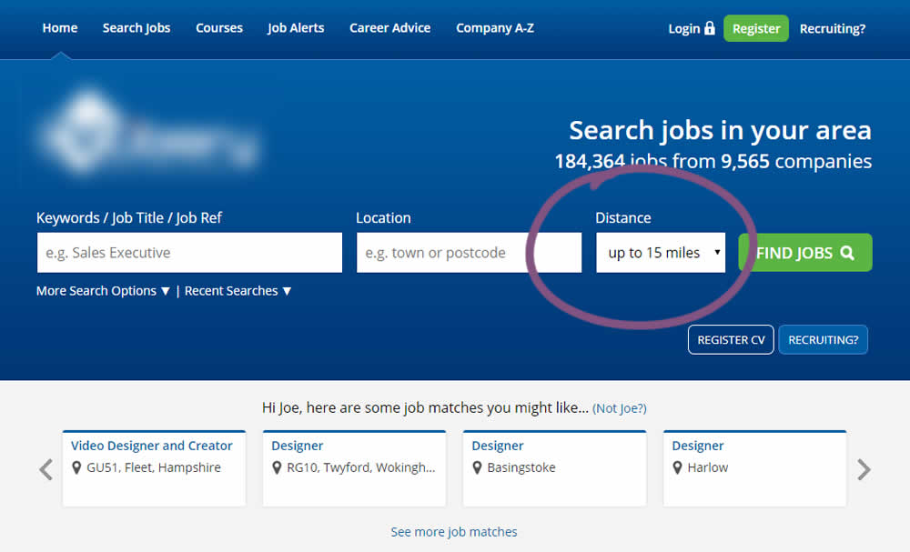
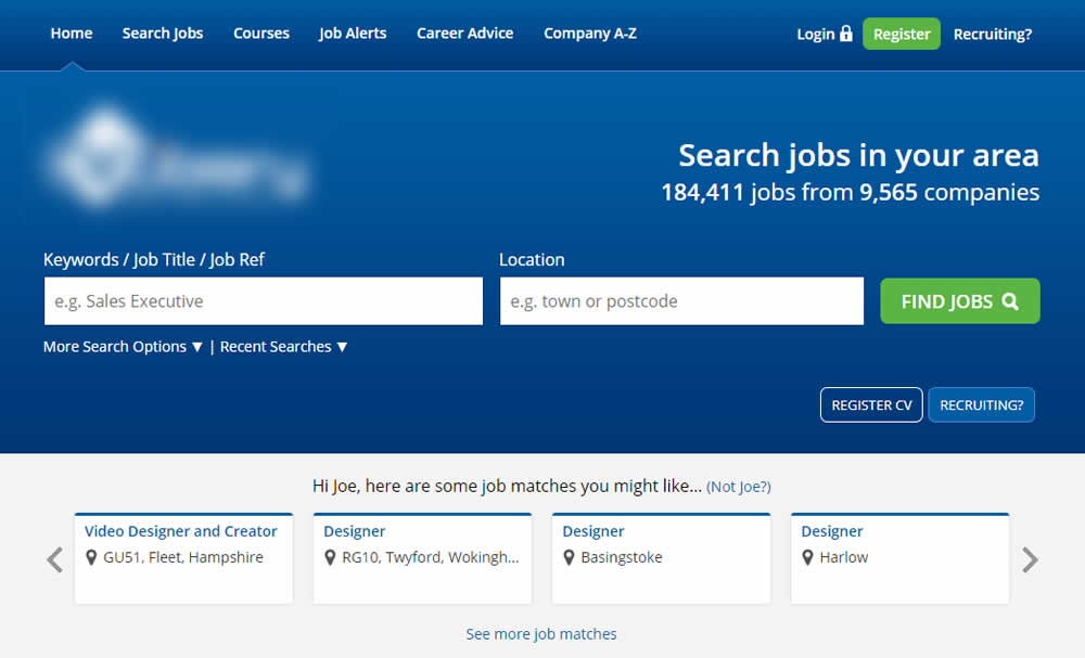
This experiment reduced the search form by removing the distance field.
Test #222 on
Thomasnet.com
by
 Julian Gaviria
Feb 01, 2019
Desktop
Listing
Julian Gaviria Tested Pattern #7: Social Counts In Test #222 On Thomasnet.com
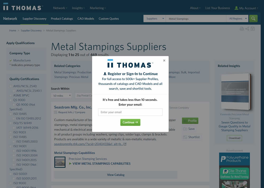
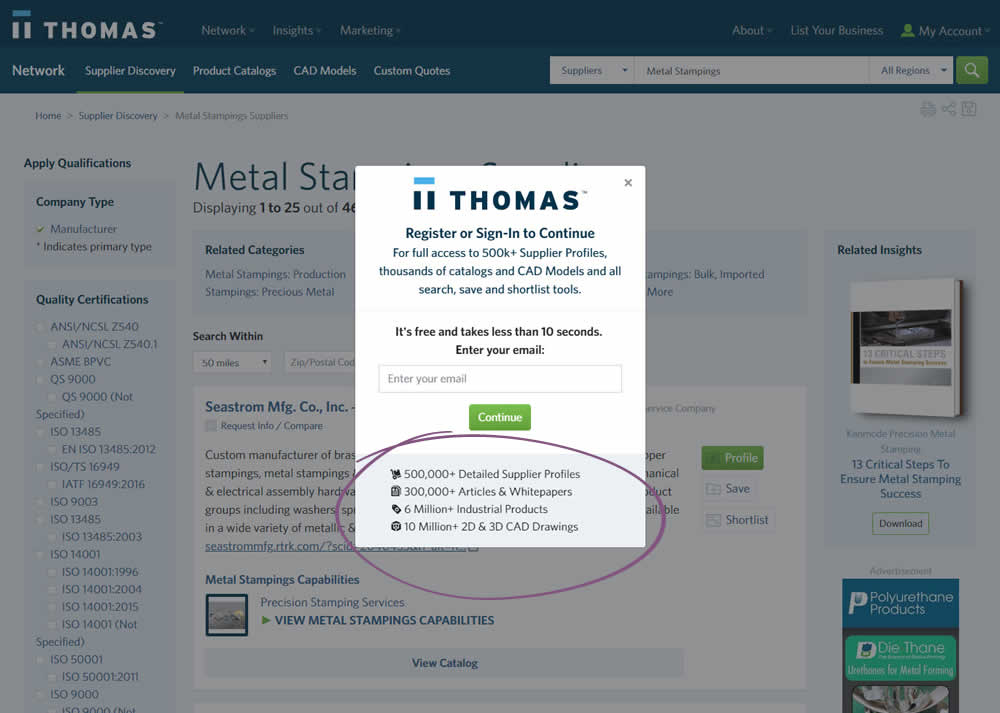
In this variation, a number of social proof references were added to a signup modal.
Test #223 on
Volders.de
by
 Alexander Krieger
Feb 01, 2019
Desktop
Mobile
Signup
Alexander Krieger Tested Pattern #12: Payment First In Test #223 On Volders.de
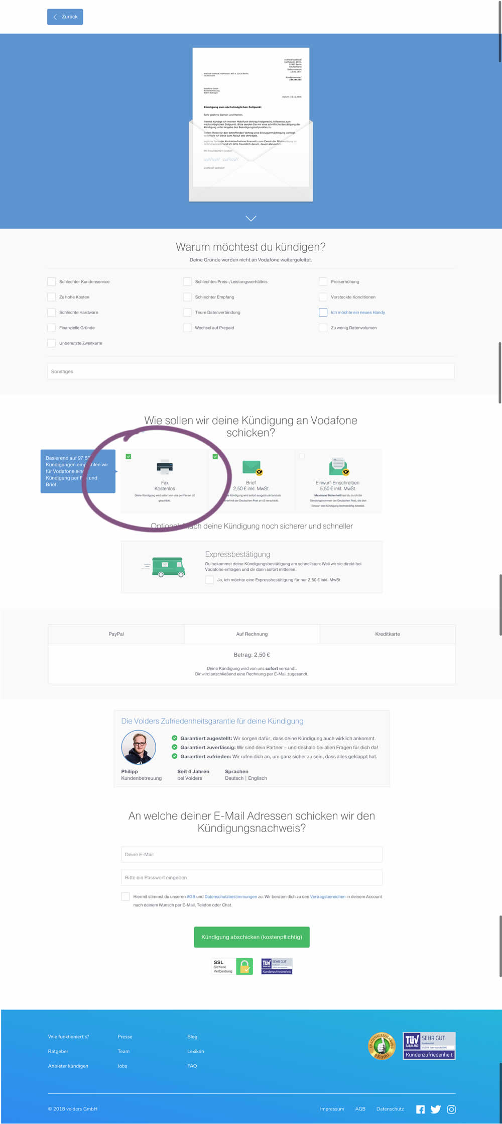
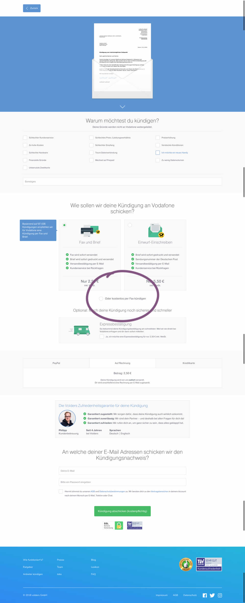
This test deprioritized the free option (kostenlos) of cancelling a contract. It did so by placing it under the paid options as small text link / radio option.
Test #221 on
Microsoft.com
by
 Ronny Kohavi
Jan 27, 2019
Desktop
Product
Ronny Kohavi Tested Pattern #49: Above The Fold Call To Action In Test #221 On Microsoft.com
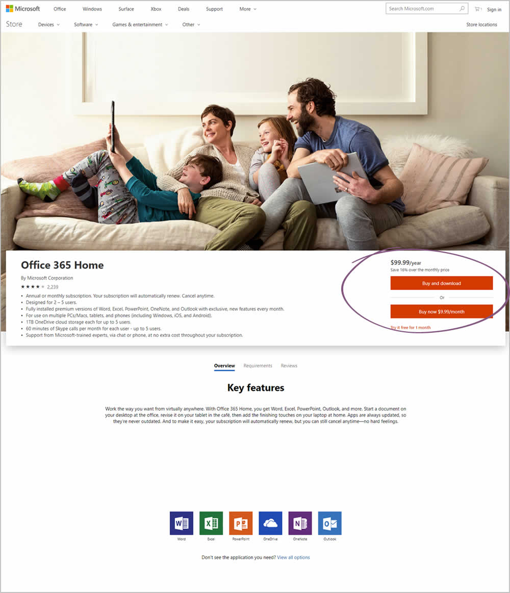
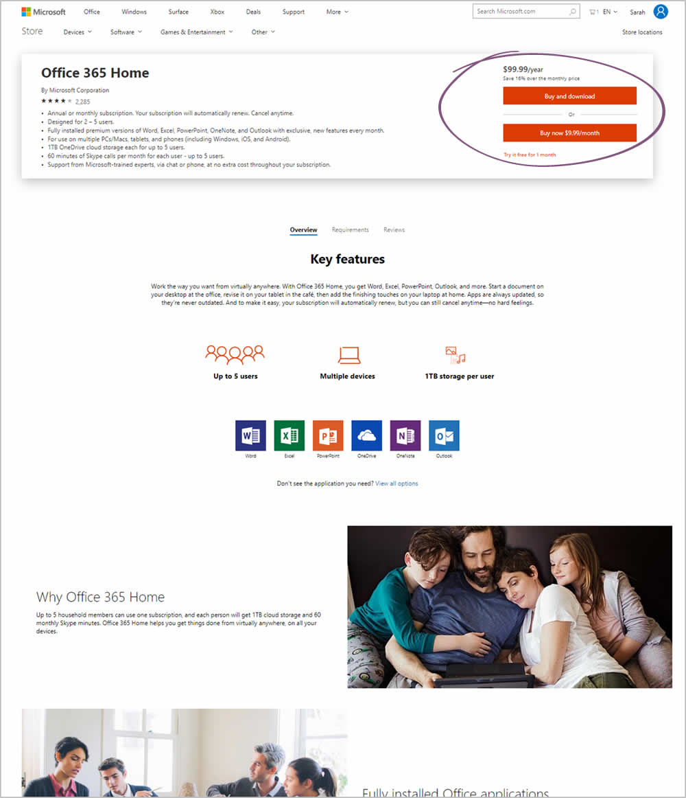
Microsoft Store ran an experiment on the Office 365 Home product page. The treatment raised the purchase calls to action higher by removing the hero image.
Test #220 on
by
 Alex James
Jan 18, 2019
Desktop
Listing
Alex James Tested Pattern #34: Open In A New Tab In Test #220
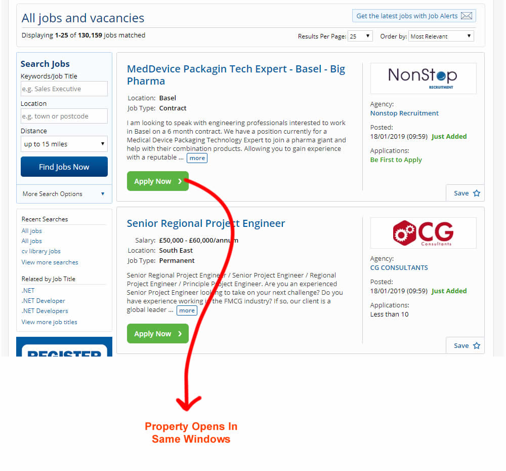
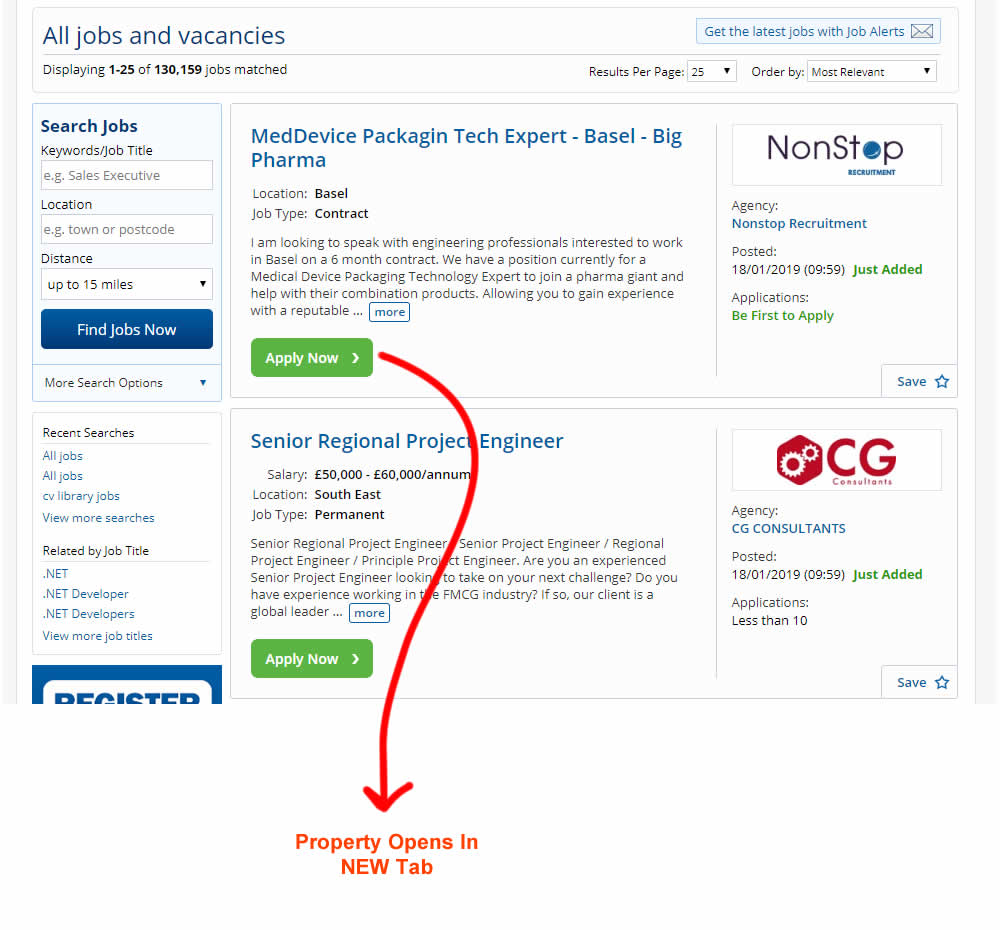
This experiment measured the effect of opening new listing (job applications) in a new tab, against opening them in the same window. The experiment A-B was inversed to match the pattern (in reality, the original already opened the tabs in a new window).
Test #218 on
Yummly.com
by
 Kimberly Cheung
Jan 14, 2019
Desktop
Mobile
Home & Landing
Kimberly Cheung Tested Pattern #94: Visible Search In Test #218 On Yummly.com
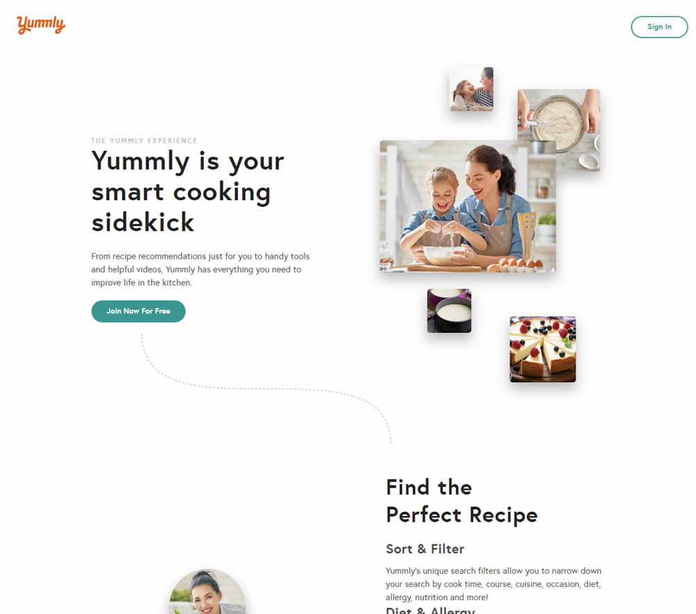
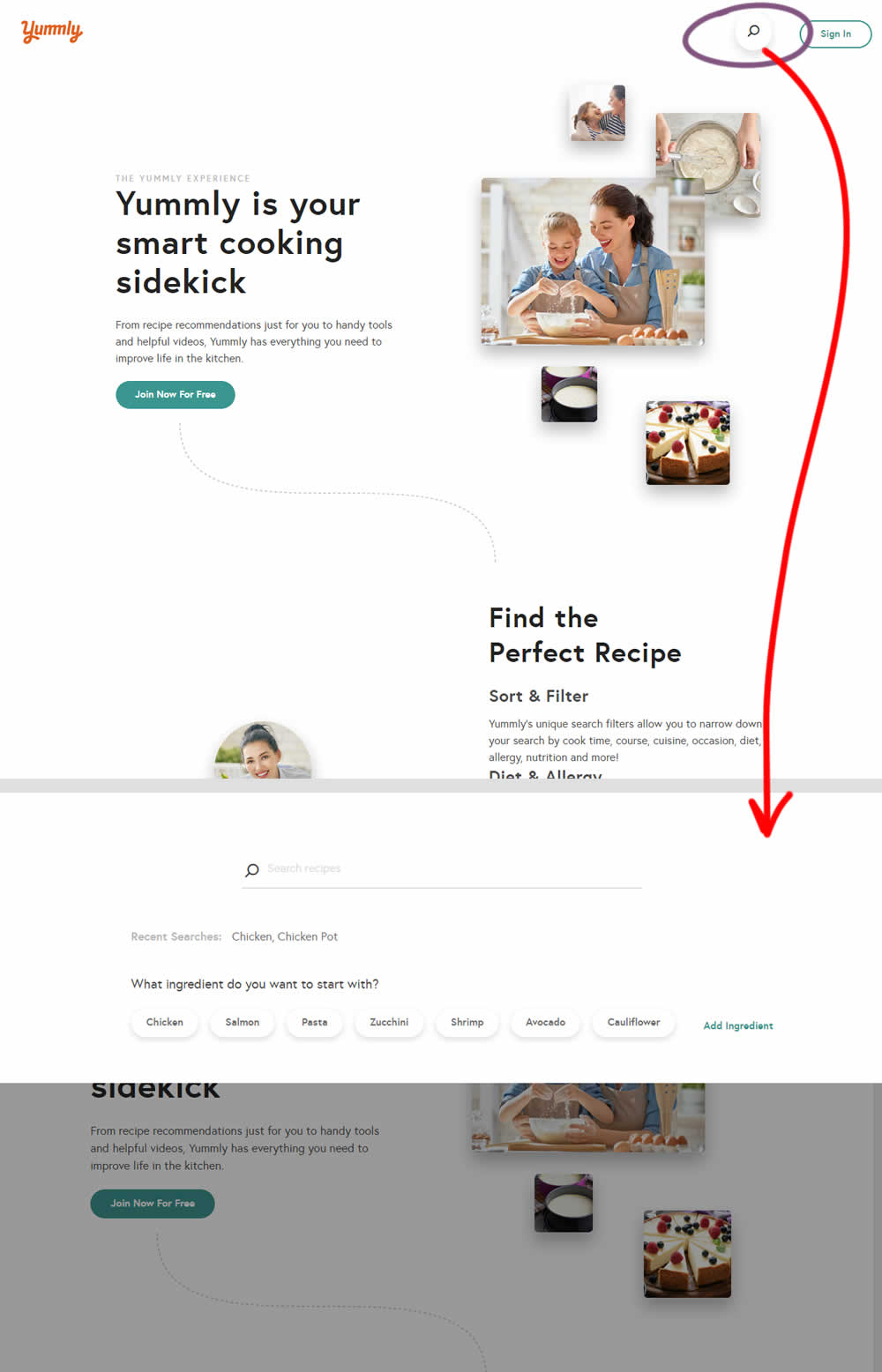
Hypothesis: Anonymous users can't use global search while on the home promo page. We believe that if we show a global search bar to anonymous users, it presents a higher converting funnel (guided search) and will increase our sign-up rates significantly.
Control (A): Logged out users don't see global search bar.
Variant (B): Logged out users see global search bar. After searching for a keyword, the signup funnel starts with a more personalized reason to continue the signup process.
Test #219 on
Mt.com
by
 Vito Mediavilla
Jan 14, 2019
Desktop
Mobile
Home & Landing
Vito Mediavilla Tested Pattern #95: Clickable Product Previews In Test #219 On Mt.com
