All Latest 556 A/B Tests
Become a member to unlock the abiltiy to see the highest impact a/b tests. Being able to see the actual test results and sort by impact allows growth and experimentation teams to take action on the biggest gains first
MOST RECENT TESTS
Test #158 on
Kenhub.com
by
 Niels Hapke
Mar 11, 2018
Desktop
Mobile
Checkout
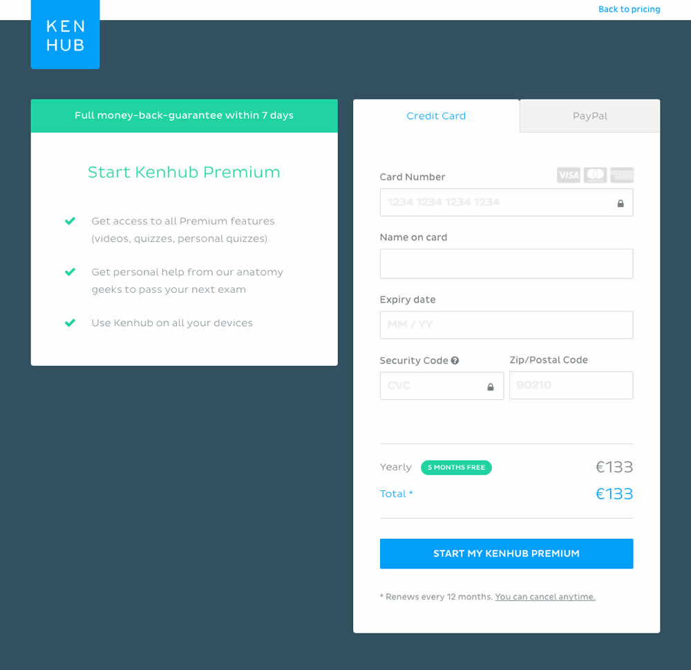
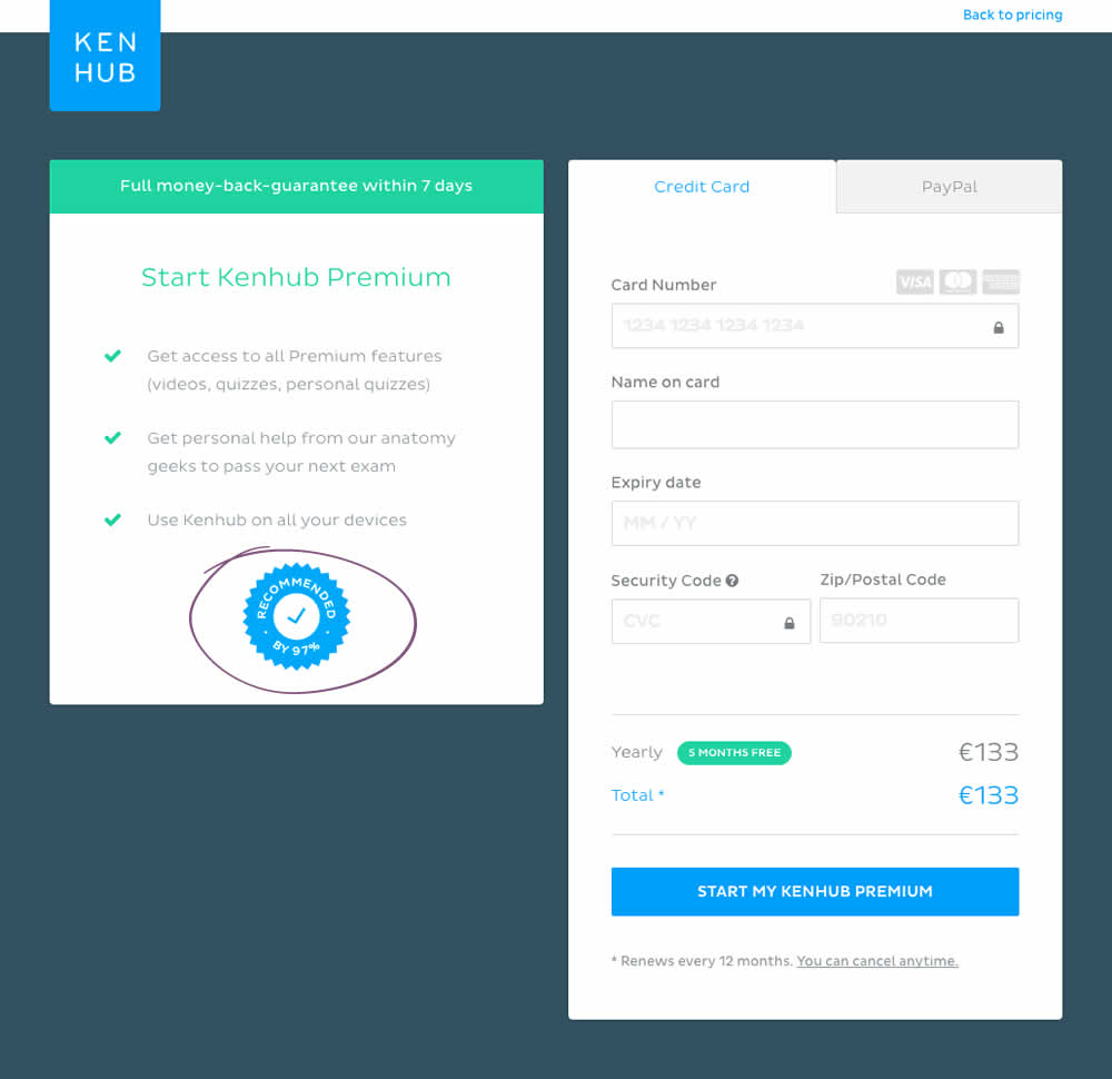
Niels Hapke Tested Pattern #63: Trust Seals In Test #158 On Kenhub.com
Test #159 on
Swimsuitsforall.com
by
 Devesh Khanal
Mar 11, 2018
Desktop
Checkout
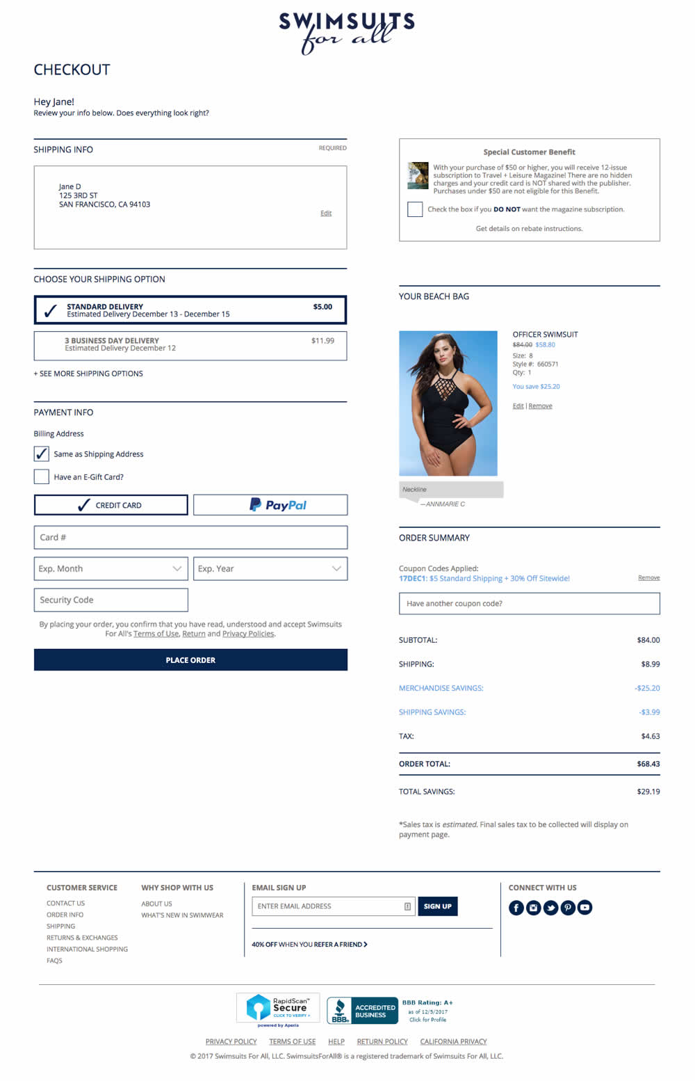
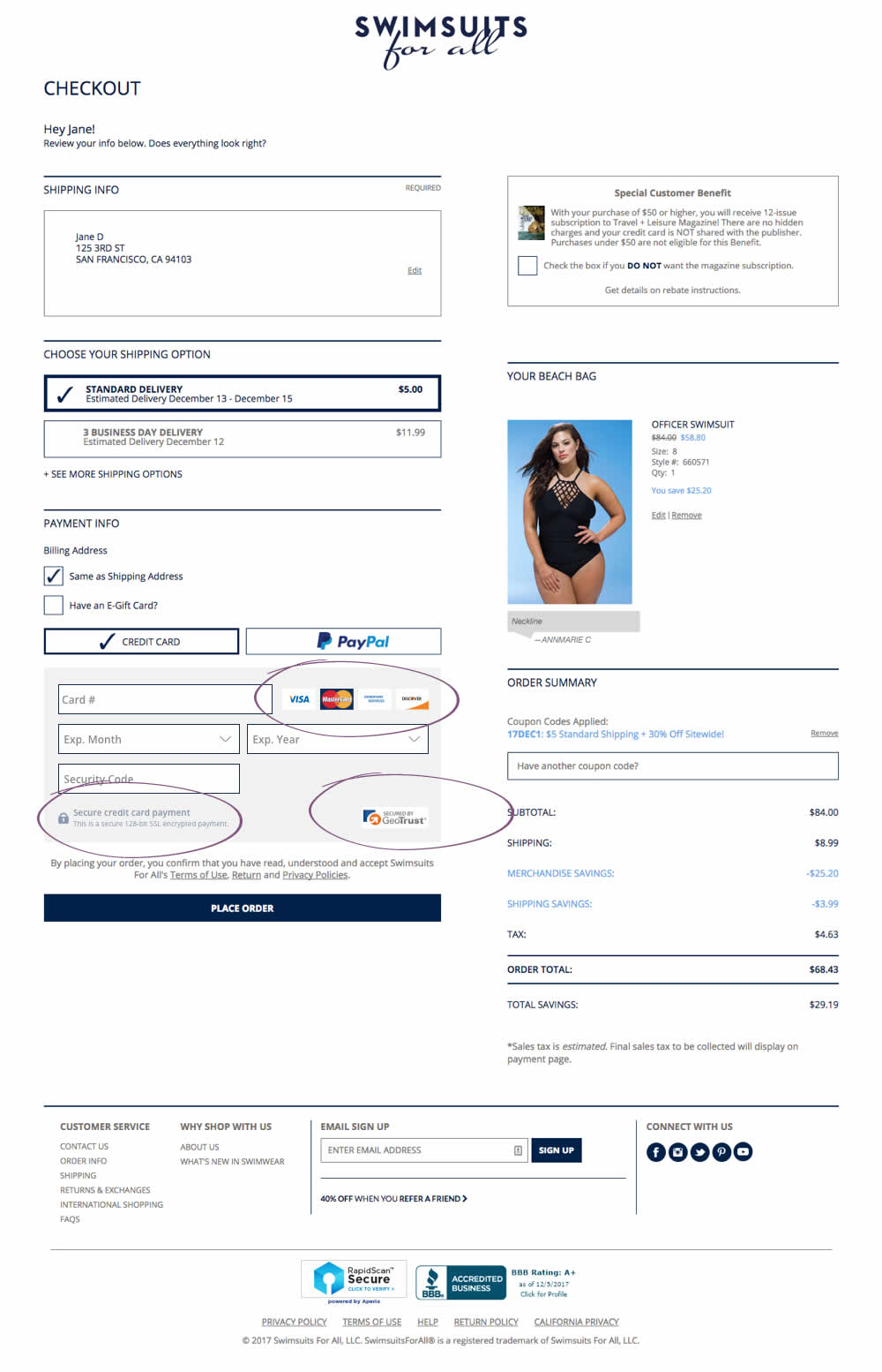
Devesh Khanal Tested Pattern #63: Trust Seals In Test #159 On Swimsuitsforall.com
Test #157 on
Bobandlush.com
by
 Viljo Vabrit
Mar 06, 2018
Desktop
Product
Viljo Vabrit Tested Pattern #62: Urgent Next Day Delivery In Test #157 On Bobandlush.com
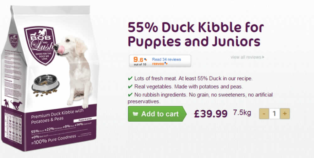
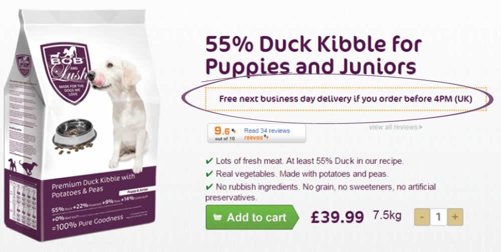
Hypothesis - Urgency leads to higher conversions as people have less time to think and will instead follow their impulse to complete the purchase now rather than later.
The Treatment - From Monday to Friday, before 4 PM, we added the urgency message “Free next business day delivery if you order before 4 PM (UK)”. We placed the urgency message just below the product name ensuring that it fell into the reading pattern of all visitors interested in the products. To ensure the treatment was only shown at the right time and for the right people we added a condition: MON, TUE, WED, THU, FRI before 4 PM; UK IP.
Test #156 on
Mt.com
by
 Vito Mediavilla
Feb 25, 2018
Desktop
Listing
Vito Mediavilla Tested Pattern #60: Repeated Bottom Call To Action In Test #156 On Mt.com
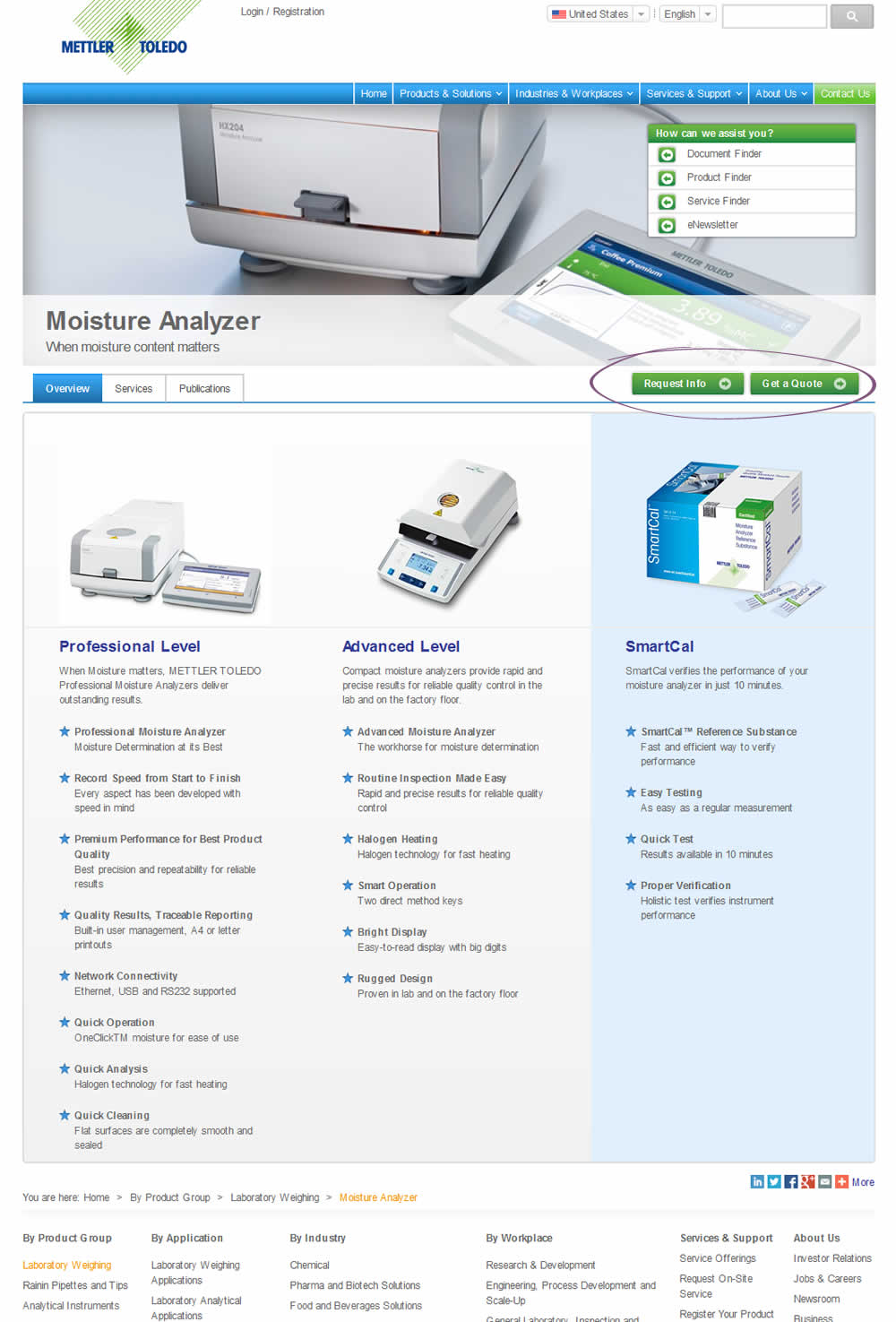
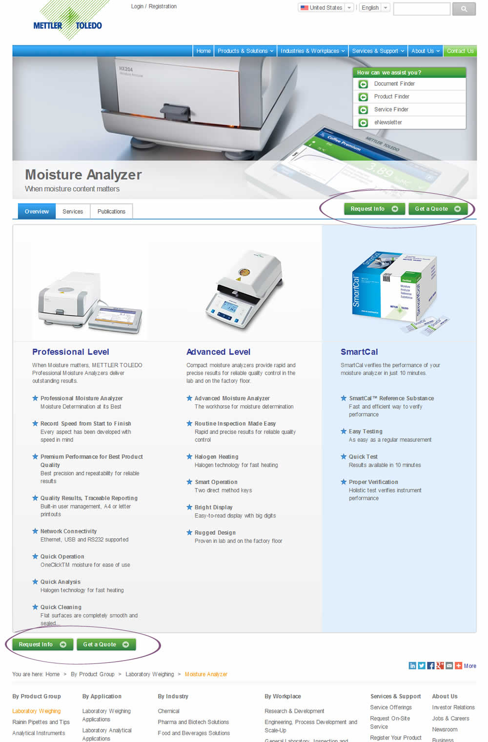
This test duplicated two buttons at the bottom of the page. However, the site already contained floating buttons (from the header).
Test #155 on
Mt.com
by
 Vito Mediavilla
Feb 22, 2018
Mobile
Product
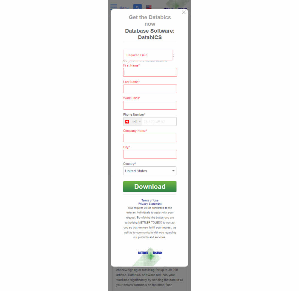
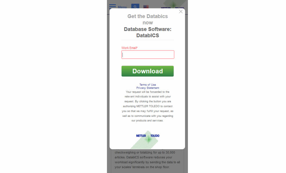
Vito Mediavilla Tested Pattern #3: Fewer Form Fields In Test #155 On Mt.com
Test #154 on
Reverb.com
by
 Nicholas Evans
Feb 20, 2018
Desktop
Mobile
Product
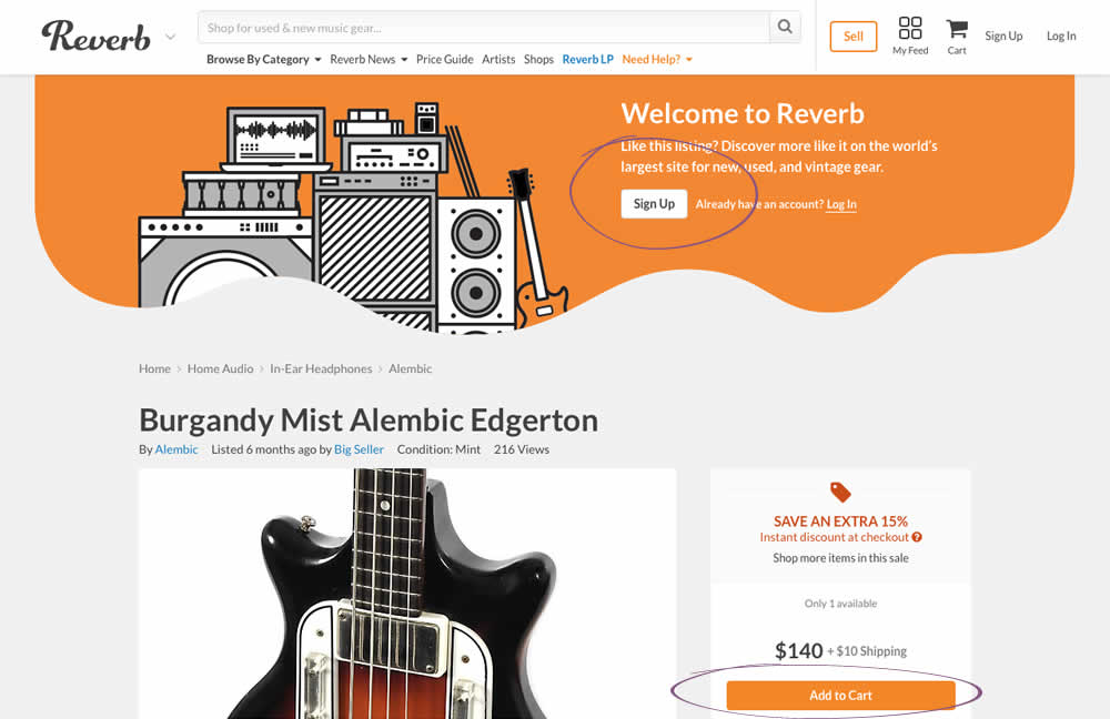
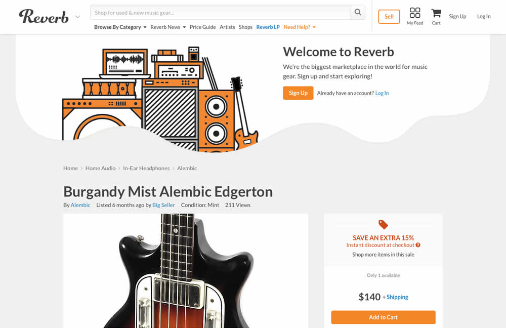
Nicholas Evans Tested Pattern #59: Inverted Or Consistent Button Styles In Test #154 On Reverb.com
Test #153 on
Goodui.org
by
 Jakub Linowski
Feb 19, 2018
Desktop
Mobile
Home & Landing
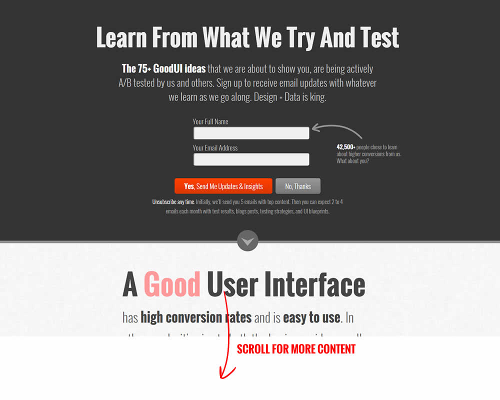
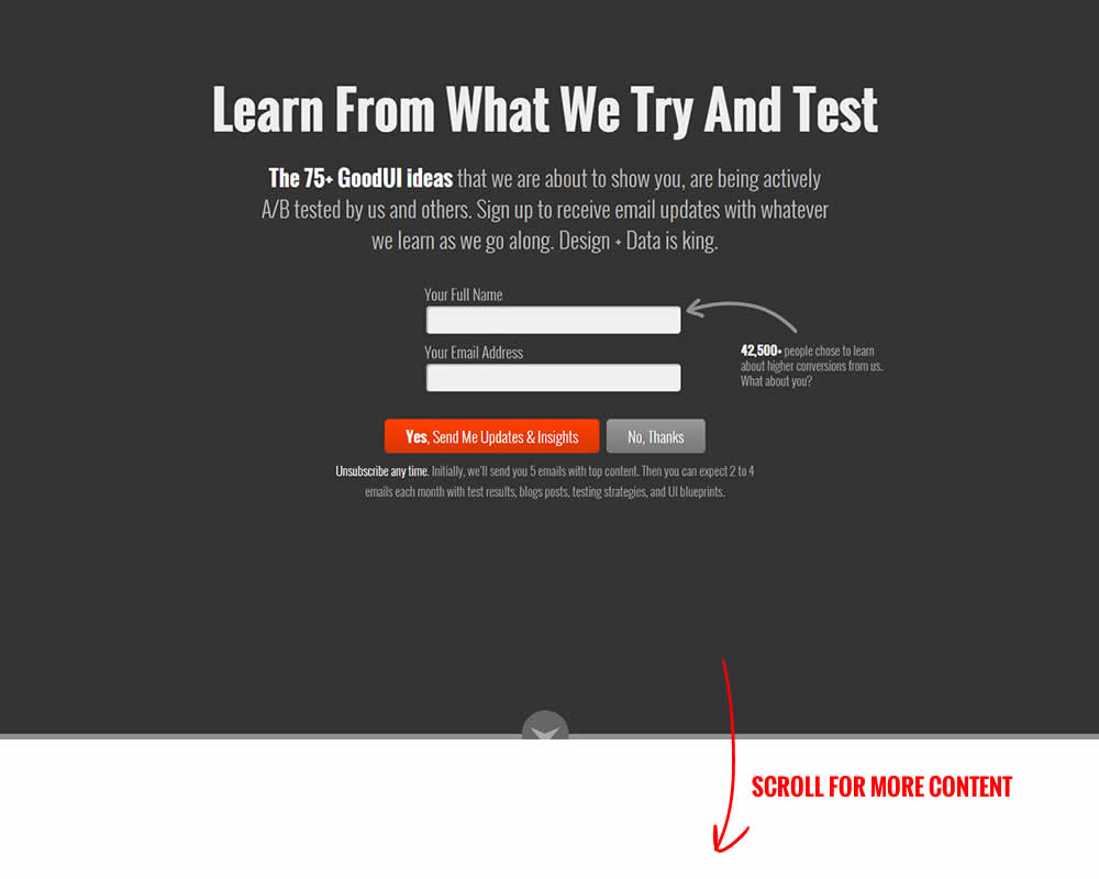
Jakub Linowski Tested Pattern #58: Full Height False Bottom In Test #153 On Goodui.org
Test #152 on
Reverb.com
by
 Nicholas Evans
Feb 13, 2018
Desktop
Mobile
Product
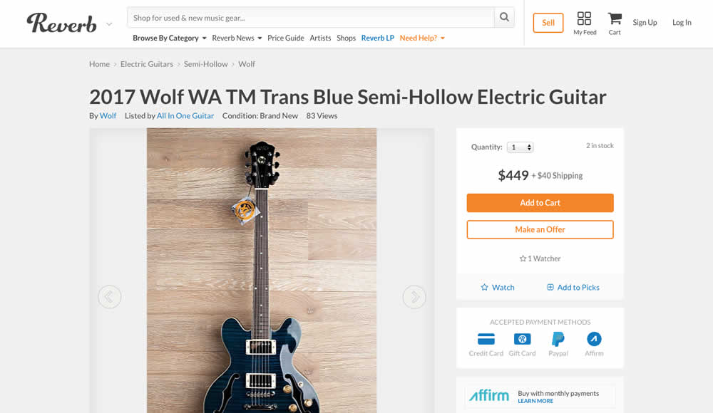
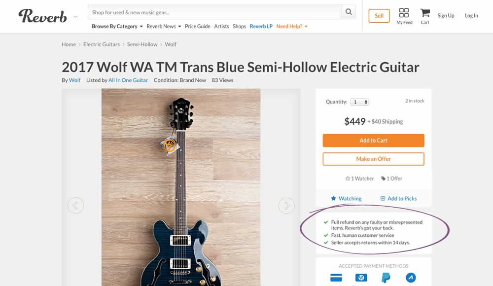
Nicholas Evans Tested Pattern #15: Bulleted Reassurances In Test #152 On Reverb.com
Test #151 on
Mamaearth.ca
by
 Michael Bernstein
Feb 08, 2018
Desktop
Checkout
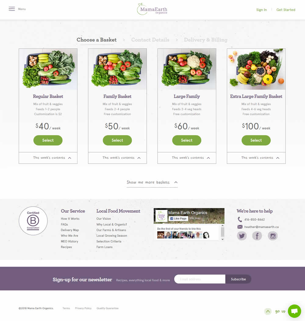
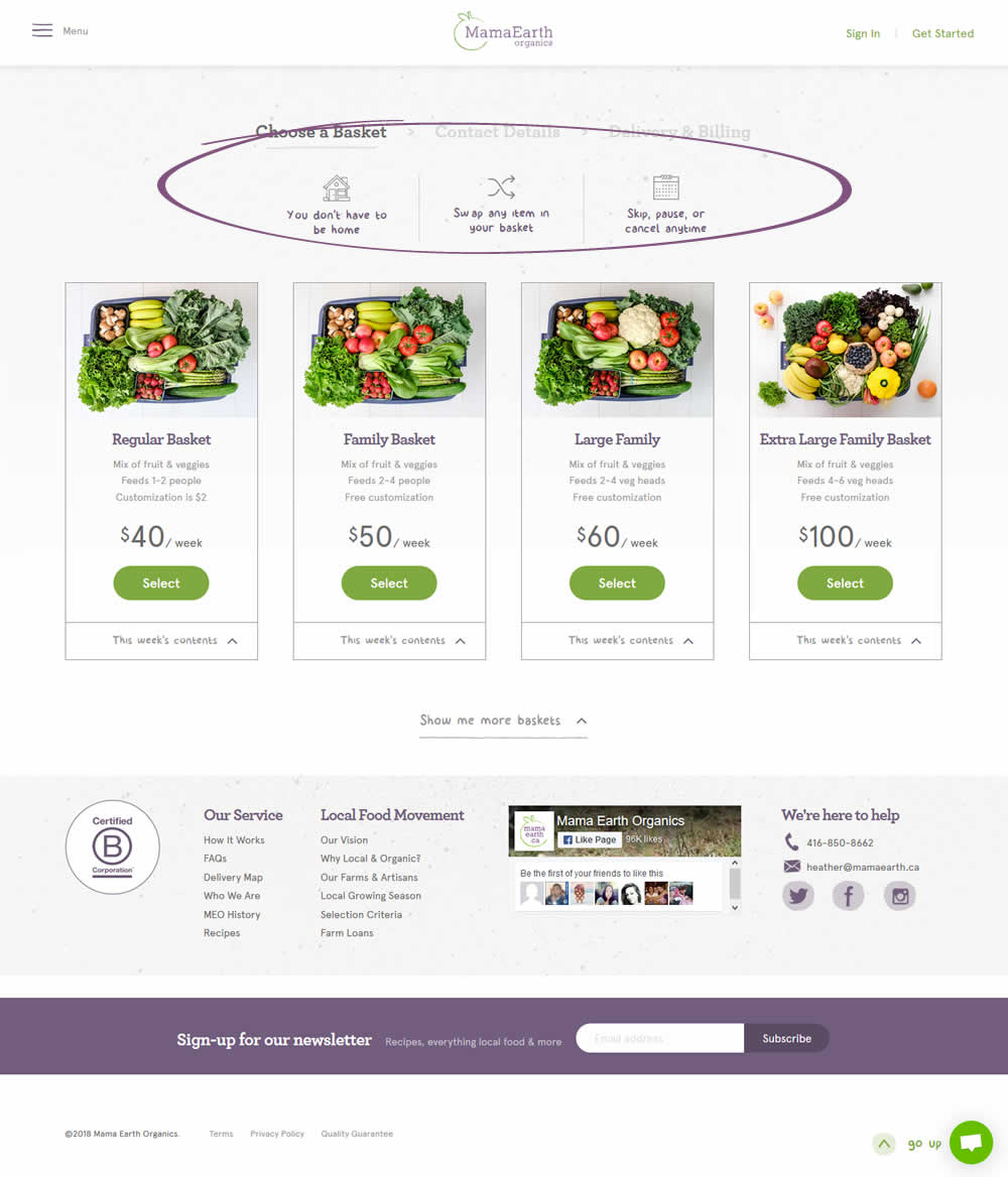
Michael Bernstein Tested Pattern #45: Benefit Bar In Test #151 On Mamaearth.ca
Test #150 on
Normanrecords.com
by
 Nathon Raine
Feb 07, 2018
Desktop
Home & Landing
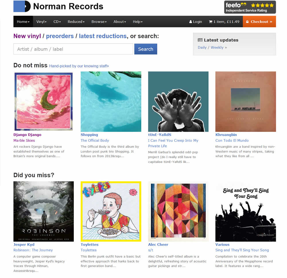
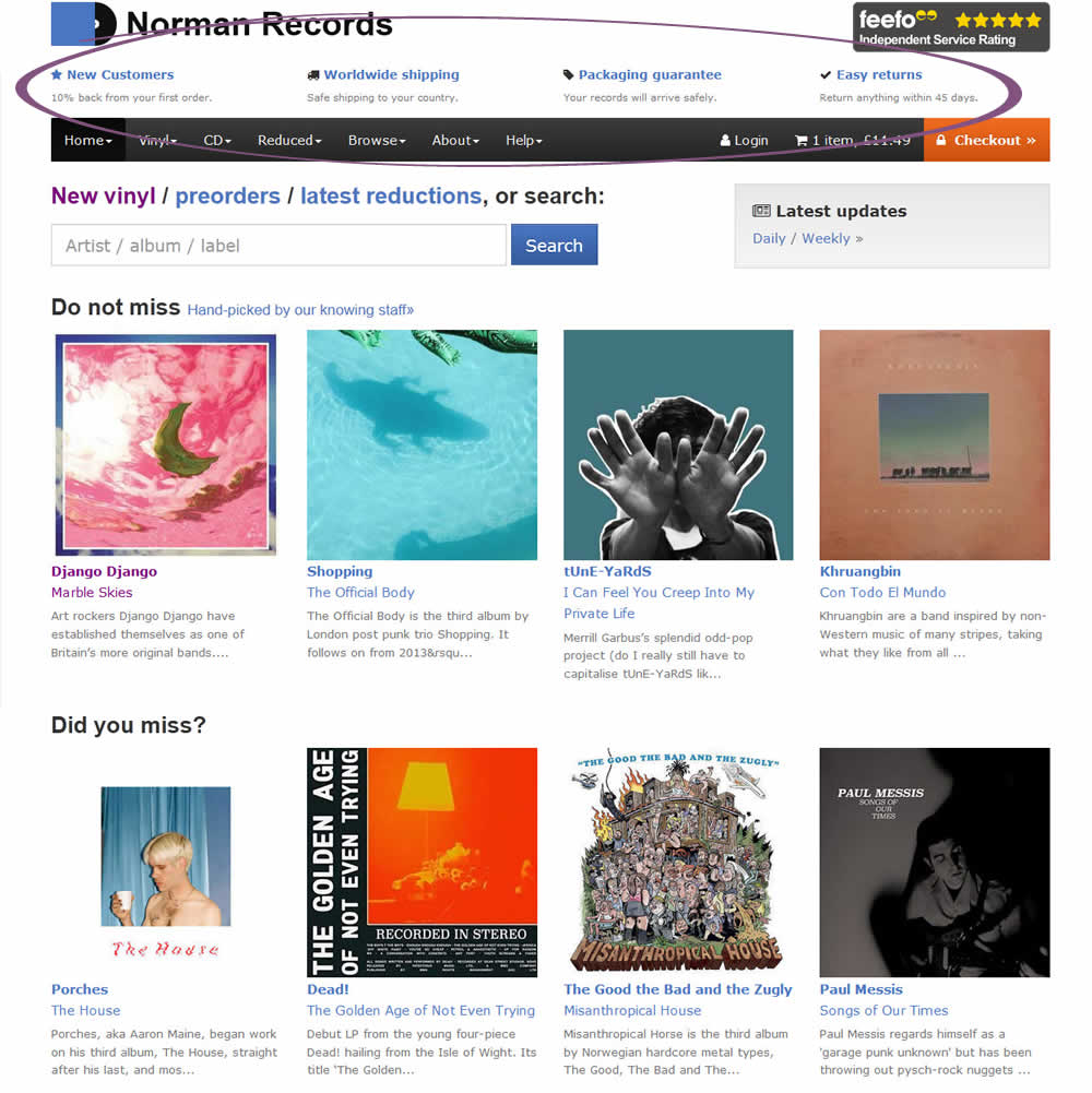
Nathon Raine Tested Pattern #45: Benefit Bar In Test #150 On Normanrecords.com
Test #149 on
Reverb.com
by
 Nicholas Evans
Feb 07, 2018
Desktop
Product
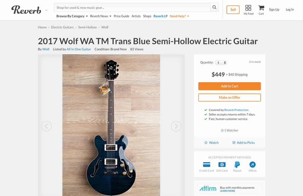
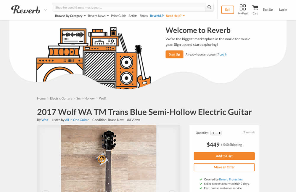
Nicholas Evans Tested Pattern #16: Welcome Mat - Partial In Test #149 On Reverb.com
Test #148 on
Kenhub.com
by
 Niels Hapke
Feb 01, 2018
Desktop
Mobile
Home & Landing
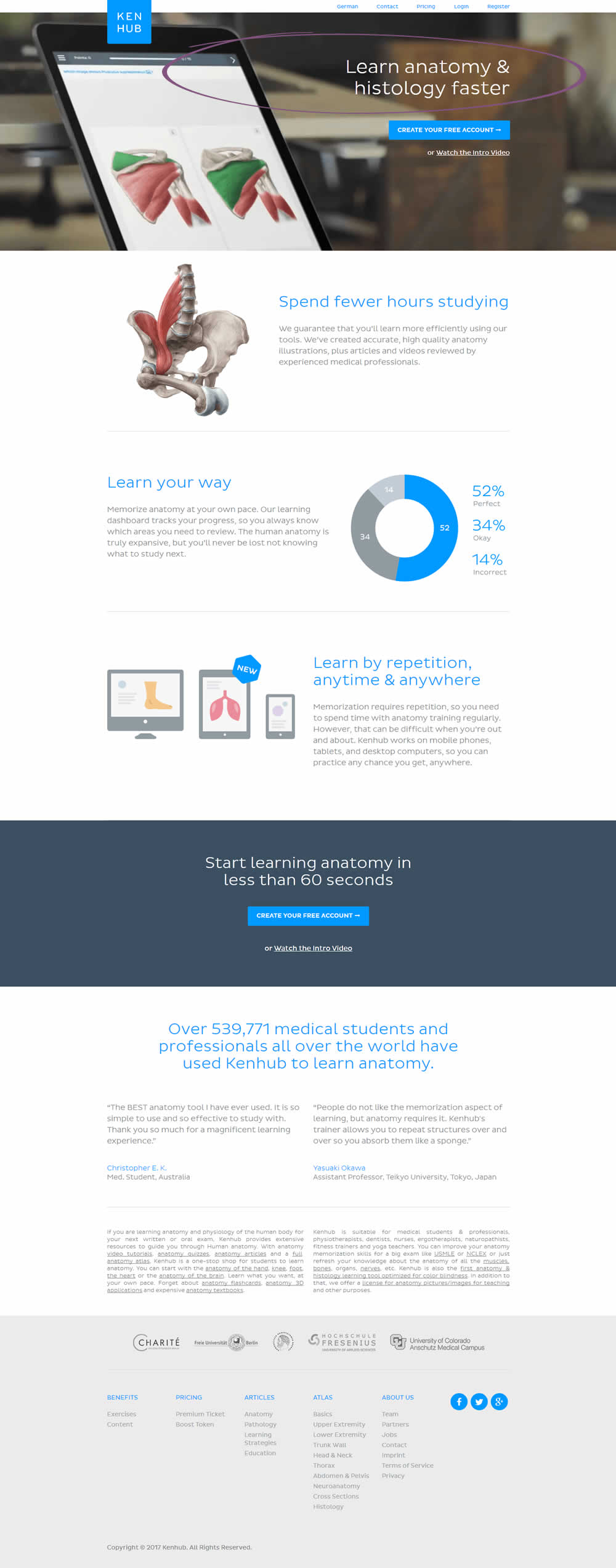
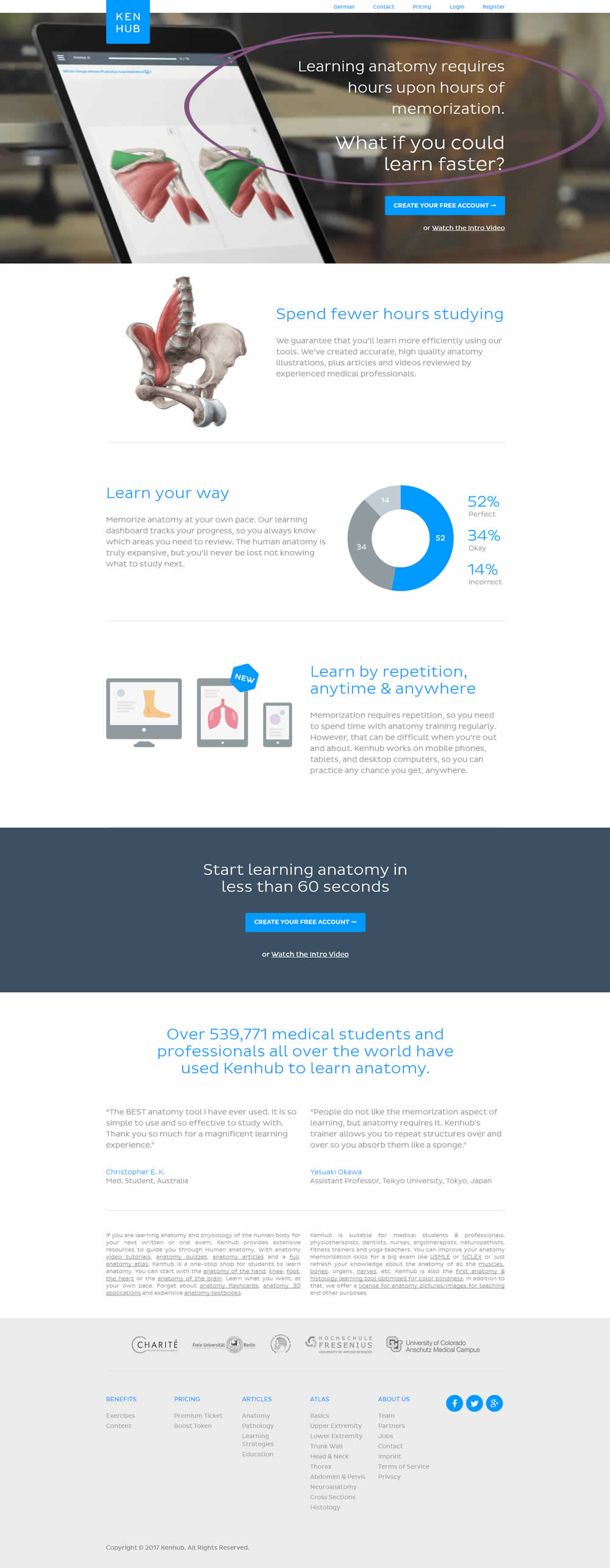
Niels Hapke Tested Pattern #53: Problem-Solution Headline In Test #148 On Kenhub.com
Test #147 on
Reverb.com
by
 Nicholas Evans
Jan 25, 2018
Desktop
Mobile
Product
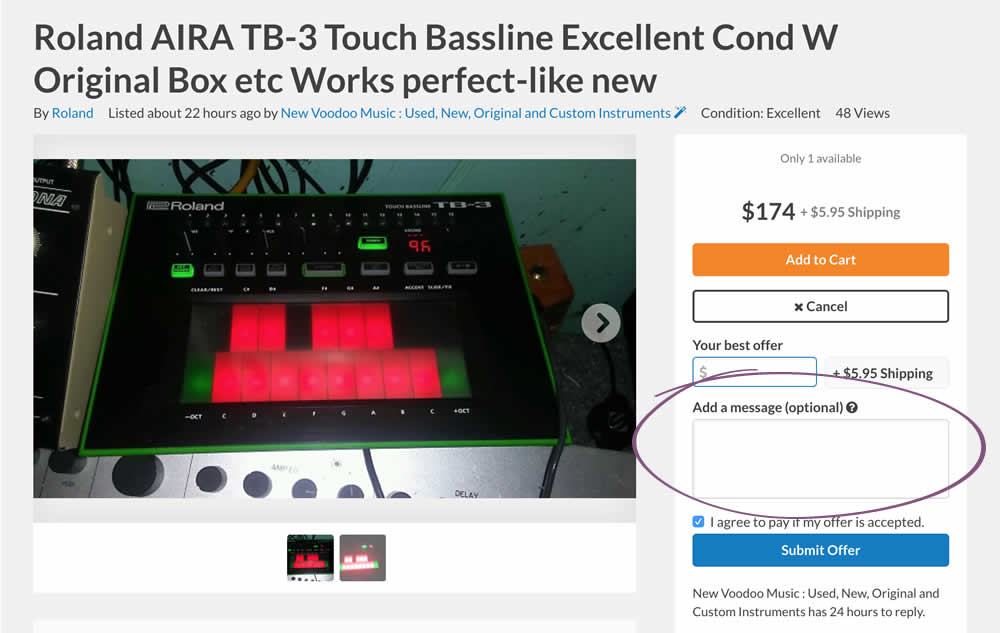
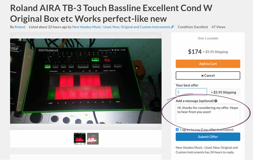
Nicholas Evans Tested Pattern #20: Canned Response In Test #147 On Reverb.com
Test #146 on
Goodui.org
by
 Jakub Linowski
Jan 25, 2018
Desktop
Mobile
Home & Landing
Jakub Linowski Tested Pattern #49: Above The Fold Call To Action In Test #146 On Goodui.org


Test #145 on
Normanrecords.com
by
 Nathon Raine
Jan 18, 2018
Desktop
Checkout
Nathon Raine Tested Pattern #1: Remove Coupon Fields In Test #145 On Normanrecords.com
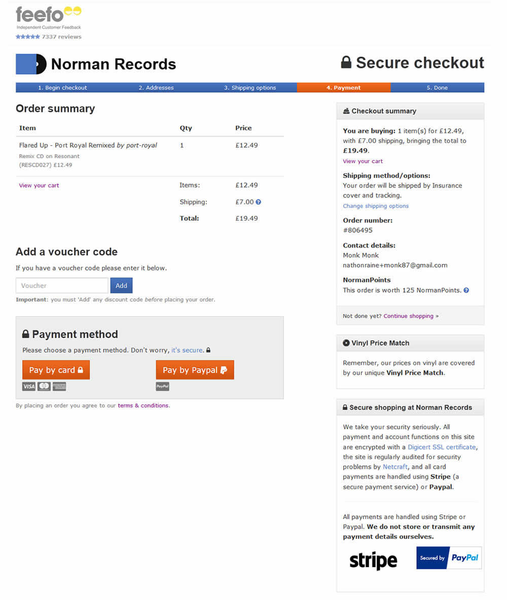
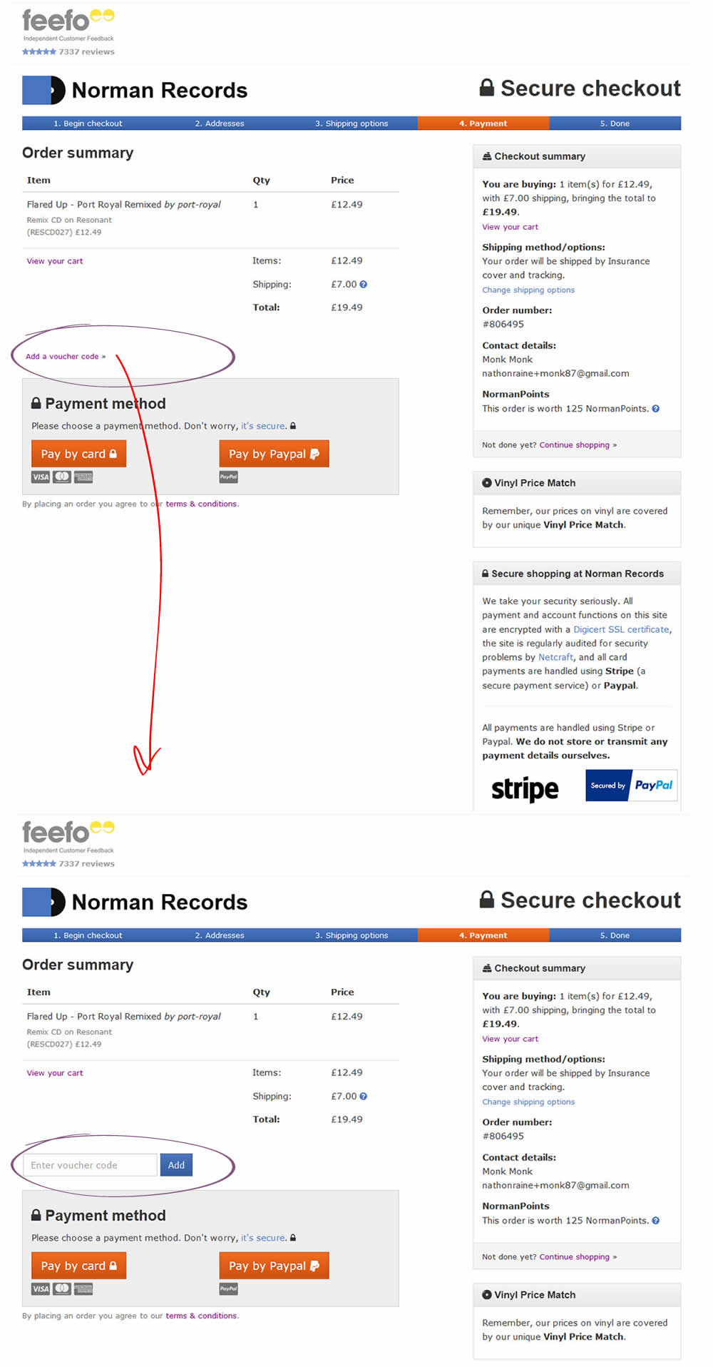
In this test the coupon field was replaced with a small link that would bring the field back if needed. This is a more suble approach than just completely removing the coupon field. It still allows for the use of coupon fields by those customers which are truly searching for a way to enter their aquired codes.
Test #143 on
Vivareal.com.br
by
 Rodrigo Maués
Jan 14, 2018
Desktop
Listing
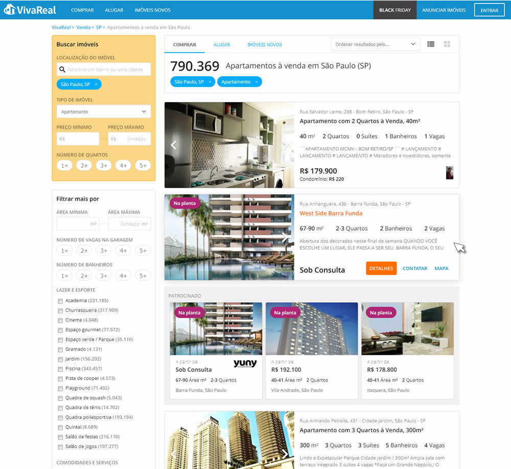
Rodrigo Maués Tested Pattern #56: Hover Button In Test #143 On Vivareal.com.br

Test #144 on
Examine.com
by
 Martin Wong
Jan 14, 2018
Desktop
Mobile
Product
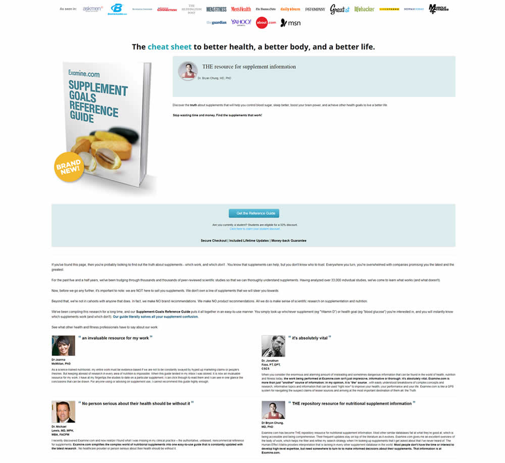
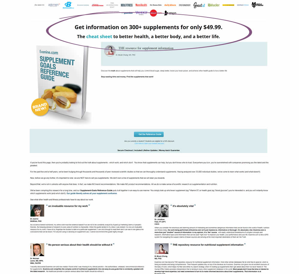
Martin Wong Tested Pattern #27: More For Less Headline In Test #144 On Examine.com
Test #142 on
Streamlineicons.com
by
 Vincent Le moign
Jan 13, 2018
Desktop
Product
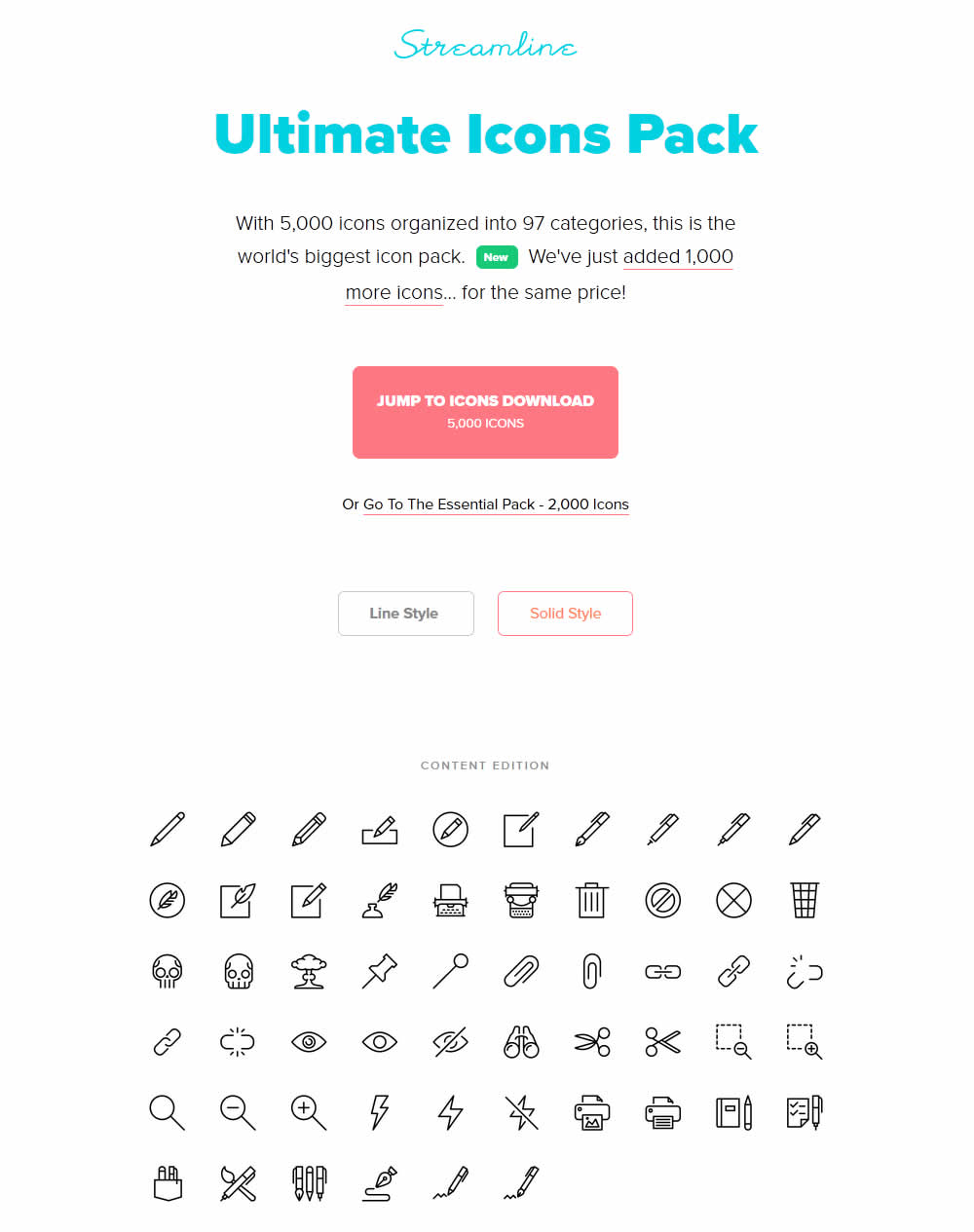
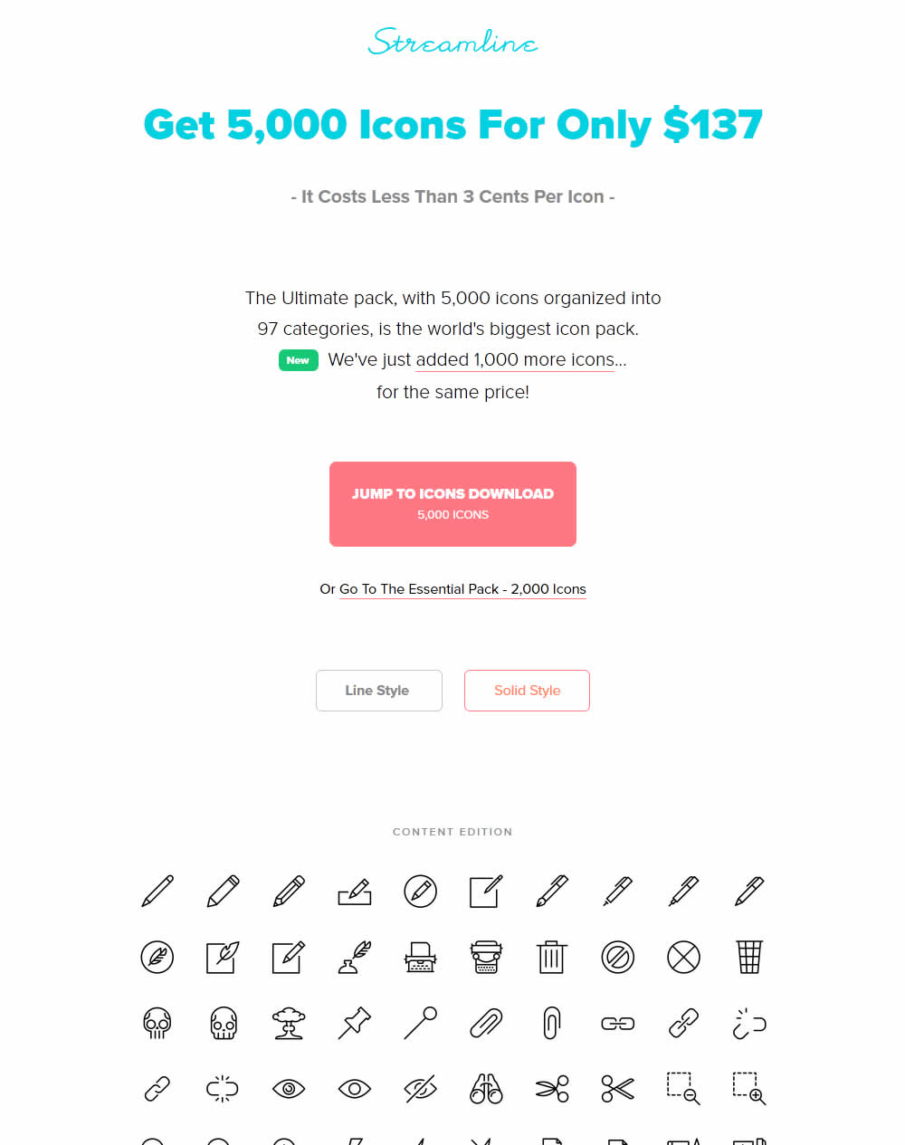
Vincent Le moign Tested Pattern #27: More For Less Headline In Test #142 On Streamlineicons.com
Test #140 on
Akademiafotografii.p...
by
Grzegorz Jancewicz
Jan 05, 2018
Desktop
Mobile
Product
Grzegorz Jancewicz Tested Pattern #46: Pay Later In Test #140 On Akademiafotografii.p...
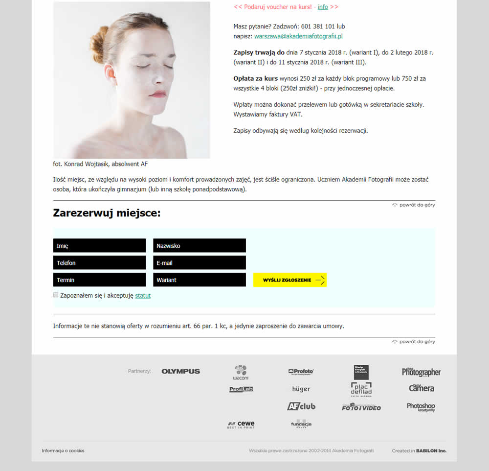
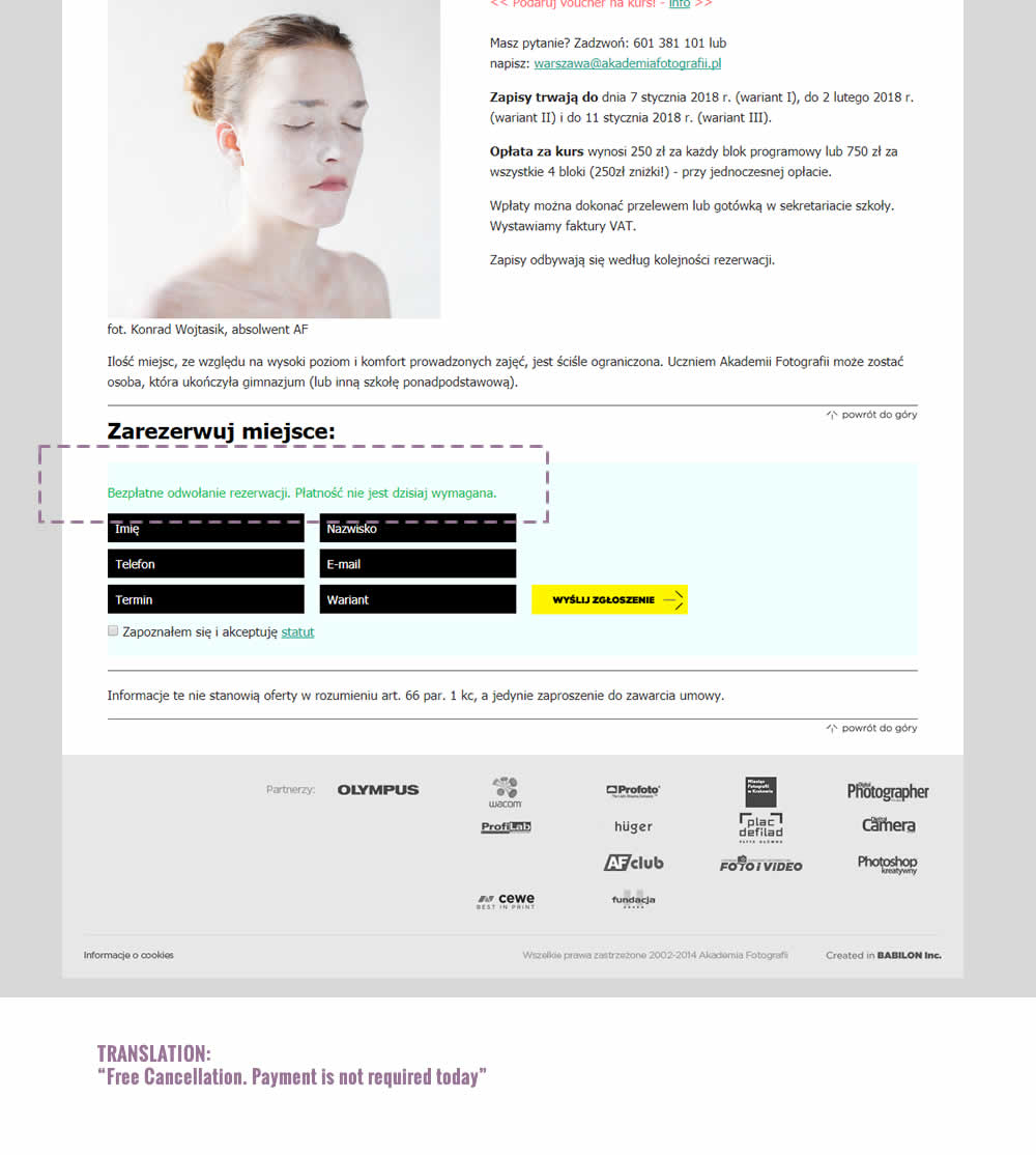
The test was run on multiple course pages. The screenshot contains the cropped bottom part of a long screen with an exposed signup form. The variation introduced additional text above the form which states: "Free Cancellation. Payment is not required today".
Test #141 on
Trydesignlab.com
by
 Daniel Shapiro
Jan 05, 2018
Desktop
Mobile
Product
Daniel Shapiro Tested Pattern #49: Above The Fold Call To Action In Test #141 On Trydesignlab.com


The variation introduced a call to action at the top of the screen that linked to a form deep down on a long course page.