All Latest 556 A/B Tests
Become a member to unlock the abiltiy to see the highest impact a/b tests. Being able to see the actual test results and sort by impact allows growth and experimentation teams to take action on the biggest gains first
MOST RECENT TESTS
Test #51 on
Menufy.com
by
 Aleksandr Elesev
Oct 20, 2016
Desktop
Mobile
Checkout
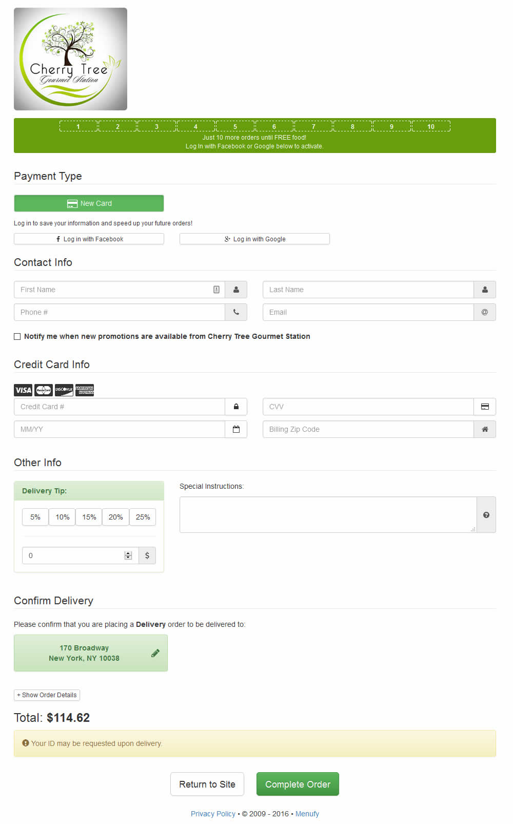
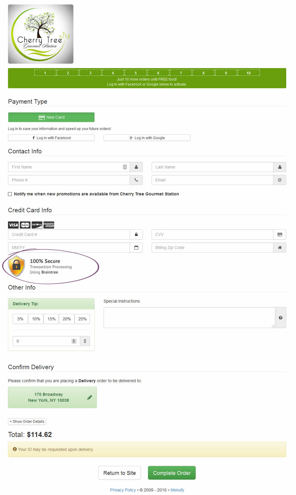
Aleksandr Elesev Tested Pattern #63: Trust Seals In Test #51 On Menufy.com
Test #59 on
by
 Someone
Oct 01, 2016
Home & Landing
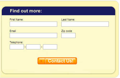
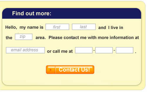
Someone Tested Pattern #8: Natural Language Forms In Test #59
Test #48 on
Adoramapix.com
by
 Herman Klein
Oct 01, 2016
Product
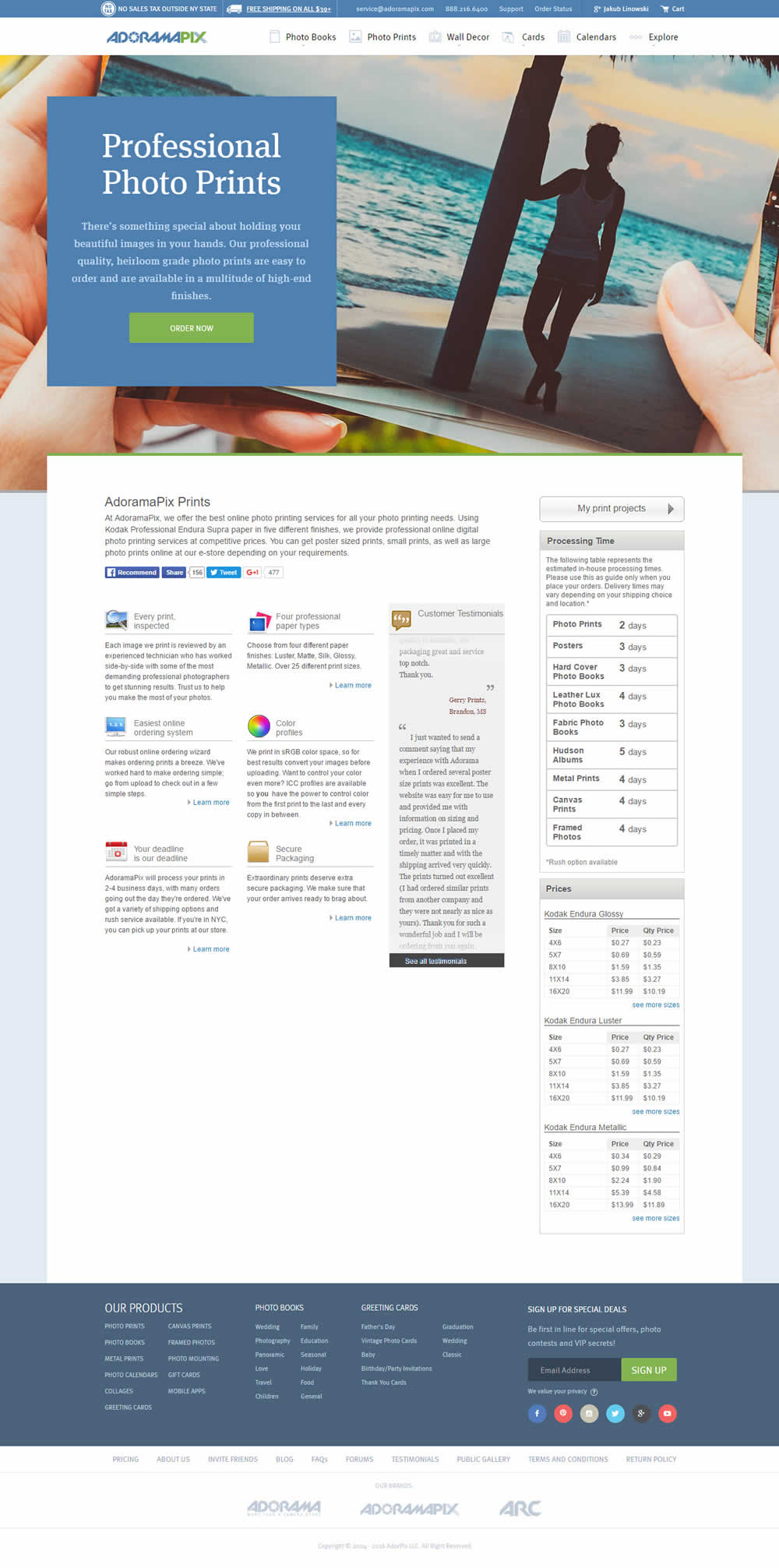
Herman Klein Tested Pattern #4: Testimonials In Test #48 On Adoramapix.com

Test #58 on
Bingocardcreator.com
by
 Patrick McKenzie
Aug 26, 2016
Desktop
Home & Landing
Patrick McKenzie Tested Pattern #8: Natural Language Forms In Test #58 On Bingocardcreator.com


Test #54 on
by
 Chris Goward
Aug 11, 2016
Desktop
Mobile
Product
Chris Goward Tested Pattern #7: Social Counts In Test #54


Client background (e.g. industry, business model):
This client is a healthcare company: their website is designed for lead generation. This company collects leads for their kidney-focused programs and ultimately provides kidney dialysis for those who decide to become patients.
Experiment background:
This experiment was focused on a right rail and the goal was to encourage more users to sign up to download the client’s free diabetes-friendly cookbook.
Test #55 on
Autodesk.com
by
 Lisa Seaman
Aug 11, 2016
Desktop
Home & Landing
Lisa Seaman Tested Pattern #14: Exposed Menu Options In Test #55 On Autodesk.com


In this test, some of the menu options (accessible in the top right hamburger menu) were copied over onto the top navigation. The options that were exposed were "All Products", "Free Trial" and "Buy".
Test #69 on
Digitalmarketer.com
by
 Justin Rondeau
Aug 01, 2016
Desktop
Mobile
Home & Landing
Justin Rondeau Tested Pattern #10: Postponed Modal Forms In Test #69 On Digitalmarketer.com


Test #57 on
by
 Jakub Linowski
Jul 07, 2016
Desktop
Checkout
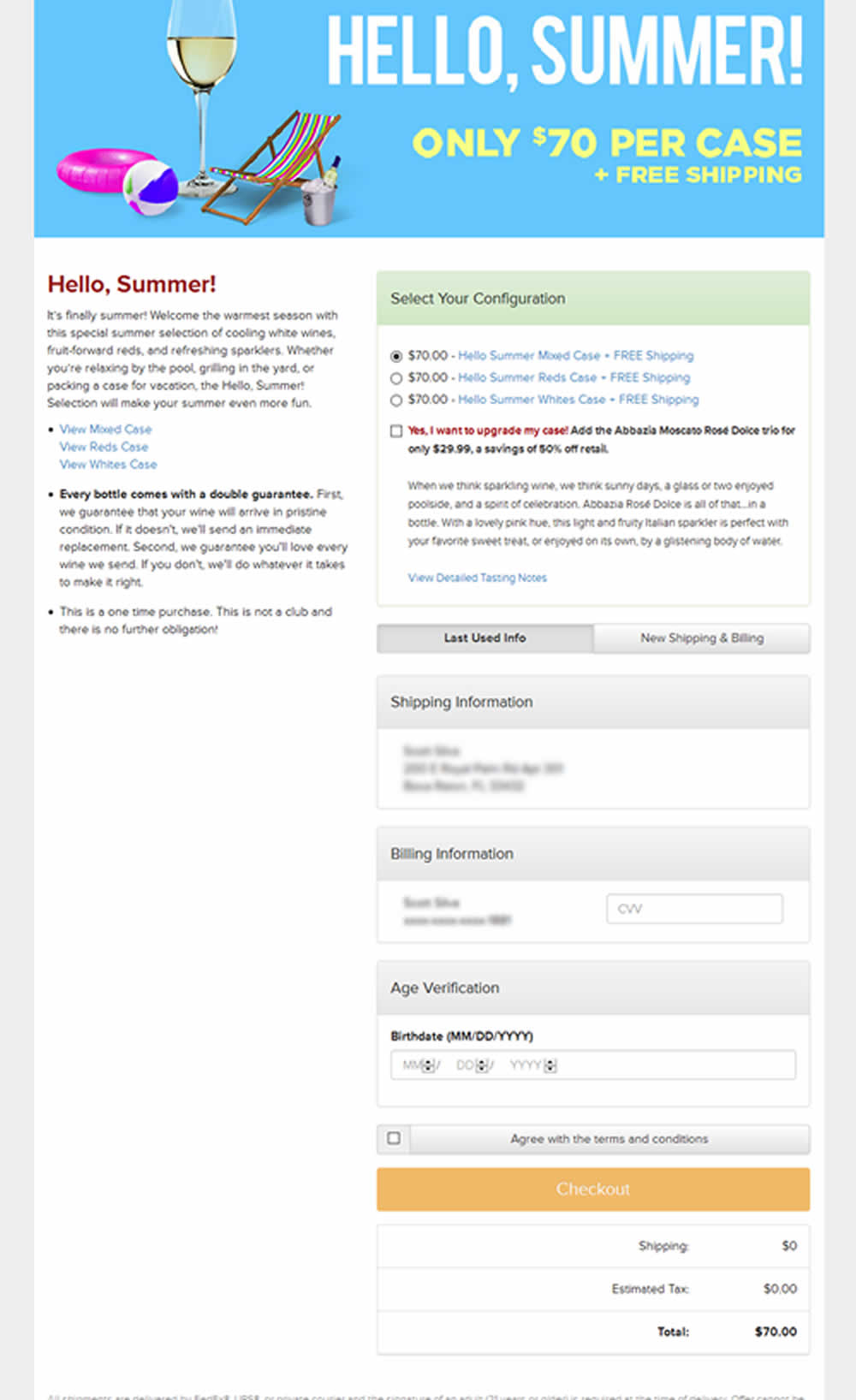
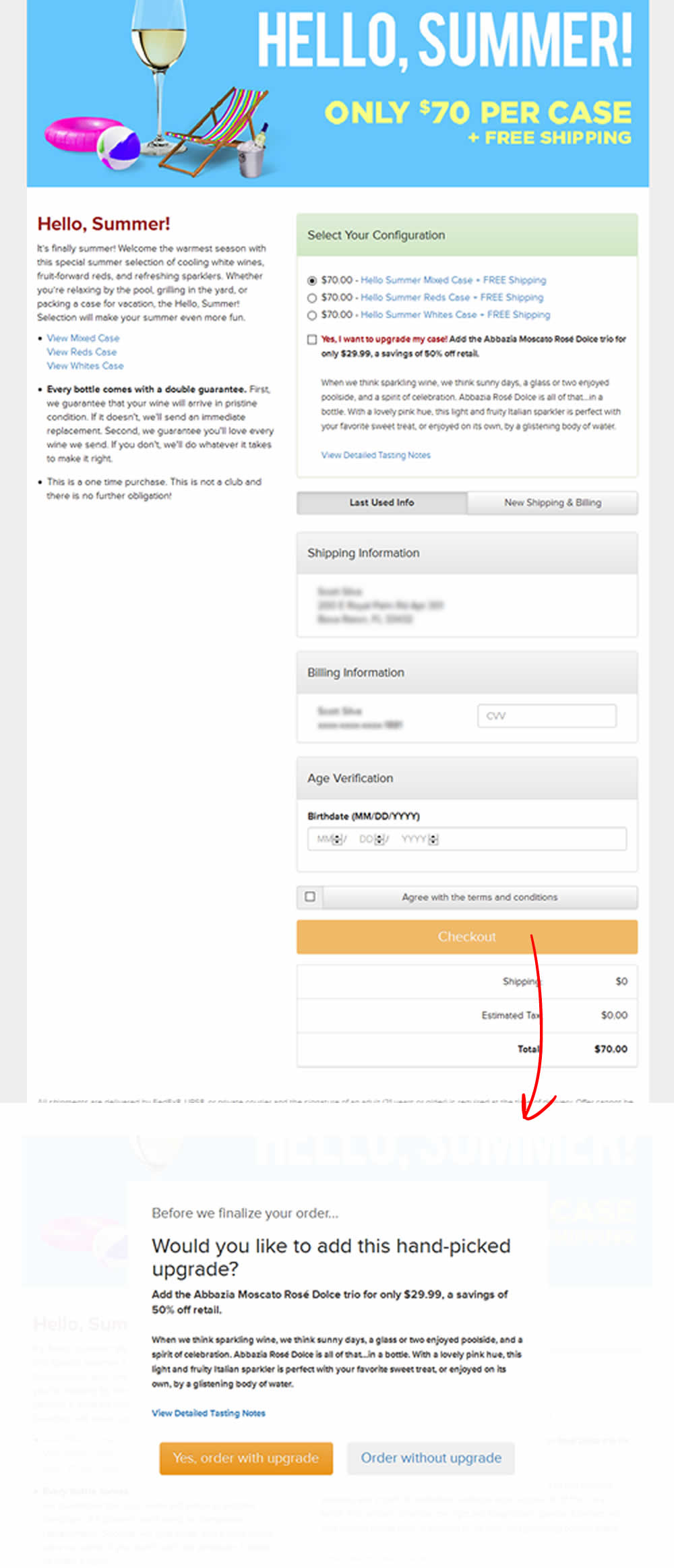
Jakub Linowski Tested Pattern #66: Complementary Upsell In Test #57
Test #16 on
Caffeineinformer.com
by
 James Foster
Jul 01, 2016
Mobile
Home & Landing
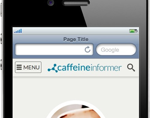
James Foster Tested Pattern #2: Icon Labels In Test #16 On Caffeineinformer.com
Test #17 on
Caffeineinformer.com
by
 James Foster
Jul 01, 2016
Mobile
Home & Landing
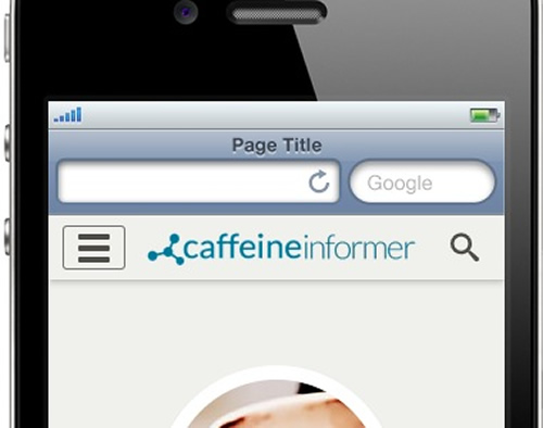
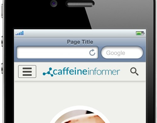
James Foster Tested Pattern #2: Icon Labels In Test #17 On Caffeineinformer.com

Test #18 on
Caffeineinformer.com
by
 James Foster
Jul 01, 2016
Mobile
Home & Landing
James Foster Tested Pattern #2: Icon Labels In Test #18 On Caffeineinformer.com


This is a retest of Test017 with a lengthier testing duration.
Test #47 on
Adoramapix.com
by
 Herman Klein
Jun 09, 2016
Desktop
Shopping Cart
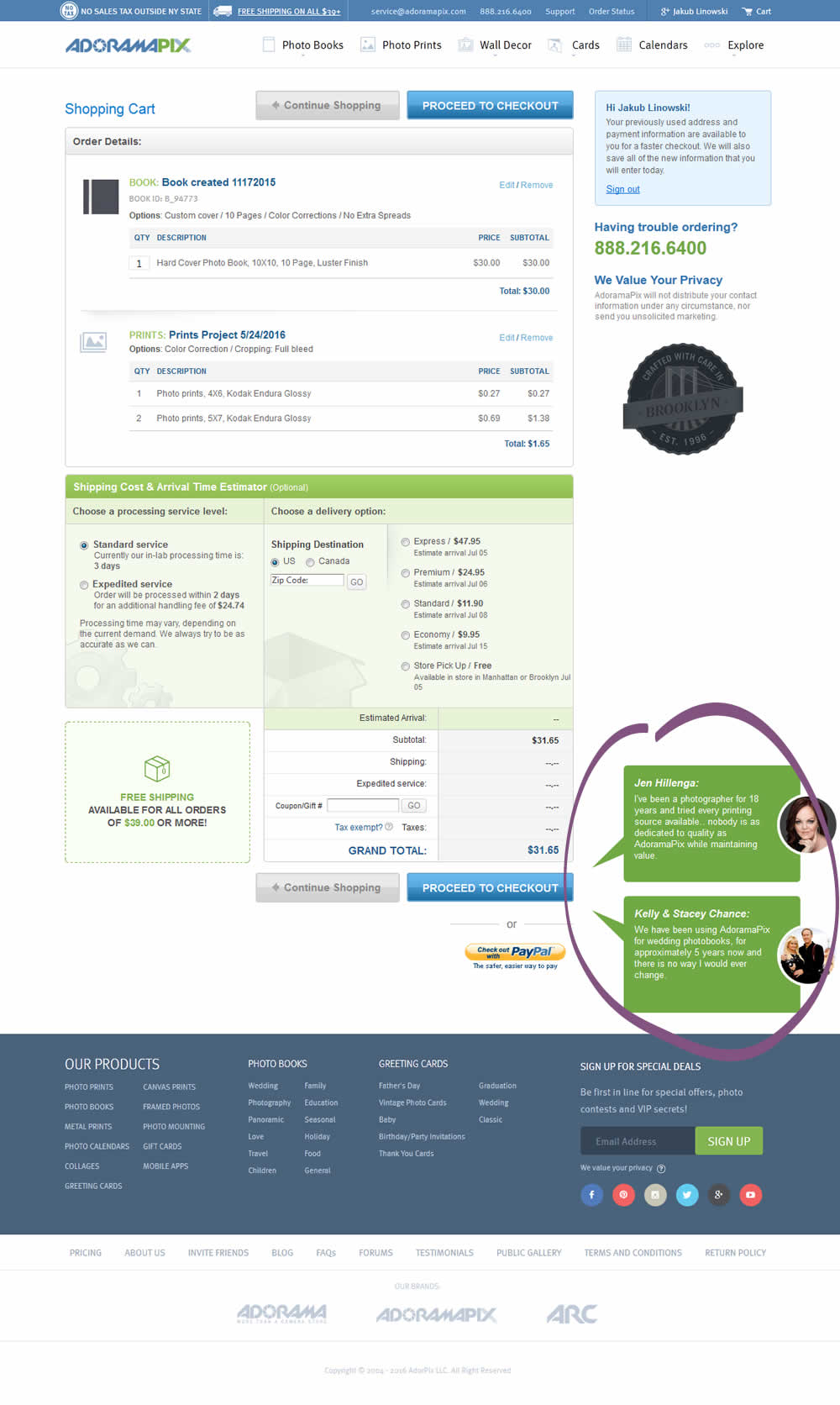
Herman Klein Tested Pattern #4: Testimonials In Test #47 On Adoramapix.com

Test #42 on
Adoramapix.com
by
 Herman Klein
May 11, 2016
Shopping Cart
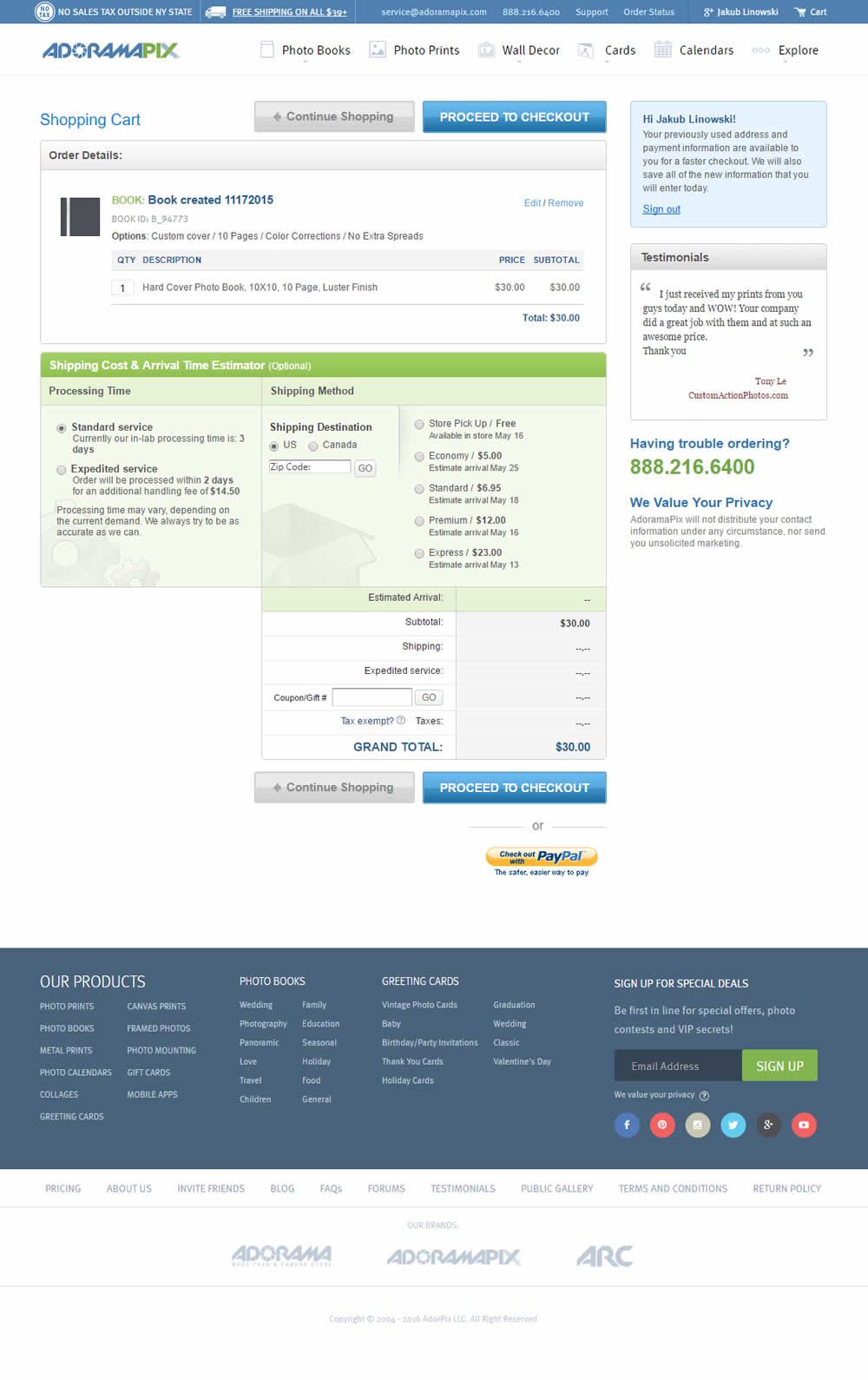
Herman Klein Tested Pattern #1: Remove Coupon Fields In Test #42 On Adoramapix.com

Test #38 on
Mt.com
by
 Vito Mediavilla
May 01, 2016
Desktop
Product
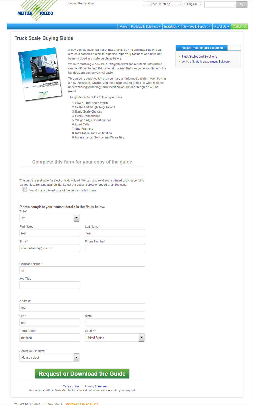
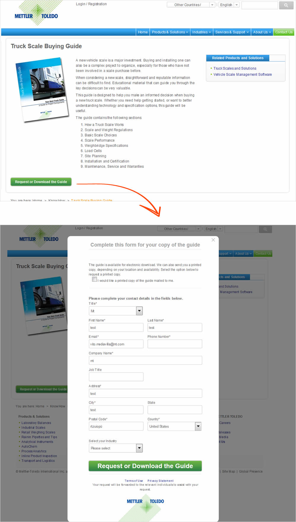
Vito Mediavilla Tested Pattern #10: Postponed Modal Forms In Test #38 On Mt.com
Test #32 on
Over-blog.com
by
 Tael Pinault
Apr 20, 2016
Desktop
Signup
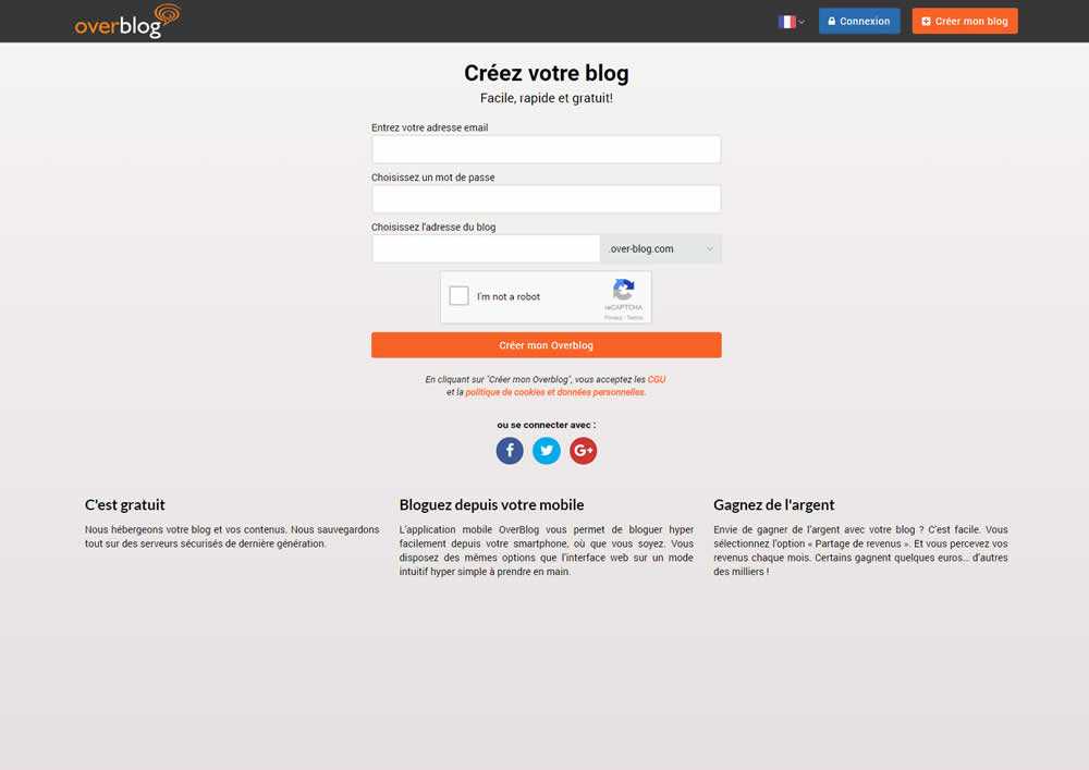
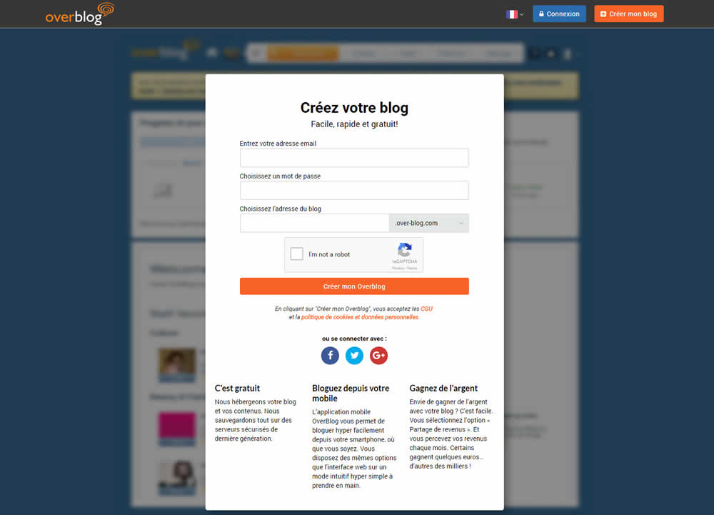
Tael Pinault Tested Pattern #40: Blurred Product Background In Test #32 On Over-blog.com
Test #37 on
Onlinefaxes.com
by
 Jaymie Friesen
Apr 09, 2016
Desktop
Mobile
Home & Landing
Jaymie Friesen Tested Pattern #27: More For Less Headline In Test #37 On Onlinefaxes.com


Test #35 on
by
 Someone
Apr 01, 2016
Desktop
Mobile
Home & Landing
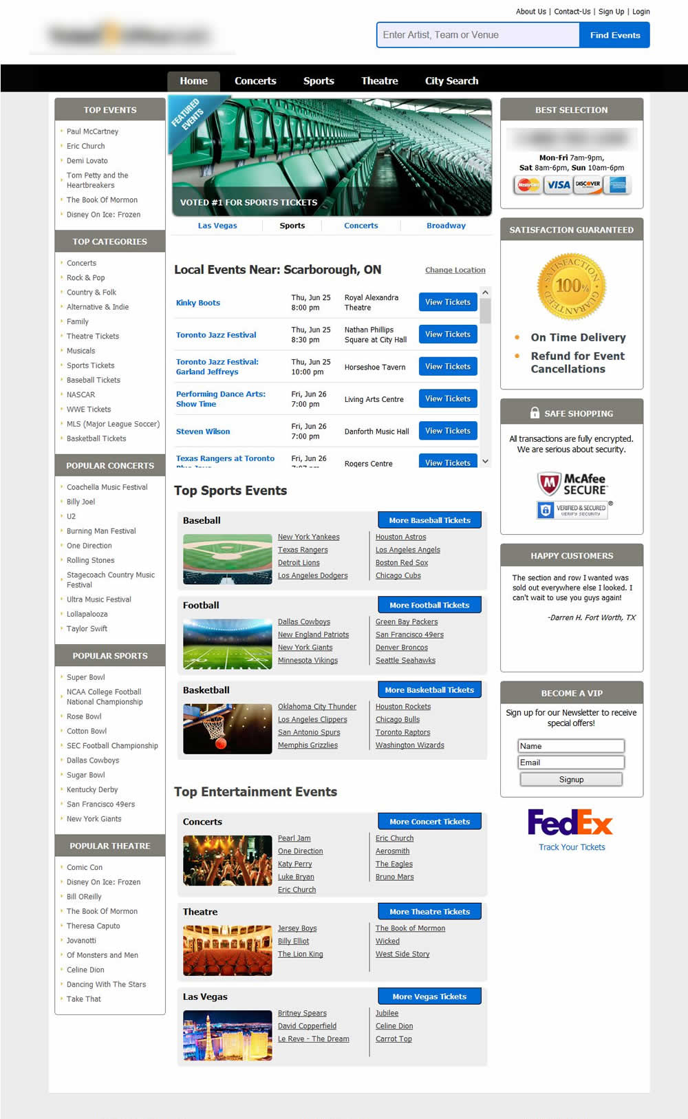
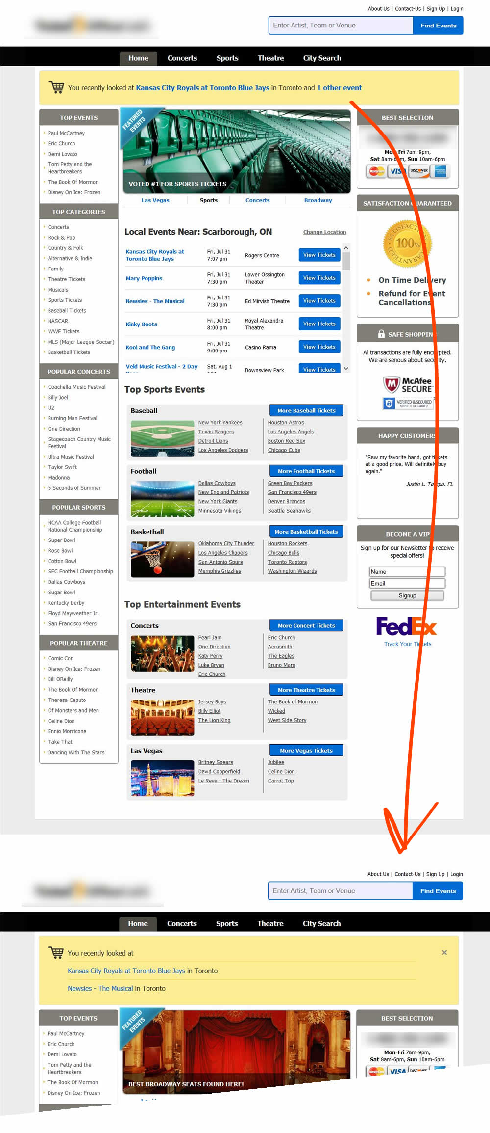
Someone Tested Pattern #26: Cart Reminder And Recently Viewed In Test #35
Test #28 on
Digitalmarketer.com
by
 Justin Rondeau
Mar 01, 2016
Desktop
Home & Landing
Justin Rondeau Tested Pattern #3: Fewer Form Fields In Test #28 On Digitalmarketer.com


Test #27 on
Adoramapix.com
by
 Herman Klein
Mar 01, 2016
Desktop
Mobile
Product
Herman Klein Tested Pattern #11: Gradual Reassurance In Test #27 On Adoramapix.com


Test #65 on
Digitalmarketer.com
by
 Justin Rondeau
Mar 01, 2016
Desktop
Home & Landing
Justin Rondeau Tested Pattern #10: Postponed Modal Forms In Test #65 On Digitalmarketer.com

