All Latest 550 A/B Tests
Become a member to unlock the abiltiy to see the highest impact a/b tests. Being able to see the actual test results and sort by impact allows growth and experimentation teams to take action on the biggest gains first
MOST RECENT TESTS
Test #110 on
Trydesignlab.com
by
 Daniel Shapiro
Jul 01, 2017
Desktop
Home & Landing
Daniel Shapiro Tested Pattern #14: Exposed Menu Options In Test #110 On Trydesignlab.com


Test #108 on
Acousticalsurfaces.c...
by
 Julian Gaviria
Jun 01, 2017
Desktop
Home & Landing
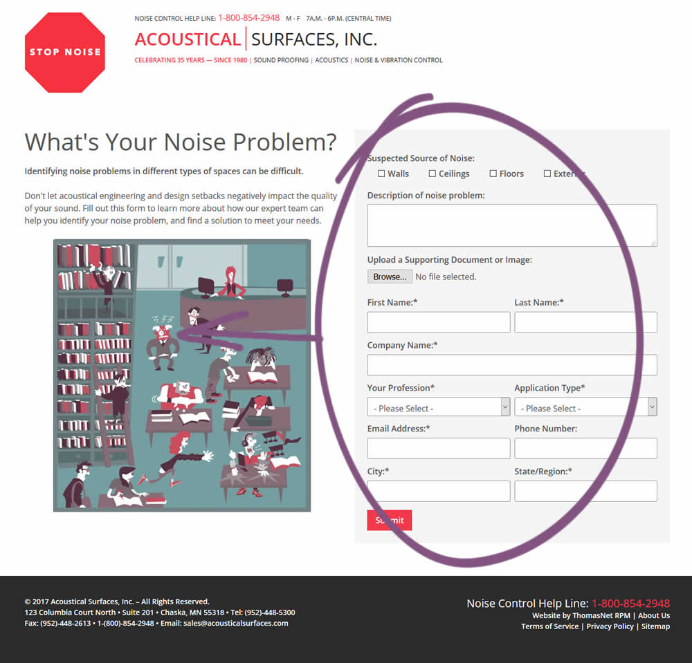
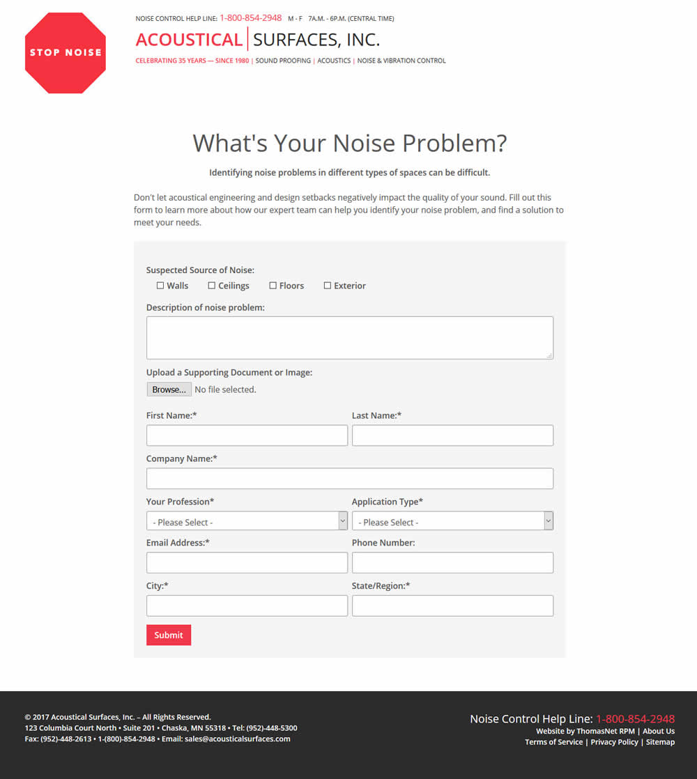
Julian Gaviria Tested Pattern #13: Centered Forms & Buttons In Test #108 On Acousticalsurfaces.c...
Test #89 on
Ssdnodes.com
by
 Matt Connor
Jun 01, 2017
Desktop
Mobile
Checkout
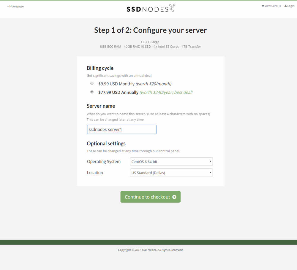
Matt Connor Tested Pattern #4: Testimonials In Test #89 On Ssdnodes.com

Test #109 on
3dhubs.com
by
 Rob Draaijer
Jun 01, 2017
Desktop
Signup
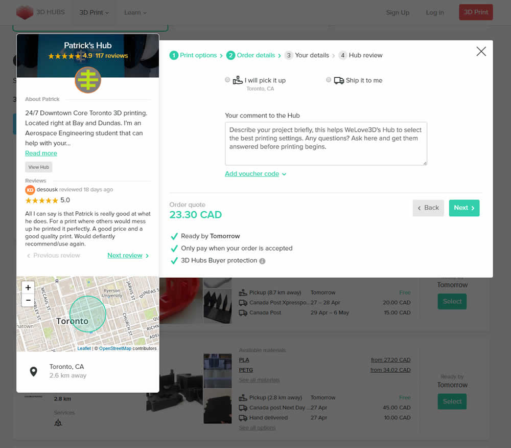
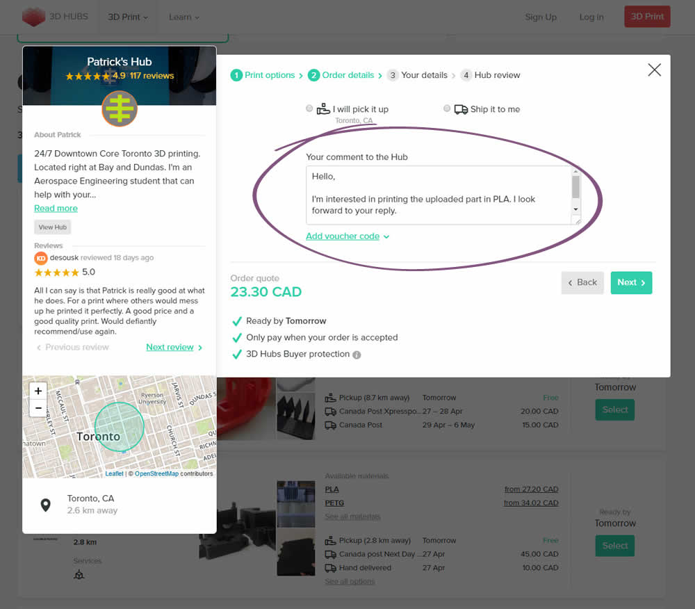
Rob Draaijer Tested Pattern #20: Canned Response In Test #109 On 3dhubs.com
Test #106 on
Examine.com
by
 Martin Wong
May 23, 2017
Desktop
Product
Martin Wong Tested Pattern #15: Bulleted Reassurances In Test #106 On Examine.com


Three reassurances were added underneath each purchase button: Lifetime Updates, Works On All Devices and Money-Back Guarantee.
Test #107 on
Examine.com
by
 Martin Wong
May 22, 2017
Desktop
Product
Martin Wong Tested Pattern #14: Exposed Menu Options In Test #107 On Examine.com


Test #97 on
3dhubs.com
by
 Rob Draaijer
May 03, 2017
Desktop
Mobile
Listing
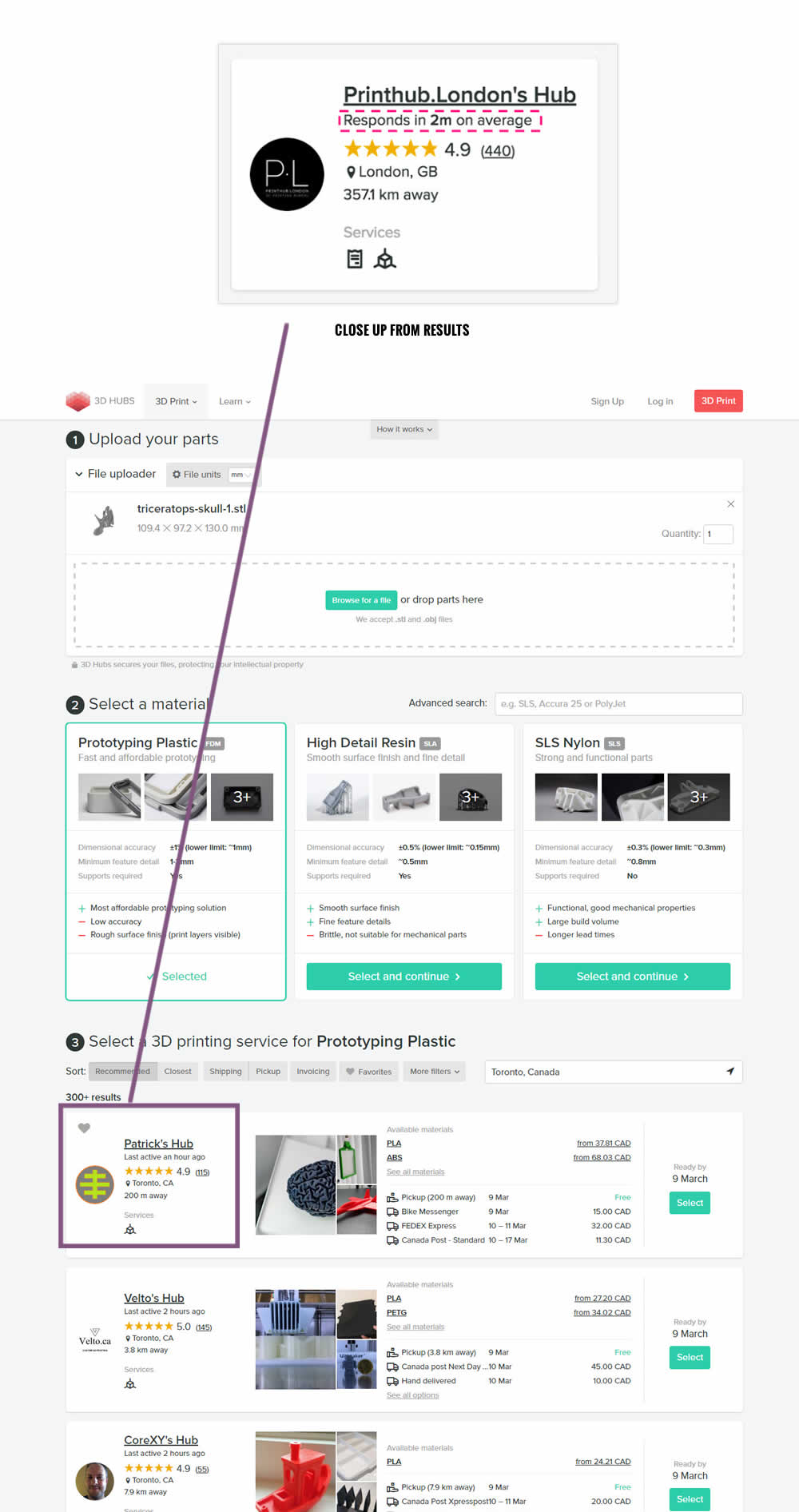
Rob Draaijer Tested Pattern #24: Visible Availability In Test #97 On 3dhubs.com

Test #101 on
Acousticalsurfaces.c...
by
 Julian Gaviria
May 02, 2017
Desktop
Mobile
Content
Julian Gaviria Tested Pattern #23: Inline Link Nudge In Test #101 On Acousticalsurfaces.c...


Test #102 on
Vivareal.com.br
by
 Rodrigo Maués
May 02, 2017
Desktop
Mobile
Product
Rodrigo Maués Tested Pattern #24: Visible Availability In Test #102 On Vivareal.com.br

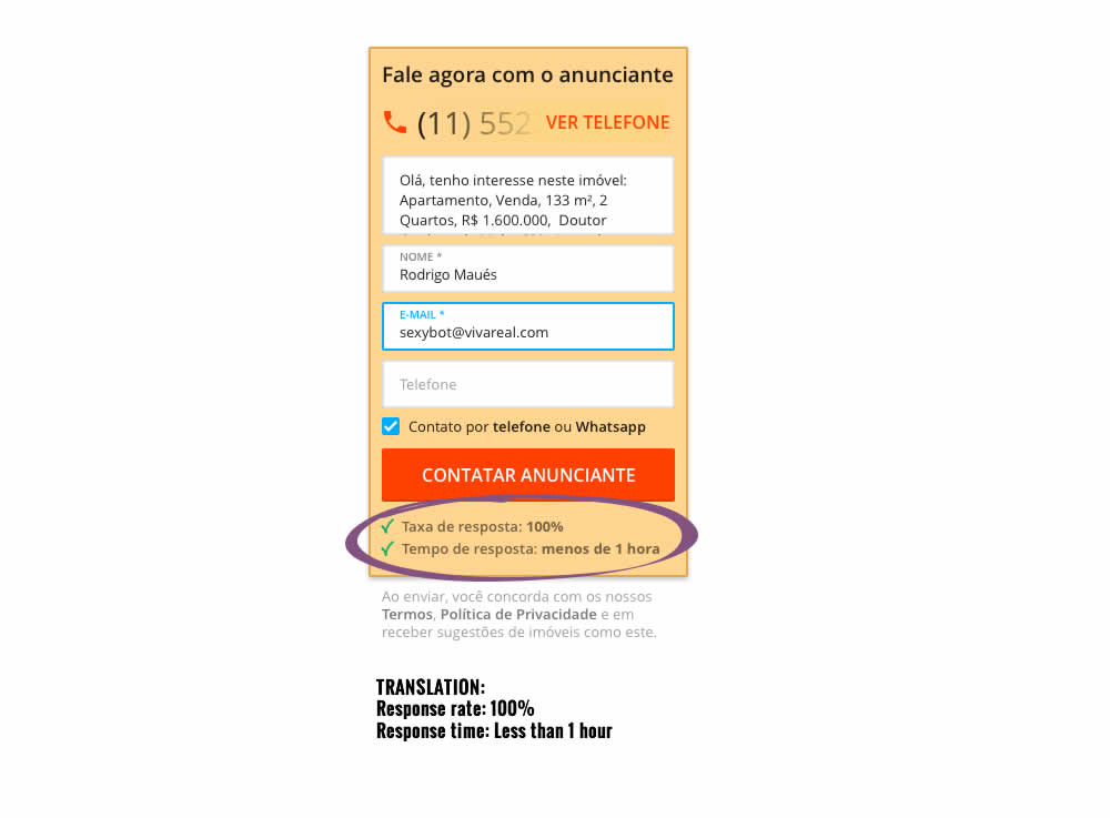
Test #95 on
Vivareal.com.br
by
 Rodrigo Maués
May 01, 2017
Desktop
Mobile
Home & Landing
Rodrigo Maués Tested Pattern #15: Bulleted Reassurances In Test #95 On Vivareal.com.br
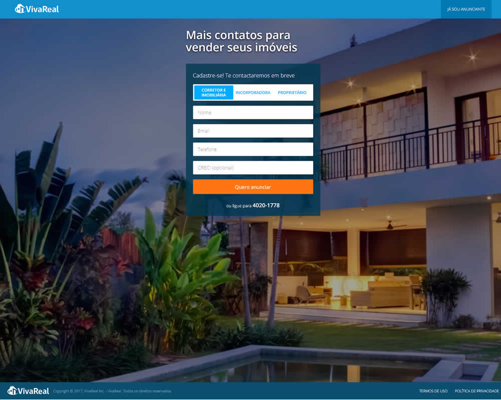
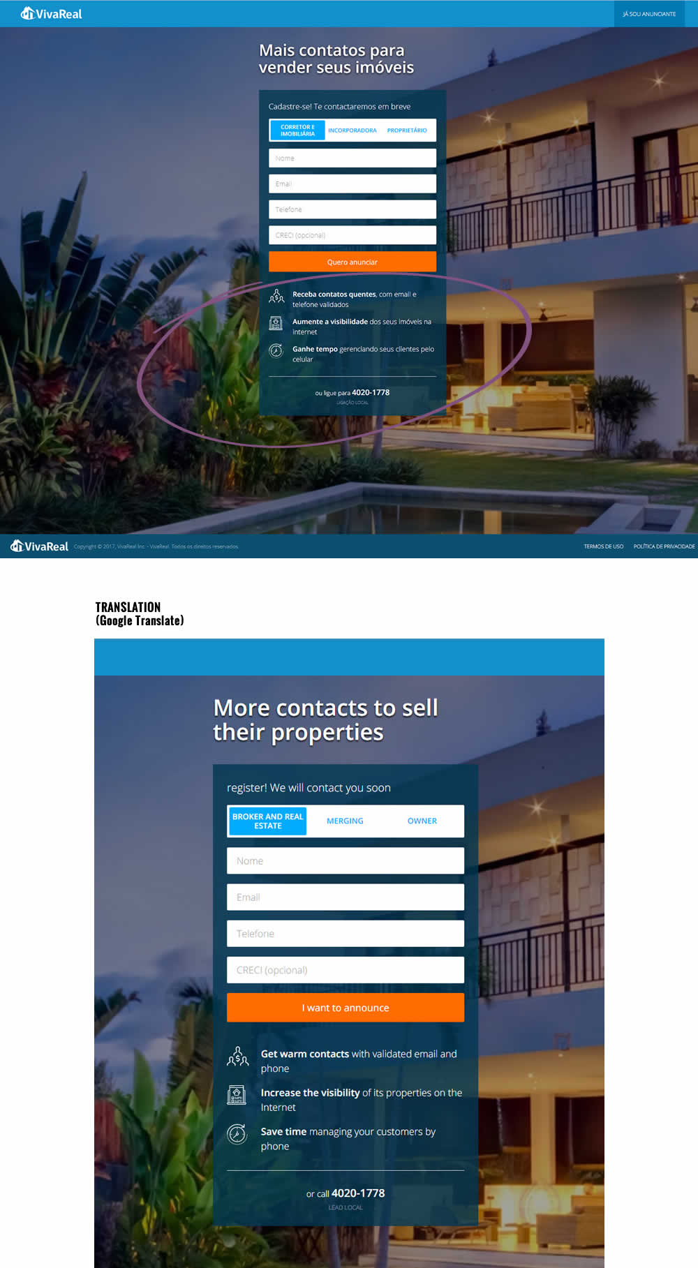
Test #103 on
Rollbar.com
by
 Mike Smith
May 01, 2017
Desktop
Home & Landing
Mike Smith Tested Pattern #11: Gradual Reassurance In Test #103 On Rollbar.com


Test #96 on
3dhubs.com
by
 Rob Draaijer
Apr 21, 2017
Desktop
Mobile
Home & Landing
Rob Draaijer Tested Pattern #61: Local Headline In Test #96 On 3dhubs.com


Test #90 on
Vivareal.com.br
by
 Rodrigo Maués
Apr 01, 2017
Desktop
Home & Landing
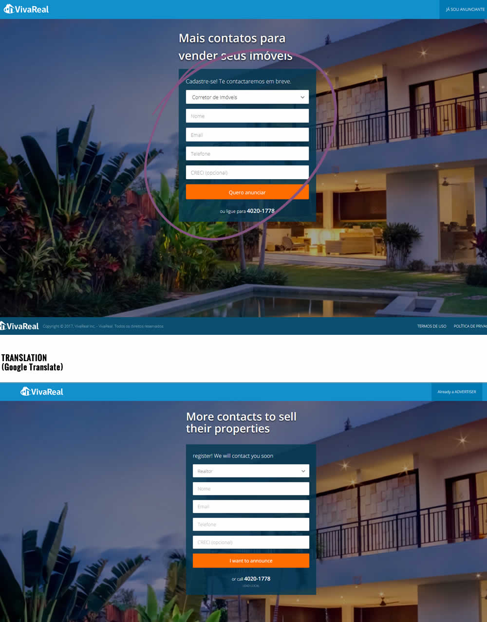
Rodrigo Maués Tested Pattern #13: Centered Forms & Buttons In Test #90 On Vivareal.com.br
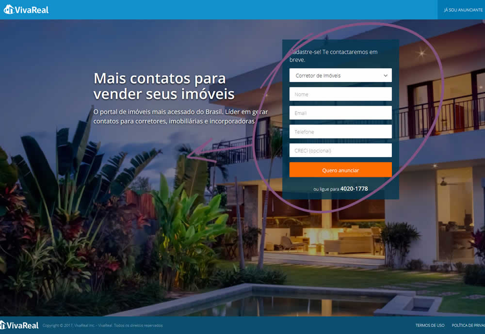
Test #88 on
Ssdnodes.com
by
 Matt Connor
Mar 31, 2017
Desktop
Mobile
Shopping Cart
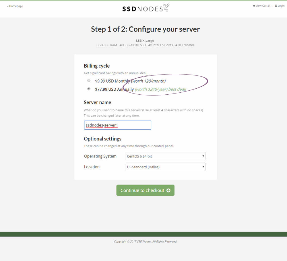
Matt Connor Tested Pattern #21: What It's Worth In Test #88 On Ssdnodes.com

Test #84 on
Onlinefaxes.com
by
 Jaymie Friesen
Mar 02, 2017
Desktop
Mobile
Home & Landing
Jaymie Friesen Tested Pattern #7: Social Counts In Test #84 On Onlinefaxes.com


Test #83 on
Onlinefaxes.com
by
 Jaymie Friesen
Mar 02, 2017
Desktop
Home & Landing
Jaymie Friesen Tested Pattern #4: Testimonials In Test #83 On Onlinefaxes.com


Test #85 on
Vivareal.com.br
by
 Rodrigo Maués
Mar 01, 2017
Desktop
Mobile
Product
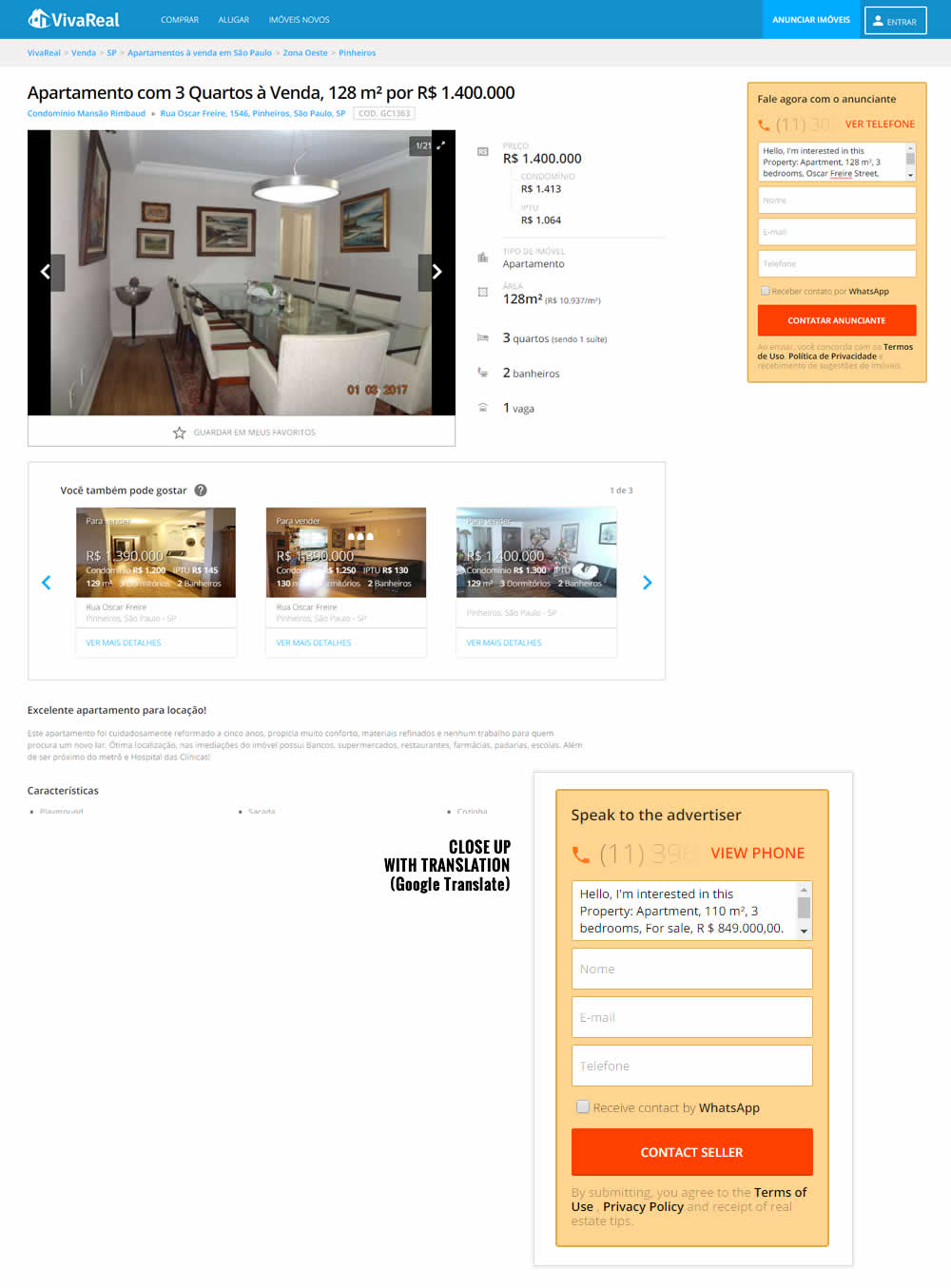
Rodrigo Maués Tested Pattern #3: Fewer Form Fields In Test #85 On Vivareal.com.br
Test #87 on
Vivareal.com.br
by
 Rodrigo Maués
Mar 01, 2017
Desktop
Mobile
Product
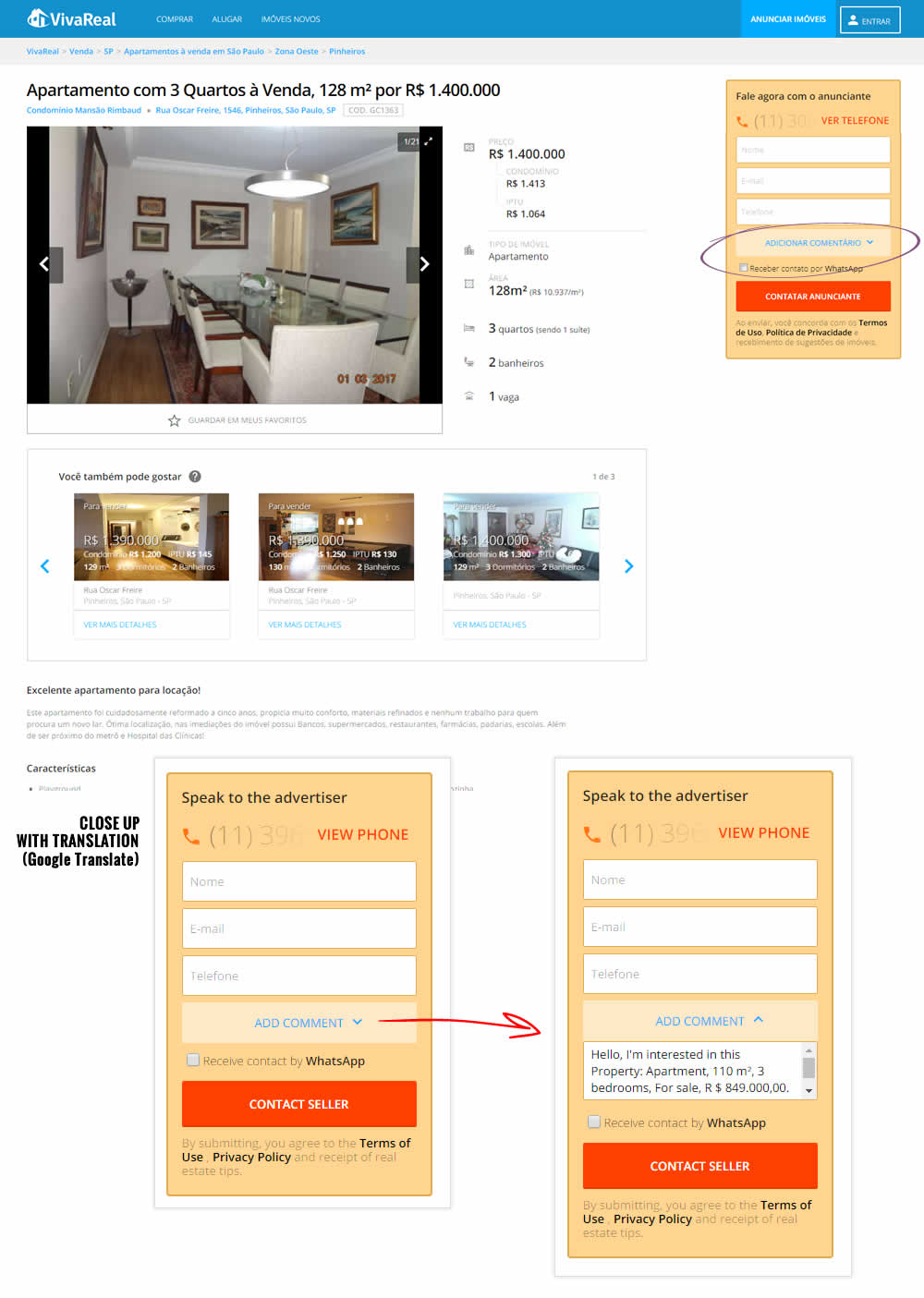
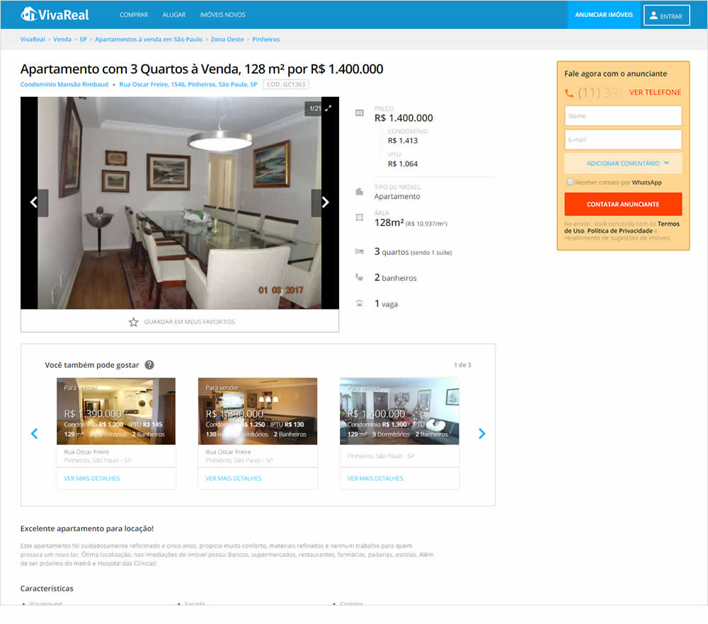
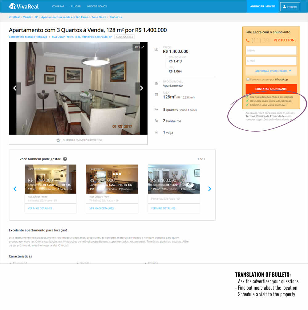
Rodrigo Maués Tested Pattern #15: Bulleted Reassurances In Test #87 On Vivareal.com.br
Test #76 on
Goodui.org
by
 Jakub Linowski
Feb 01, 2017
Desktop
Home & Landing
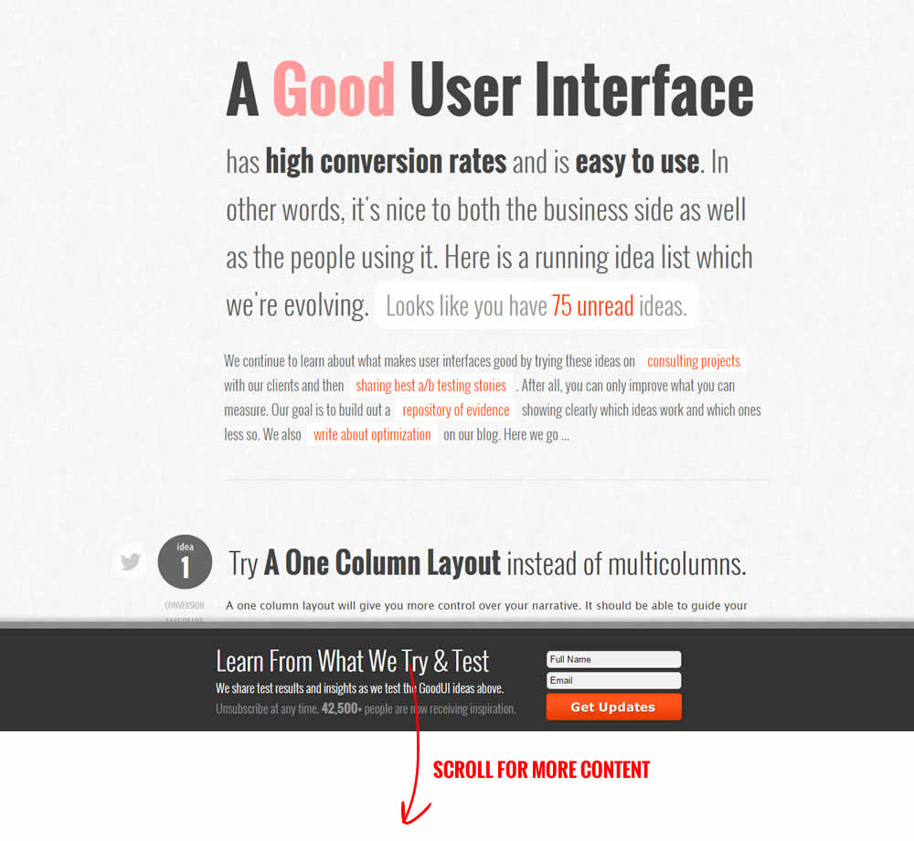
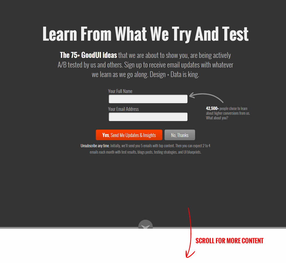
Jakub Linowski Tested Pattern #16: Welcome Mat - Partial In Test #76 On Goodui.org
Test #46 on
Hylokusa.com
by
 Julian Gaviria
Feb 01, 2017
Desktop
Product
Julian Gaviria Tested Pattern #60: Repeated Bottom Call To Action In Test #46 On Hylokusa.com
